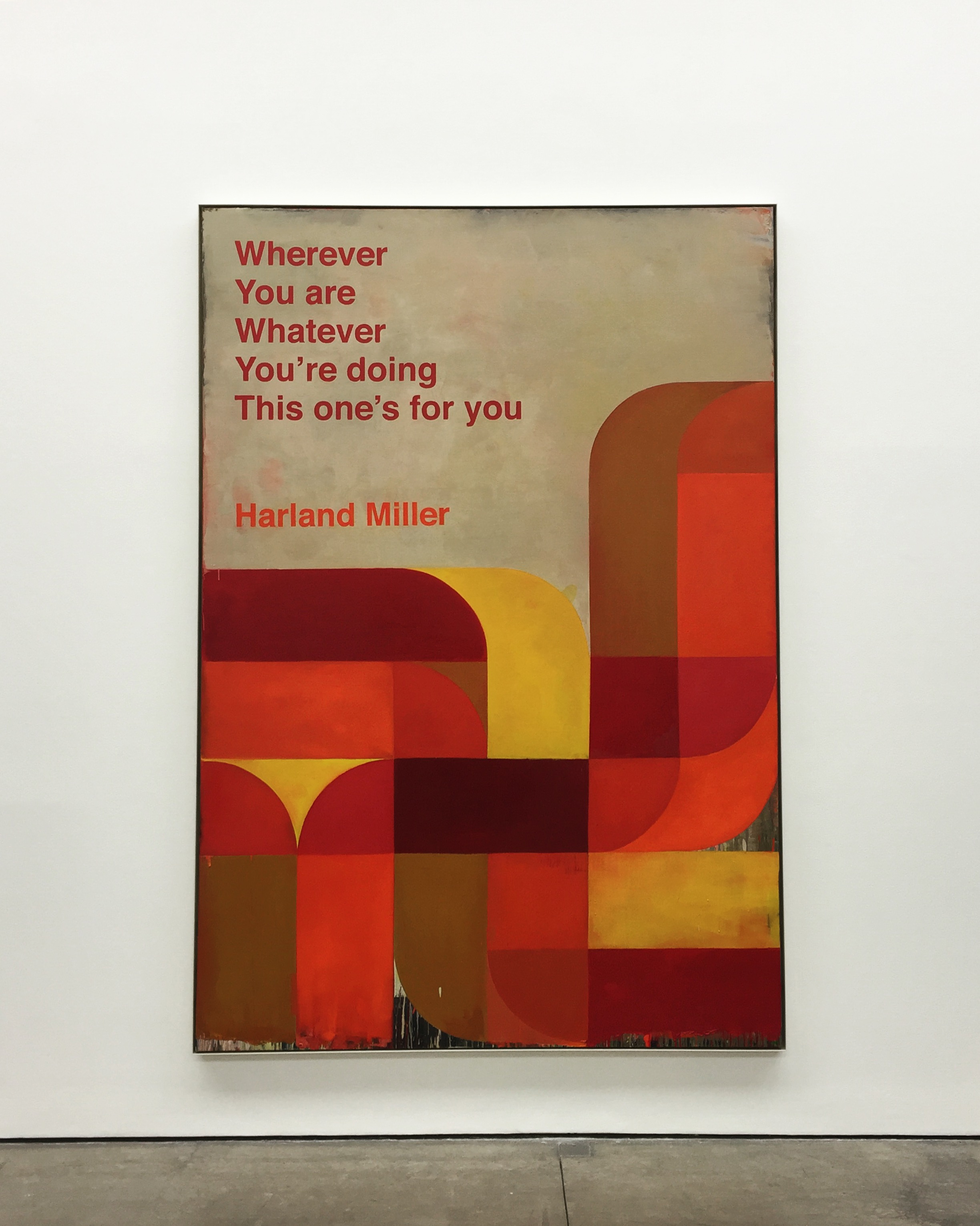
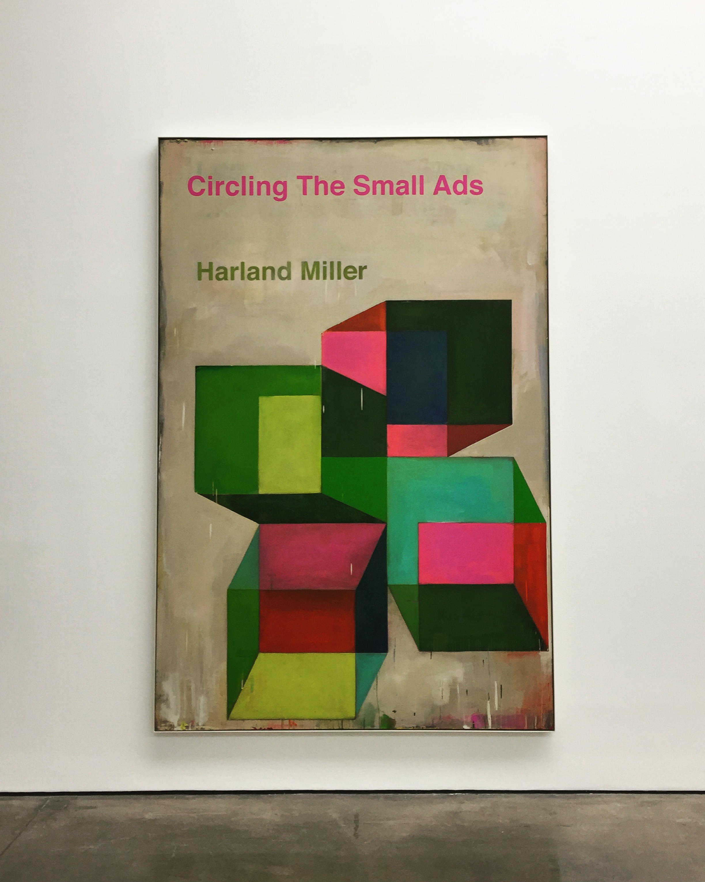
The first series of large-scale works draws on Miller’s extensive archive of psychology and social science books, which date from the 1960s and ’70s. Characterised by their bold and colourful abstract covers, these books embraced a positive attitude and the possibility of ‘fixing’ disorders through a process of self-help.
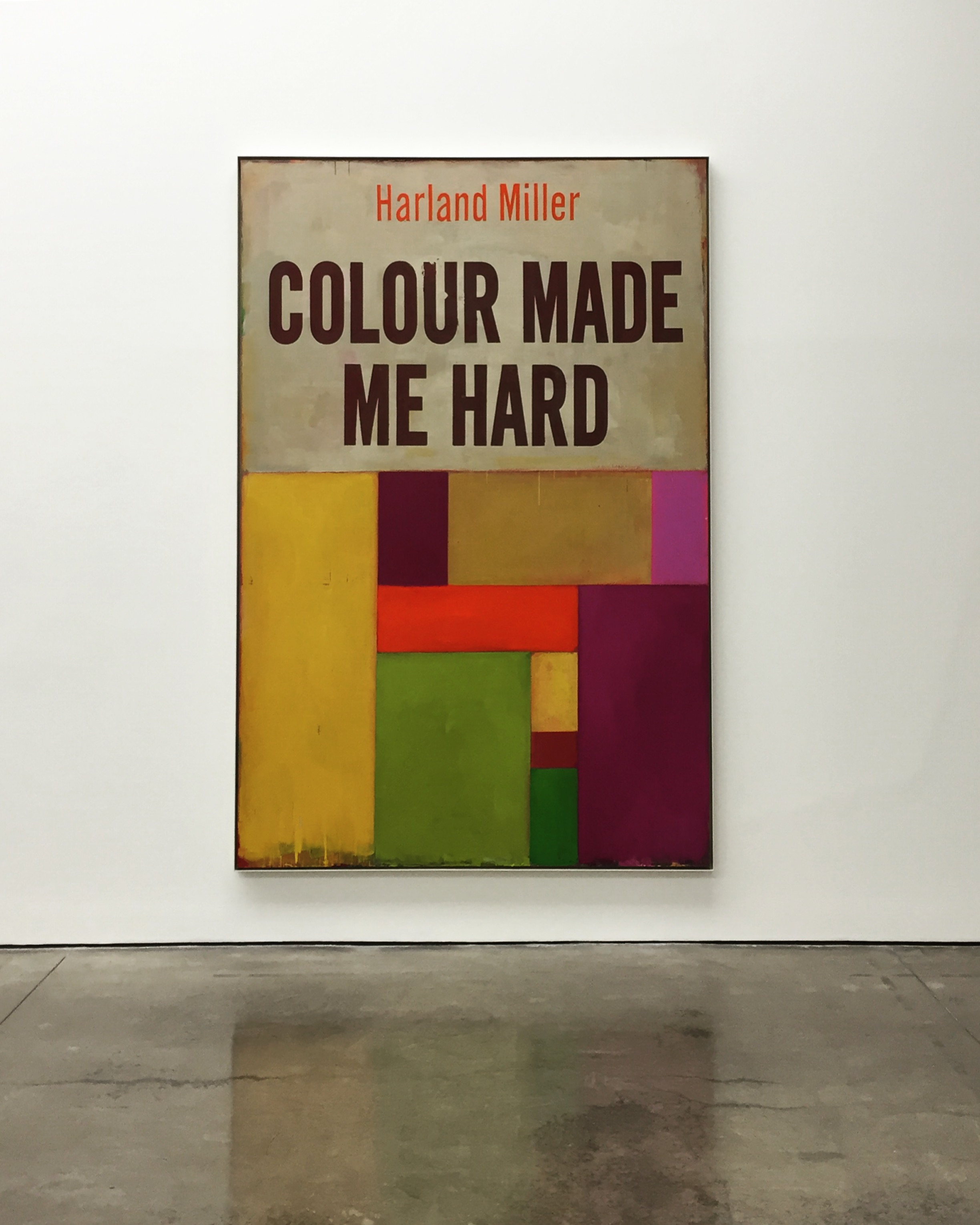
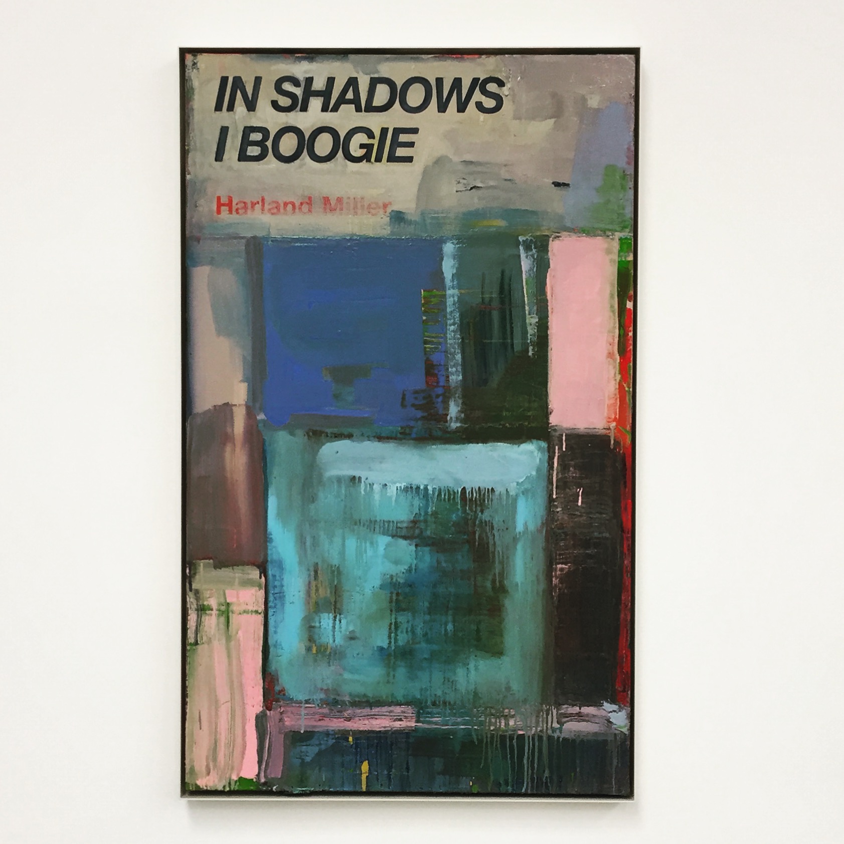
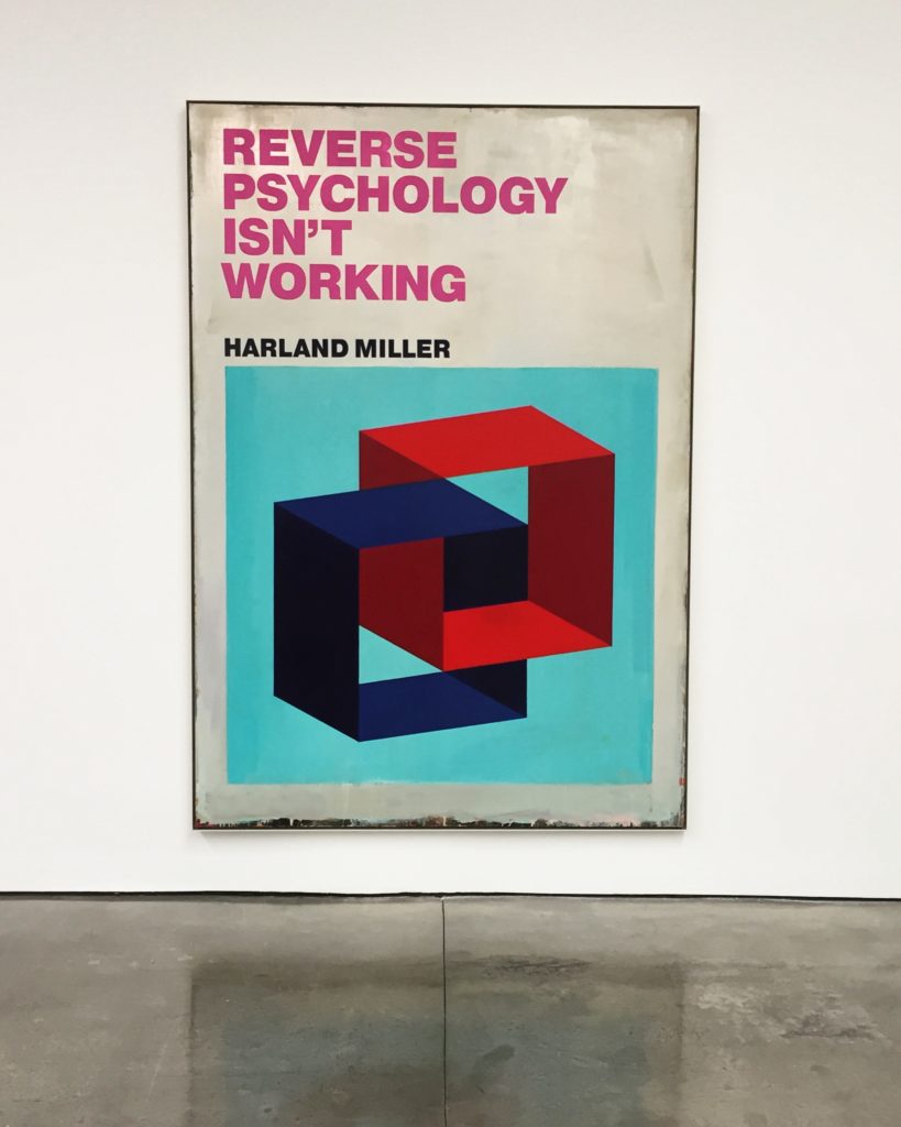
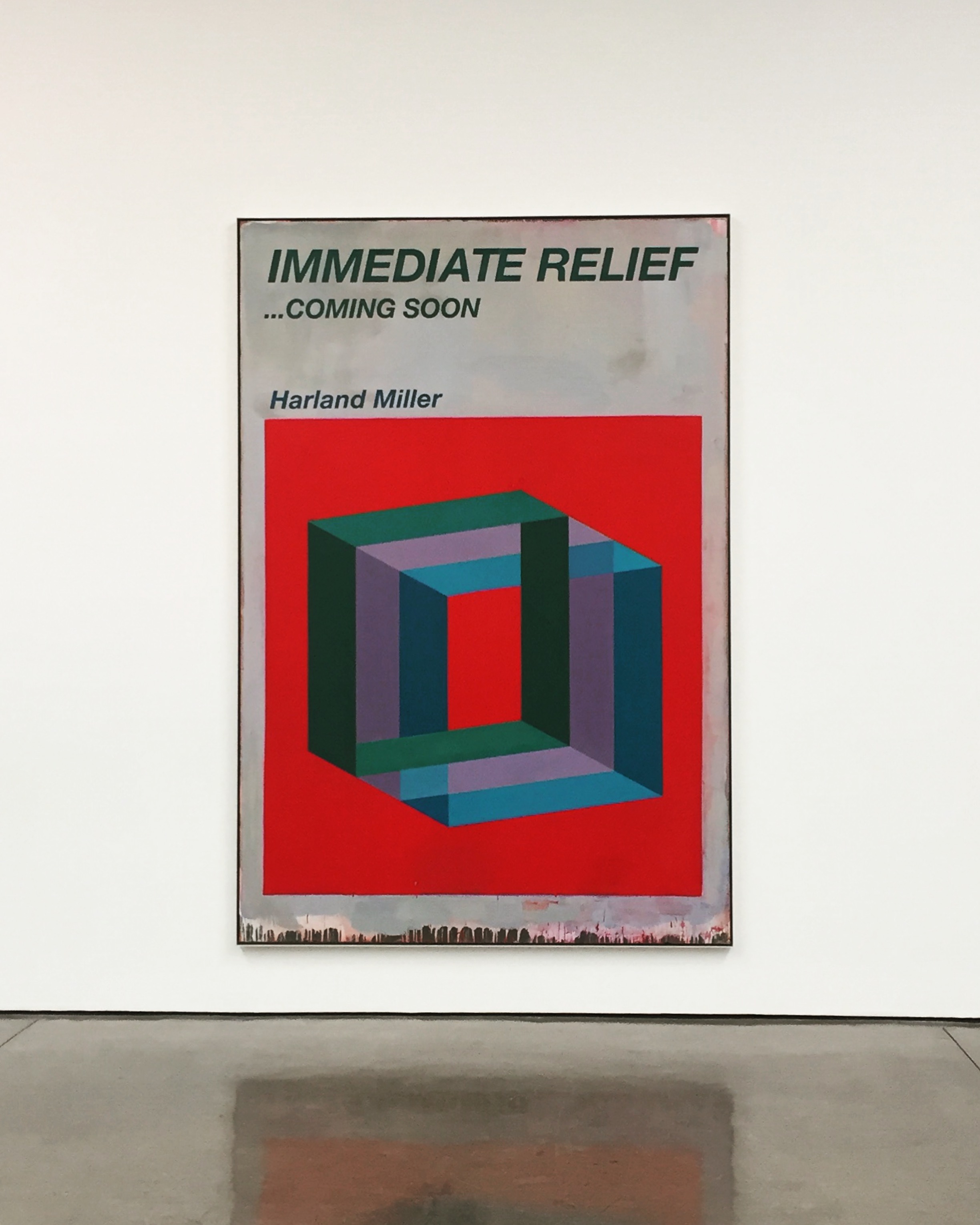
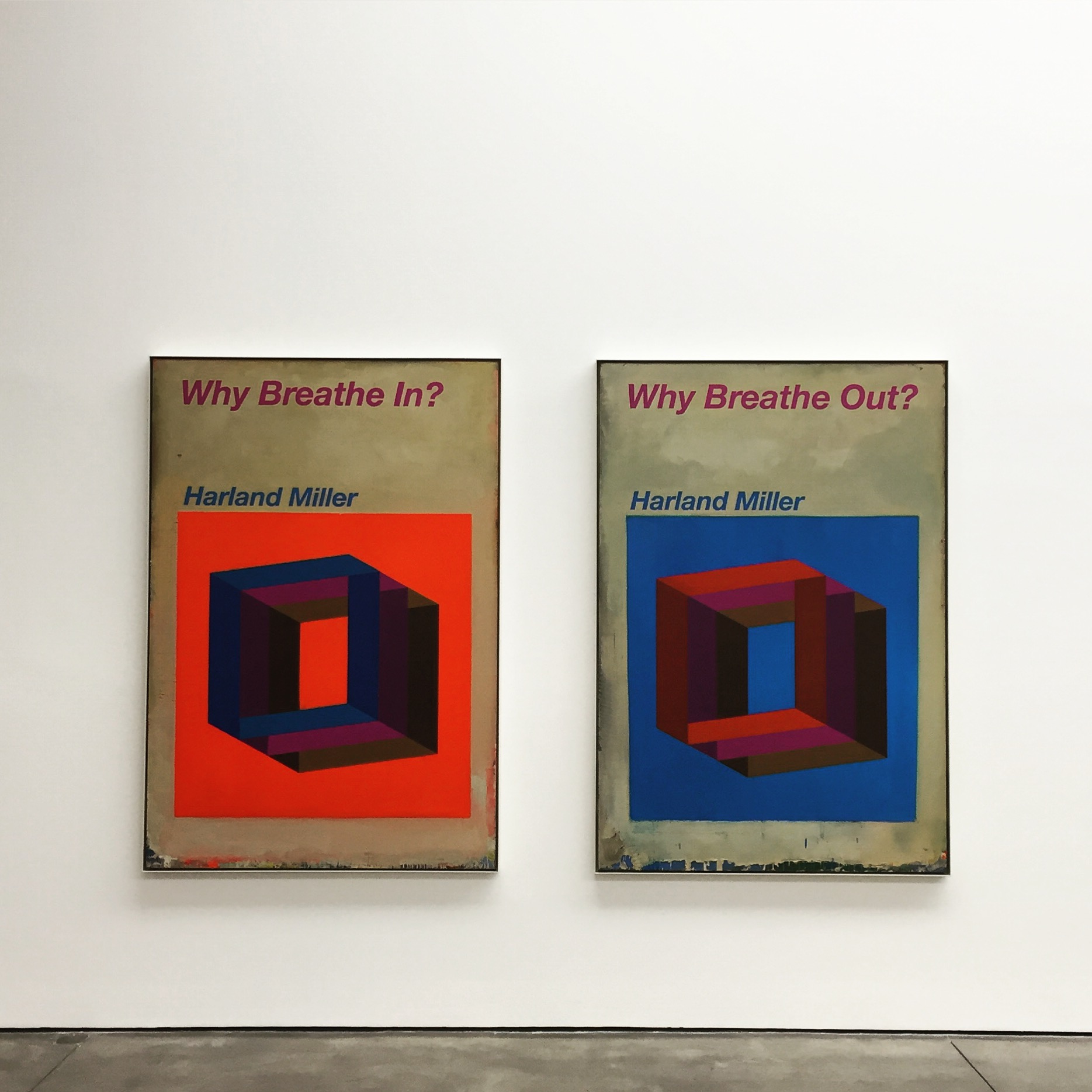
In Miller’s paintings, three-dimensional architectonic forms in bright, pop colours float against solid saturated backgrounds and are paired with fictional, sardonically humorous titles such as Reverse Psychology Isn’t Working (2017) and Immediate Relief … Coming Soon (2017). Occasionally, the same title appears on different compositions, highlighting how colour, forms and context can change both the rhythm and meaning of words.
Similar to the titles, Miller’s abstract imagery can also be read in different ways. Commenting on the work Armageddon – Is It To Much To Ask? (2017), for example, he says: ‘it’s an image that you see one way – then, when you relax, it flips and, no matter how hard you try, you can’t see it the original way. It’s symbolic of the way you read the title.’ These words reflect a departure for the artist, whose previous series of Penguin paperback paintings were re-appropriations of an existing object. Here, for the first time, Miller creates his own designs, focusing more closely on the impact of the image itself.
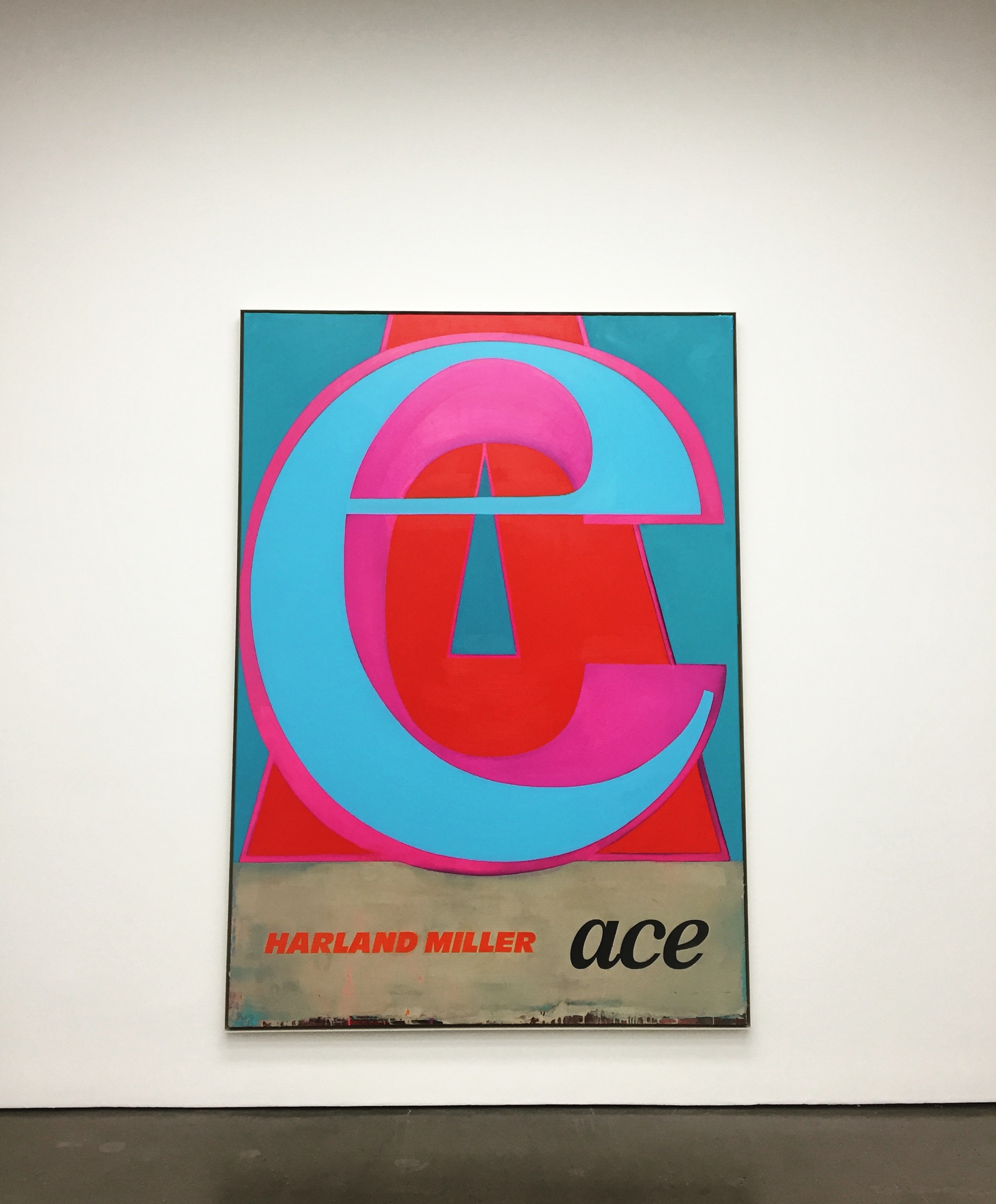
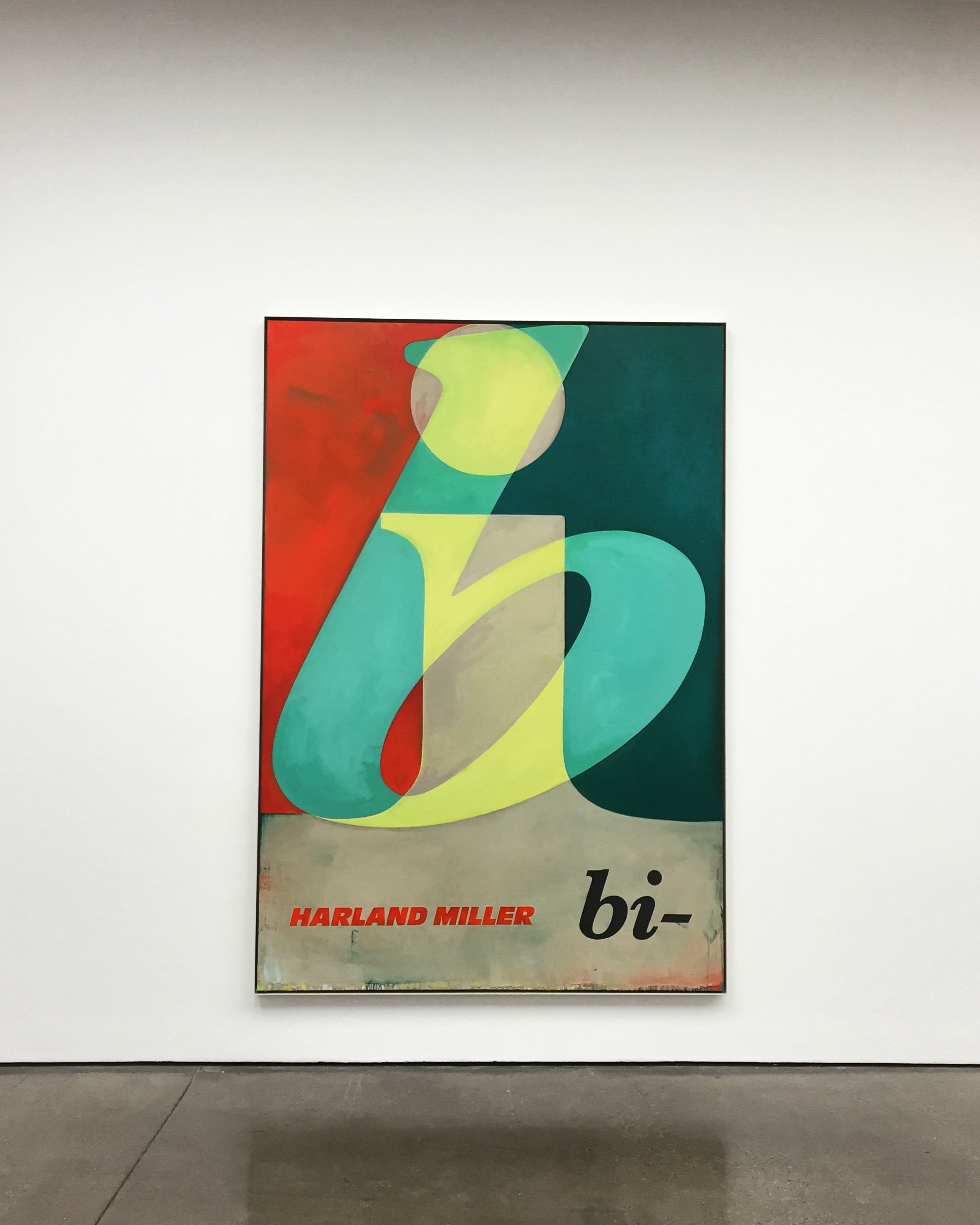
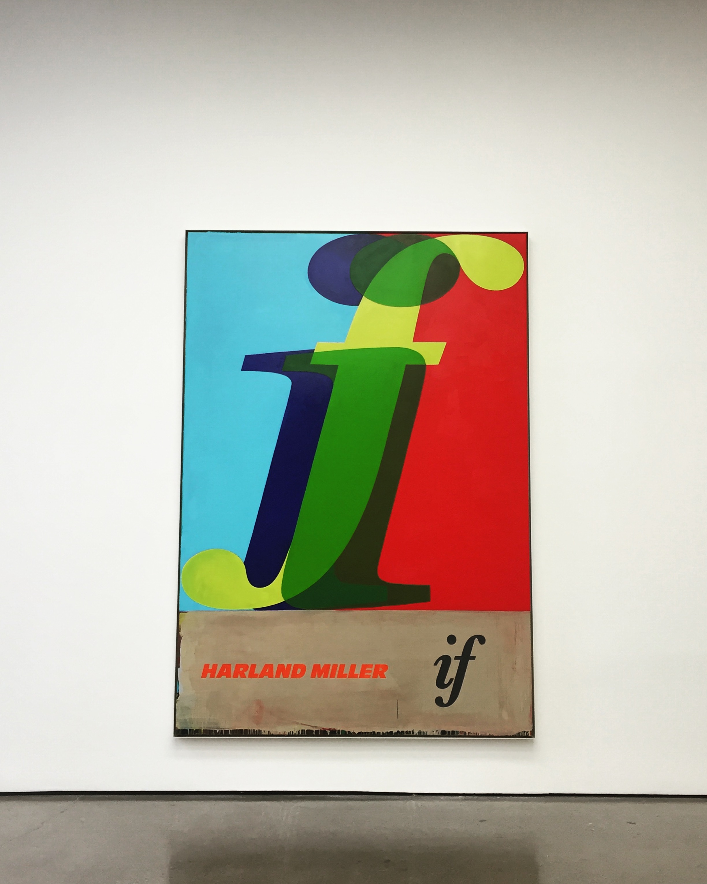
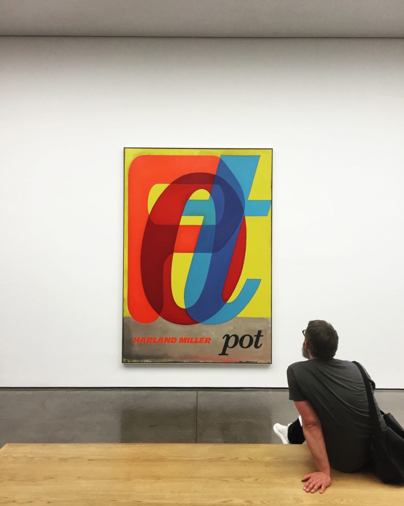
In another series of fictional book cover paintings, Miller depicts the outlines of letter in a range of typefaces and colours, intersected or layered over each other to create short, enigmatic words such as ‘Up’ or ‘If’.
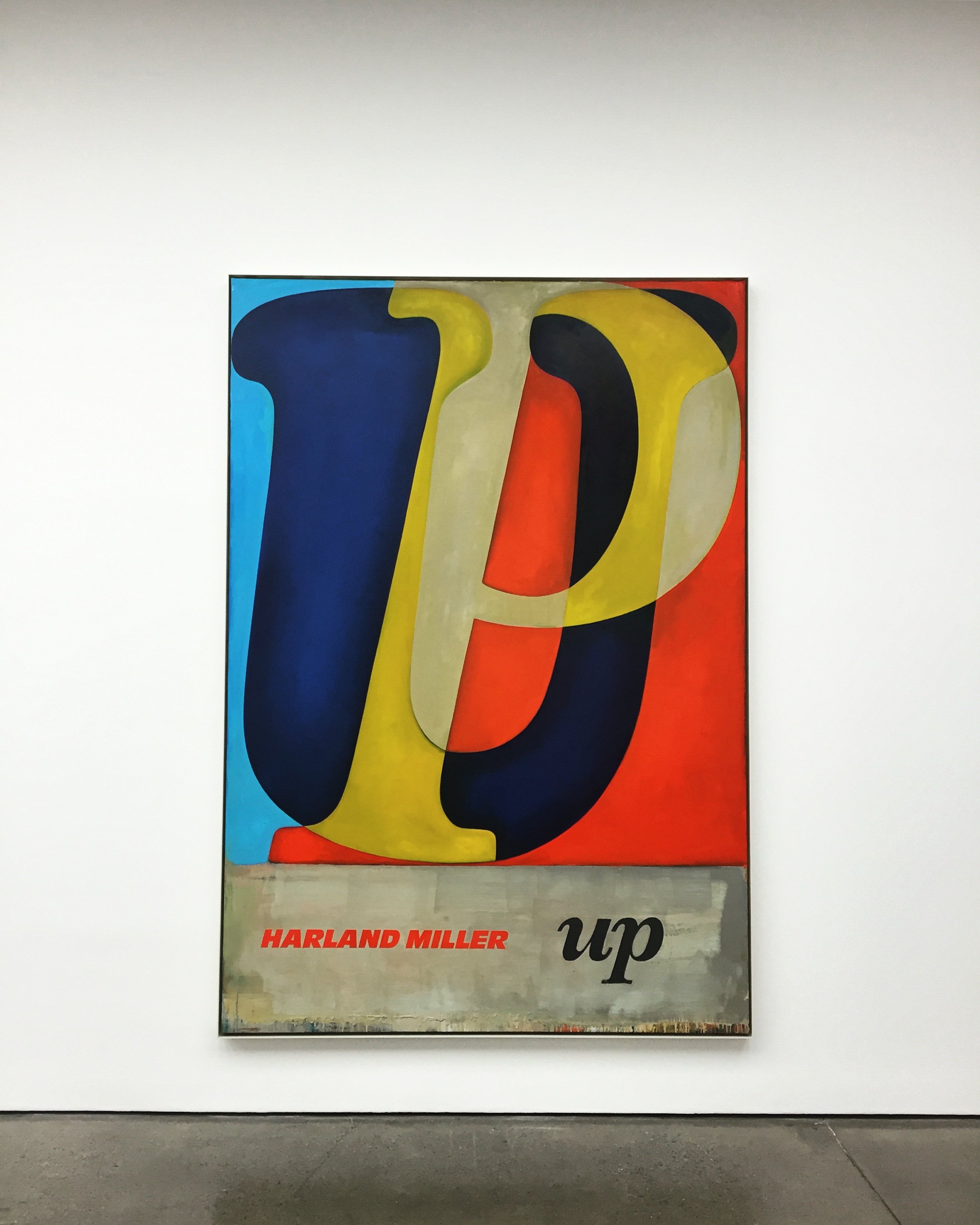

Through a process of isolation, overlaying and re-connecting, Miller creates a sense of depth in the image that deconstructs and abstracts the meaning of language itself. With their bold, saturated colours, these paintings reference American abstraction and, in particular, Robert Rauschenberg and Ed Ruscha’s use of vernacular signage and motifs. Miller has said about this series: ‘The idea is to make paintings that are just words, in contrast to the titles of previous works’.
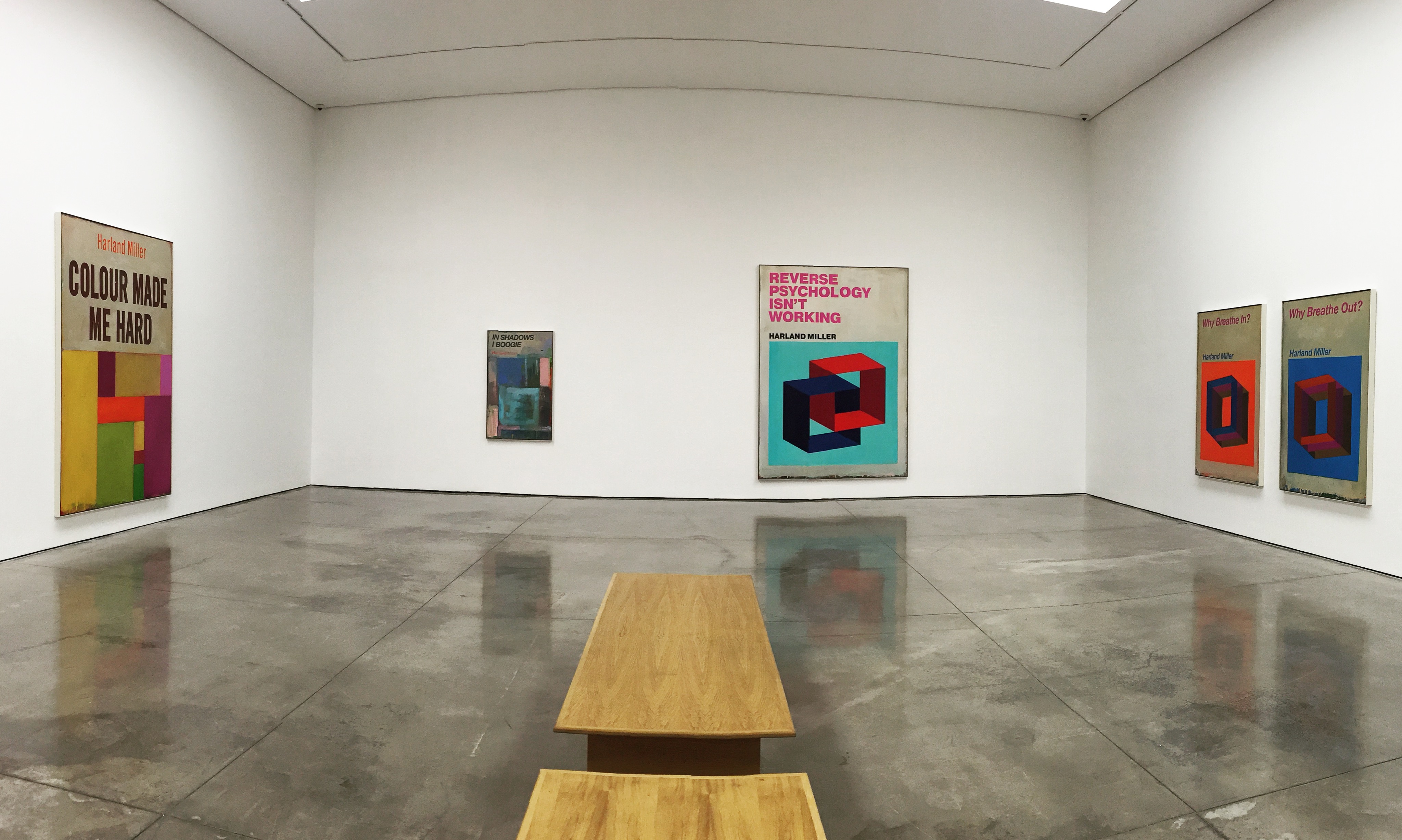
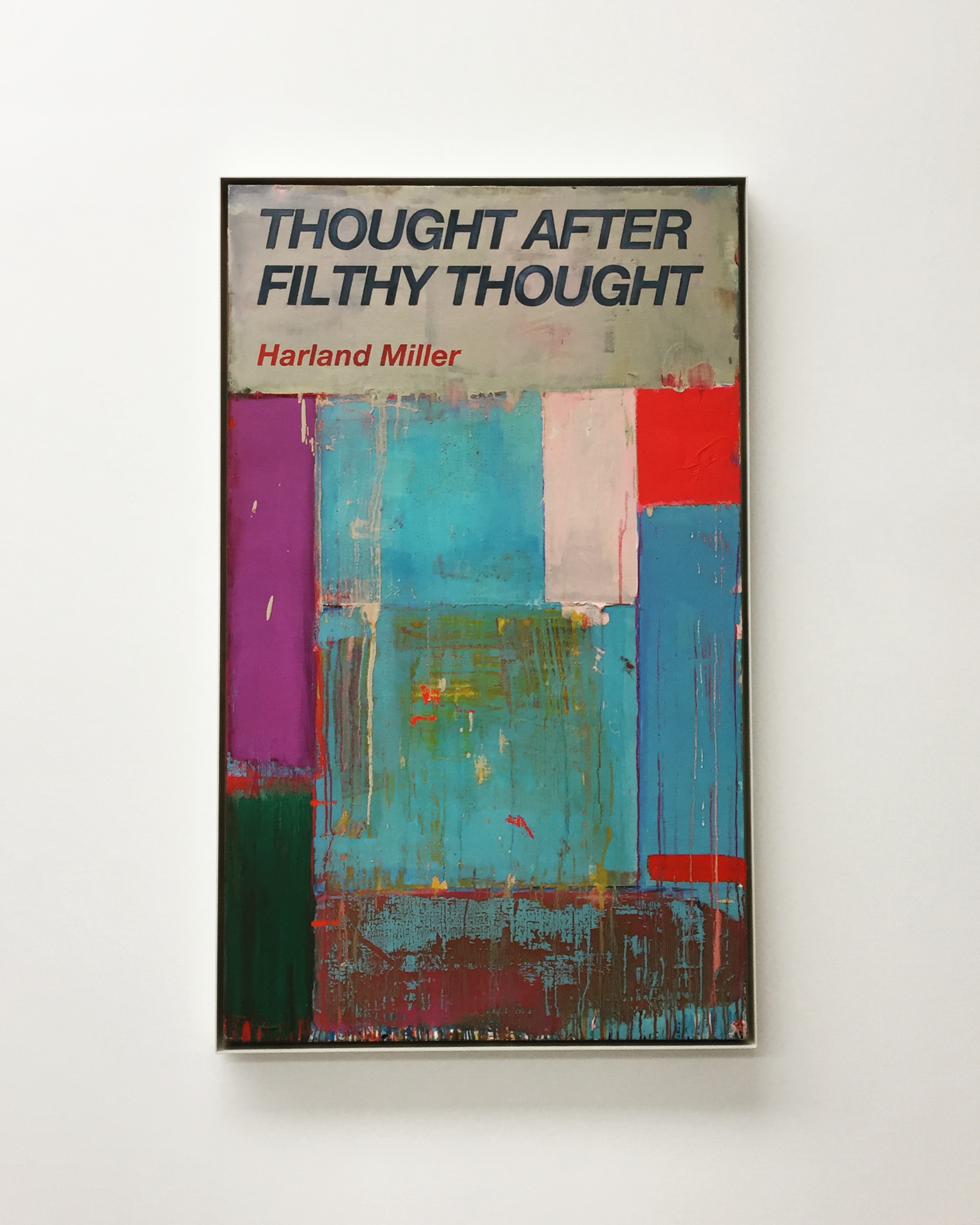
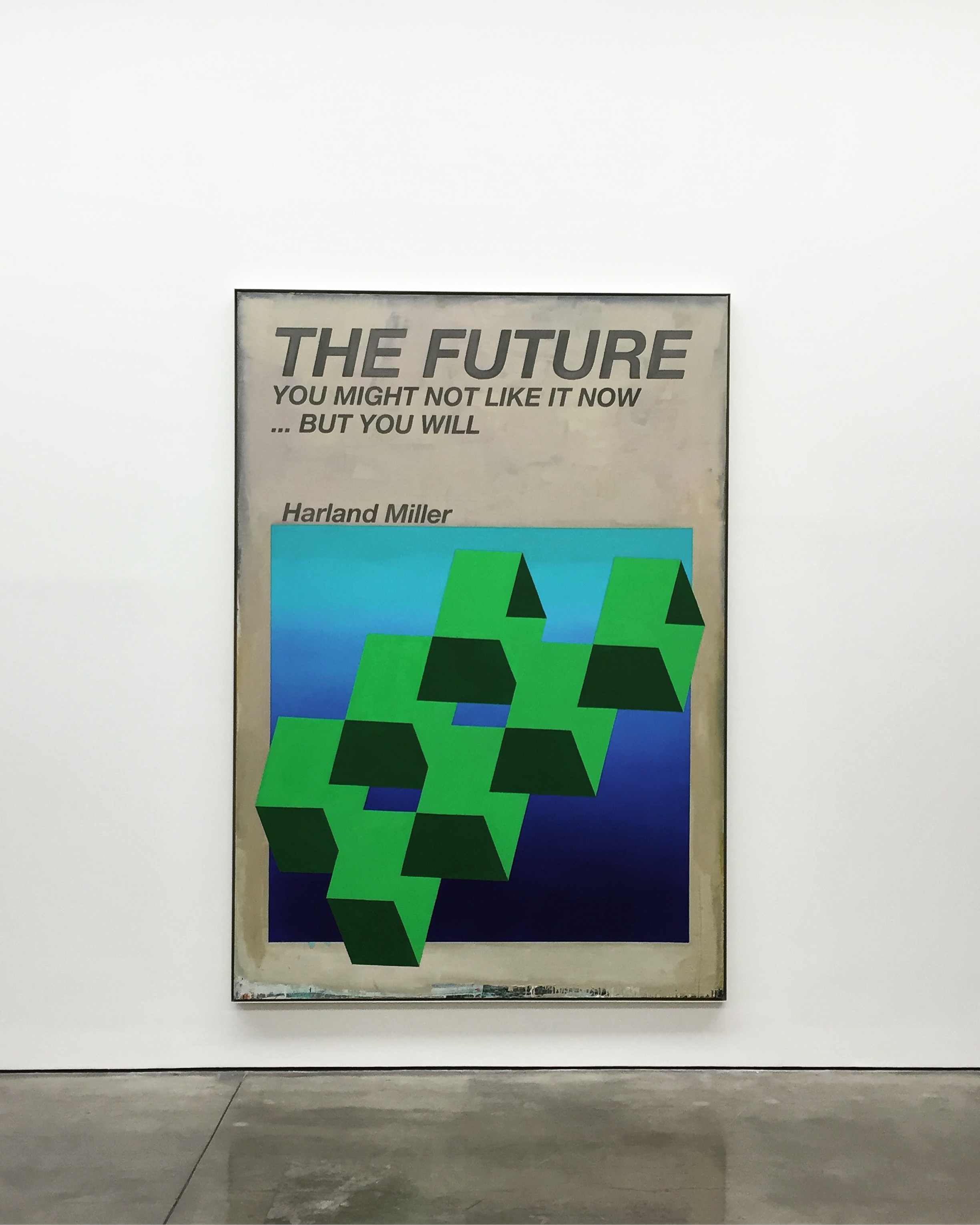
In both series of paintings the artist continues to use his own name as author. While the presence of Miller’s name alludes to the actual authorship of both image and text, fact and fiction became blurred, allowing for the artist’s deadpan humour to provoke, question and draw attention to the context and content of each work.
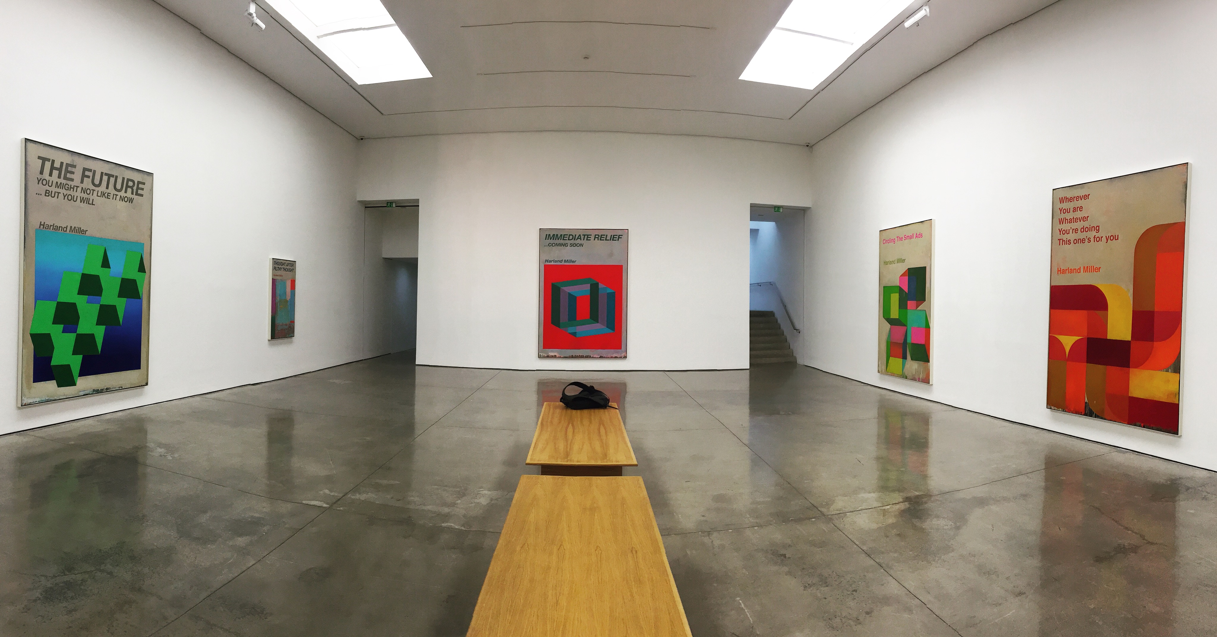
Photos: Art Road
Notes: White Cube Gallery
