Are we losing touch with the art of making in this age of advancing technology?

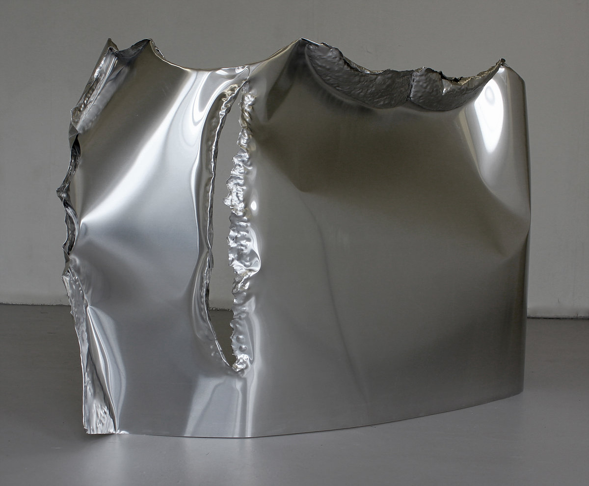
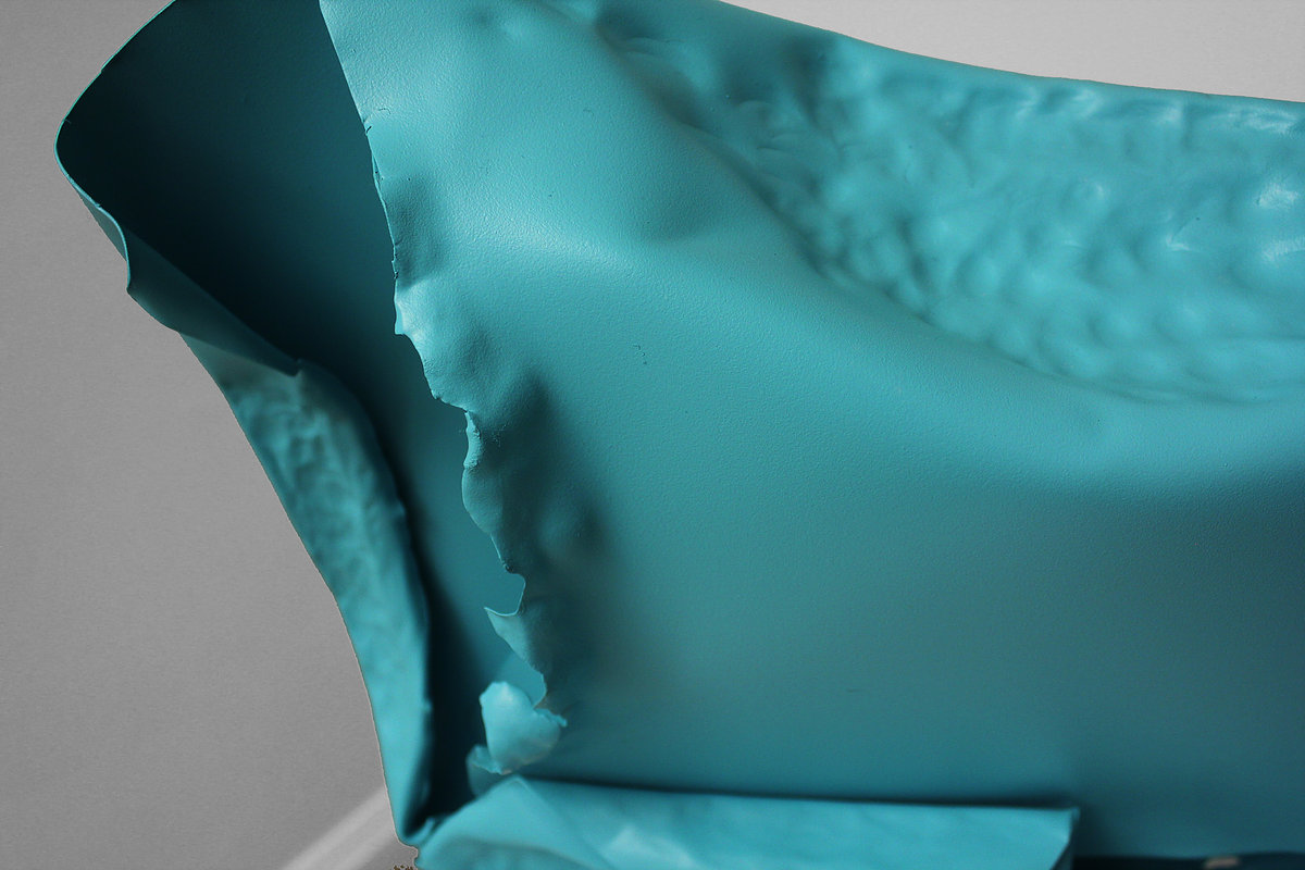
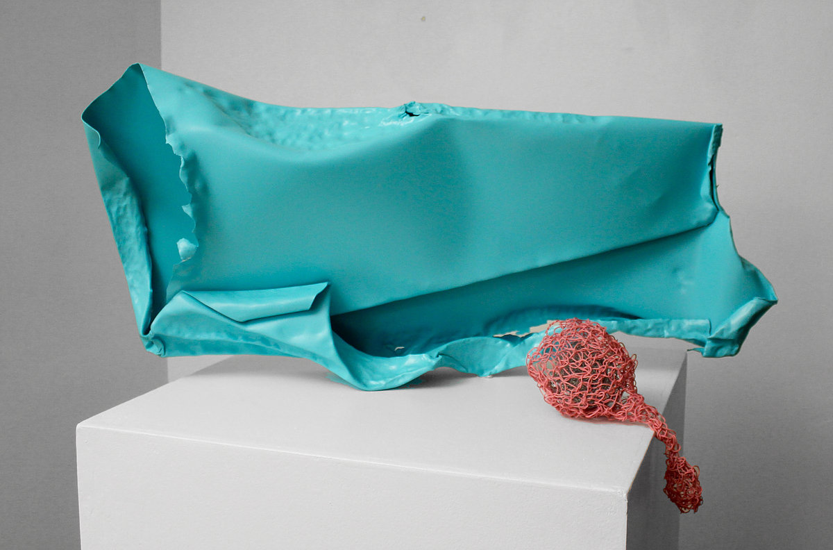
THE PALISADES, Aluminium, acrylic spray paint, plastic coated wire & wire, 82x40x18cm, 2017, Detail

Name: Polly du Cros

DOB: April 1969

Place of birth: Lancashire, United Kingdom

Occupation: Artist

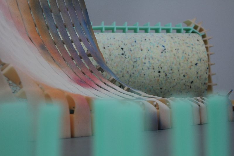
Polly works in sculpture/installation with an emphasis on making and materiality. Her spontaneous and instinctual process of being physically involved with the material means that the matter selected is exploited without controlling the experiment, to maintain an element of naivety. Current materials include metal, foam, polystyrene, plastic and scrap, along with paint. Working within the liminal space between the expanded field and sculpture works are developed within the space. She is interested in the way an object exists and is seen in a space and in the psychology of the response to it.
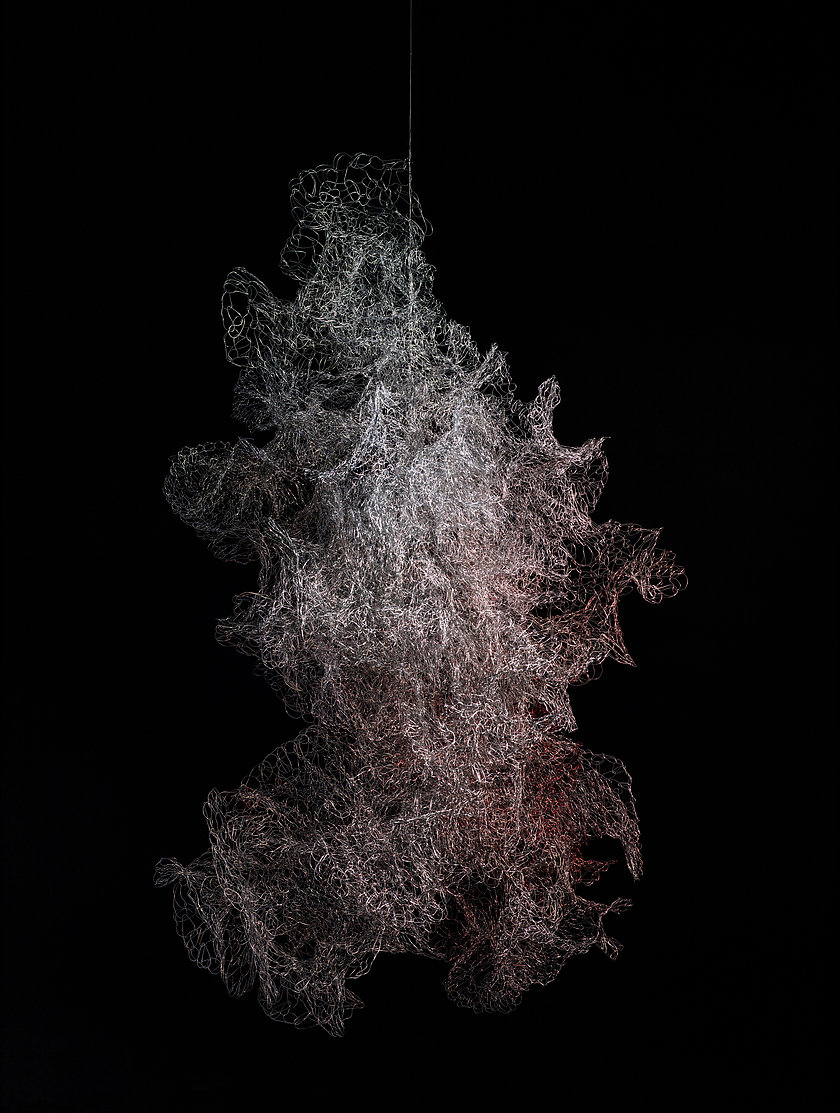
Wire, 2015
Photographer: Eva Lova

Polly’s rationale for being an artist is to ask are we losing touch with the art of making in this age of advancing technology.

Is it possible for me to make a body of work that questions the possibility of creating sculpture as a unifying experience which has as its cognate a parallel narrative in multiple digital sources or ‘feeds’. Is it possible for me to produce work that has a sense of unity.
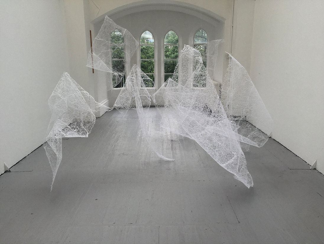
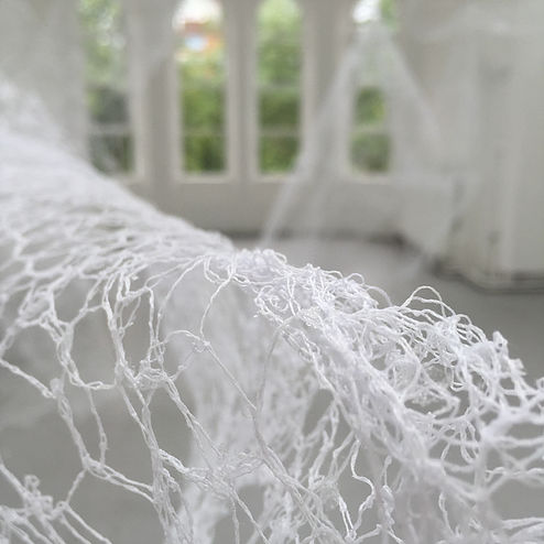
FLOAT, Cotton thread, 5x4x2.4m, 2016

Underpinning my sculpture and installations are a fundamental search for something through action, grappling with materials and manipulating until a kind of truth or realisation is released during the process, allowing the intrinsic properties of the material to arise. The work avoids obvious connotations and is non-representational, it is, ‘about sculpture’. I enter into a mental dialogue with the material as to what is required and the process allows me to move beyond metaphor and into something more directly experienced. I am in a place of ‘flow’ and completely absorbed in the making of the work.
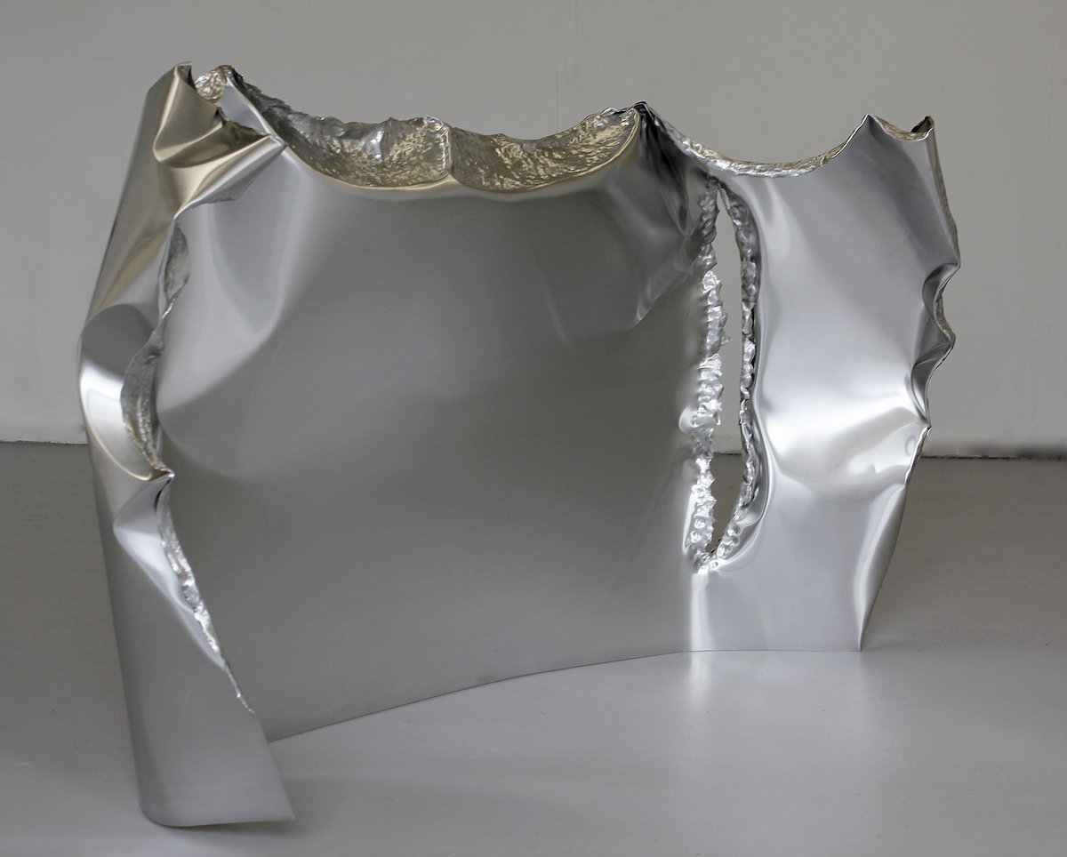
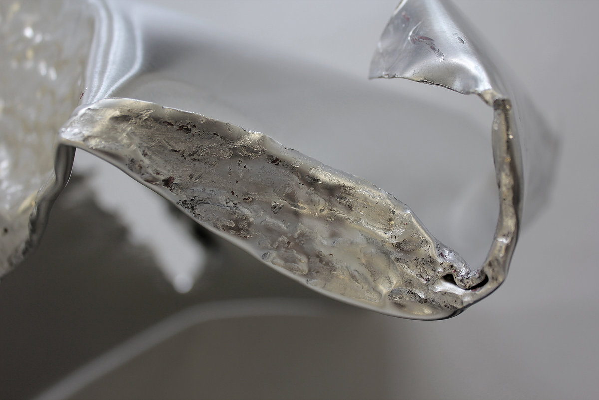
GUARD, Aluminium, 150x50x95cm, 2016

Influenced by the human body and how it leaves a memory of its action on the material, the work is physical and confrontational. I both isolate and absorb myself in the making process to allow the materials to dictate their form. I am keen to find out about the materials and what they need on one hand, whilst controlling them on the other; this balance is central and sought.

In my day-to-day studio practice I have perceived an unexpected correlate for this period of total ‘flow’ with the data streams of information I receive.
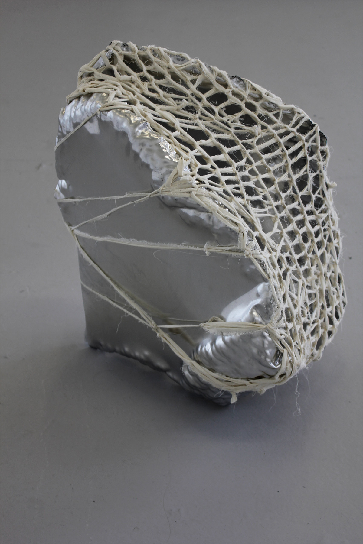
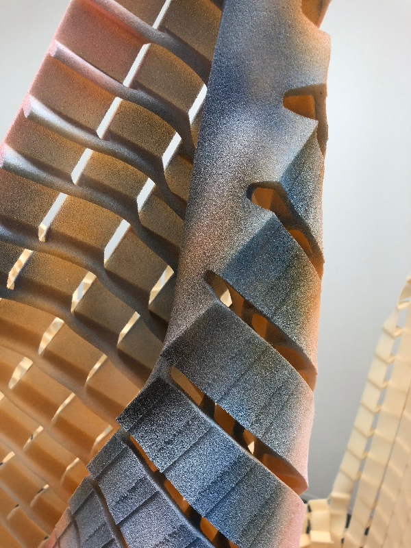
TWILL HOOKED, Aluminium & calico, 40x30x50cm, 2016

The frenetic lives we lead are in part due to the digital communication that takes place. We are constantly bombarded with information via technology and many different components are acting upon us at any one time. How does this translate within the work that is being made and can we separate ourselves from these influences or does every piece of information become stored on a cellular level in our bodies and therefore affect the work in progress.
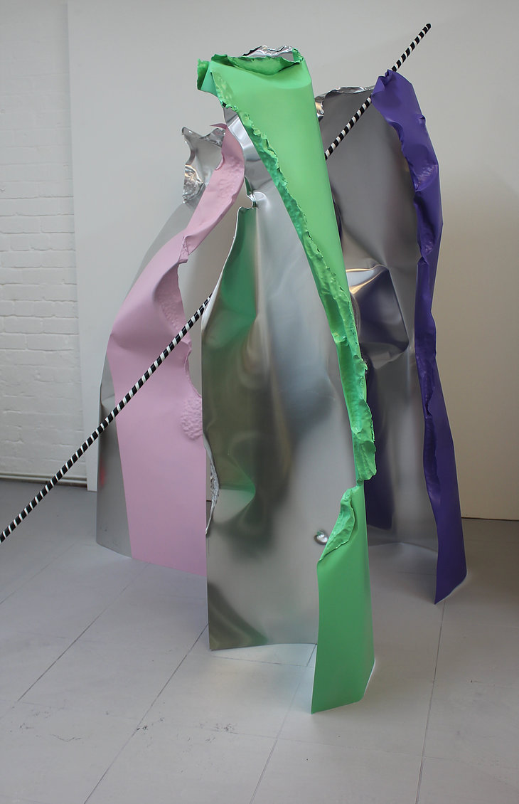
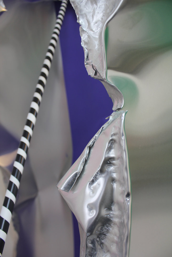
TRIDENT PROP, Aluminium, acrylic spray paint, plastic tubing and tape, 220x160x180cm, 2017

Walter Benjamin’s essay, The Work of Art in The Age of Mechanical Reproduction continues to play a role in understanding how technology contributes to a de-aestheticization of art in the modern world.

Artist Helen Marten creates work that is multi-faceted and currently we seem unable to establish if there is a master narrative or unity to her work. I intend to contribute to the debate by making sculpture and questioning if unity is possible or if technology is responsible for the disparate nature.
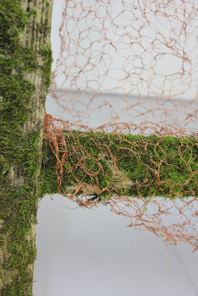
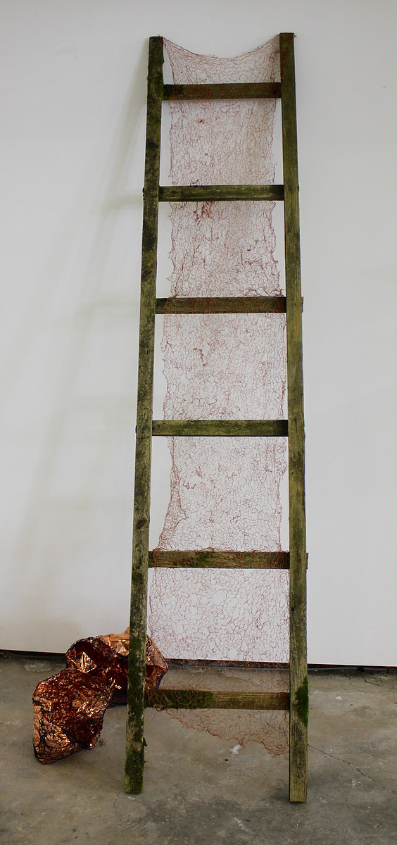
TRACERY RUNGS, Wood, moss and copper thread, 246x50x75cm, 2017

I am concerned with the expansion of taste. Taste in terms of what can be accepted in the making process, and what cannot. Within these concerns is an awareness of the potential space for creativity, the heightened idea of potentiality through the process of making. When is the mark or the action encouraged, nurtured and honed, and when is it eradicated or altered? Such a potential space is paramount in the work and occupies a place where language and communication occur.
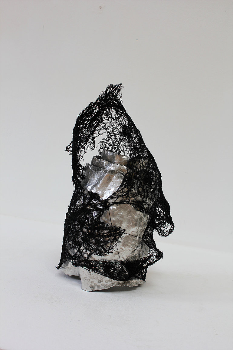
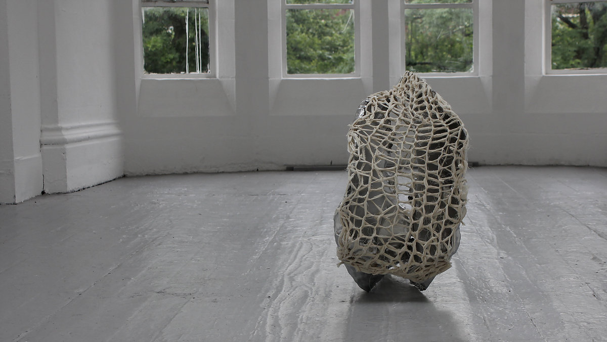
APOGEE, Aluminium & cotton thread, 27x23x30cm, 2016

I graduated from St. Helens College (part of Chester University) in 2011 where I achieved a first class honours degree in Fine Art (Painting). In 2014 I undertook an MFA in Fine Art at Manchester Metropolitan University which was successfully completed in October 2016.

Methods:

The central objective is to continue to make a work within a practice-based methodology. As such original investigation will be undertaken to gain new knowledge, partly by means of practice and partly by the outcomes of that practice. The objectives and methodologies are therefore intrinsically linked as the practice is evolutionary.
References:

W. Benjamin, 1936, The Work of Art in the Age of Mechanical Reproduction; Broderson XV

Berger, John, 2008, Ways of Seeing, Penguin Modern Classics

Cooke, Lynne, 2011, Agnes Martin, Dia Art Foundation, New York

Elkins, James, 1996, The Object Stares Back, Harvest, Inc. New York

Csikszentmihalyi, M, 1996, Creativity, New York, Harper Collins

Exhibitions

COMPETITIONS, AWARDS

2017,  3D Prize, West Lancs Open, UK

2015,  Blooom Award by Warsteiner , shortlisted

Residencies

2018, Abingdon Studios, Blackpool, UK

2017, The Great Medical Disaster, Manchester, UK

TWO MAN SHOWS

2018 with Paul Bramley, The Abingdon Experiment, Abingdon Studios, Blackpool, UK

2017 with Paul Bramley, Recent Works, Studio 24, Leeds, UK

2017 Jenny Eden & Polly Tomlinson, Cornerstone Gallery, Liverpool Hope University, UK

Group Shows

2017 Transfuse, The Great Medical Disaster, Manchester, UK

2017 West Lancs Open, Chapel Gallery, Ormskirk, UK

2016 MFA Show Grosvenor Gallery, Manchester School of Art, UK

2015 MA Show Grosvenor Gallery, Manchester School of Art, UK

2015 Electric Open Electric Picture House, Congleton, UK

2014, West Lancashire Open Exhibition, Chapel Gallery, Ormskirk, UK

2014 Degree Show St. Helens College, UK

2013 8BA2 Show St. Marys Market, St. Helens, UK

2013 St. Helen’s Open, World of Glass, St. Helens, UK

©Polly du Cros

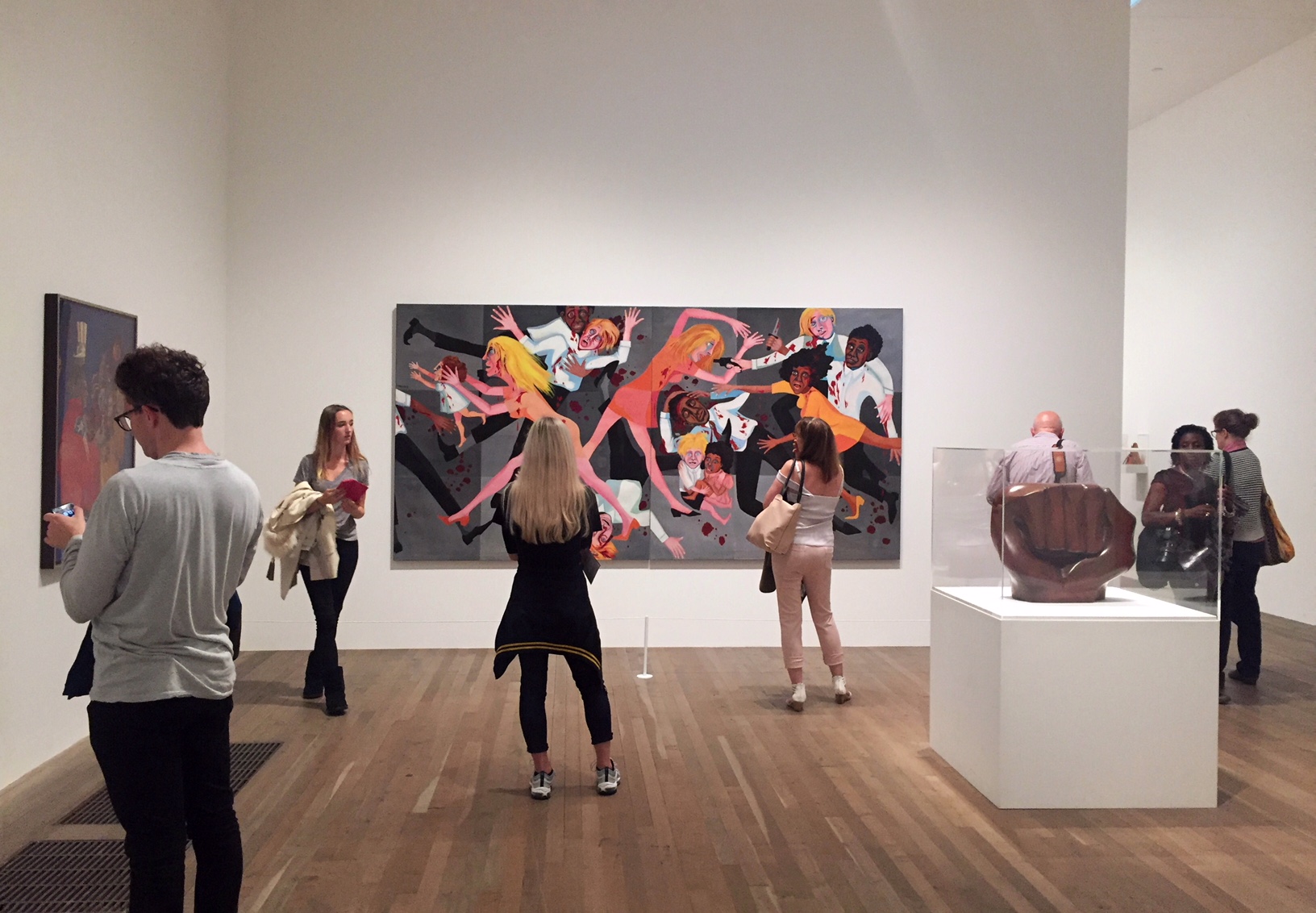
SOUL OF A NATION: ART IN THE AGE OF BLACK POWER

This exhibition celebrates the work of Black artists working in the united states in the two decades after 1963. During this turbulent time, these artists asked and answered many questions. How should an artist respond to political and cultural changes? Was there a ‘Black art’ or a ‘Black aesthetic’? Should an artist create legible images or make abstract work? Was there a choice to be made between addressing a specifically Black audience or a ‘universal’ one? The exhibition looks at responses to such questions.

In 1963, when the exhibition begins, the American Civil Rights Movement was at its height. At the March on Washington for Jobs and Freedom in Washington D.C., Dr Martin Luther King, Jr dreamed that his children would live in ‘a nation where they will not be judged by the colour of their skin but by the content of their character’.
King referred to himself proudly as ‘Negro’, but by this time, many who were on the March were beginning to call themselves Black. Taking issue with King’s non-violent position, especially after appalling racist violence later in 1963, many joined in calls for ‘Black Power’.
Others rejected in idea of an integrated America, and began to speak of a separate, autonomous Black Nation. Looking at newly independent African nations, and understanding an ancestral connection to the continent, the terms ‘Afro-American’ and ‘African American’ also began to take root. The artists in Soul of a Nation were profoundly aware of these political visions and different senses of self, and each took an aesthetic position in relation to them.
Reginald Gammon, Freedom Now, Acrylic paint on board, 1963

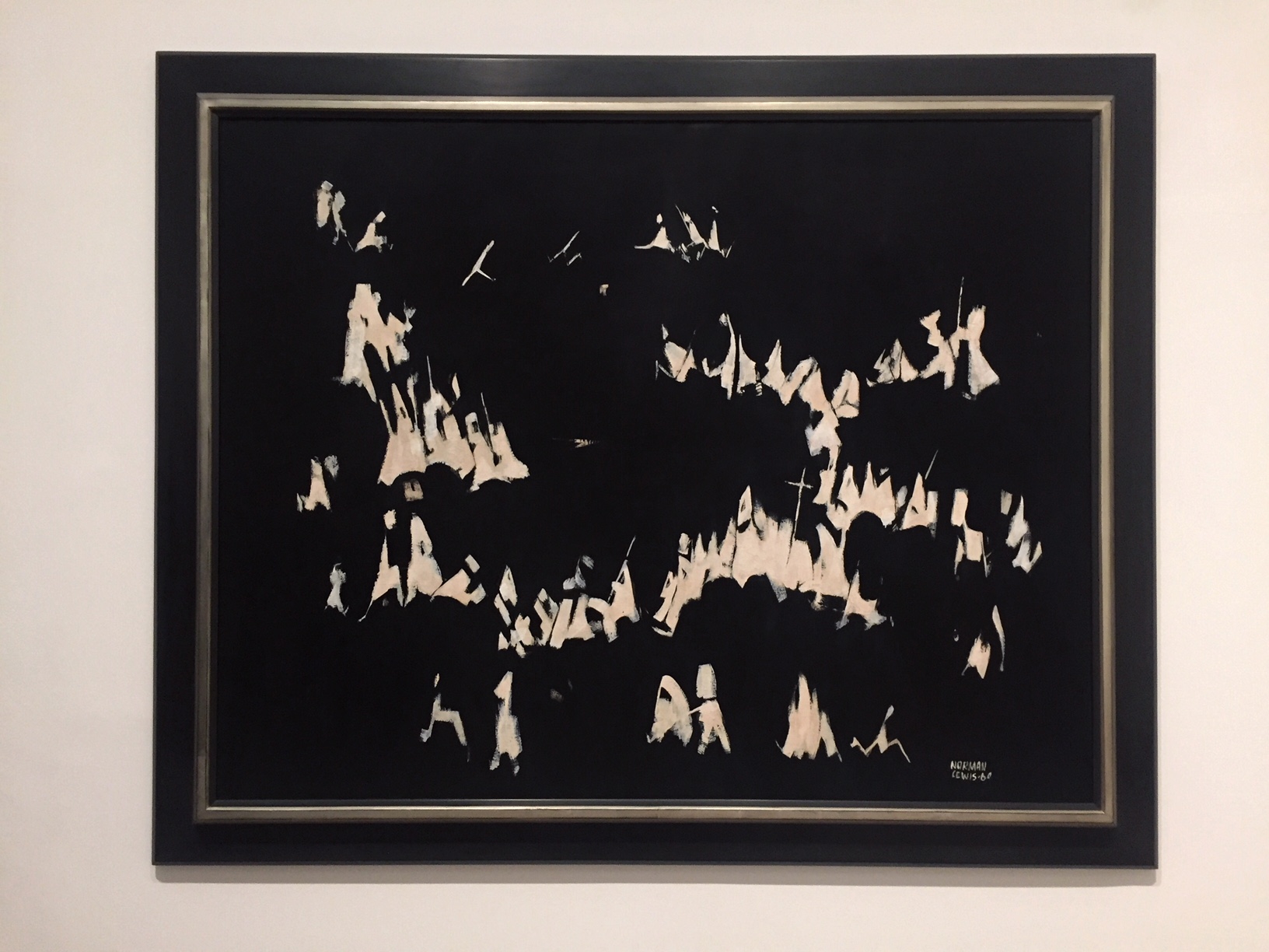
Norman Lewis
“America the Beautiful”
In a small series of works, he set aside his flair for colour to concentrate on black and white, in order to reflect on race relations in America. Here, lewis evokes a gathering of the Ku Klux Klan, while titling the work to suggest the difference between America’s vision of itself and its realities.
Norman Lewis, America the Beautiful, Oil paint on canvas, 1960


Romare Bearden The Dove Photostat on Fibreboard 1964

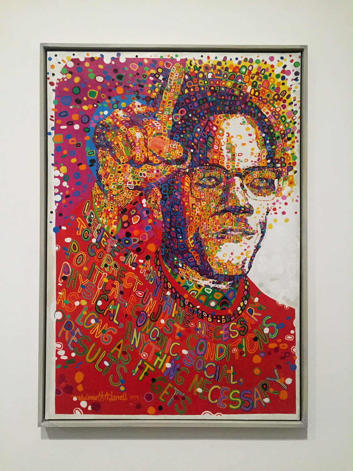
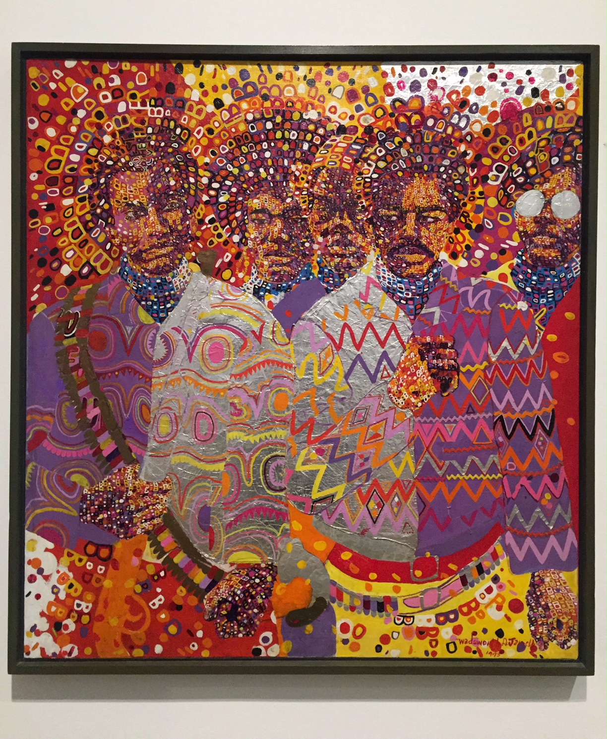
Wadsworth Jarrell
“Black Prince”
Black Prince is a portrait of Malcolm X, made for the second AfriCOBRA exhibition in 1971 held, like their first, at the Studio Museum in Harlem. It is based on a May 1963 photograph of Malcolm X in Harlem, speaking against segregation and ‘Uncle Tom Negro preachers’.
Wadsworth Jarrell Black Prince Acrylic paint on canvas


Wadsworth Jarrell Liberation soldiers Acrylic paint and foil canvas

Kay Brown 
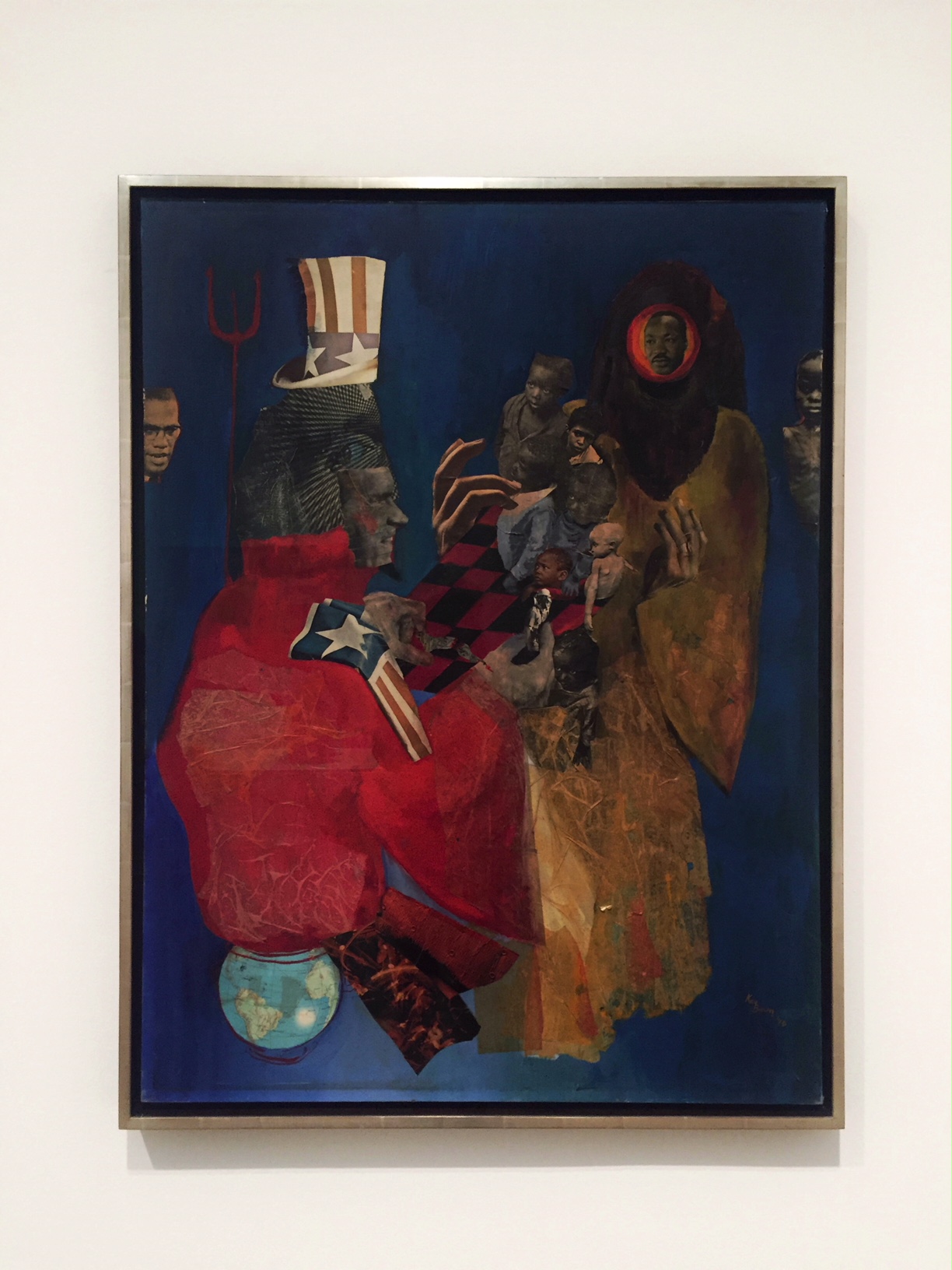
“The Divel and His Game”
Kay Brown was for a time the sole woman member of Weusi artist collective, named after the Swahili word for ‘blackness’, and would go on to be an influential member of Where We At! In The Devil and His Game, Brown comments on then-US president Richard Nixton’s foreign and domestic policies.
Kay Brown  The Divel and His Game Paper and acrylic paint on canvas 1970
 

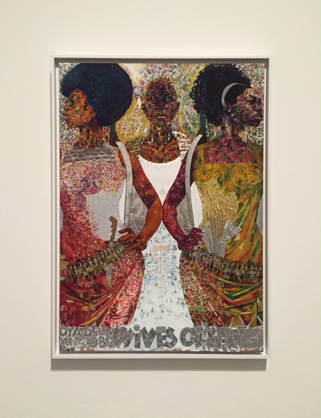
Jeff Donaldson, Wives of Sango, Acrylic paint, gold foil and silver foil on cardboard, 1979


Ed Clark 
“Yenom (#9)”
 Ed Clark was a part of the second generation of abstract expressionist and in 1957 was the first American artist to experiment with irregularity shaped canvases.
Ed Clark, Yenom (#9), 1970


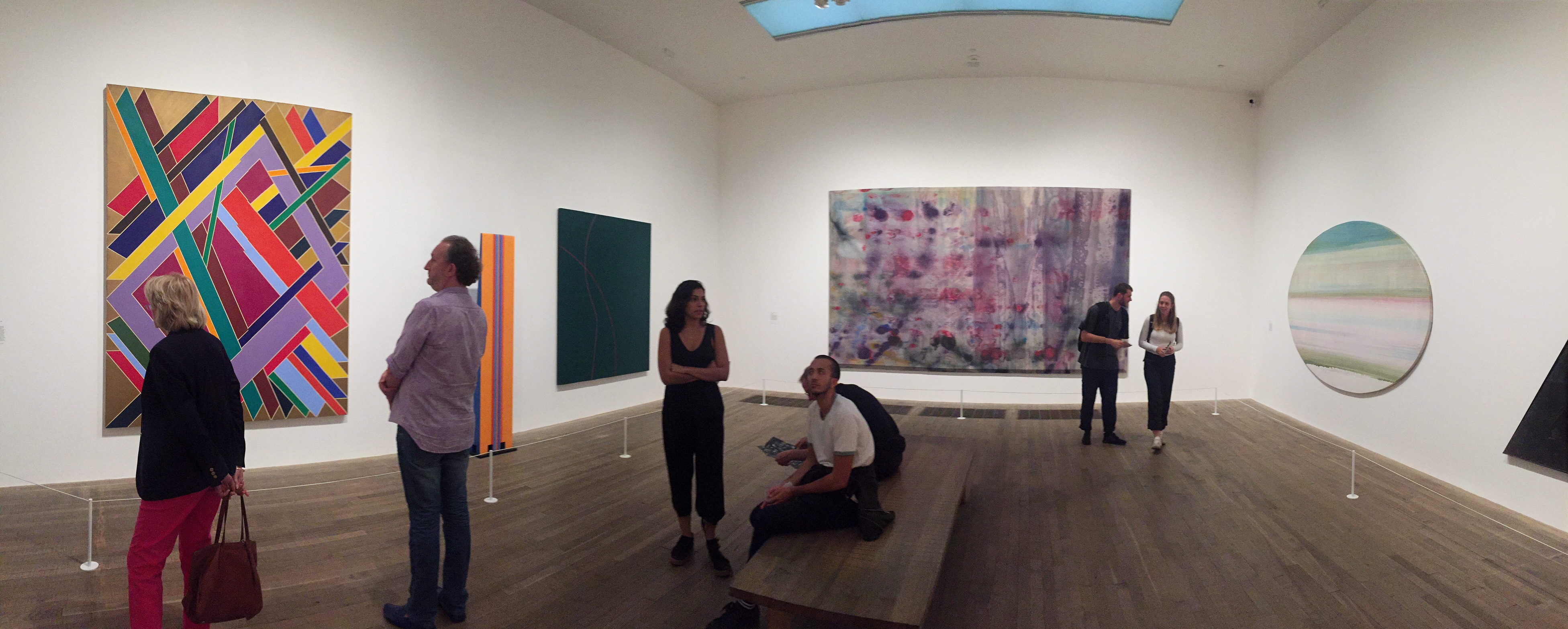
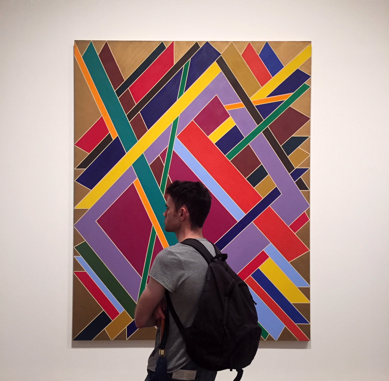
William T. Williams
“Trane”
 This painting was named after John Coltrane and may conjure the cascades of sound in his performances.
William T. Williams, Trane Acrylic paint on canvas, 1969


Jack Whitten
“Homage to Malcolm”
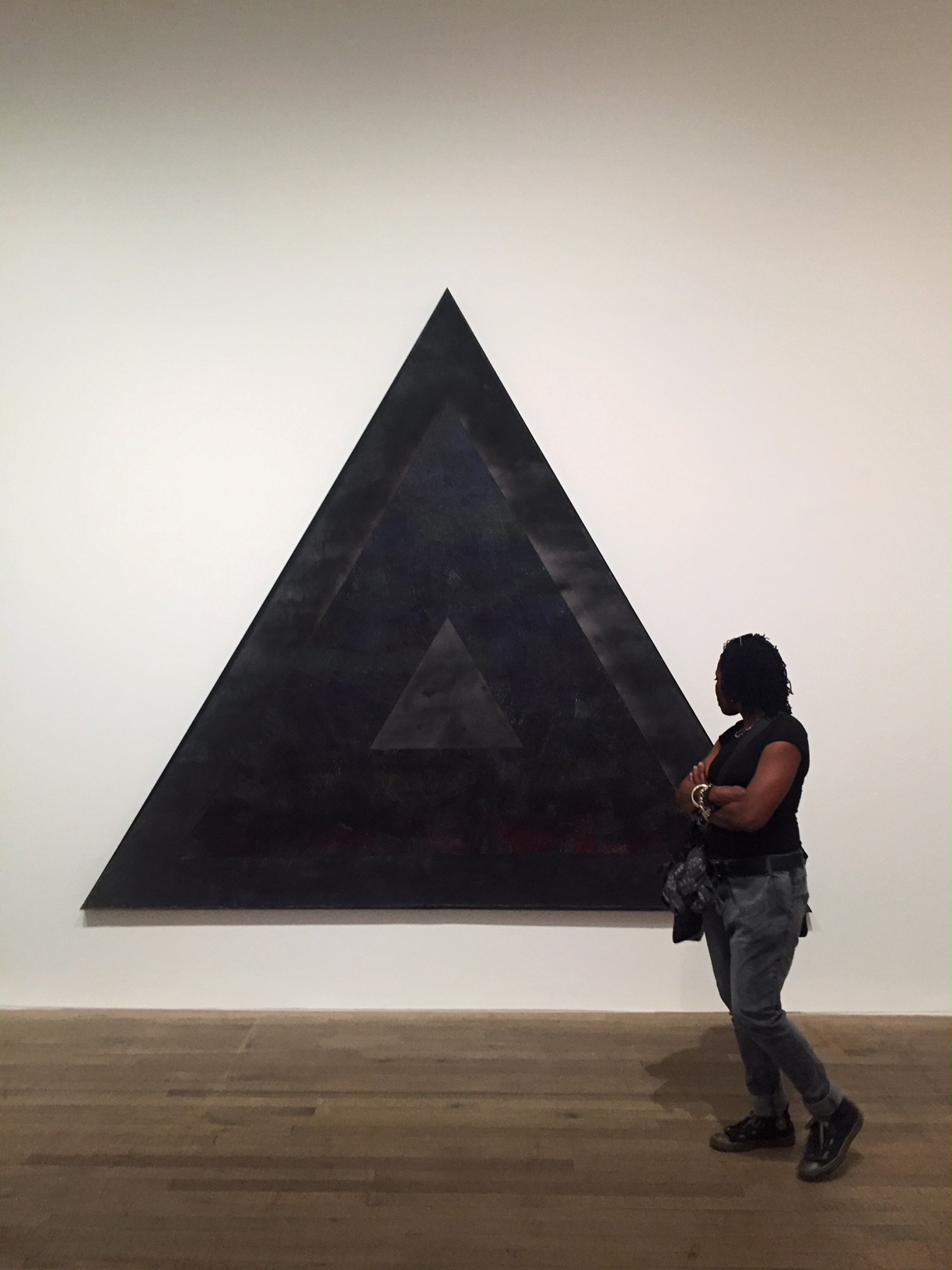
Most of his late 1960s works were colourful with expressive brushstrokes, however Homage to Malcolm is very clearly structured and is the artist’s only triangular painting.
Jack Whitten, Homage to Malcolm, Acrylic paint on canvas,1970

Andy Warhol
“Muhammad Ali”
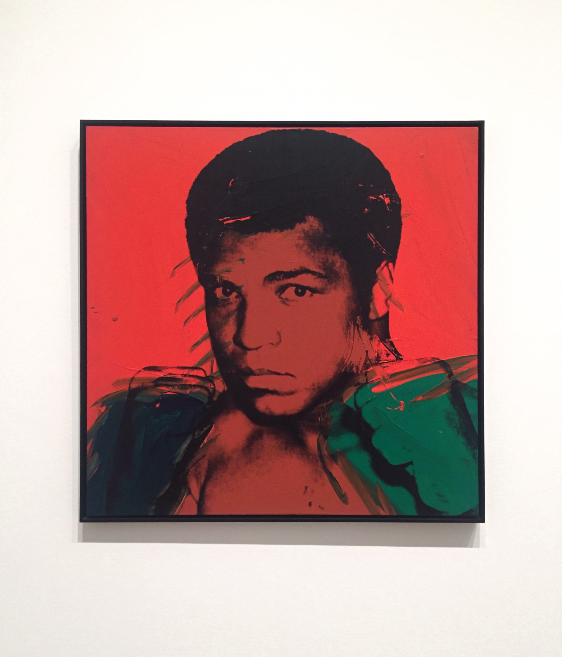
The palette of red, black and green shares its colours with the pan-African flag where red represents the blood uniting the African diaspora, black as representative of its people, and green being the natural riches of the African continent.
Andy Warhol, Muhammad Ali, Acrylic paint and screenprint on canvas, 1978


Barkley Hendricks
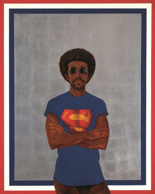
“Icon for My Man Superman (Superman Never Saved any Black People – Bobby Seale)”
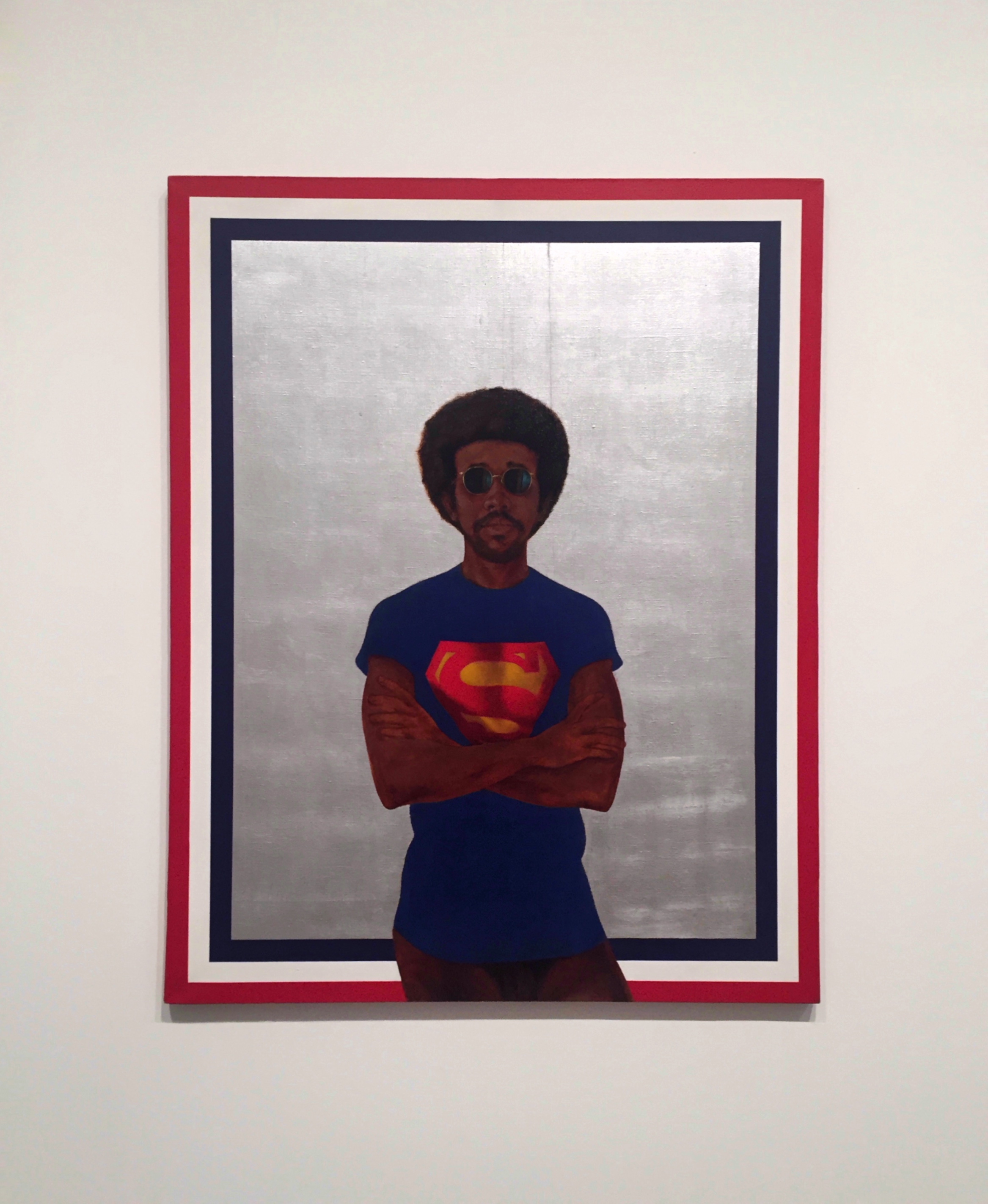
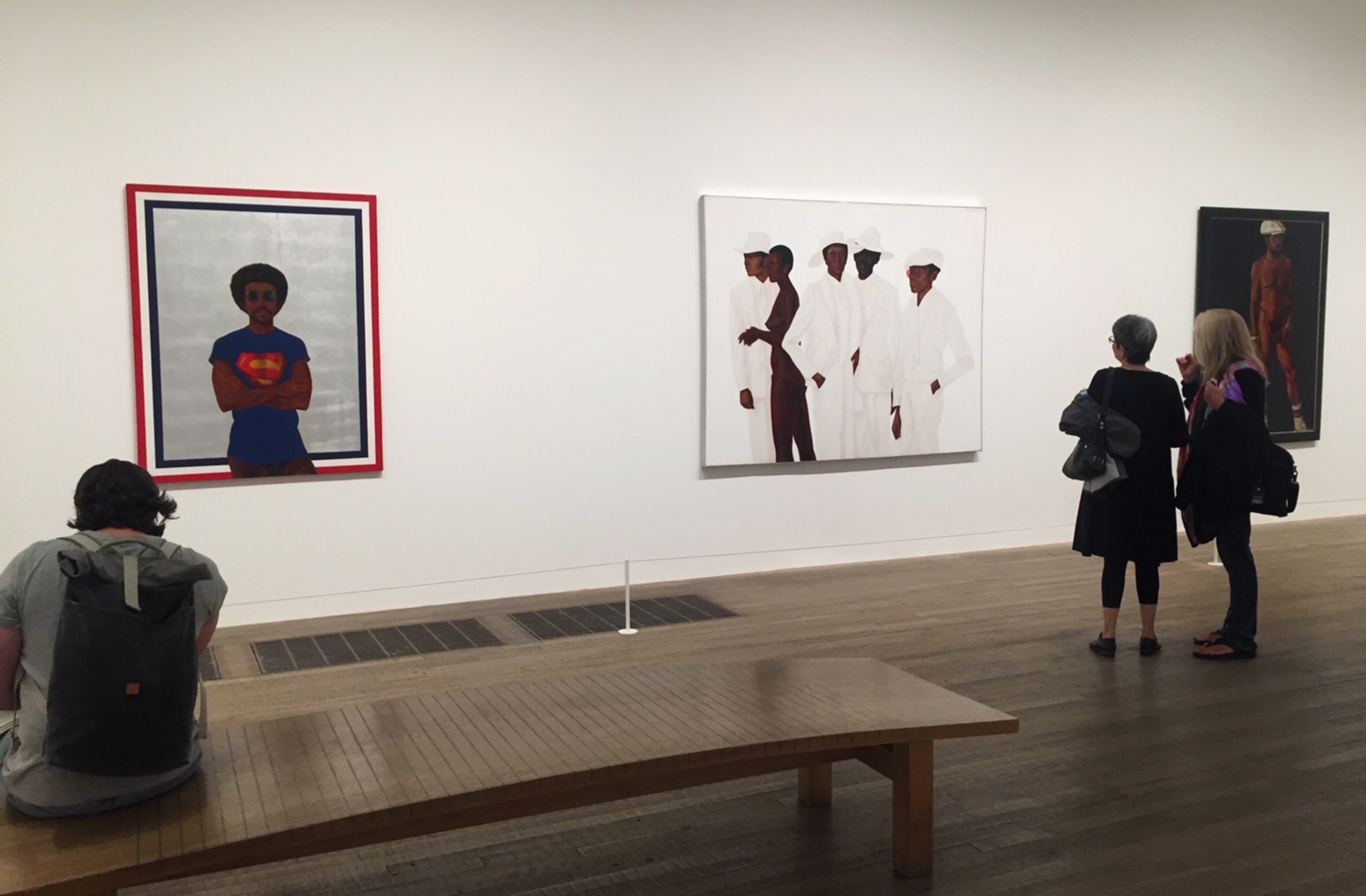
Icon for My Man Superman (Superman Never Saved any Black People – Bobby Seale) is a self-portrait, trimmed with a border evoking the American flag. Barkley Hendricks painted himself wearing a novelty T-shirt, provocatively nude from the waist down. The work’s subtitle invites a declarative statement of solidarity with the Black Panther co-founder Bobby Seale.
Barkley Hendricks, Icon for My Man Superman (Superman Never Saved any Black People – Bobby Seale), Oil paint, acrylic paint and aluminium leaf on canvas,1969


Gerald Williams
“Nation Time”
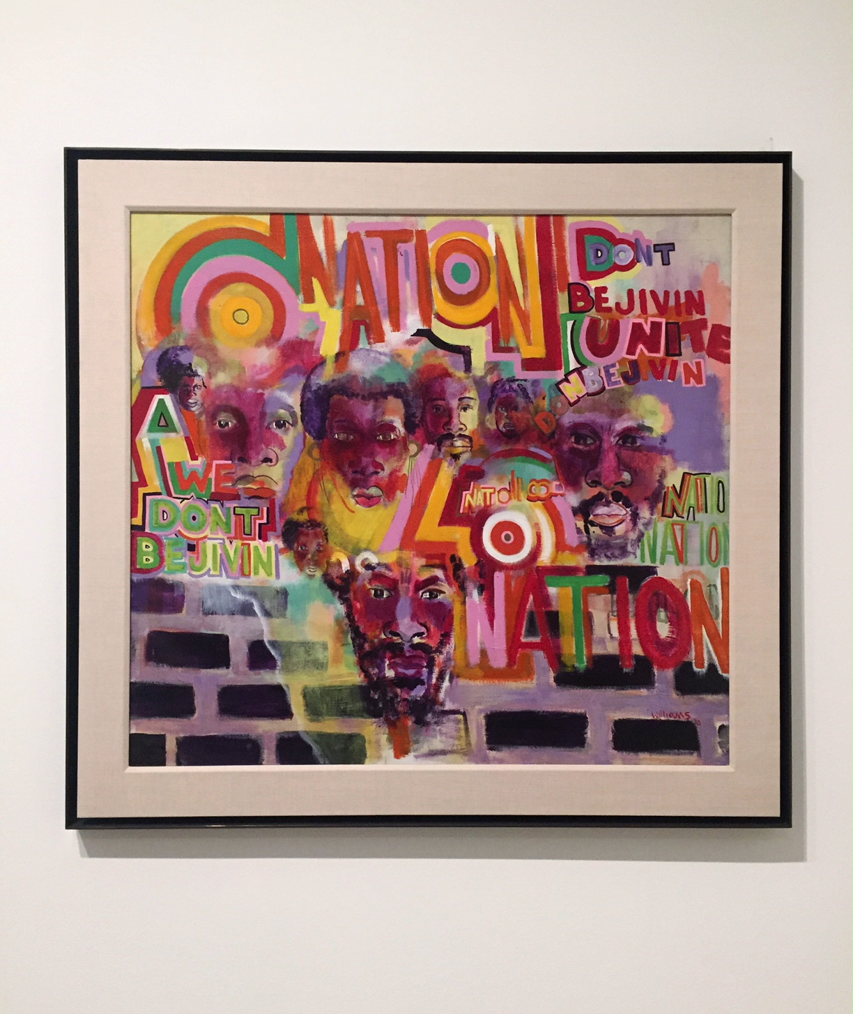
Gerald Williams was one of the five founding members of AfriCOBRA. For Williams, ‘Nation’ referred not to America but to a separate Black nation. Amiri Baraka used the word in the same way in his poem of the same year, ‘It’s Nation Time’, and Jeff Donaldson used the phrase too in the landmark AfriCOBRA text, ’10 in Search of a Nation’, also 1970: ‘It’s NATION TIME and we re now searching.


Gerald Williams, Nation Time, Acrylic paint on canvas, 1970


David Hammons
“Injustice Case”
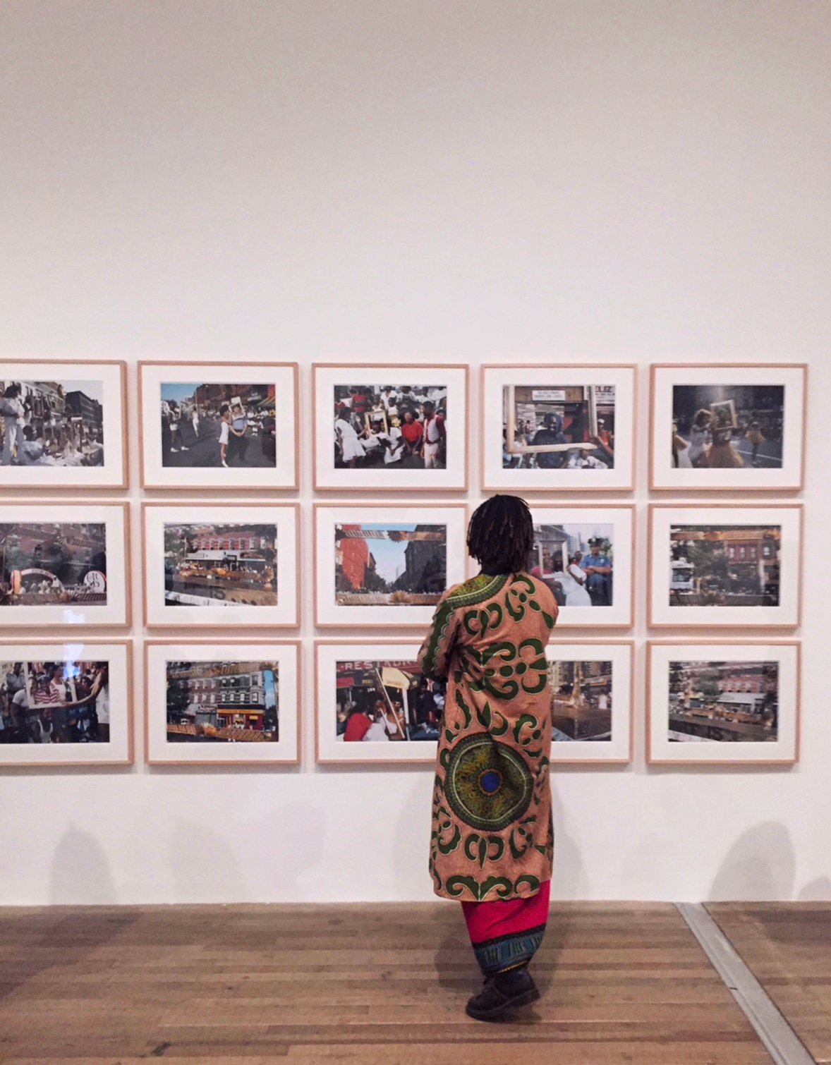
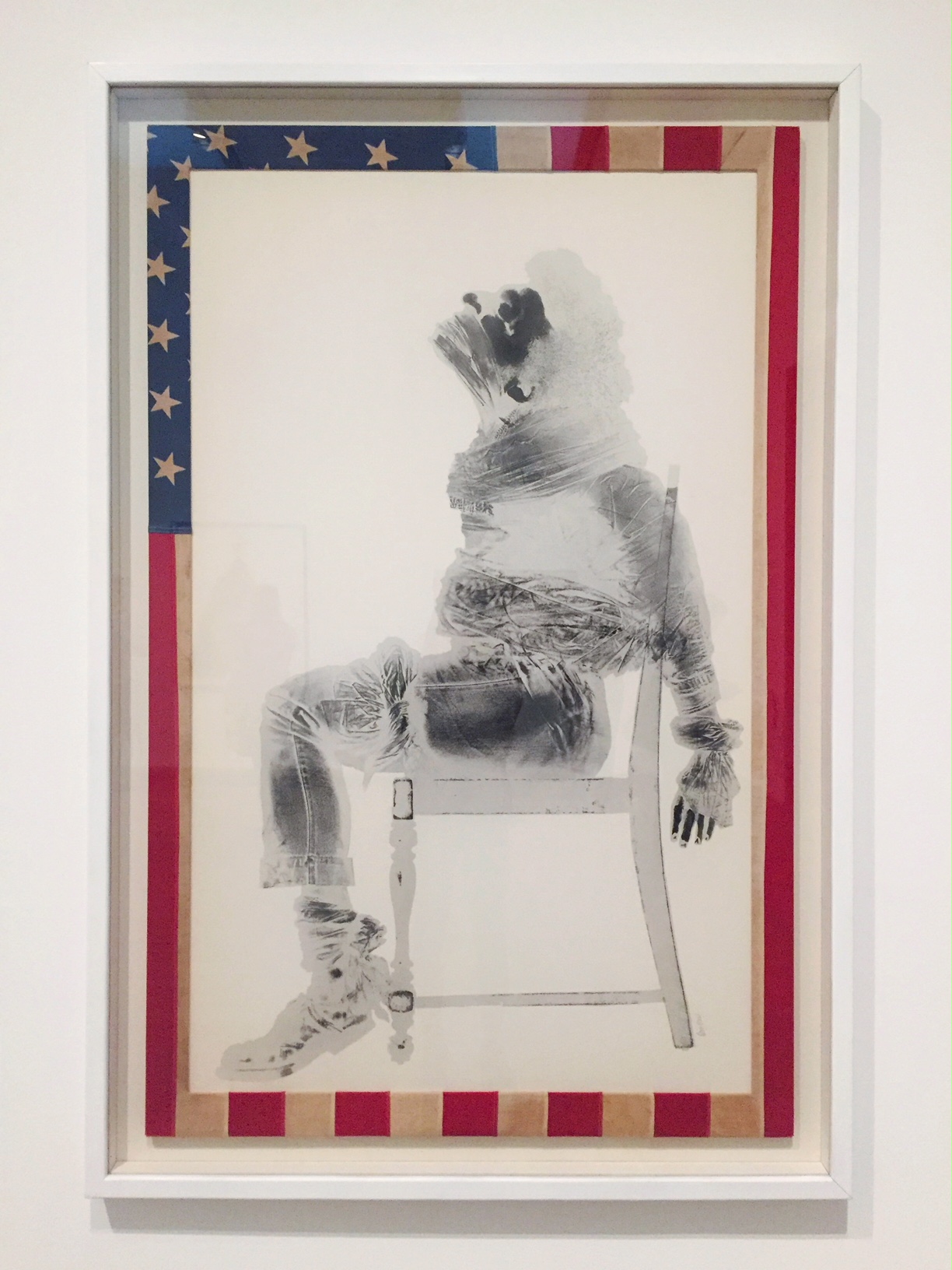
Injustice Case refers to Black Panther Party co-founder Bobby Seale’s trial for conspiracy to incite violence, during which Seale was bound and gagged in the courtroom. Hammons cut an American flag to frame the image (itself a punishable offence), effectively making this shocking scene from the halls of justice an x-ray of America.

David Hammons,  Injustice Case,  Body print and screenprint on paper, frame wrapped with American Flag,  1970


Barkley Hendricks
“What’s Going on”
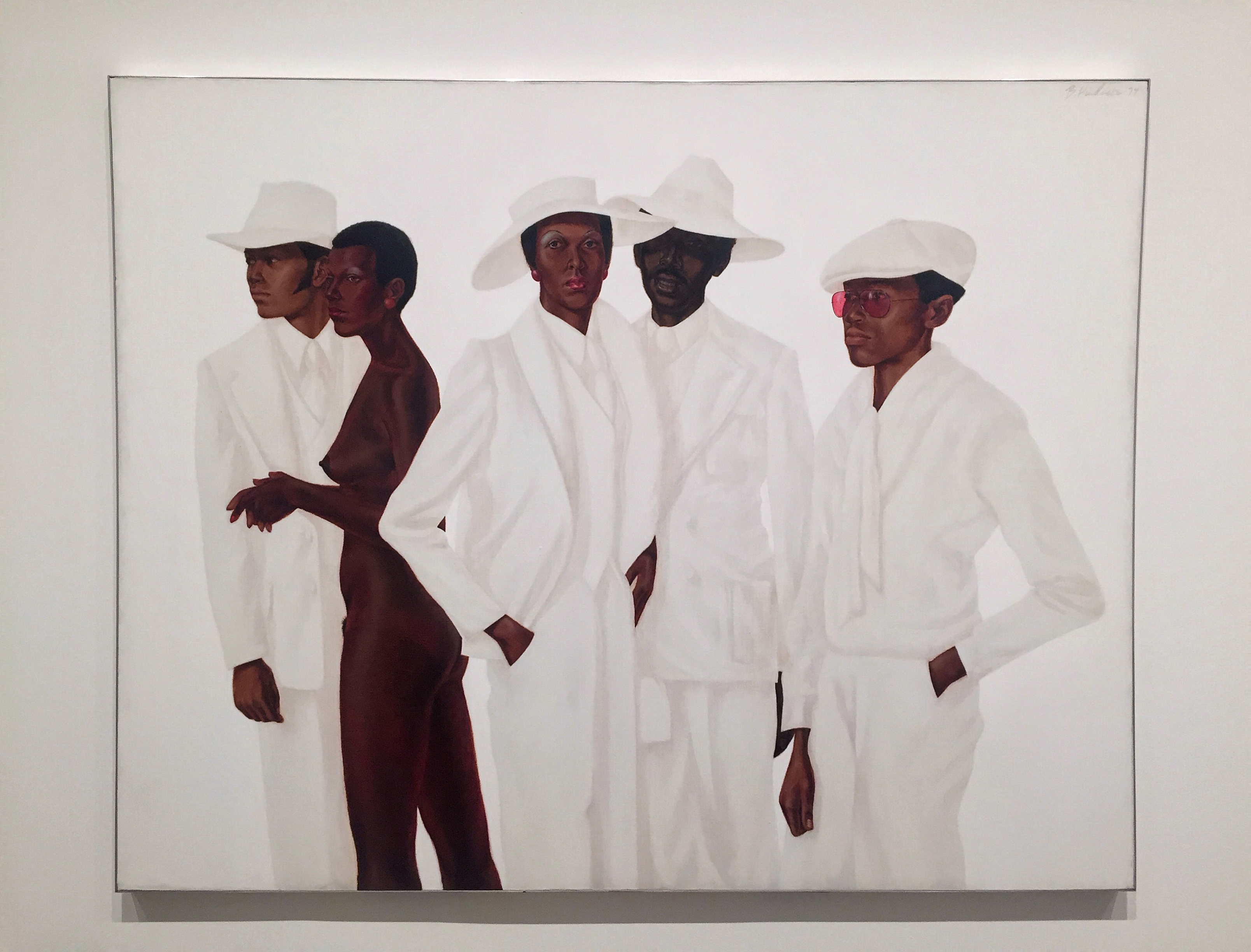
Five figures stand nearly life-size. Amalgamations of people real and imagined, the nude woman is modelled on Hendricks’s recurring model, dancer Adrienne Hawkins, and the youngest man in rose-tined glasses is based on the artist’s brother. Hendricks conveys a range of complexions by seamlessly transitioning between highly malleable, slow-drying oil paint and fast-dying acrylic to suggest different textures and surfaces.

Barkley Hendricks,  What’s Going on Oil paint, acrylic paint and acrylic resin paint on canvas,  1974


Barkley Hendricks
“Brilliantly Endowed (Self-Portrait)”
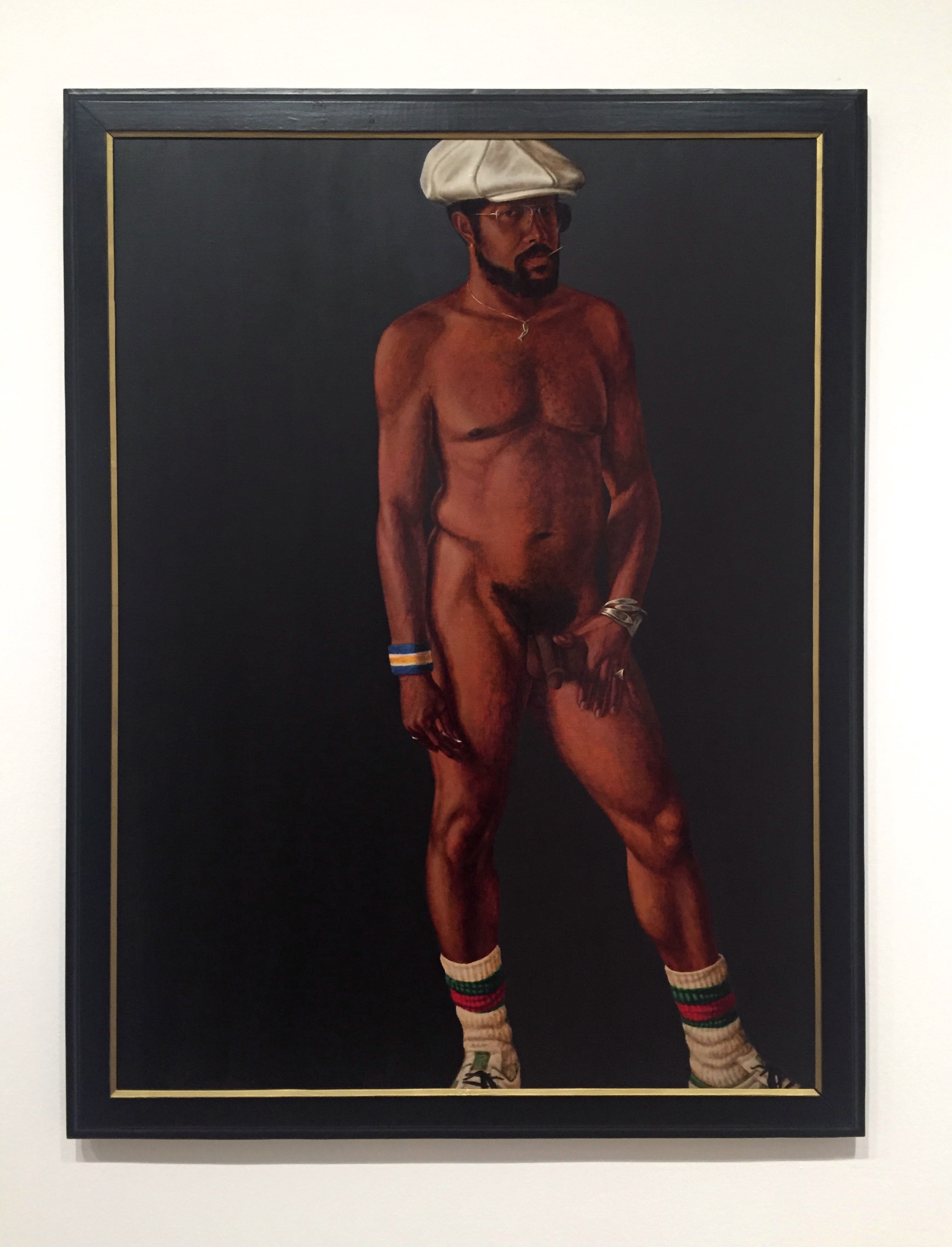
Brilliantly Endowed is a self-portrait that demonstrates swagger – defiance and cool detachment – as an everyday act of revolutionary aesthetics. Hendricks subtly targets New York Times critic Hilton Kramer, who had concluded a 1977 review by calling that artist ‘a brilliantly endowed painter who erred, perhaps, on the side of slickness’. The artist tackles head-on the double entendre and its potential stereotype connotation of Black male anatomy, while also putting on show his confidence as a painter, upending ‘slickness’ to embrace it as an attribute.

Barkley Hendricks,  Brilliantly Endowed (Self-Portrait),  Oil paint and acrylic paint on canvas,  1977


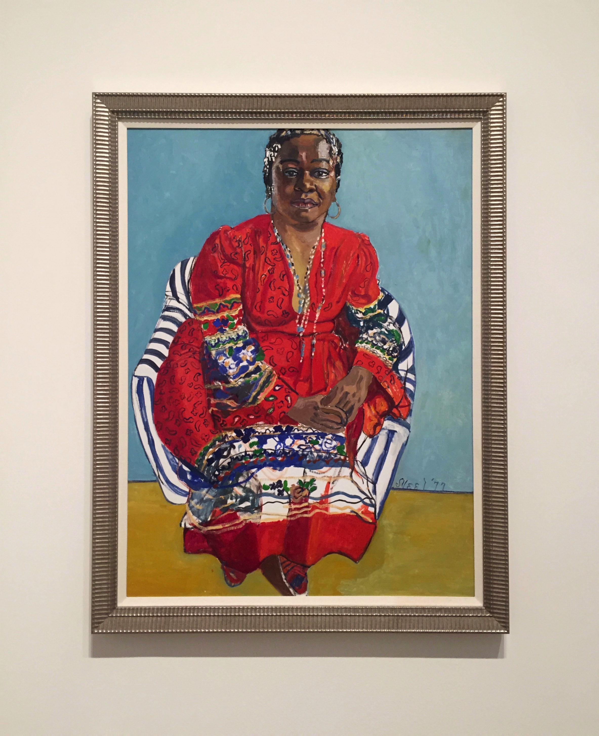
Alice Neel
“Faith Ringgold”
Alice Neel, a white artist, was an ardent supporter of the equal representation of Black people – both through her own selection of sitters, such as this portrait of artist Faith Ringgold, and in her social actions.

Alice Neel, Faith Ringgold, Oil paint on canvas, 1977


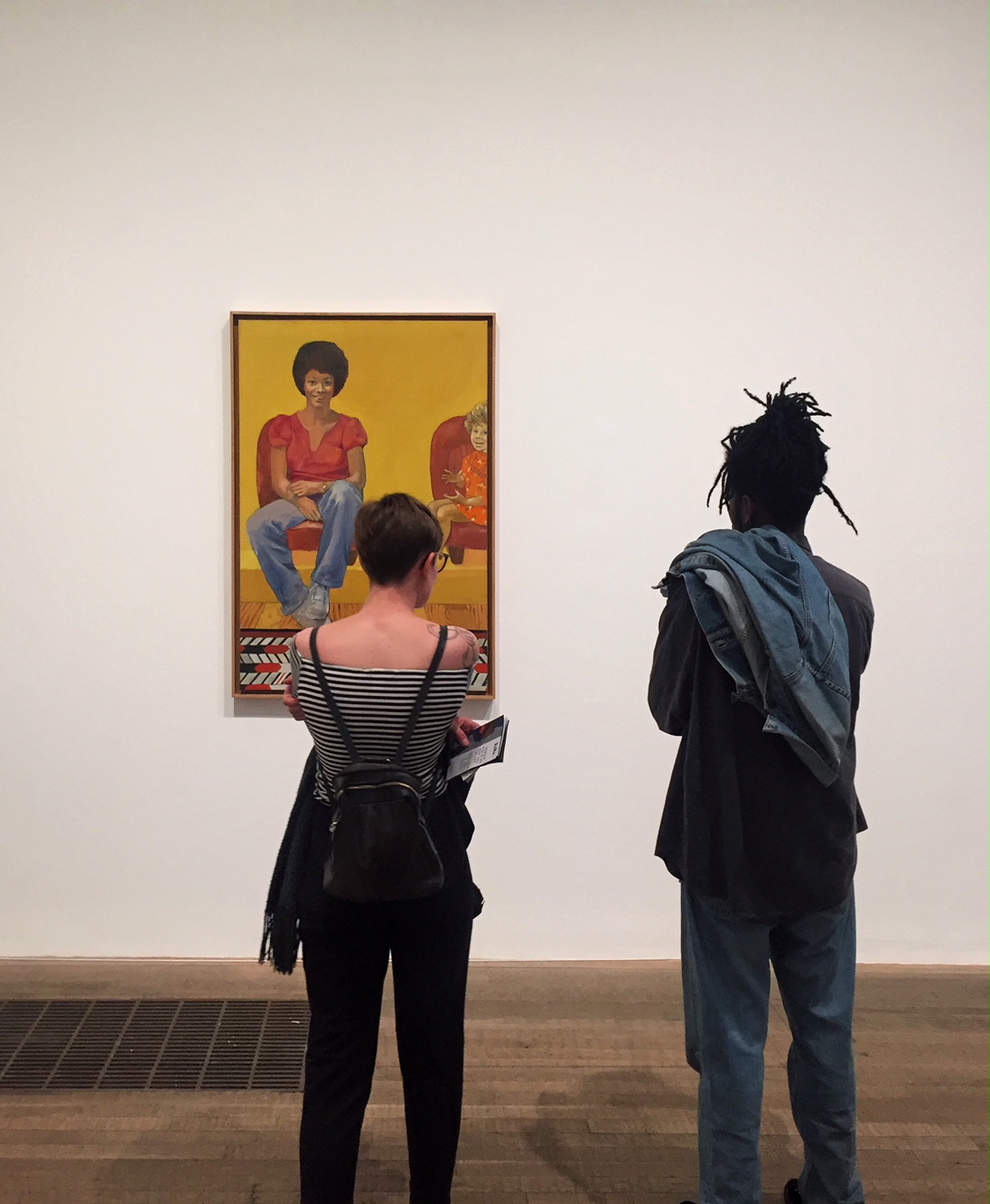
Emma Amos
“Eva the Babysitter”
Emma Amos was the sole woman artist in the Spiral group. The circumstances of socially-accepted domestic and child rearing responsibilities compounded the challenges women artists faced. This image honours a woman who helped enable Amos’s artistic practice. The radiant child-carer smiled while the artist’s toddler daughter is barely contained by the canvas.

Emma Amos,  Eva the Babysitter,  Oil pain on canvas, 1973


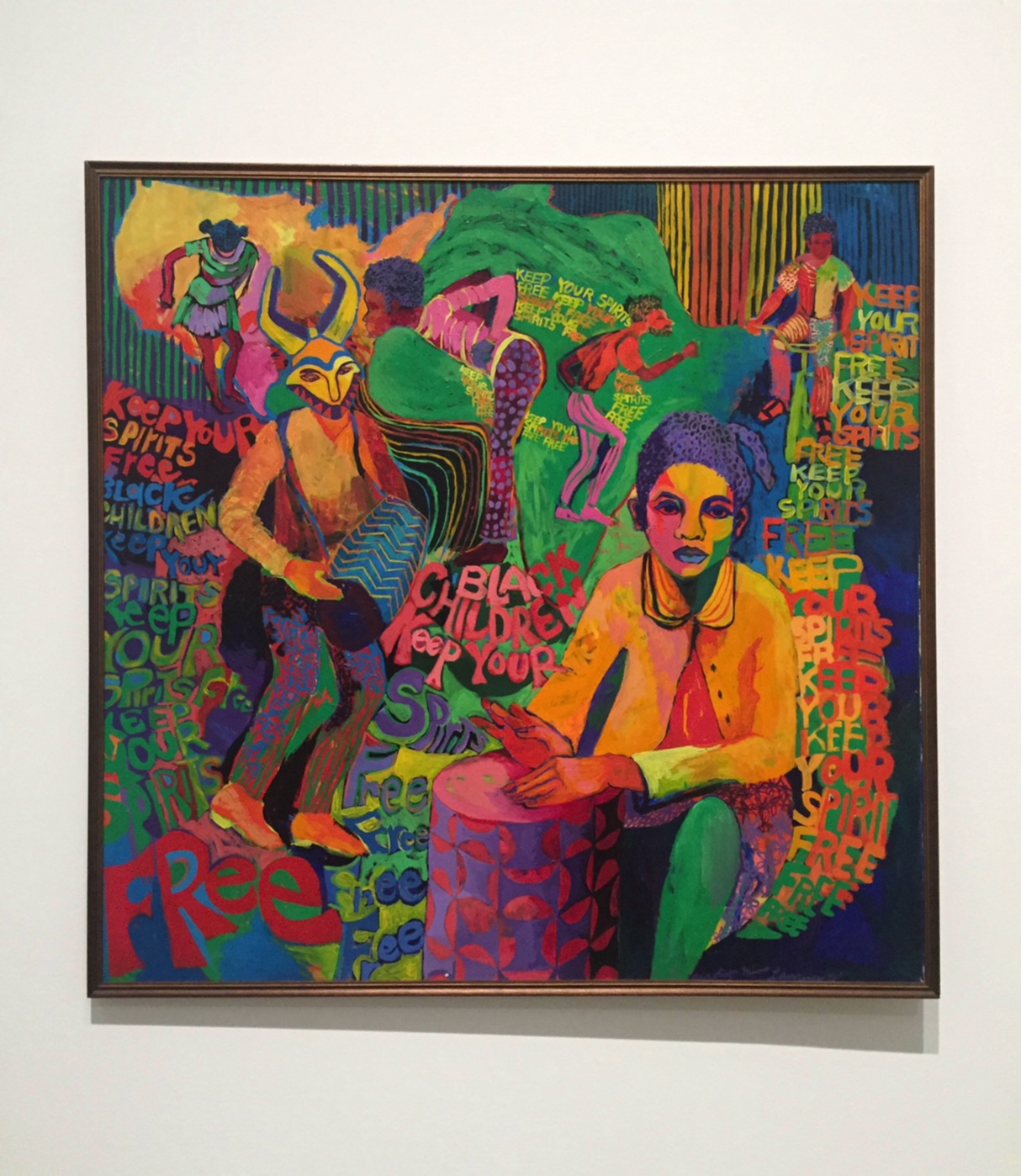
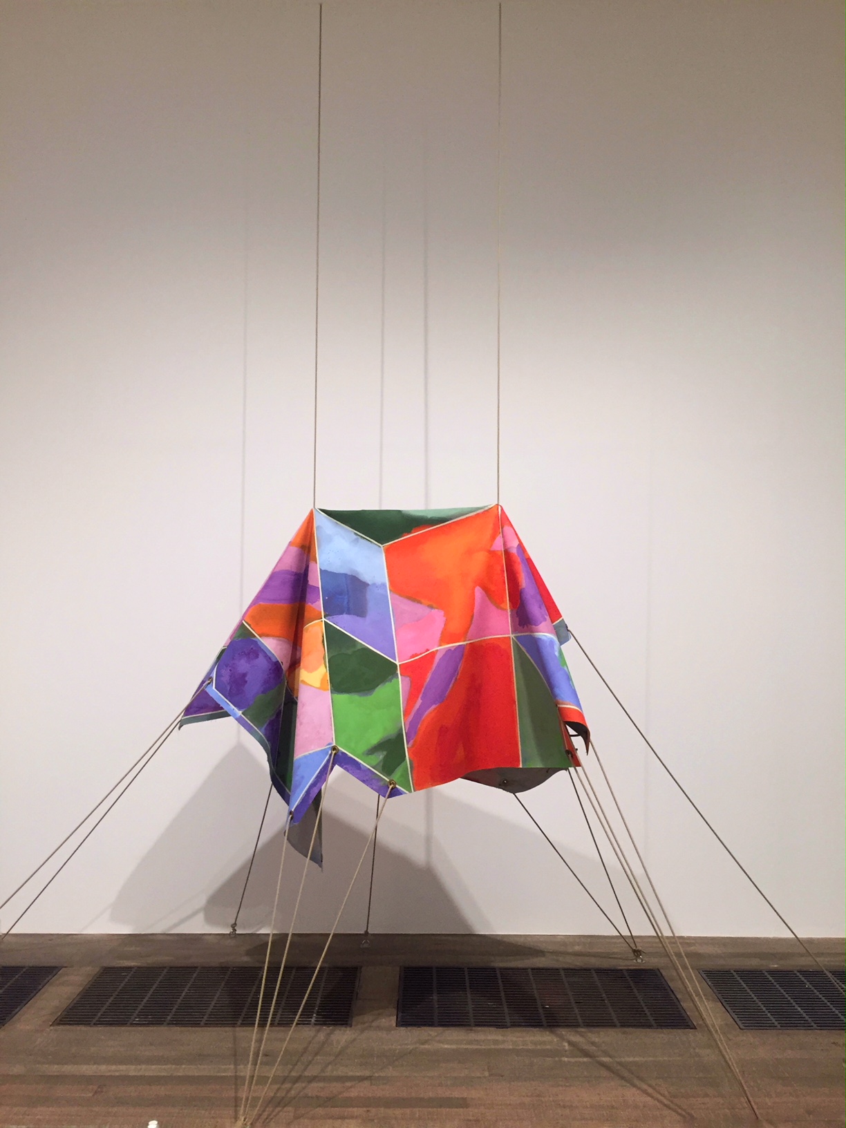
Carolyn Lawrence, Black Children Keep Your Spirits Free, Acrylic paint on canvas, 1972


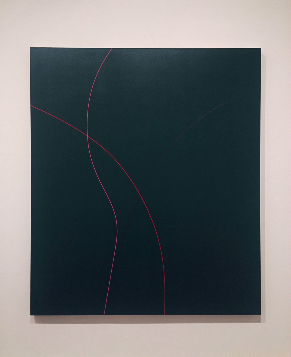
virginia jaramillo, Untitled, Acrylic paint on canvas, 1971


Joe Overstreet
“We Came from There to get Here”
In he early 1960s, Joe Overstreet Was making image-based painting clearly expressing the political goals of Black Power; he was closely associated with the Black Arts Movement, and painted backdrops for the jazz musician Sun Ra. He later turned to making more abstract work, here painting a colourful grid and drawing the outlines of figures giving gestures of empowerment.

Joe Overstreet, We Came from There to get Here, Acrylic pain on canvas and rope, 1970
 

Frank Bowling
“Texas Louise”
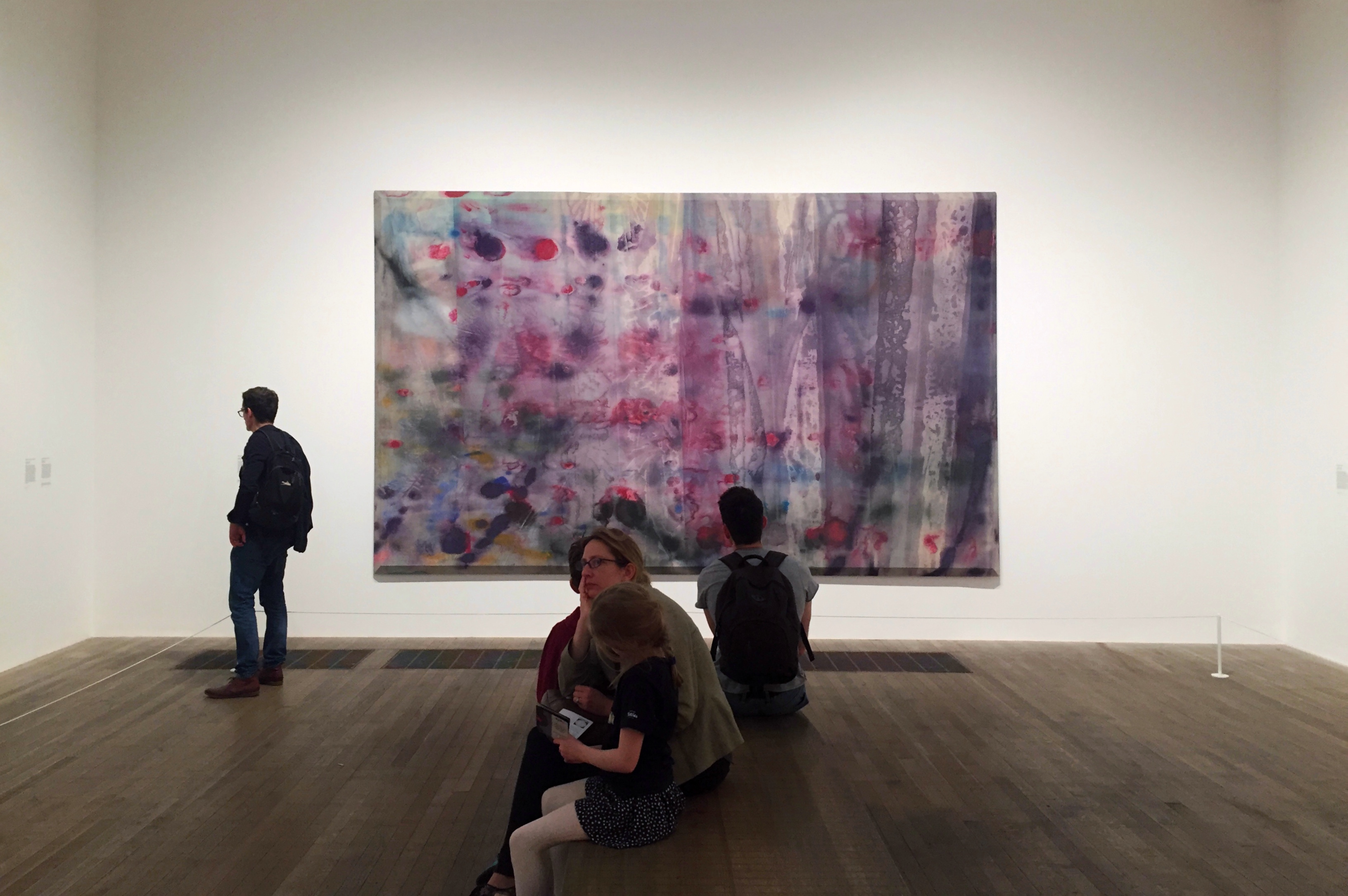
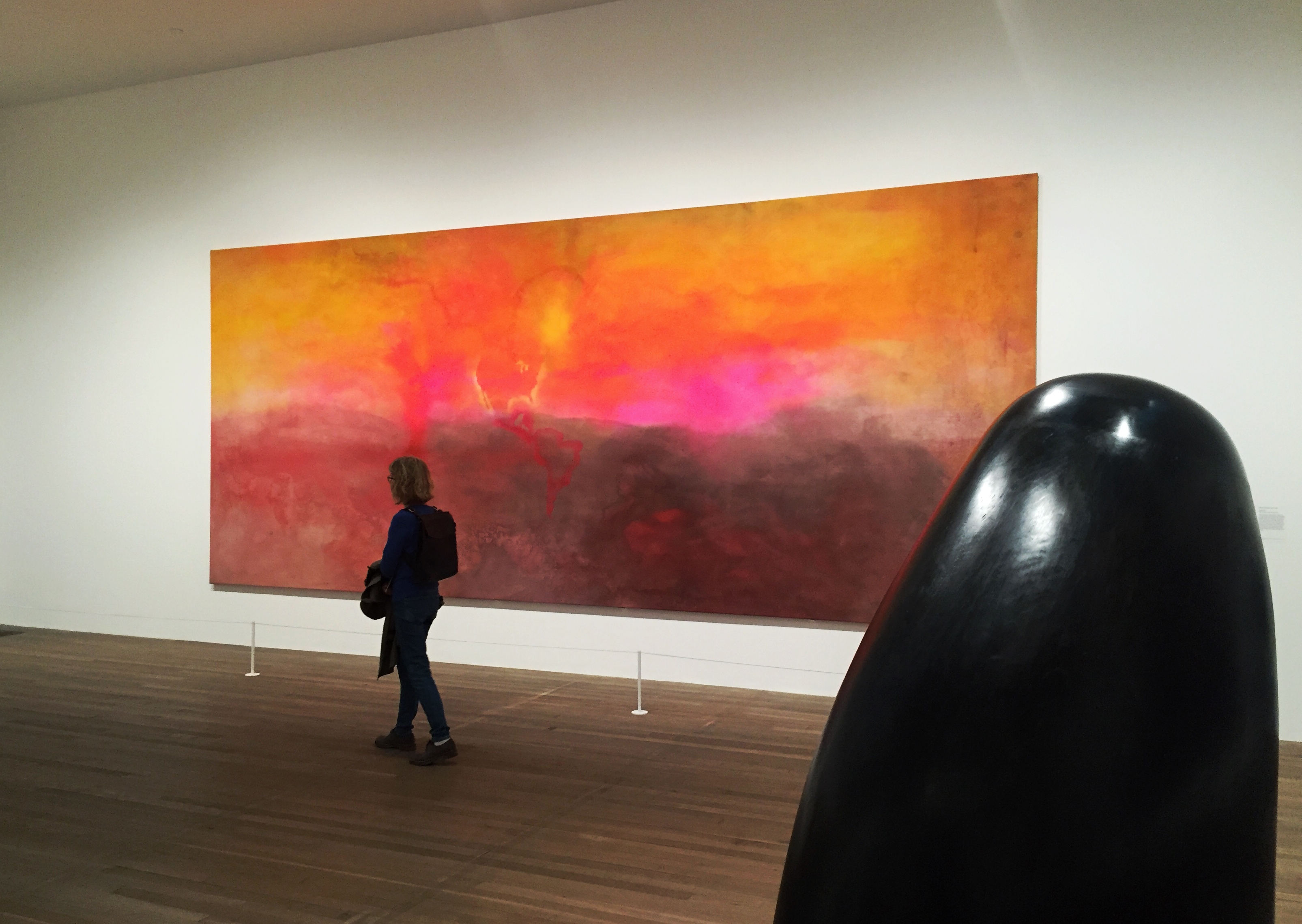
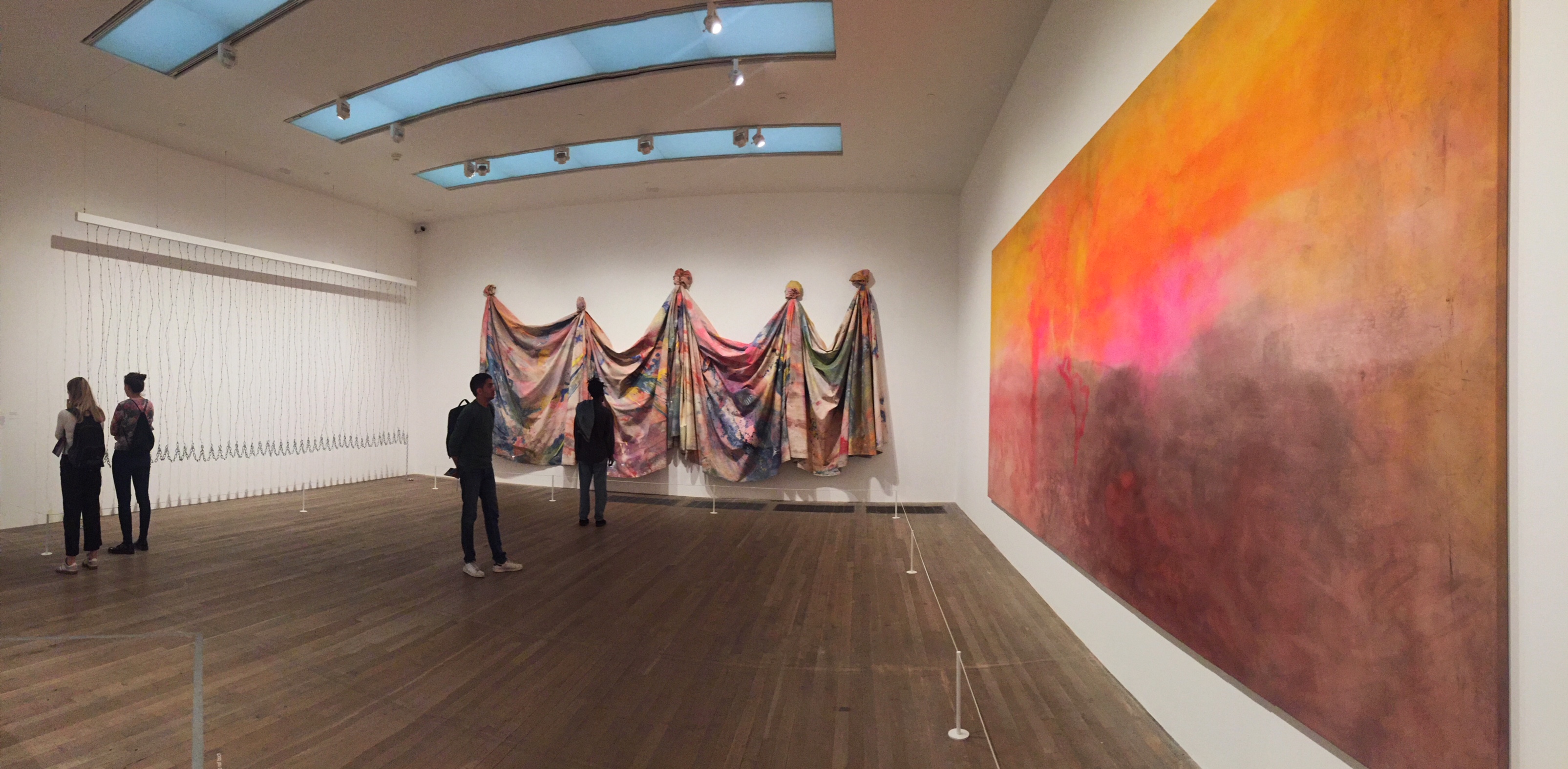
Texas Louise was one of six Map Paintings Bowling included in his solo exhibition at the Whitney Museum of American Art in late 1971. He poured waves of acrylic over stencils of continents that were removed before more paint was applied, so ghostly outlines remain. Continents emerge from and disappear into colour; oceans and rivers are combined with pools and trails of liquid paint. While many Black Americans were pointing to Africa as a mother continent, Bowling’s maps do not privilege any particular place, and celebrate a more fluid and open idea of identity and belonging to the world.
Frank Bowling,  Texas Louise,  Acrylic paint on canvas,  1971


Photography: Art Road

Notes: Tate Modern

Part of what I saw and lived as a child is reflected today in my work

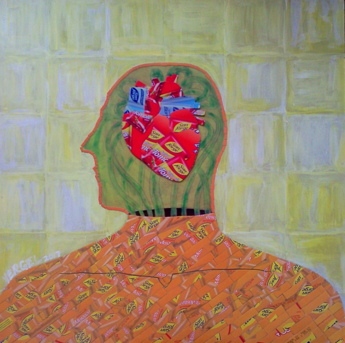
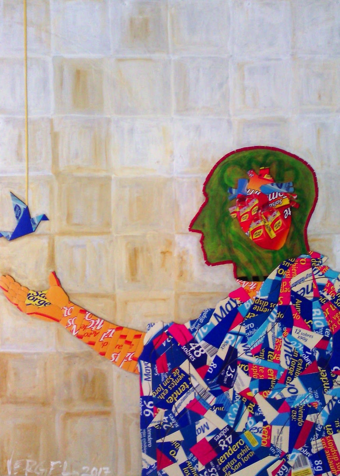
“No.1 / series: The Artist’s Mind” – Mixed, Acrylic and recycled cardboard on wood- 18.5in x 18.5in x 1.57in, 2017

Name: Leo Vergel

DOB: December 1988

Place of birth: Cartagena de Indias, Colombia

Occupation: Artist

I was born on December 16, 1988 in the Caribbean city of Cartagena de Indias, Colombia, I was given the name Jesús Leonardo Vergel Alvarez, but I prefer Leonardo Vergel, because of the pressures of this society that is always dictating what to do, ending up giving up and studying a university degree “Profitable”, which by the way does not end because I decided to make art and live from it. I have never entered an artistic institution, I firmly believe in confronting the work a thousand times and do it very often, I am totally self-taught, painting now means for me to have recast the child I had forgotten.

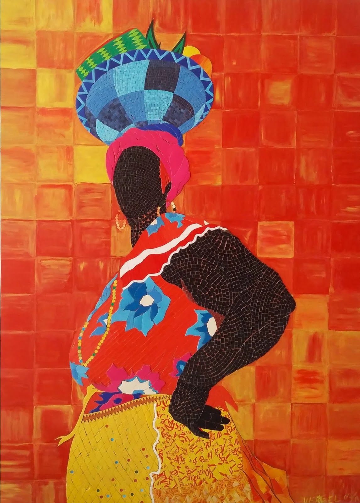
“Palenquera No.1” – Mixed, Acrylic and recycled cardboard on wood -38.19in x 27.36in x 1.57in, 2015

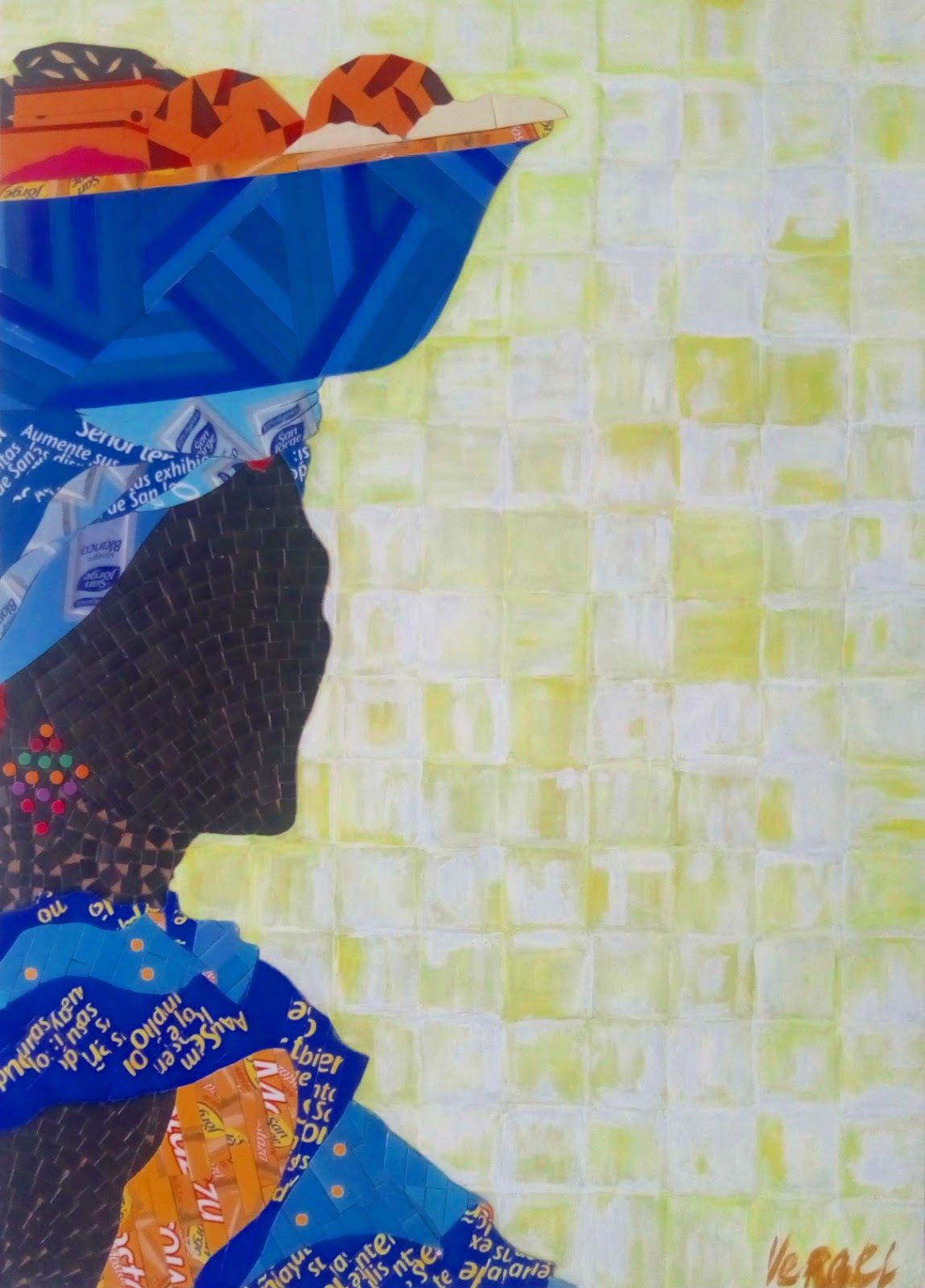
“Palenquera No.2” – Mixed, acrylic and recycled cardboard on wood- 24.02in x 17.32in x 1.57in, 2016

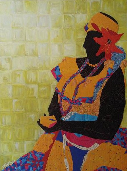
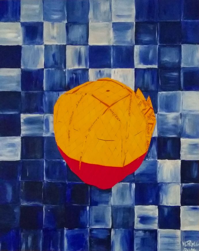
My technique is to use colored cardboard cutouts, I can use them in a way that has an order or a random shape purposely that allows me to express the idea at that time. The shapes I use are rectangular, square, rhomboid or other triangular cases, I think it is because when I had a little fun playing using these materials and associated them with those geometric figures I saw in school.

“Palenquera No.3” – Mixed, Acrylic and recycled cardboard on wood- 48.03in x 36.02in x 1.57in, 2017

This can also be seen in the funds that I make in my works, to this is added that when I was 7 or 8 years I saw a lot of Japanese TV program called “nopo y gonta” where the presenter very creatively taught Children on topics such as geometry and how this could be creatively used to create any number of fun objects. Part of what I saw and lived as a child is reflected today in my work.

“Mango”- Mixed, Acrylic and recycled cardboard on wood, 55cm x 44cm x 4cm, 2016

My work is handled in a genre that I still try to understand and that for me is handled between painting and collage, but I could not say that it is clearly one or the other. My work begins to manage a little symbolism, from the memories, what I live in my daily life and what I think or how I see the world.

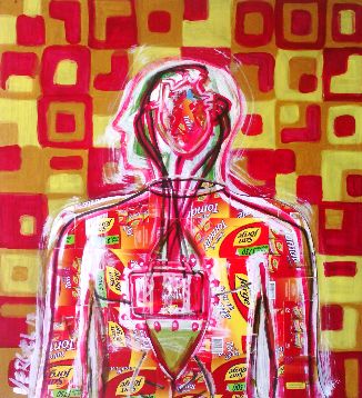
“No.2 / The Artist’s Mind” Acrylic and recycled cardboard on wood, 2017
“No.3 / The Artist’s Mind”- Mixed, Acrylic and recycled cardboard on wood-31.89in x 28.74in x 1.57in, 2017

I like to think that it is Fauvism, by the way I express myself emotionally through color, but with recycled cardboard of vivid colors reinforced with acrylic. I have seen and I am inspired by works of great masters like Gustav Klimt, the way as in his work and uses the color are great teaching for me and I try to achieve it with my work, that the color and the human figure achieve a moving impact In people to the point of reflection. I would like very much to get my work to transcend my generation and in fact to impact people, to let people know that there are always second chances, I want to leave a legacy. My technique is inherent in me, it represents my childhood, when you do not have the resources to paint the only thing that matters is you and your imagination, the rest you forget, it loses importance.

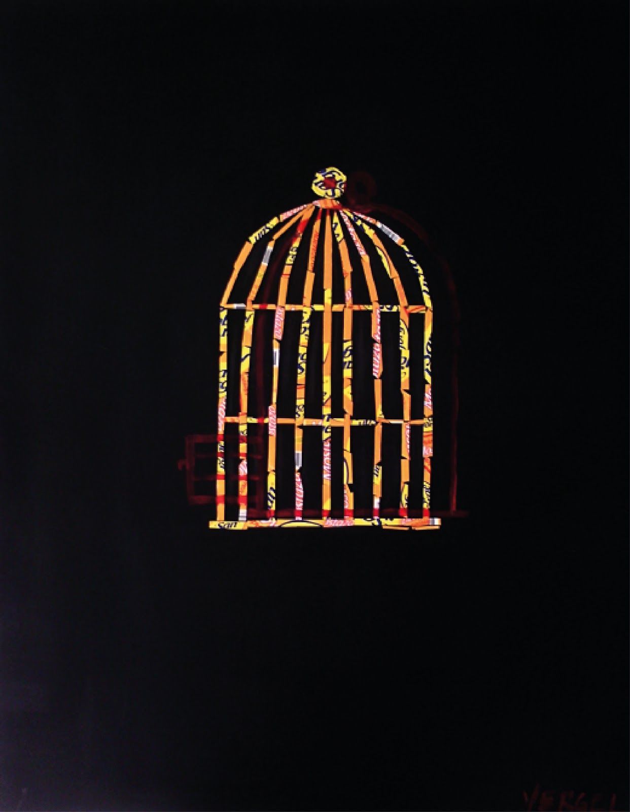
“Open Cage”- Acrylic & recycled cardboard on wood, 45.67in x 35.83in x 1.57in, 2017


Exhibitions

2015- Artists Happy Hour. Roxana Avila. Badillo Hotel Gallery. Cartagena Colombia.

2016- Project 30. Art Director: Leonardo González. XIX Festival Zaquesazipa-Funza.

2016- Funza, Cundinamarca, Colombia.


© Leonardo Vergel

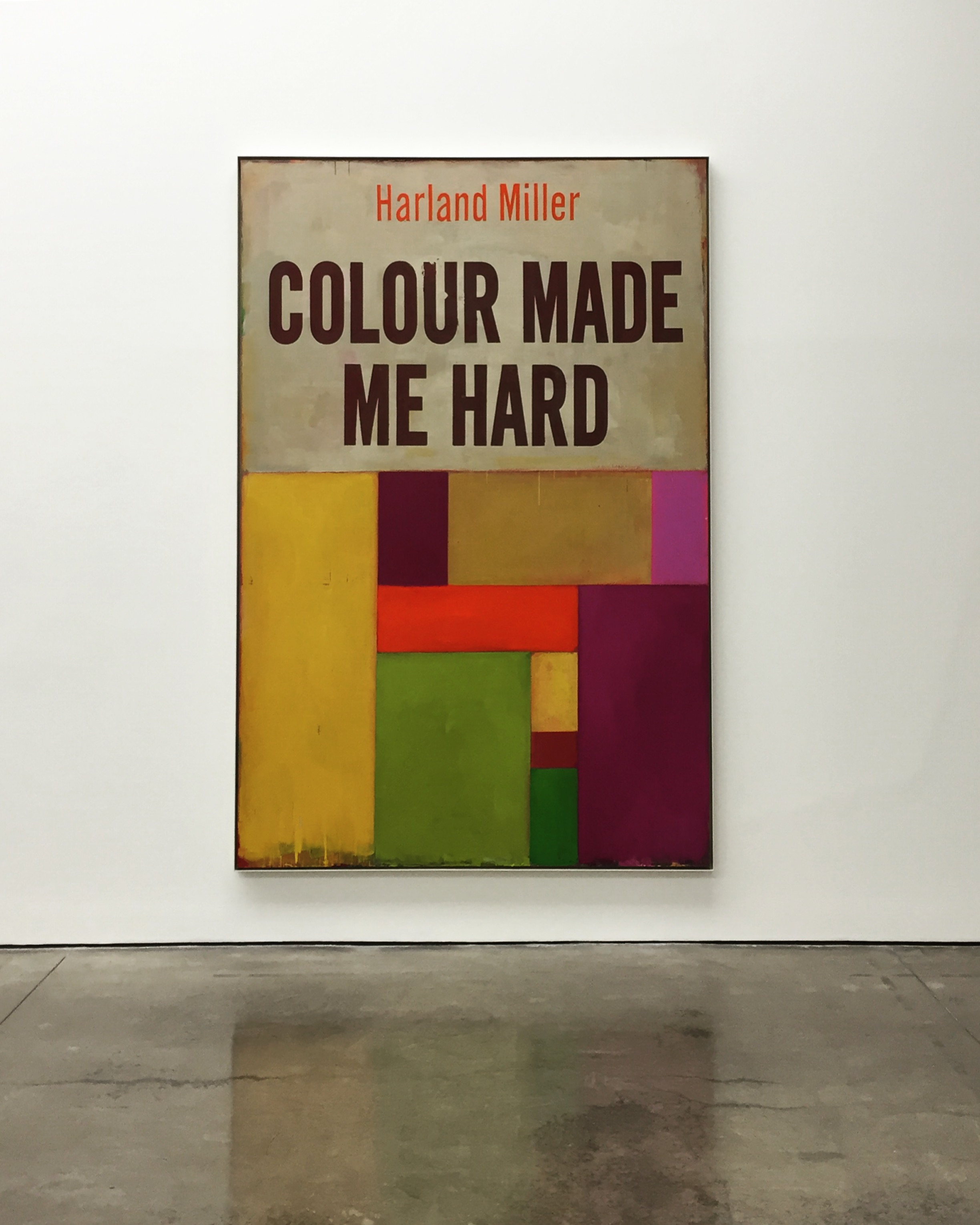
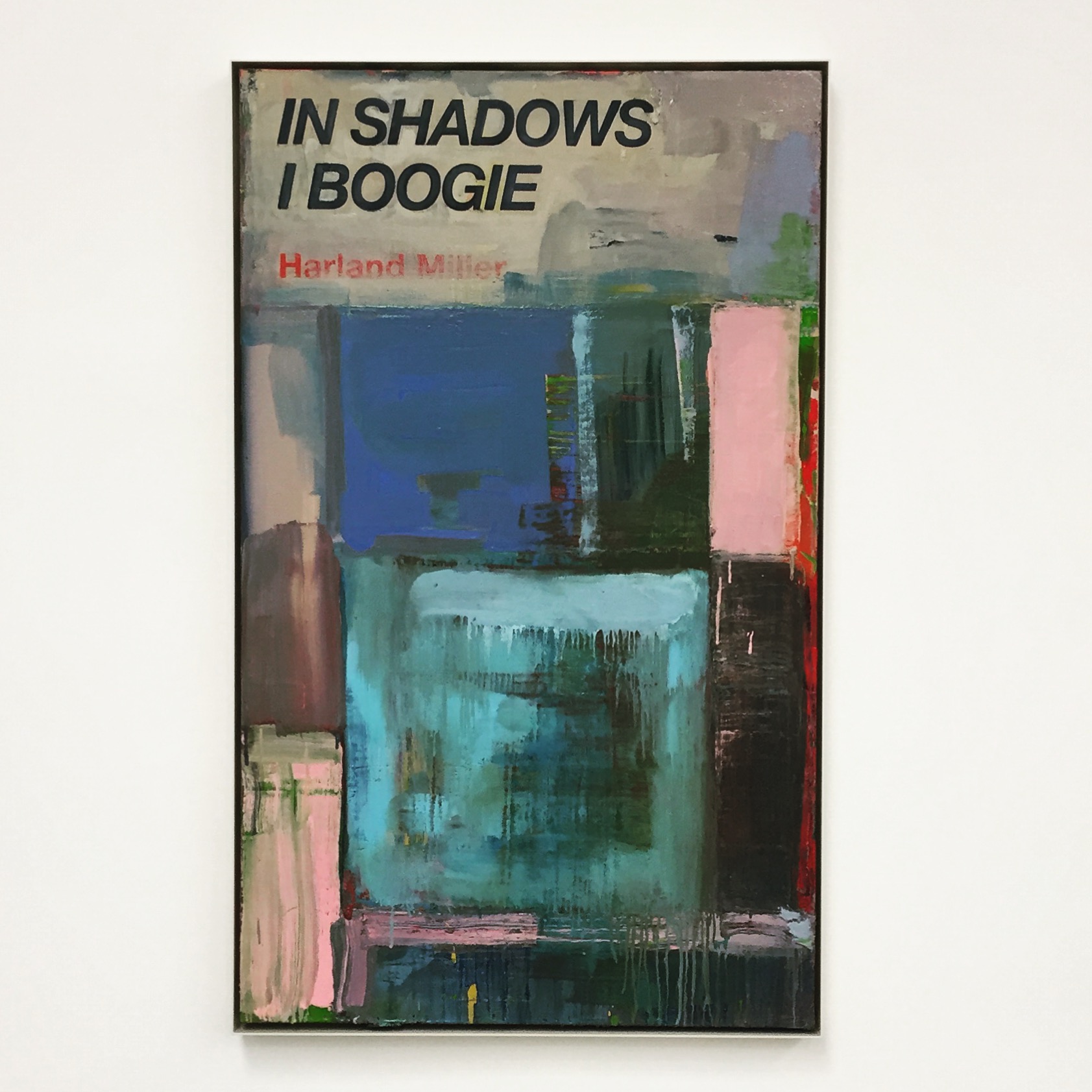
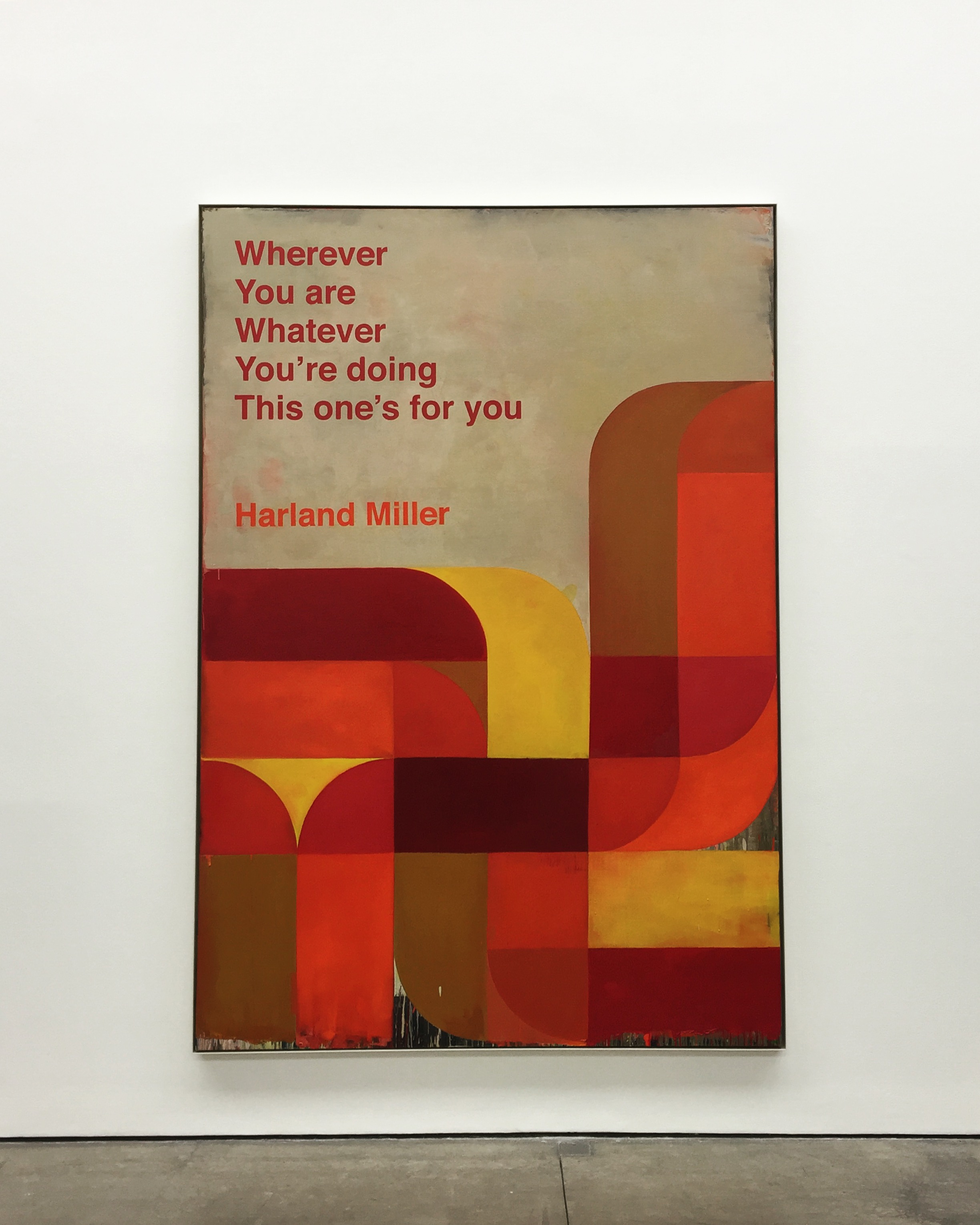
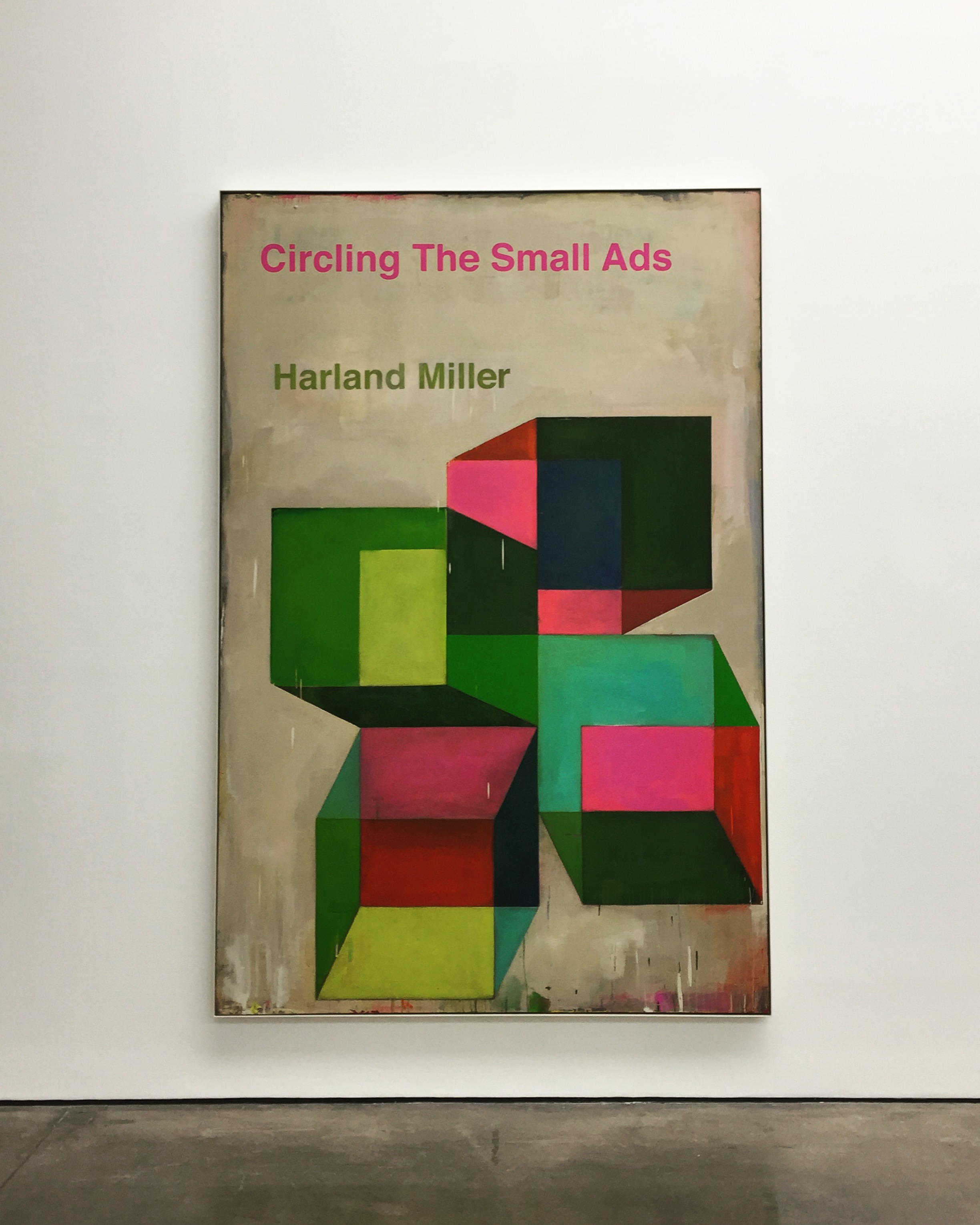
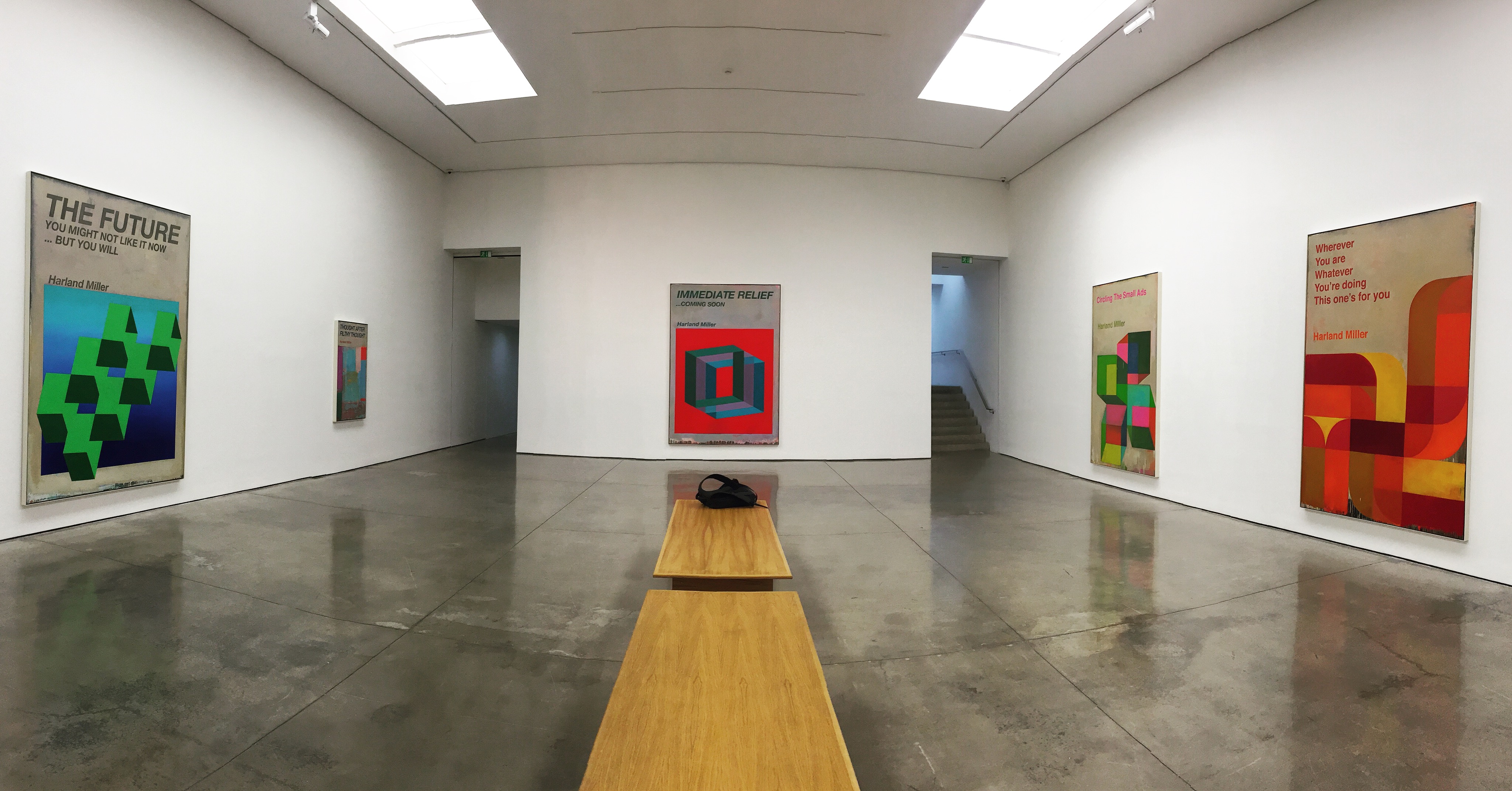
Harland Miller, One Bar Electric Memoir

The first series of large-scale works draws on Miller’s extensive archive of psychology and social science books, which date from the 1960s and ’70s. Characterised by their bold and colourful abstract covers, these books embraced a positive attitude and the possibility of ‘fixing’ disorders through a process of self-help.

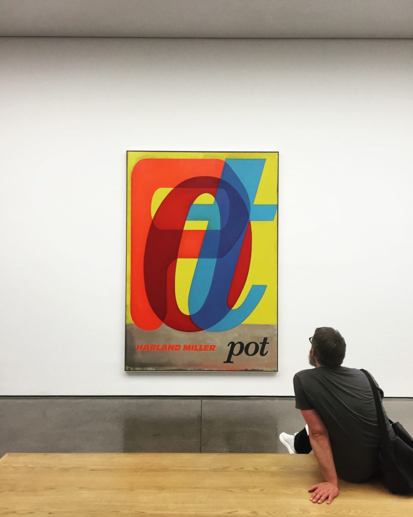
Pot, Oil on canvas, 105 x 72 x 2 in. 2017
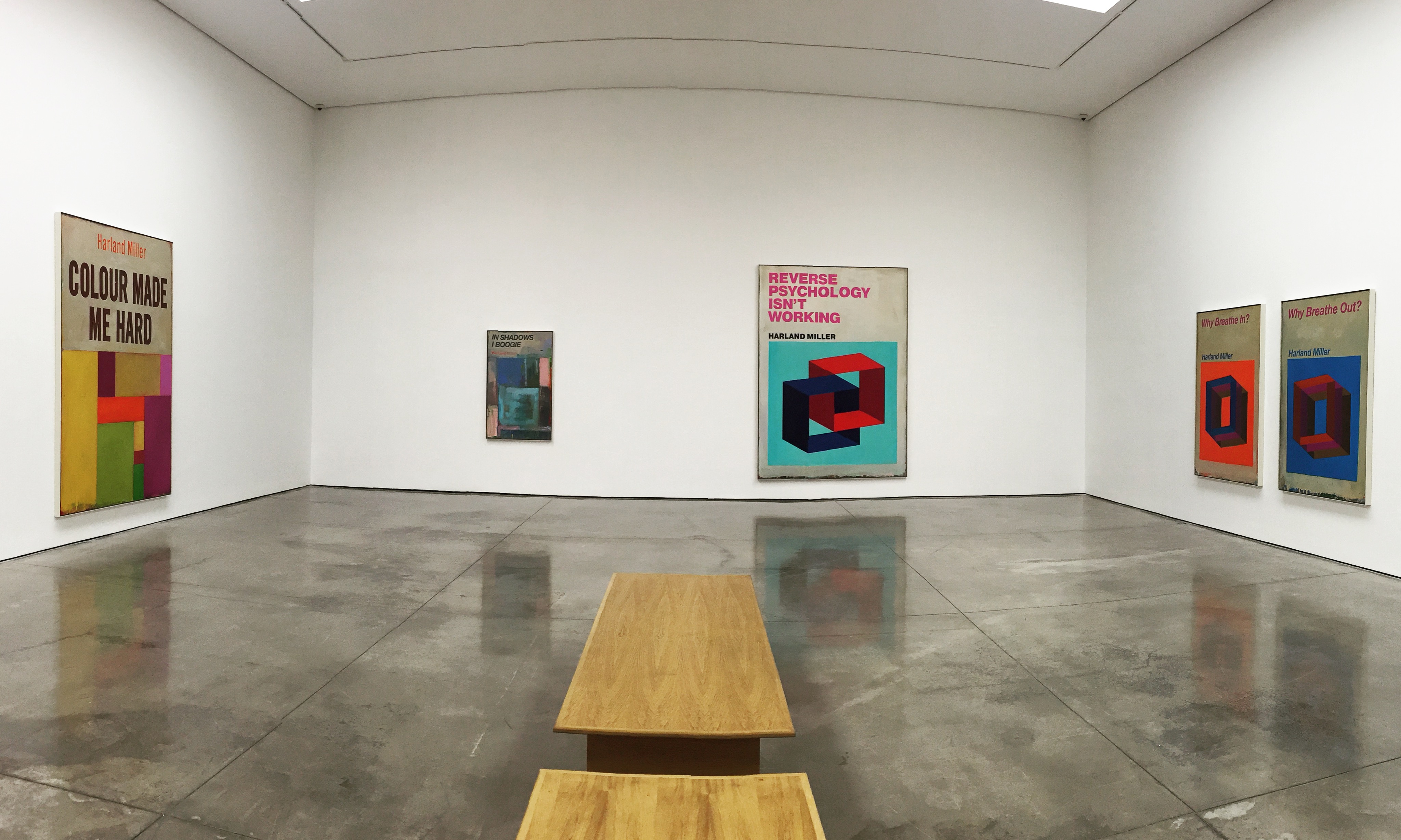
Colour Made Me Hard, Oil on canvas, 109 x 73 x 2 in. 2016
In the Shadows I Boogie, Oil on canvas, 60 x 36 x 2 in. 2017

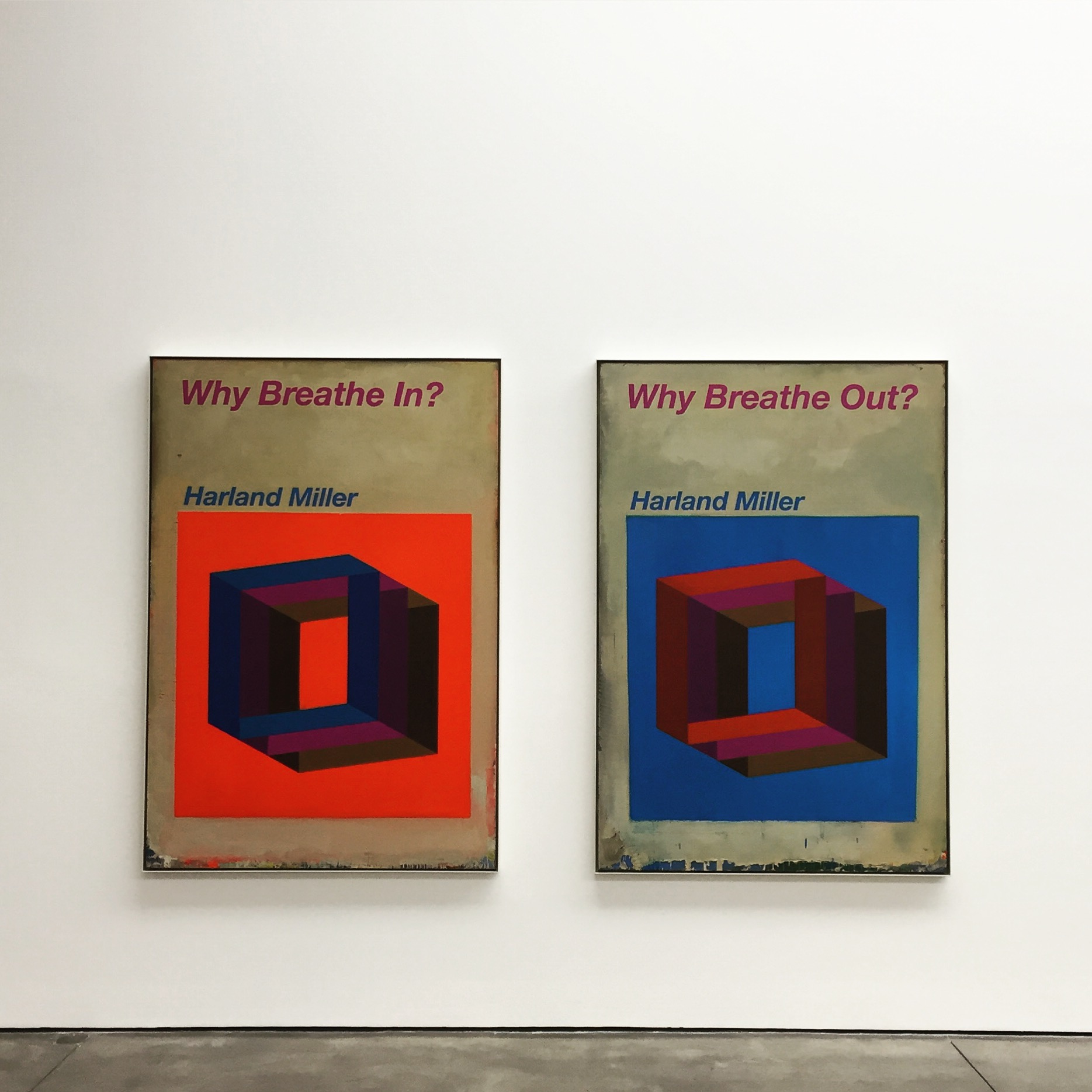
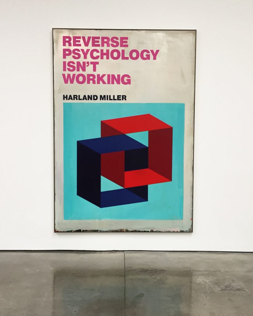
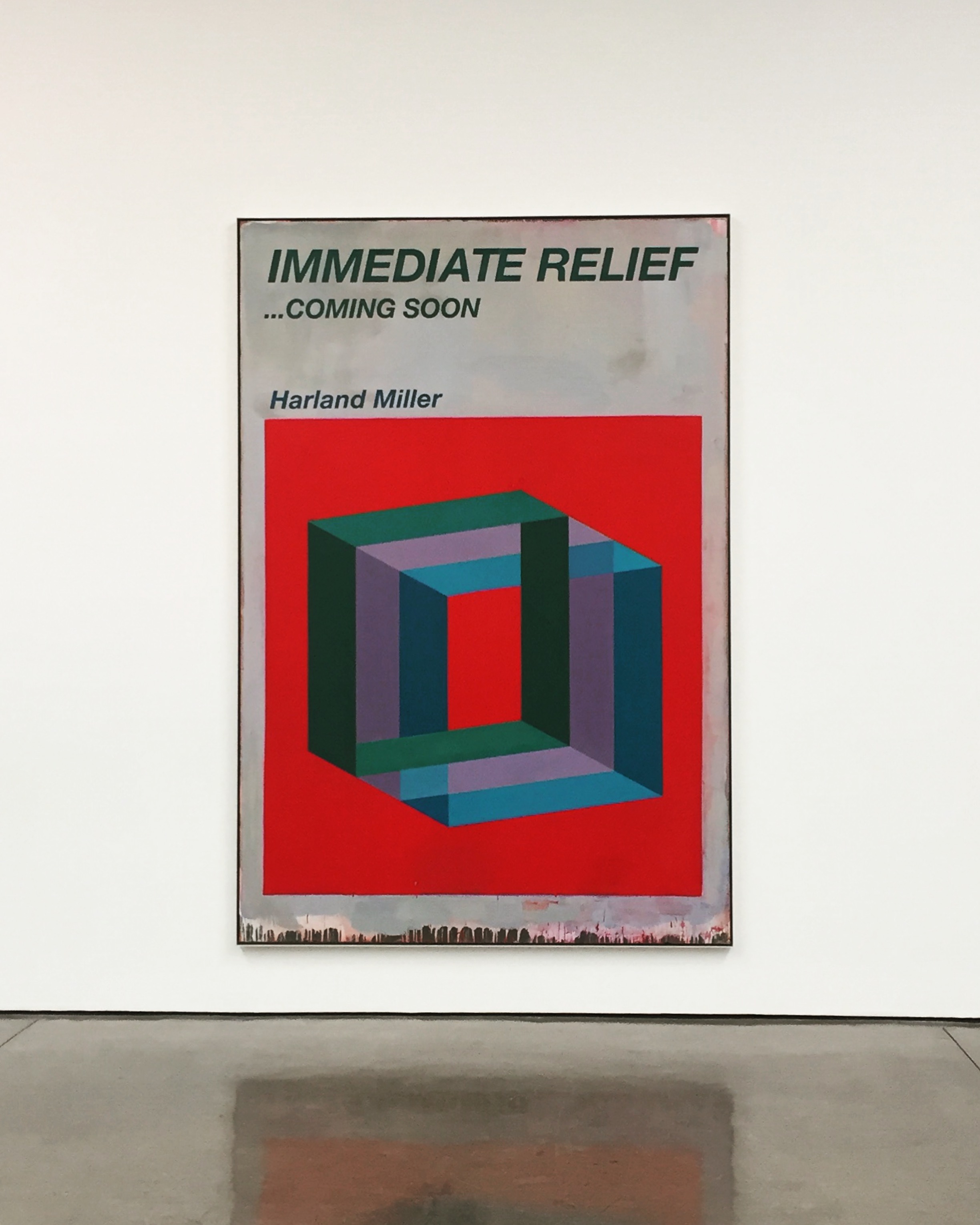
In Miller’s paintings, three-dimensional architectonic forms in bright, pop colours float against solid saturated backgrounds and are paired with fictional, sardonically humorous titles such as Reverse Psychology Isn’t Working (2017) and Immediate Relief … Coming Soon (2017). Occasionally, the same title appears on different compositions, highlighting how colour, forms and context can change both the rhythm and meaning of words.

Reverse Psychology Isn’t Working, Oil on canvas, 115 x 81 x 2 in. 2017
Immediate Relief … Coming Soon, Oil on canvas, 118 x 81 x 2 in. 2017

Similar to the titles, Miller’s abstract imagery can also be read in different ways. Commenting on the work Armageddon – Is It To Much To Ask? (2017), for example, he says: ‘it’s an image that you see one way – then, when you relax, it flips and, no matter how hard you try, you can’t see it the original way. It’s symbolic of the way you read the title.’ These words reflect a departure for the artist, whose previous series of Penguin paperback paintings were re-appropriations of an existing object. Here, for the first time, Miller creates his own designs, focusing more closely on the impact of the image itself.

Why Breathe In, Why Breath Out, Oil on canvas, Two panels, each: 75 x 61 x 2 in. 2017
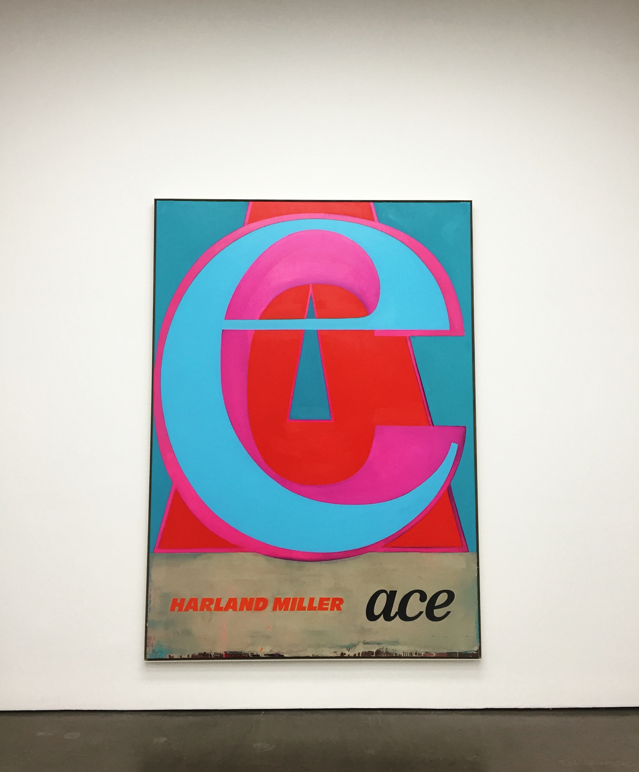
Ace, Oil on canvas, 105 x 75 x 2 in. 2017
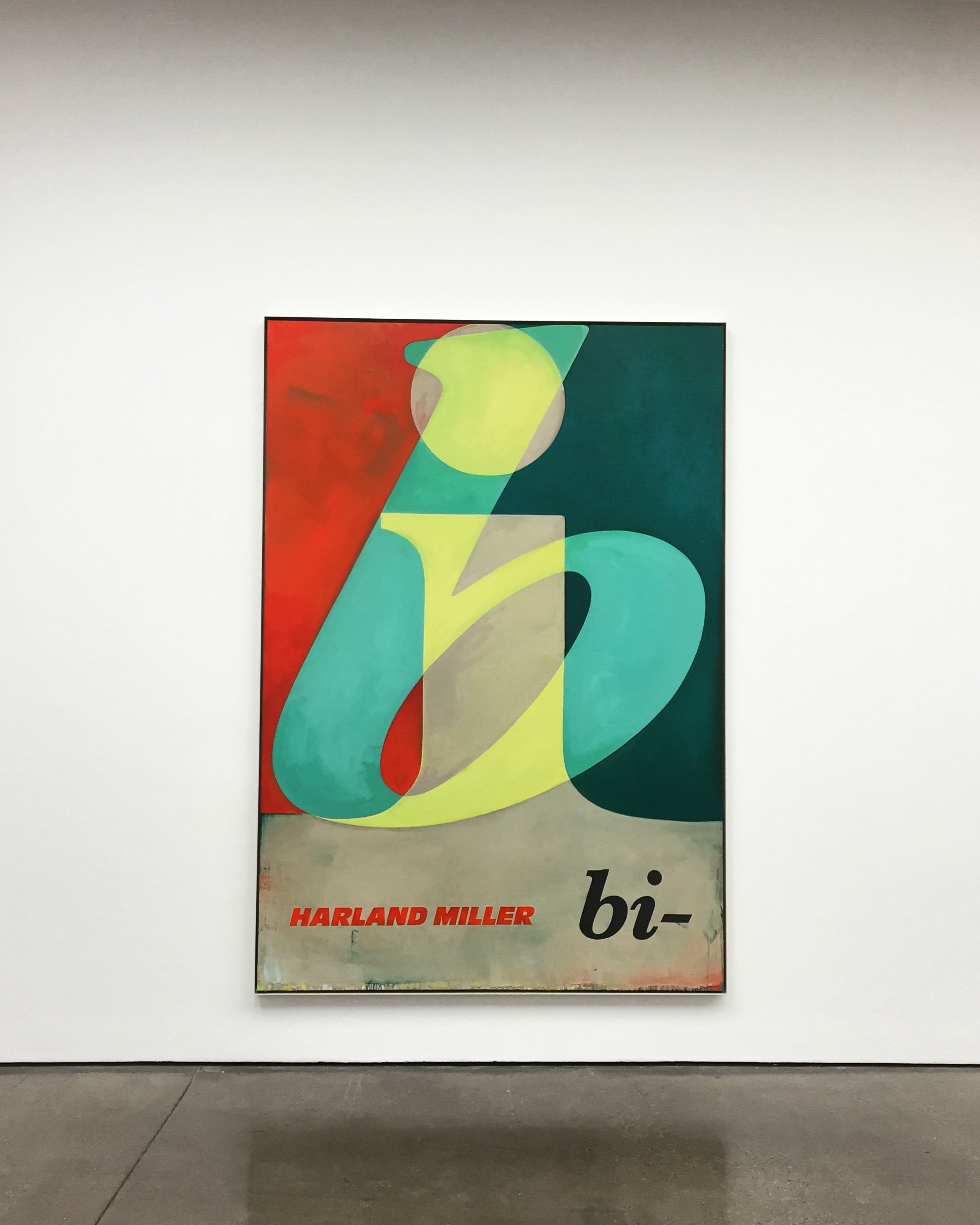
Bi, Oil on canvas, 104 x 72 x 2 in. 2017

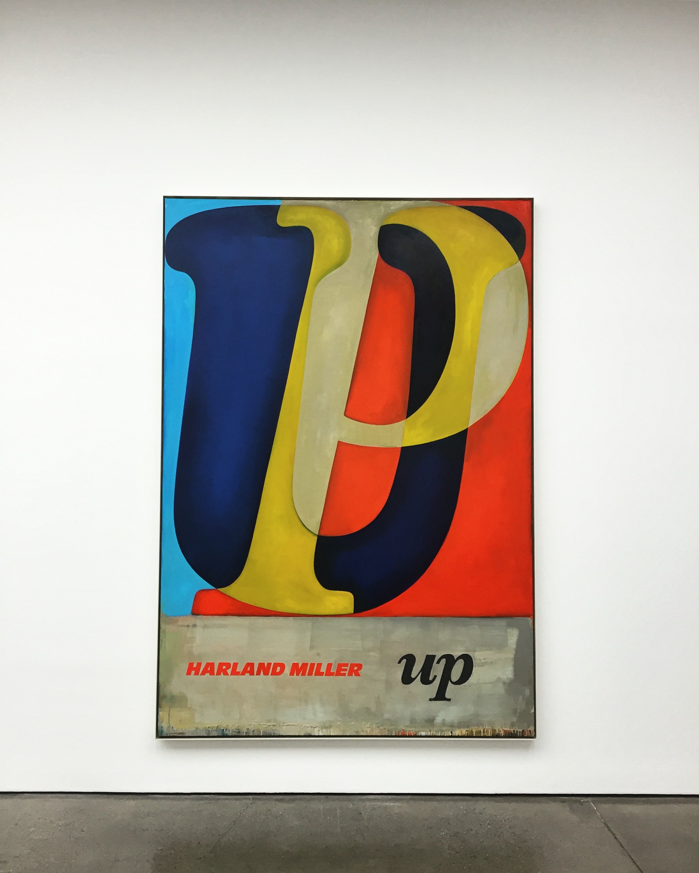
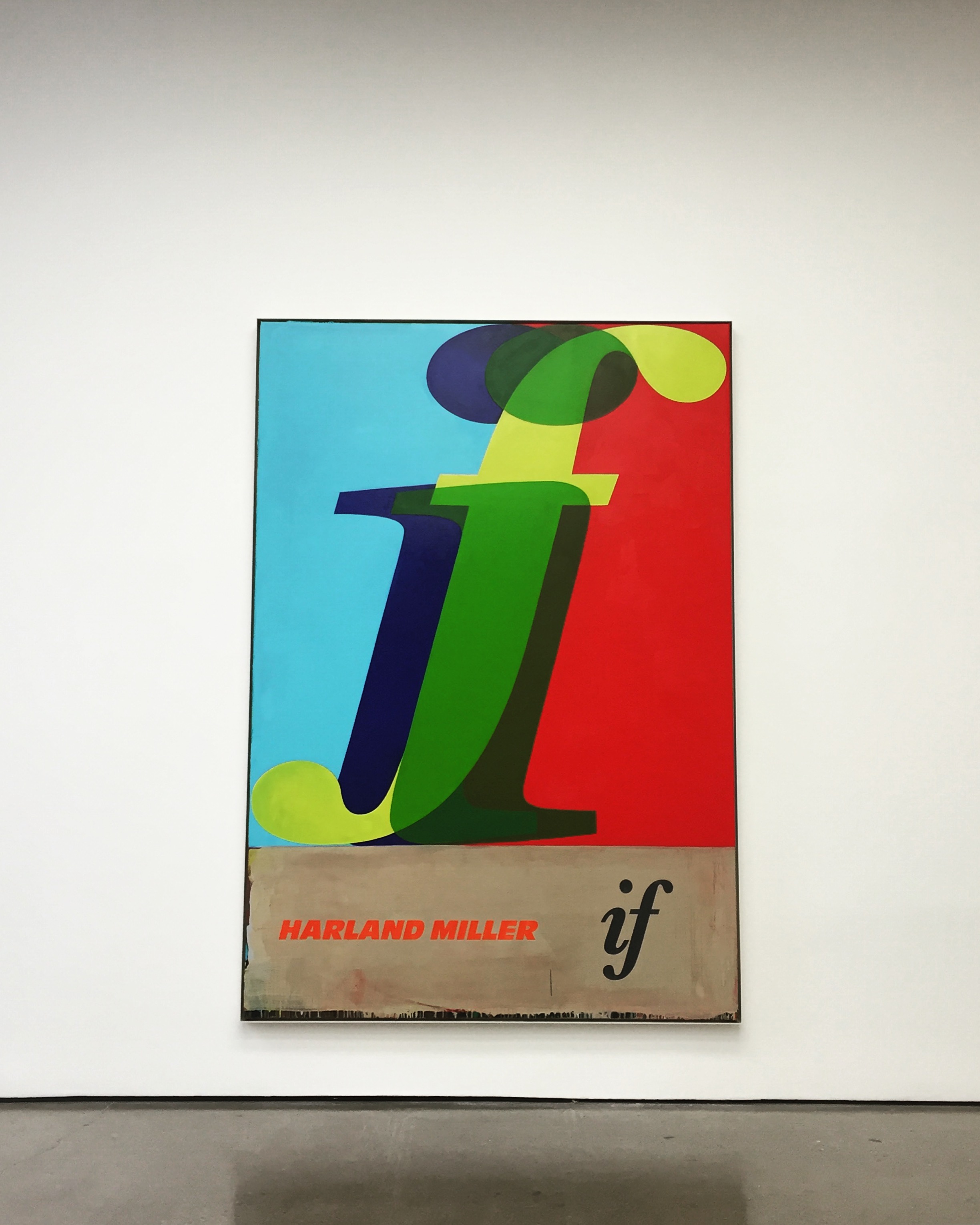
In another series of fictional book cover paintings, Miller depicts the outlines of letter in a range of typefaces and colours, intersected or layered over each other to create short, enigmatic words such as ‘Up’ or ‘If’.

Up, Oil on canvas, 104 x 73 x 2 in. 2017
If, Oil on canvas, 104 x 72 x 2 in. 2017

Through a process of isolation, overlaying and re-connecting, Miller creates a sense of depth in the image that deconstructs and abstracts the meaning of language itself. With their bold, saturated colours, these paintings reference American abstraction and, in particular, Robert Rauschenberg and Ed Ruscha’s use of vernacular signage and motifs. Miller has said about this series: ‘The idea is to make paintings that are just words, in contrast to the titles of previous works’.

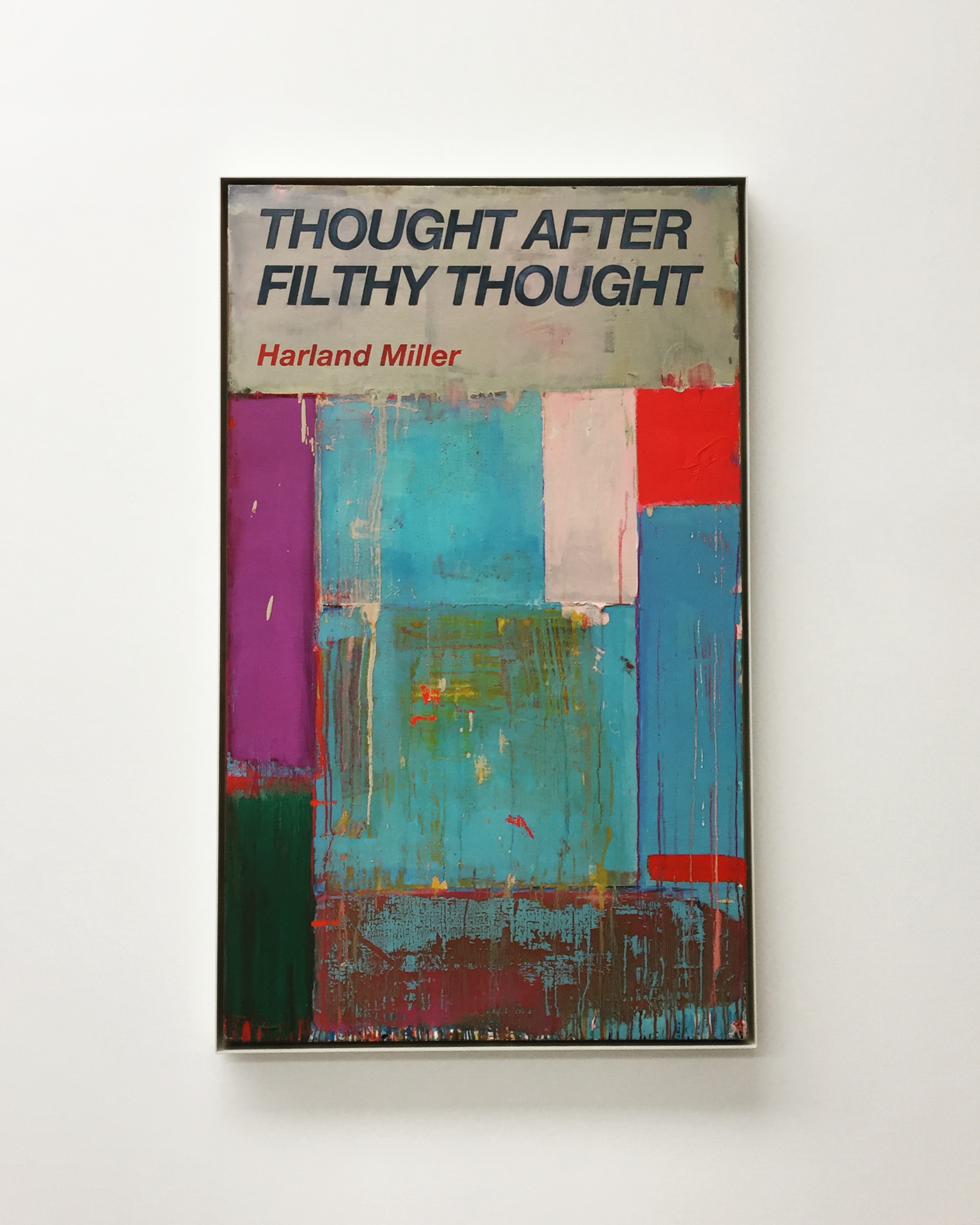
Thought After Filthy Thought, Oil on canvas, 60 x 36 x 2 in. 2017
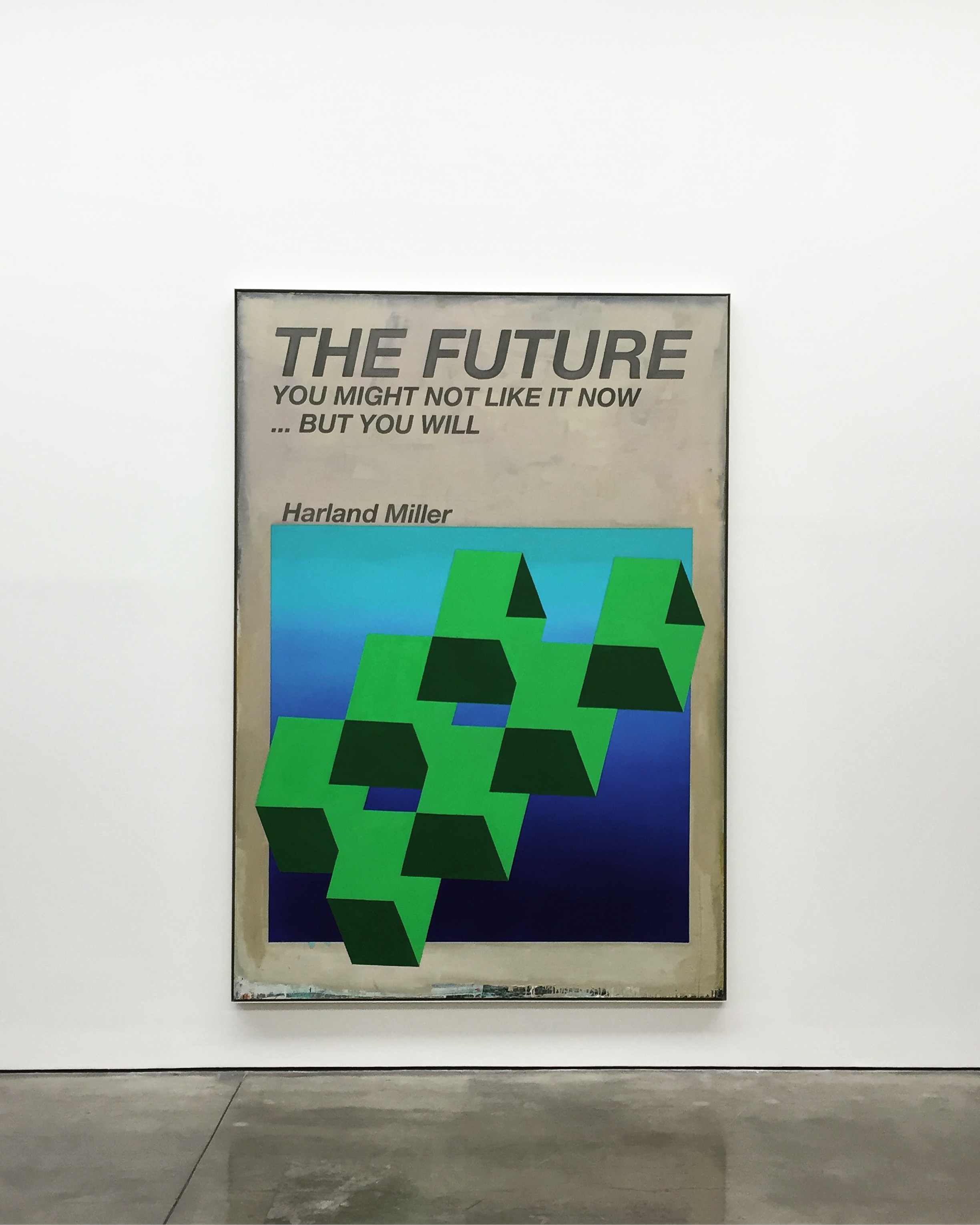
The Future, You May Not Like it Now, But You Will, Oil on canvas, 115 x 80 x 2 in. 2017


In both series of paintings the artist continues to use his own name as author. While the presence of Miller’s name alludes to the actual authorship of both image and text, fact and fiction became blurred, allowing for the artist’s deadpan humour to provoke, question and draw attention to the context and content of each work.

Wherever You Are, Whatever You’re Doing, This One’s For You, Oil on canvas, 112 x 77 x 2 in. 2017
Circling The Small Ads, Oil on canvas, 109 x 72 x 2 in. 2017


Photos: Art Road

Notes: White Cube Gallery

This is a communication between me and the forms, and the audience or viewer

Your paintings are mainly abstract expressionism, do you start them like this (in abstract) while doing the sketches or do they get to this point at the end? 

I start them as abstract, with pure form, and meanwhile while I am working on them, I might use stuff from nature and purposely make it a tree, or a body. I then crash them, and transform them again into abstraction. I am not pointing straight to, say, a chair. Rather, if the painting ends up to be a chair, it ends up there via an organic process of construction and destruction.

Also, the abstract paintings are rotated 90 degrees and repainted, and rotated again, and so on.

There is a unique and deep personal atmosphere in your work, and sort of by looking at them I got the feeling that the image is getting destroyed and maybe is destroying itself, but all of the sudden, in the middle or even in a corner I’ll find something that is taking shape and it holds and protects the whole image. Am I right? Can you explain about this? 

Yes. That’s right. The thing about the forms, I don’t want to limit the viewer to some stupid circle or rectangle, so purposely I let them relate the forms to the world outside the canvas. I am not able to be limited. The painting’s forms keep changing. They keep crashing; coming back again. So hard to translate in English! This is a communication between me and the forms, and the audience or viewer. Take the viewer inside, and bring him out.

Are there any stories behind your paintings? Could you explain the story behind a few of them and tell us what’s happening? 

Rain: It started with pure abstract forms, and I noticed that some forms looked like rain on a window on a sad rainy day, and so I purposely changed the colors to be sad. They also looked like a bulb that is melting.

pastel & acrylic on cardboard, 18″x14″

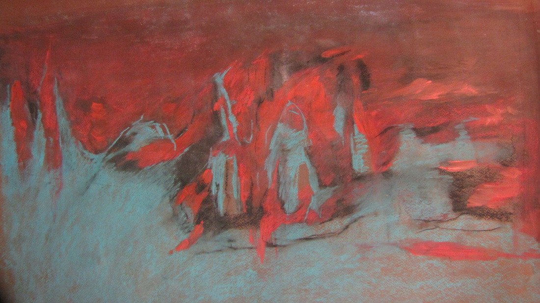
Untitled: It is purposely coming from nature, inspired by mountain and ocean, because the mountain came out from the ocean. The forms from the mountains are so sharp, and even though they’re often gray, their sharpness is represented by the color, and they have for many years been hidden under water, and have now emerged saying they are here.

pastel & acrylic on cardboard, 22″x24″

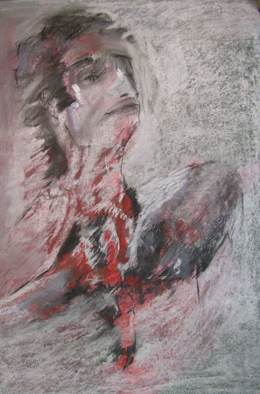
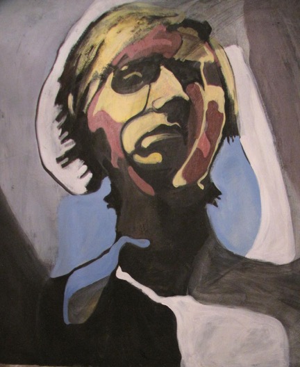
Portrait: This is a portrait from a model, and a poster for one of my exhibitions in Iran. Mostly when I am painting the people I am trying to show the emotion at that moment, whether in a studio or a coffee shop, and adding my own feelings, and exaggerating the emotion. The portrait in this case, he looks so proud, and from some corners falling apart, but is nevertheless so straight.

pastel & acrylic on cardboard, 24″x26″

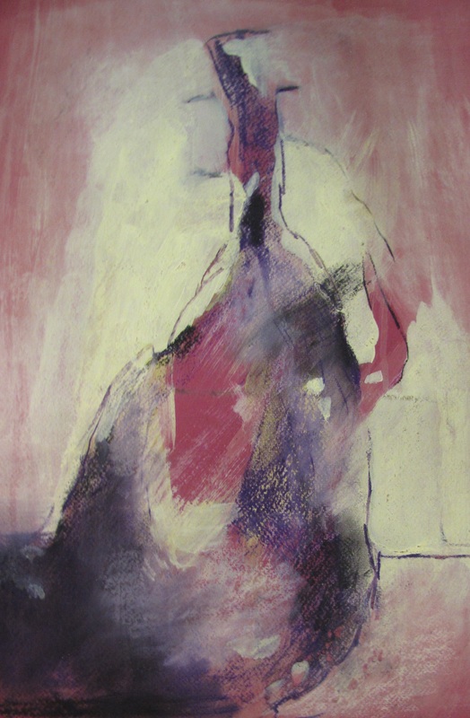
Vase: This is painted from a real vase. When I look at a real figure or still life I look at them as a different thing. For still life I feel they still have a soul; they talk to you and have a story, the people that were with them, around them; then you can connect to them, see the colors, and let them go through your filter, and passes from your filter. With my filter in my eyes, I show it to people. People with normal eyes can’t see what I see. Even a normal vase that looks old or ugly, through an artist’s eyes it can look like a million dollars. That’s the job of artists, to show you the beauty, to show viewers what they can’t see, to change the world around them.

pastel & acrylic on cardboard, 18″x16″

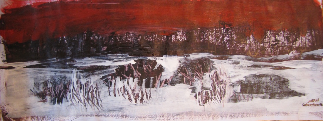
A small sketch, painted very quickly, maybe 10 minutes. A view to downtown on a cold winter day. I like to have a contrast between the two or three colors, capturing attention of the viewer.

pen & acrylic on glossy paper, 10″x6″

Now talking about the colours; the viewer will deeply get involved with the colours in a way that I was cogitating about my own issues and problems while looking at your paintings, do you start every painting like this? I mean are you struggling with something in your head? Is that your intention to involve the viewer like this? 

The colors come from my palette, sometimes I narrow myself to cold, or warm, colors; and sometimes all are there, but I only use three or four. I let my emotion take me to my color choices, especially pastel paintings. If you uncover, or x-ray, my paintings you will be surprised to find layer after layer of things covered over. For example, I try to keep a tone in my paintings, and a contrast, especially between dark and light, so usually the colors come emotionally, unless in some other painting I decide that the piece should only be with two or three colors, and I choose the frame and choose the colors, say red and white, and I imagine the color, and if during the painting the concept is not good, I change. But usually my imagination is good, and I don’t have to change. I want to surprise people by the color, and tell another story with the color. Color is the main thing in our life that we pick in our clothes and other items and we express ourselves via color; it tells others about our personality. I don’t like dead colors. As much as you see the world colorful, you’re much happier. I want sharp colors, red, and green, blue, to show more life.

Is there a reason for using mainly pastels? 

The pastels at the web site were those shown at one of my exhibitions. I do acrylic, pastel, oil, and everything. I enjoy mixed media, for example combining acrylic and pastel, and it can be soft, and hard, and you can use your fingers. Pastel I enjoy because it’s easy to get texture and emotion, and easy to mix with acrylic.

Is this a self-portrait? Personally, the way that you’ve used yellow, with all those shadows and shades and how you’re looking down at us, gives me the feeling that you are sad and mad about something.

No, that’s not a self-portrait. That’s from someone else, a model. I was trying to show very sad, and purposely picked yellow, because yellow — *that* yellow — shows sadness. Trying to show his abstract forms. The muscles on his face that I see, I divided them into specific geometric shapes, and by that, and the colors that I pick, trying to show his emotion. I hope the viewer can contact with that emotion, and feel it.

acrylic on canvas,40’x40′

Where do you get your inspirations? 

My inspiration comes from many things, especially from the people I see, and guessing what they do, what is their character. Same for nature. If I see a place, I paint it, but make it my own. Some are from dreams; I wake and paint them. Some from my emotions, if I am sad and depressed, I start painting to make myself calm down.

Could you explain the concept behind your sculptures? 

The concepts behind my sculpture begin from a thousand two-dimensional sketches. Then pick 100 from the thousand, and then 20, and then 5, and finally a three dimensional shape is selected. You have a lot of things in your brain, leading to the thousand sketches, but most are not good. Coming from things you saw, things you feel. But from these one must select just the right few. Pick the five, and then starting to build a small model. After the model I decide which material I should pick. I am mostly trying to build something that is like a new myth. Old Greek myths — Gods and creatures — but it’s time to introduce to people *new* myths, and tell their story.

How do you choose your materials? 

Usually when I cast, I cast bronze and aluminium, and then I decide if the statue is better in bronze or aluminium. Or, before casting I might decide it has to be, say, just in wood. The subject talks to you while you are building the model, and tells you what material is the right one.

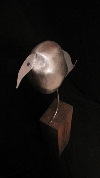
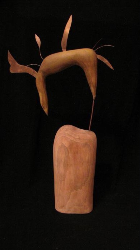
Why you’ve mixed metal with wood for those two birds? Is there any special reason for this? 

As you see in my paintings, I don’t limit myself. I don’t do old-fashioned watercolor, or old-fashioned acrylic. I try to bring things together and mix them, and have a new structure. The texture between the metal and wood — and you even see it in modern interior design — it gives the feeling of pure nature, and human, because humans build the metal, yet wild from the wood.

aluminum, 45″x20″

Whatever humans built throughout the centuries, the metal is rough. But wood is soft, and from nature. The contrast, like in my paintings, is between rough and soft, and there is a philosophy behind them — their combination is conflict: beauty in conflict. You see the total opposites, in both my paintings and sculpture.

pear tree wood, bronze sheet, 24’x12″

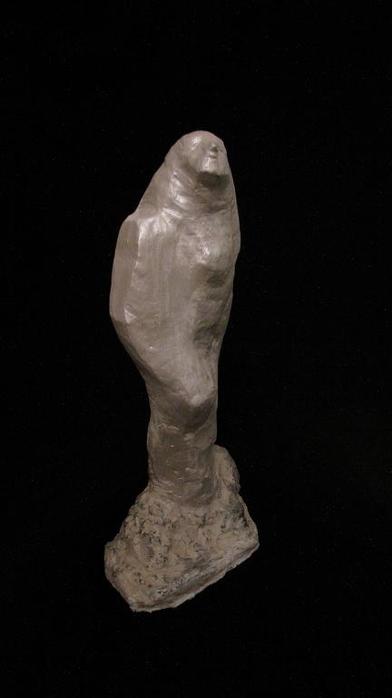
This one reminds me of Auguste Rodin’s “Balzac”, did he inspire you?

I love Rodin, but there is a funny story. When I did this piece I wasn’t thinking about him, but perhaps I was unconsciously inspired. That was leftover plaster from a previous mold. I began to shape the plaster while it was still soft, and it happened in fifteen minutes, ending up with this figure, a woman looking up, standing on rocks. I finished the entire thing in an hour, after coloring and doing the patina.

plaster, 16″

Photo Credit: Raheleh Baghri

Interviewed by Art Road

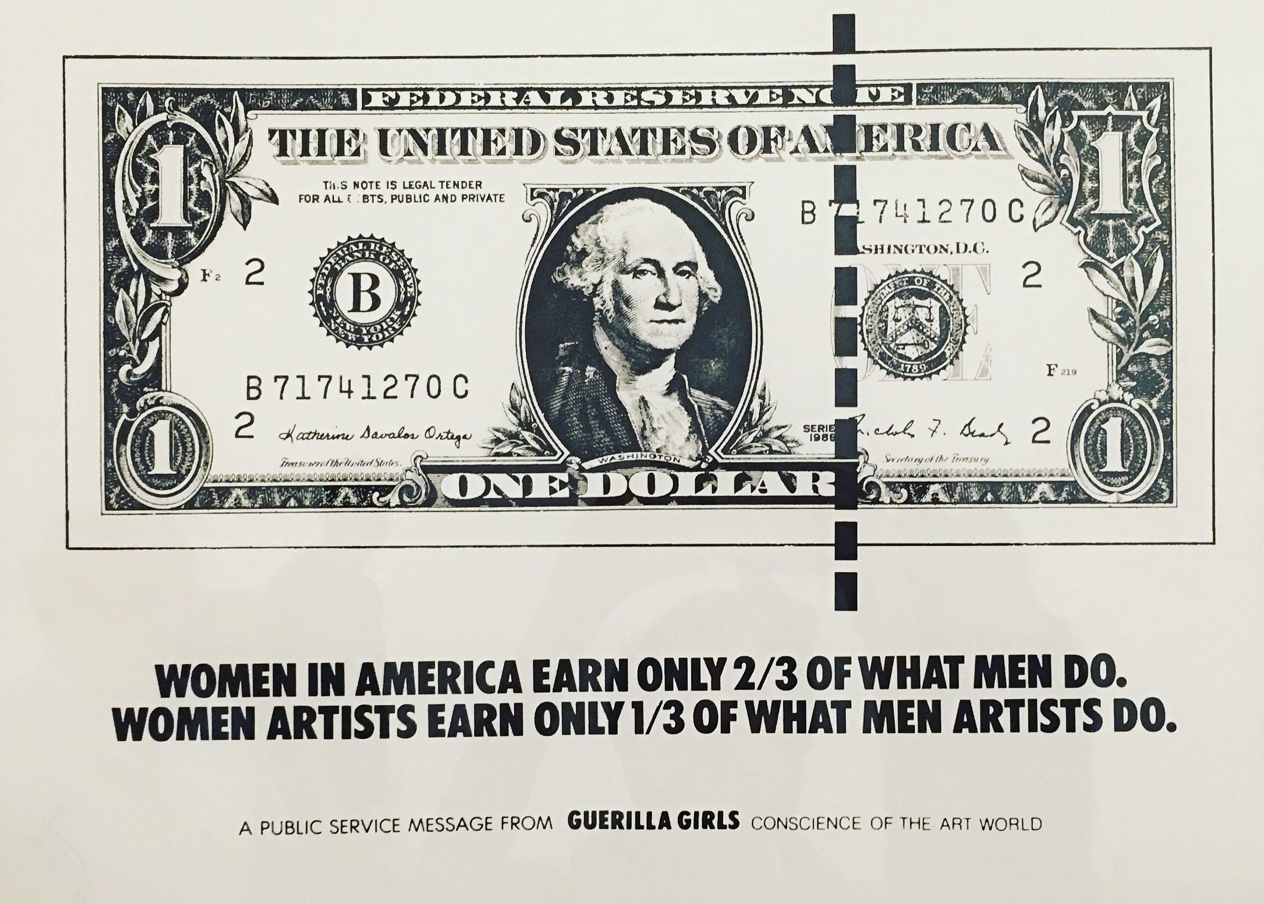
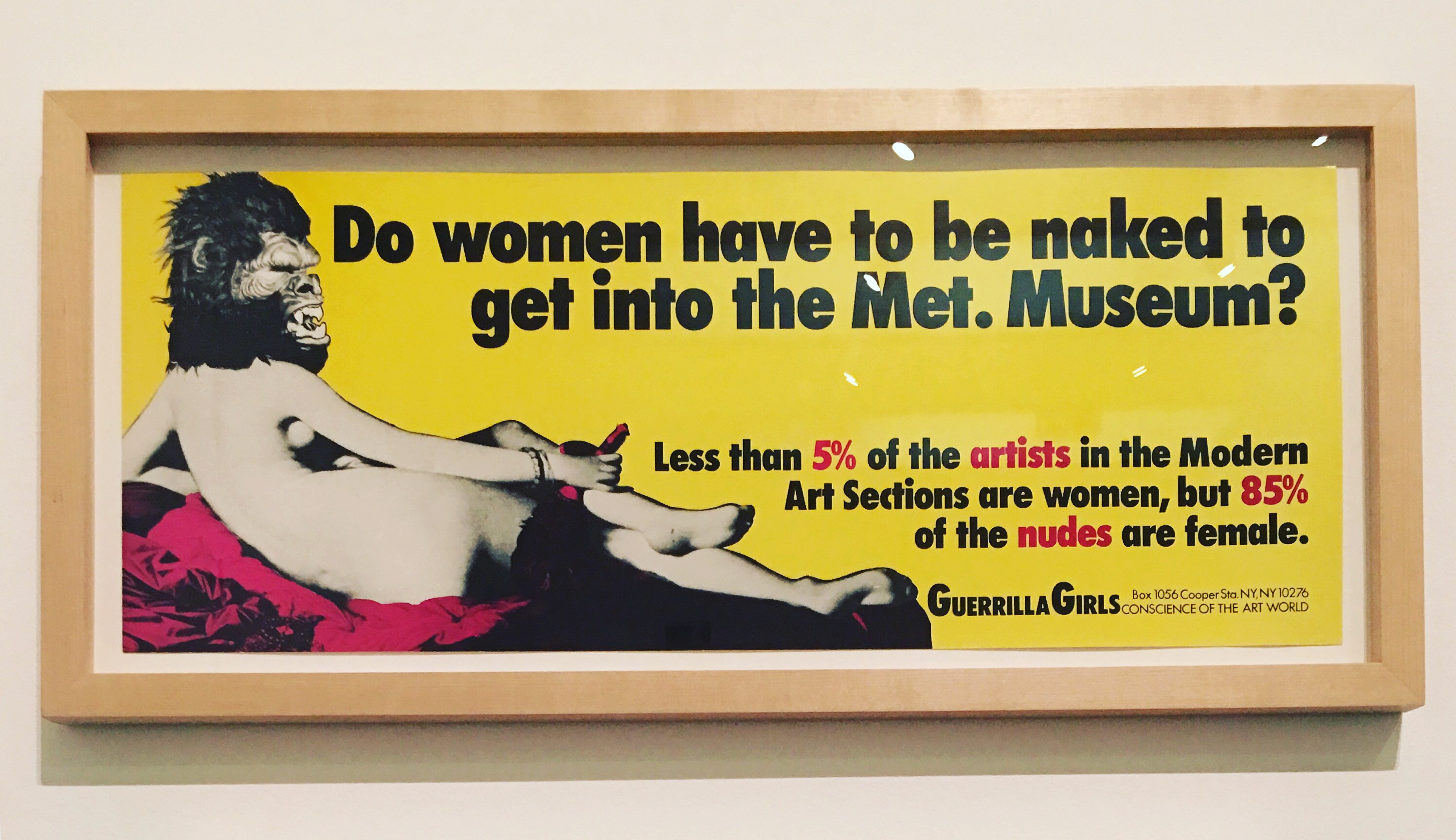
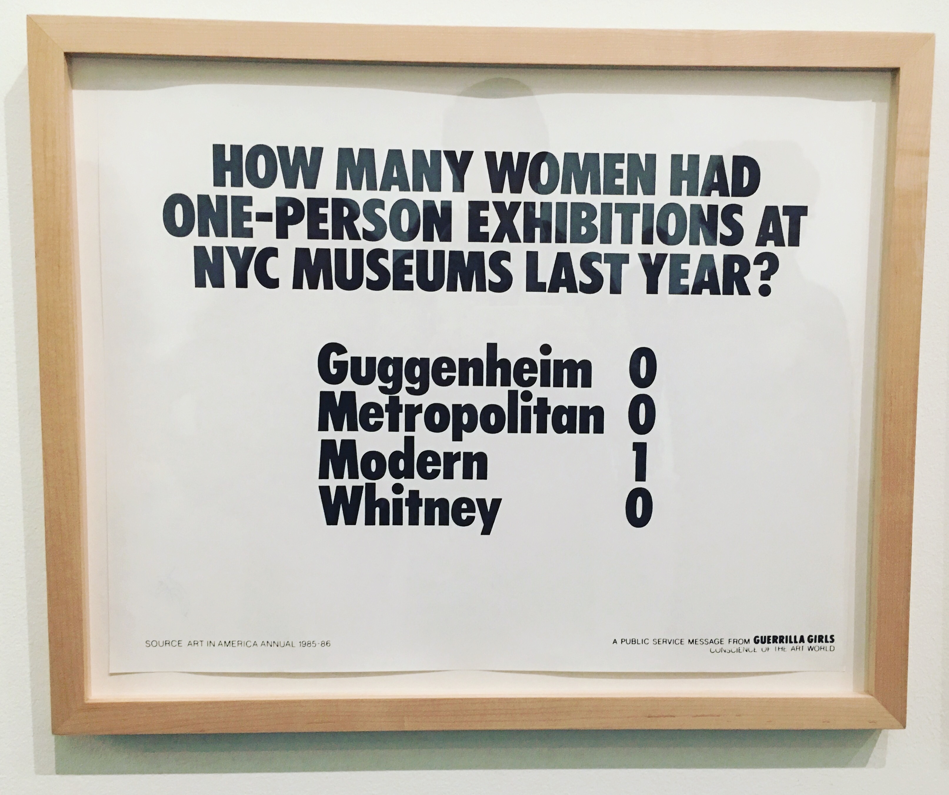
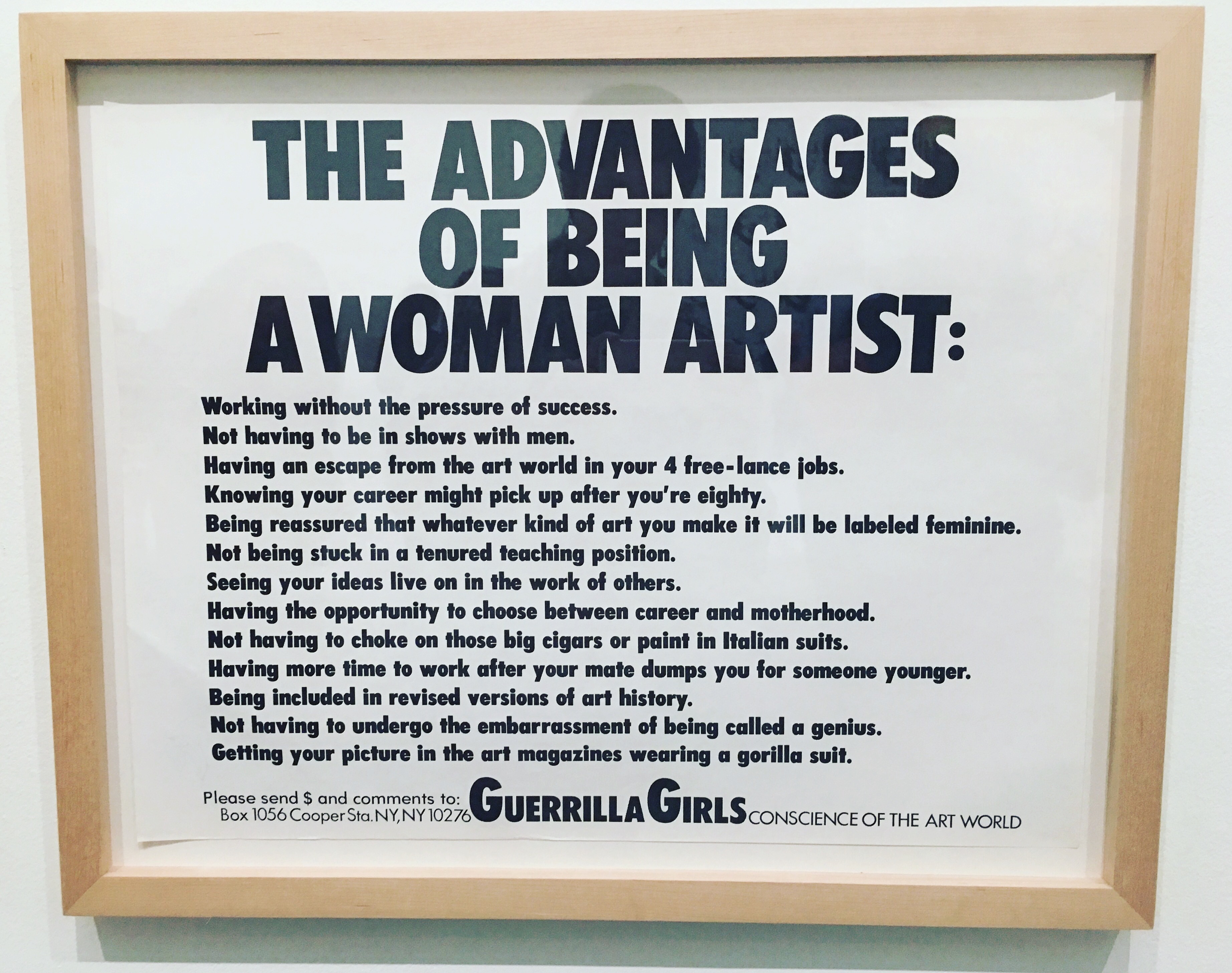
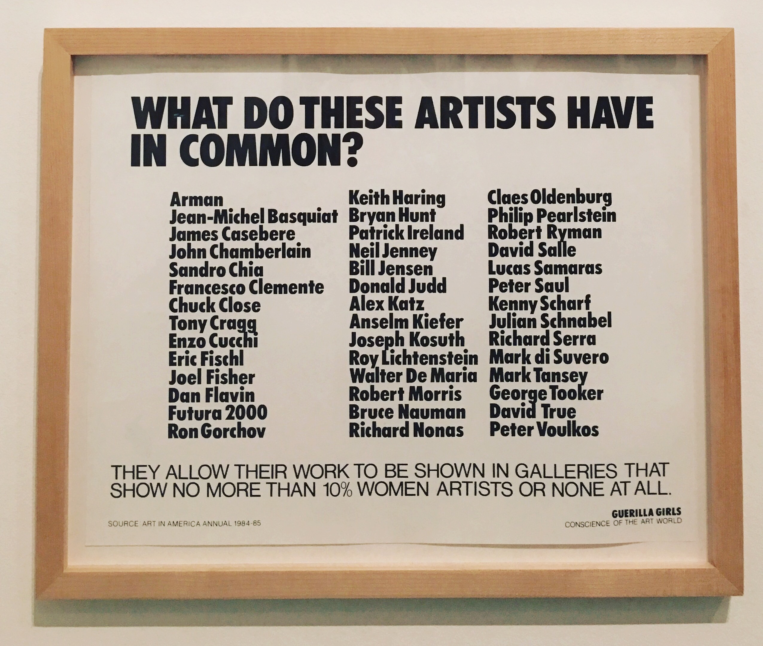
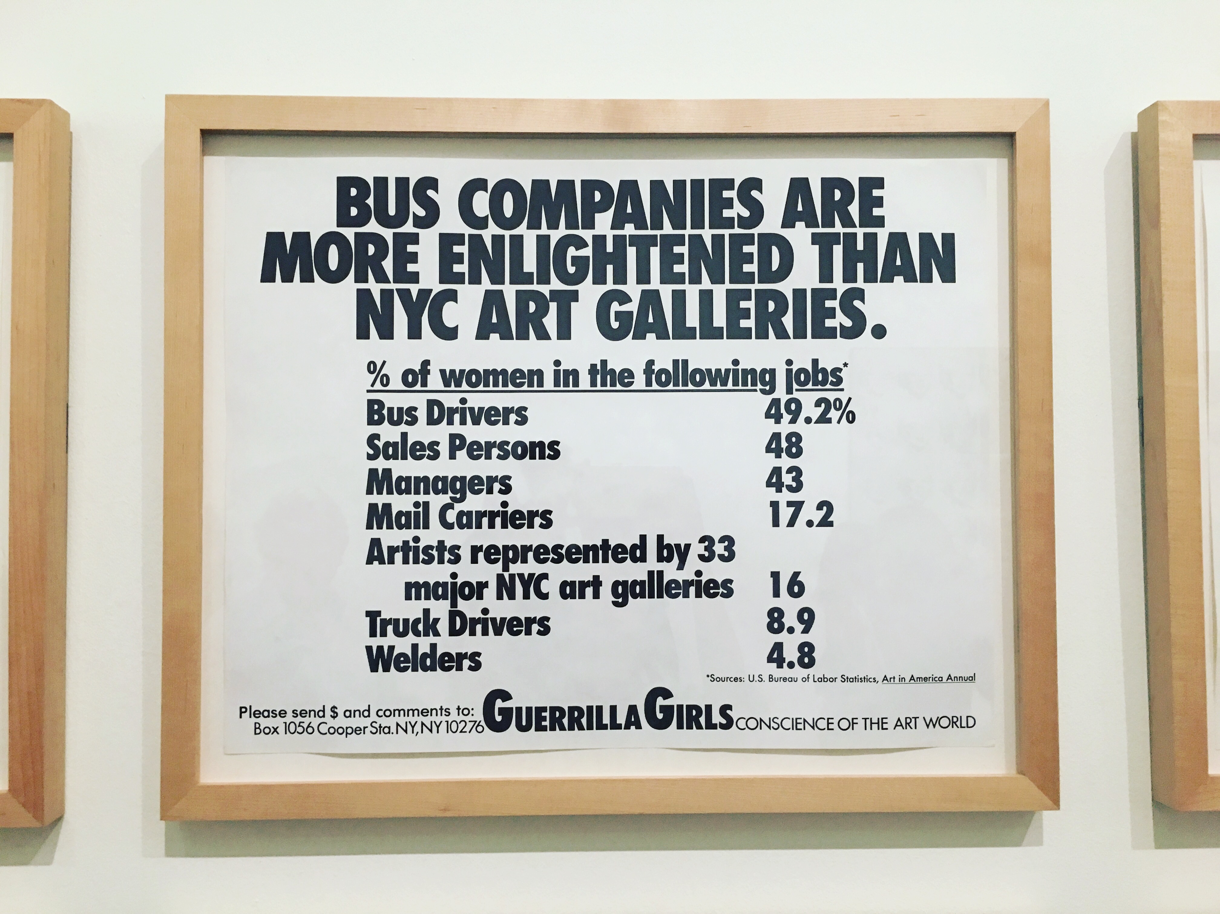
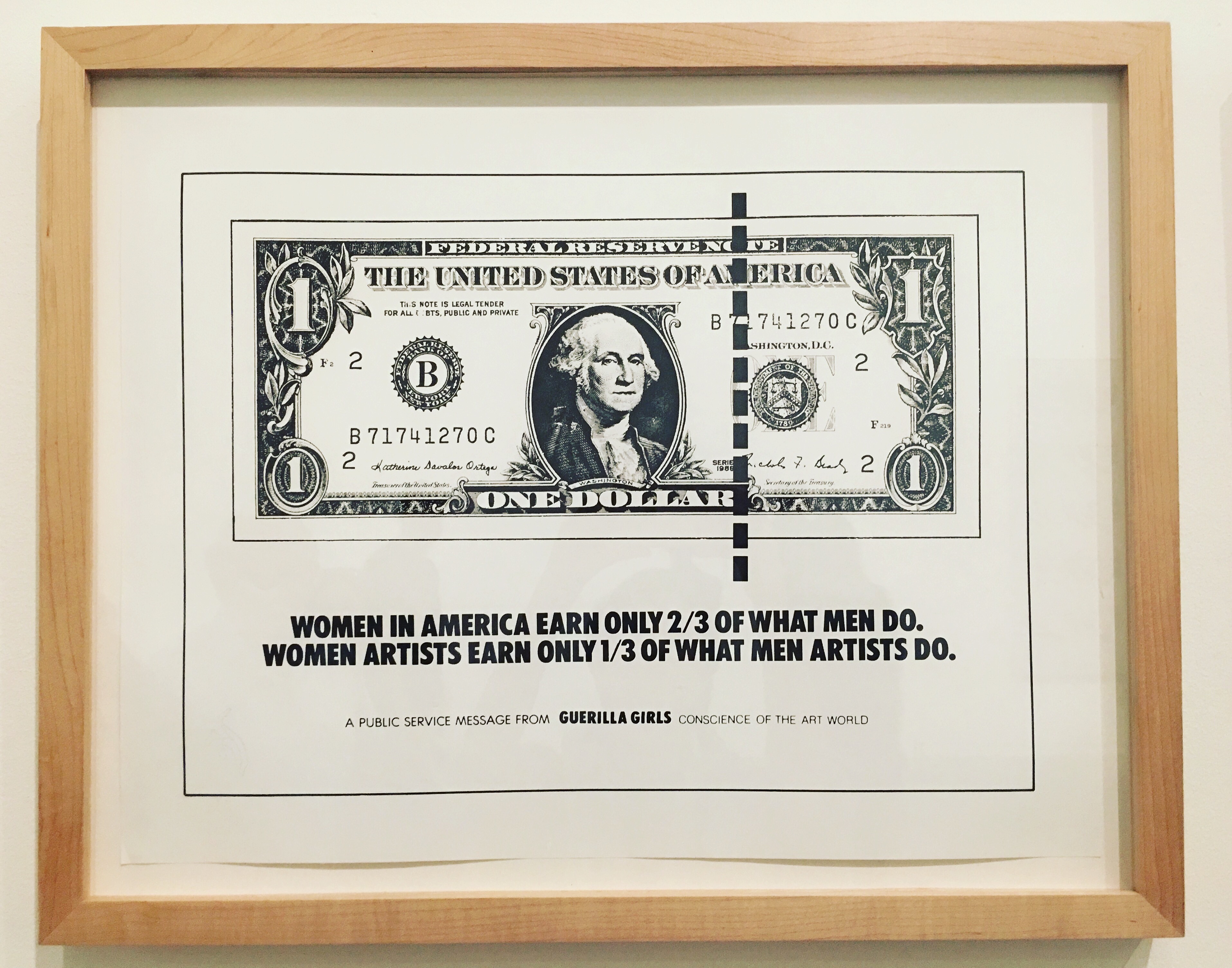
Guerrilla Girls

Guerrilla Girls

Guerrilla Girls Talk Back 1985 – 90

Screenprints on paper

ww

Formed in 1985, the Guerrilla Girls are an anonymous activist group who highlight discrimination in the art world. Their targets include museums, dealers, curators and art critics.

They fly-posted their first posters overnight in the fashionable New York art district of SoHo, and have also displayed their work as advertisements on city buses.

b

bb

Over the years their attacks on sexism have widened to other areas of social, racial and gender-based inequality.

The Guerrilla Girls wear gorilla masks for public appearances and use the names of famous deceased artists and writers as pseudonyms.

image5

image6

ss

Tate Modern

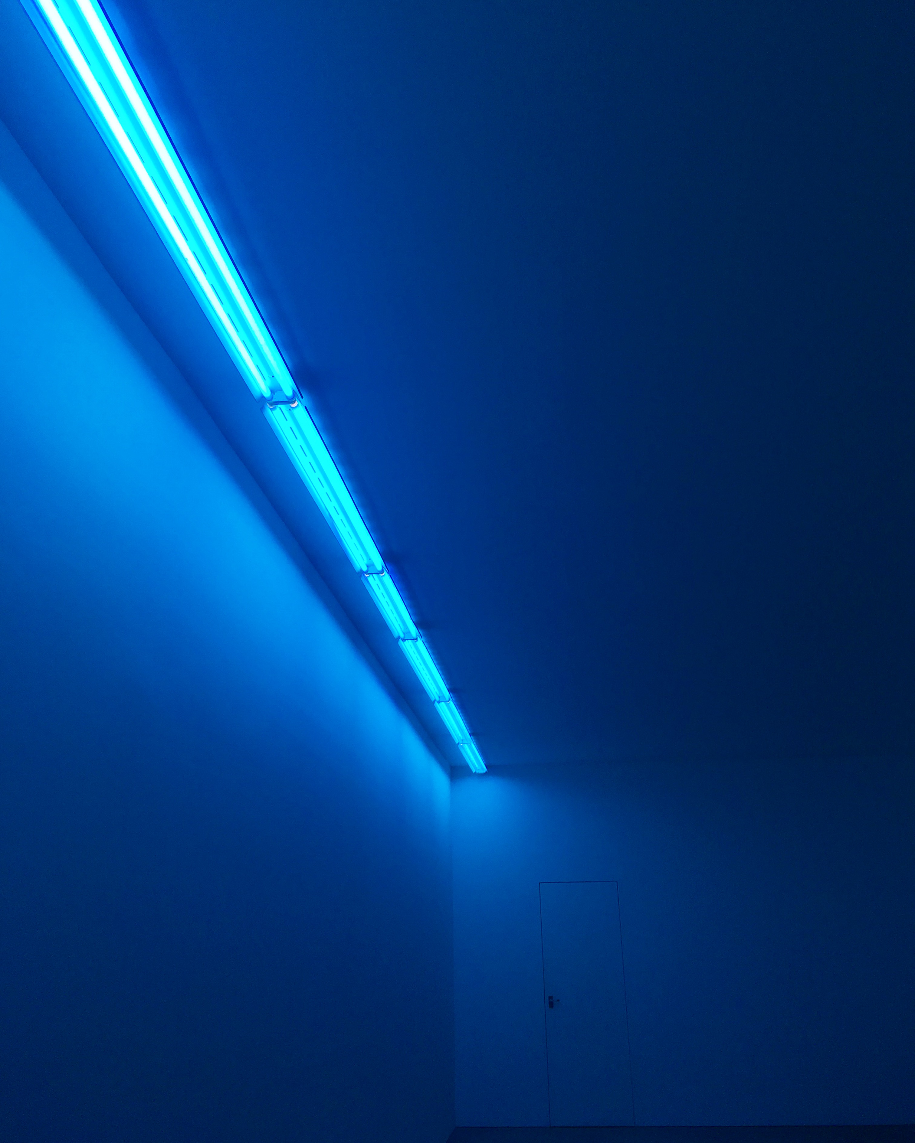
Natural Light, Blue Light Room

image11

Now on Blain Southern, London


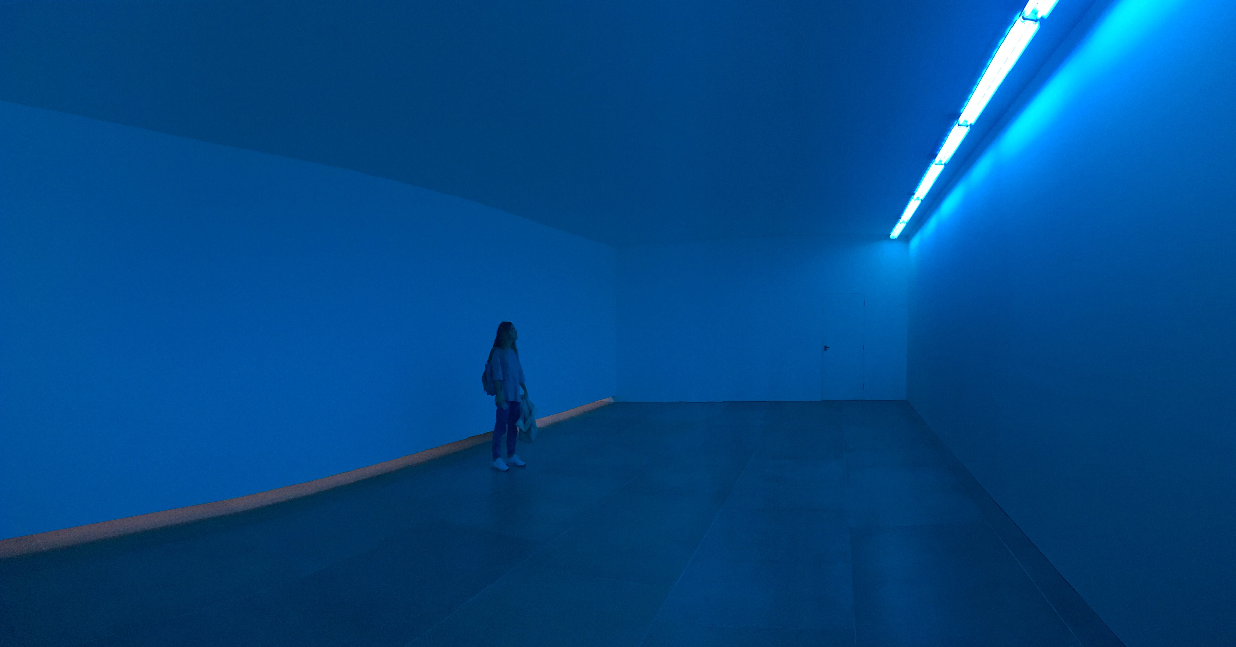
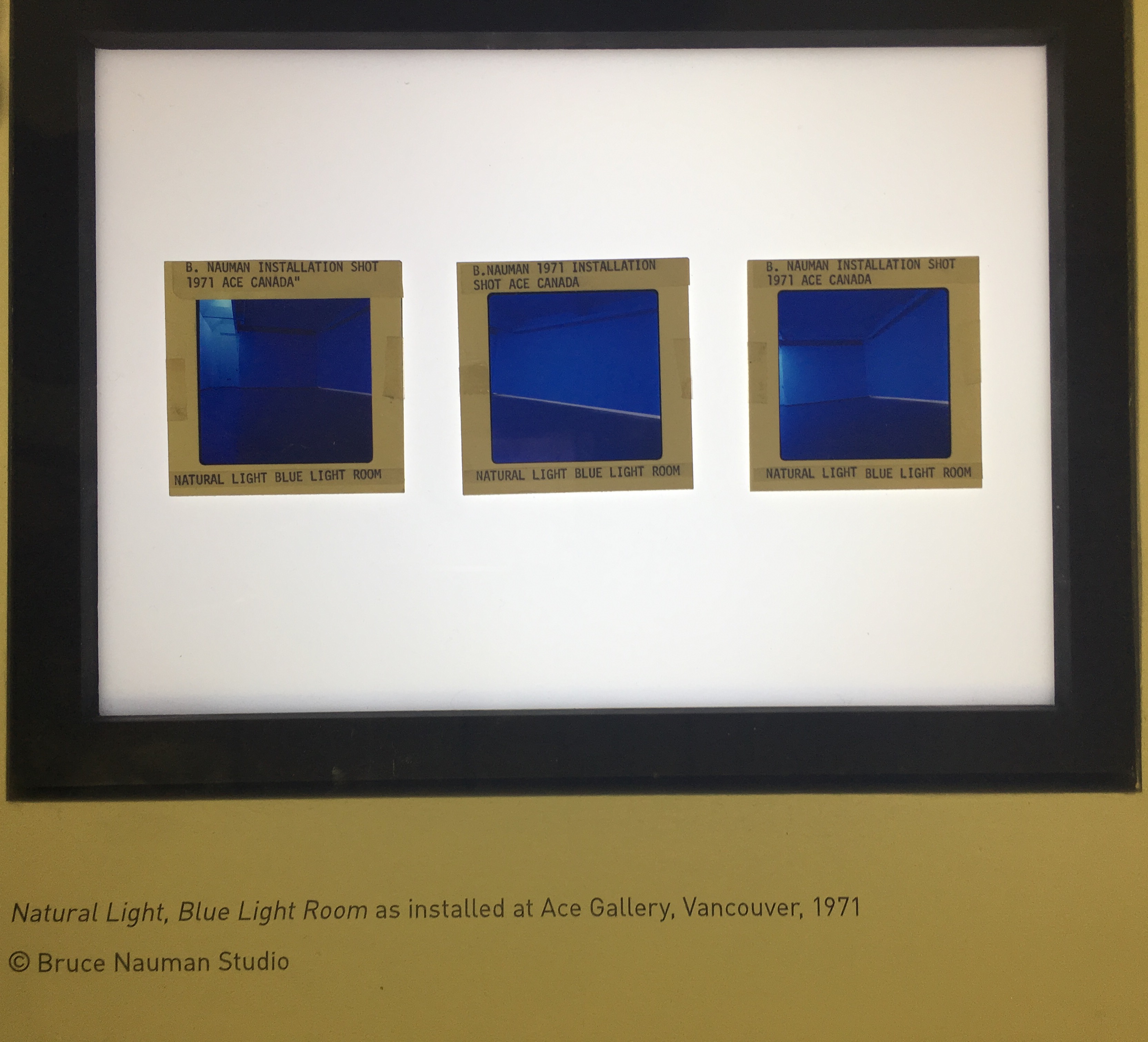
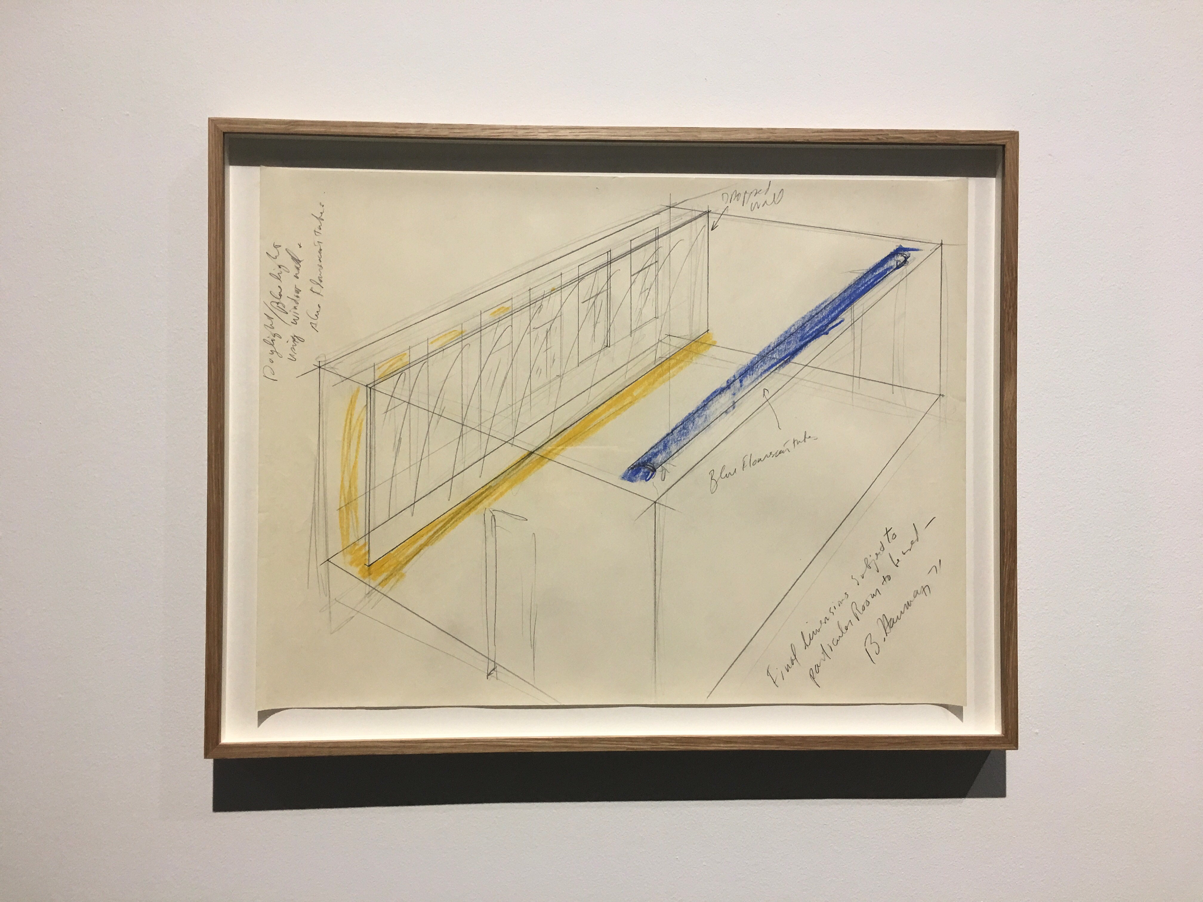
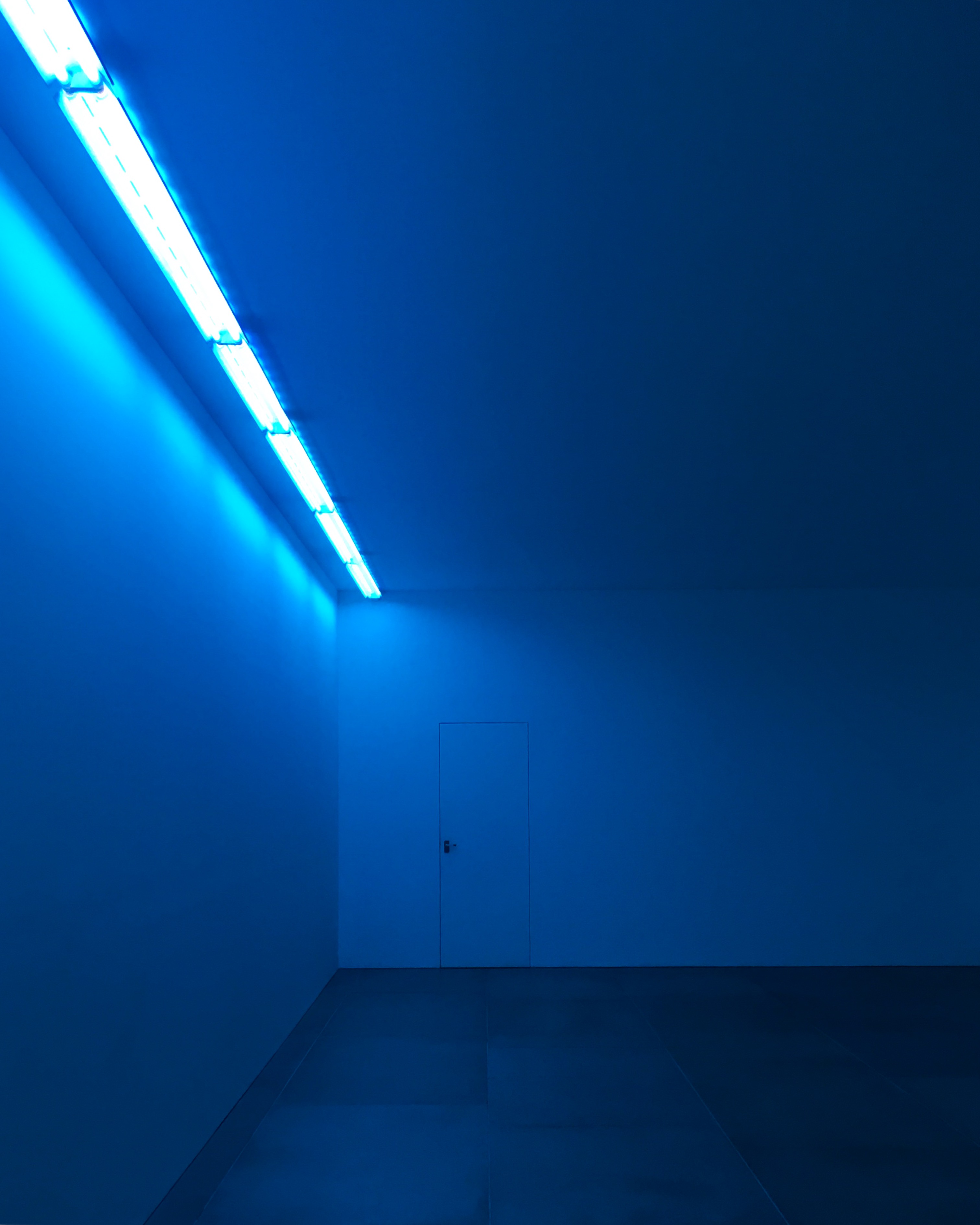
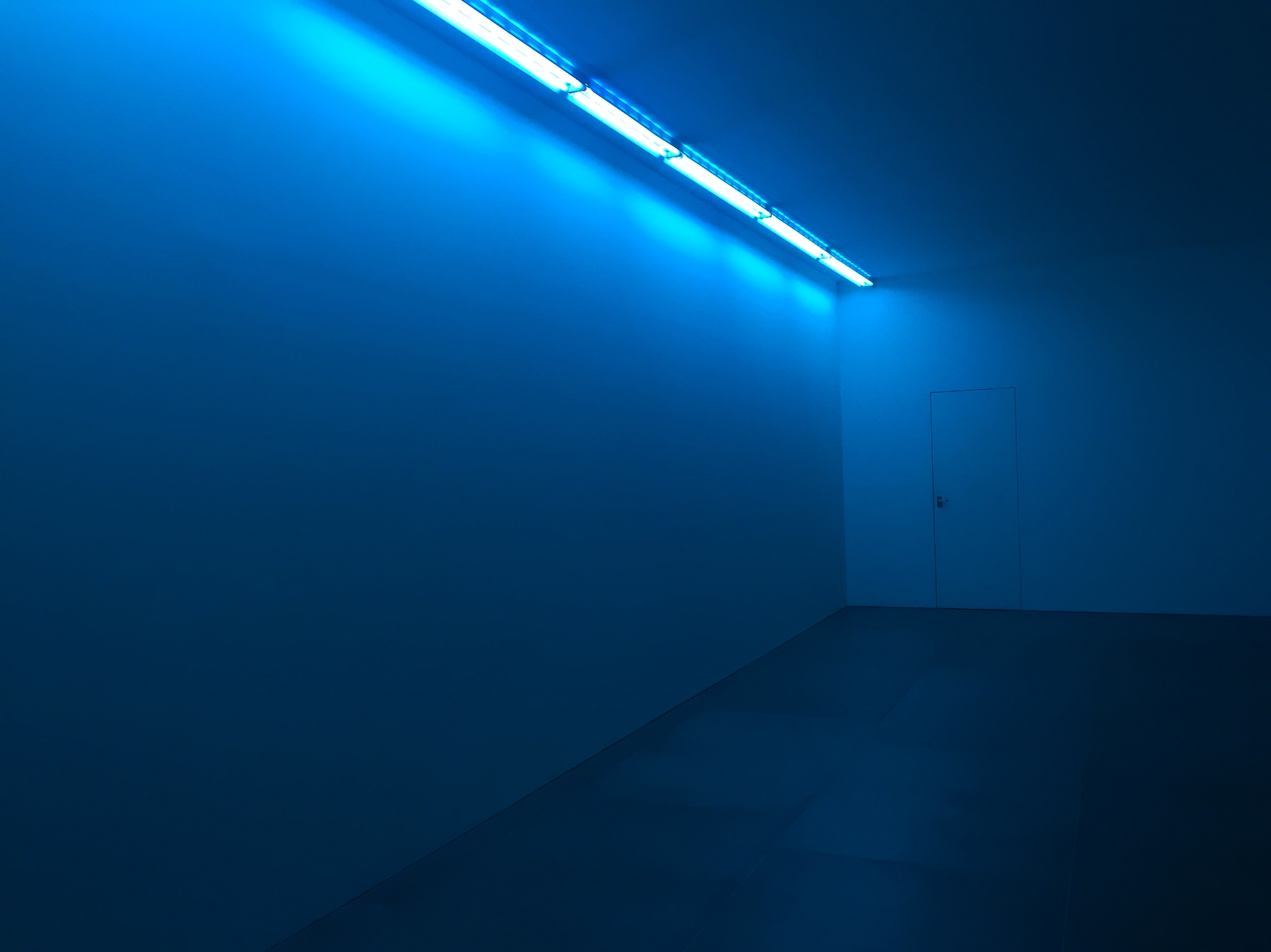
Natural Light, Blue Light Room is one of a number of environment made by Bruce Nauman between 1969 and 1974 that transforms a traditional galley from a room of discrete objects into a space that provokes a perceptual experience in the viewer the environments also served to change the viewer from a passive beholder to an active performer within the artwork.

image5

In the late 1960s, Nauman made a number of videos that showed the artist performing absurd or mundane activities in his studio space, such as Stamping in the Studio or Slow Angle Walk (Beckett Walk) (both1968).

image1-1

In January 1972, about a month after Natural Light, Blue Light Room was exhibited, Nauman was asked about this transition from artist as subject and performer in the videos, to the architectural installations, where the viewer takes on these roles. ‘ I began thinking about how to present this without making a performance,’ he said, ‘so that somebody else would have the same experience, instead of just having to watch me have that experience.’

image1
image2

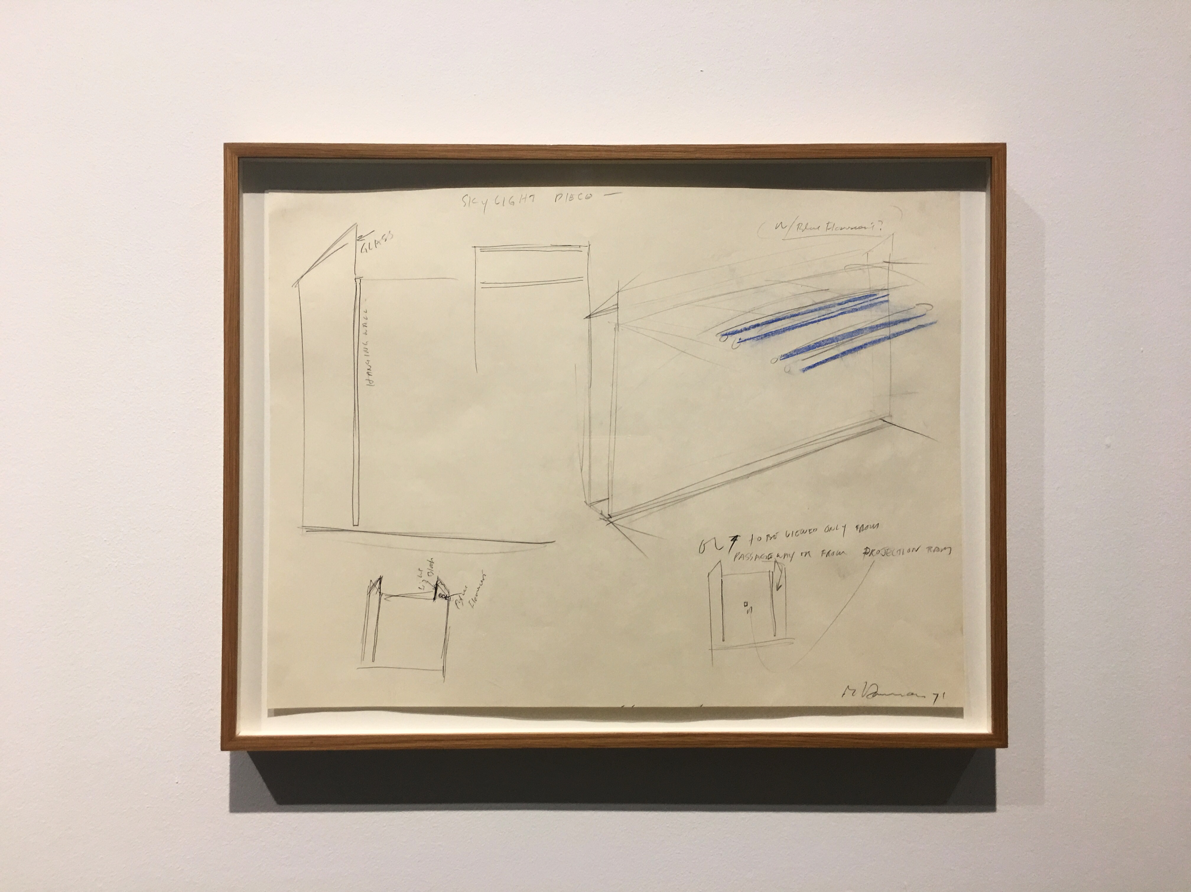
Natural Light, Blue Light Room emerged amid these concerns with space, performance, the movement of the body and perceptual experience.

When you enter the space, you might be struck by its emptiness: instead of a gallery with objects, you have an open space with a silver of natural light along the lower side of one wall and, on the other, a peculiar blue light. The gallery has been altered to discombobulate you, the viewer, who has now become the performer within the space. While the natural light changes according to the time of the day and climactic conditions, the blue light offers a constant glow. You might experience elation, confusion, even annoyance: but the room will always induce a certain kind of awareness.

Each viewer will, of curse, respond differently to the space, and each performance within it will be distinct. Part of the artwork, then, is to observe others in the space, measure their responses, and to experience the strange awareness of not only your state of mind under certain conditions, but of others in the gallery.

image4

image3

Notes from Blain Southern.

Dreaming Under The Water

In western scientific concept it is believed that universe is created by the four elements : Water, Air, Fire and Earth.

Each of these elements contains its own unique characterize, and It cannot be told whether they’re good or bad, although each element has both positive and negative sides. Nobody is perfect and whatever your personality is, you have both pros and cons.

It is so important to know your element, in order to figure out your basic emotions, desires, strengths and weaknesses.
By understanding your element you will be able to know yourself and appreciate your personality.

The concept behind Bill Viola’s (b,1961) work is mostly about these elements (Water, Air, Fire and Earth).

“Water is everything for me, that’s what I do” Viola said in his interview with The Space.
The idea of self knowledge: For the first time humanity could see their own reflection through the medium of water.
In other words, water shows your individuality to yourself, shows your personality.
He said that when he was a child he had drowning experience, and now he figured out this is the reason he is using water in his works a lot.
Under the water, under the surface of the water is always a mysterious. Its a world that you cant image it easily.

This incident effects on his whole life. Viola drown to the end of the lake like a stone and saw the most beautiful world down there. He saw all the movement and waves of the water like a moving image, “it was all blue and green.”

“I fell into a lake when I was six years old, and I fell to the bottom and I saw probably the most beautiful world I’ve ever seen and it was colourful and it was light and these plants where moving. I see it regularly. I see it constantly, almost, in my mind and my mind’s eye. It was a kind of paradise and so I felt that was the real world. I was very lucky because I didn’t die, my uncle saved me. But what happened was I was shown just by this accident that there’s more than just the surface of life; that the real thing is under the surface.” (Interview with Voila byThe Space)

41803d

We All Know The Body Is 70% Water

In human body, mind works as an intellectual part, it says what to do and when to do and it has connections with heart, but heart feels the joy, sadness, emotions and etc.
That’s all mediated by water, we all know the body is 70% water. And this water is flowing all the time, it’s moving and flowing “thats who we are, we are moving image.”

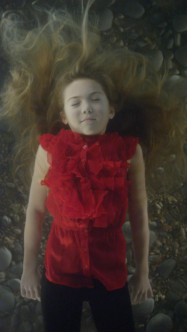
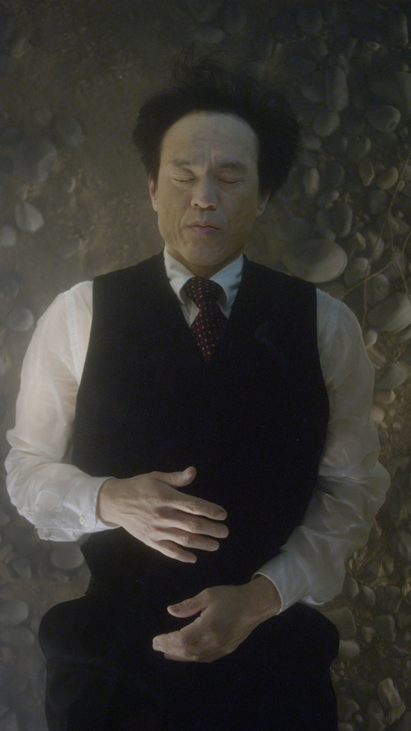
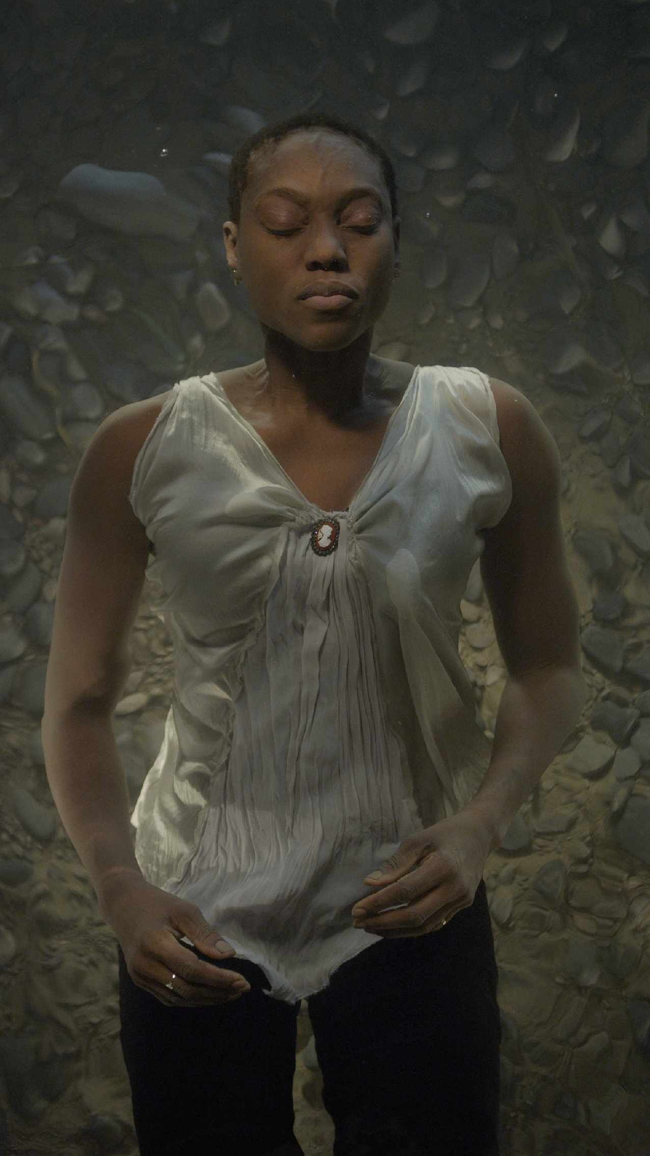
“The Dreamers” (2013) consists of seven channel screen video/sound installation which display people partly dead and partly alive, underwater with their eyes closed.

This video installation draw the spectator attention to the faces, and the way that they are suspended in the water makes this feeling like the water is a part of their bodies, they are on their reflection and it’s flowing around them.

For representing an idea or a narrative Time and Space are two basic elements, in “The Dreamers” the time does not exist, but the place is kind of multiplied.
The place, or in other word the water is part of the character and this is reality and the information and data is flowing around them.

Author Niloufar Zabihi Zohari

7f736e847f2b29324c3a414abb3a42d9

Pictures from Blain Southern & Hunger TV