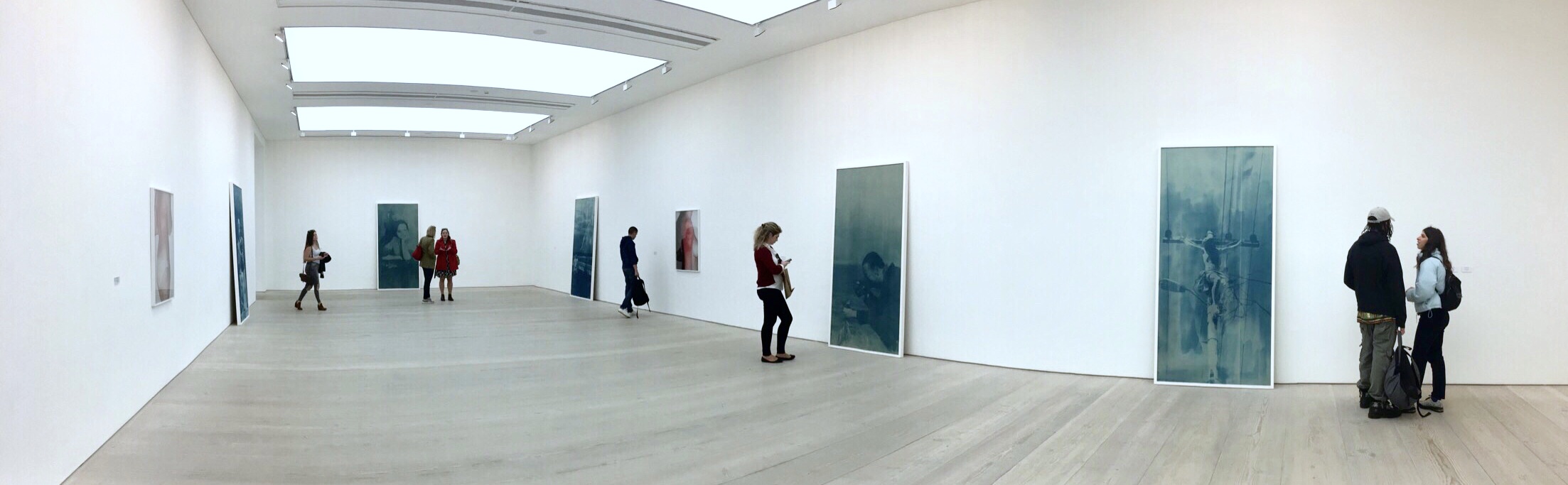
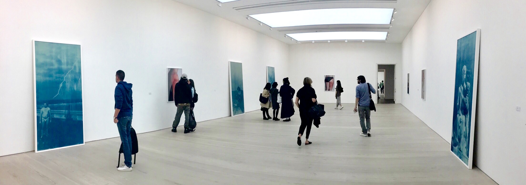
Kaveh Golestan was born in 1950, Tehran, Iran. He was a photojournalist and an artist who worked in both Iran and Britain.
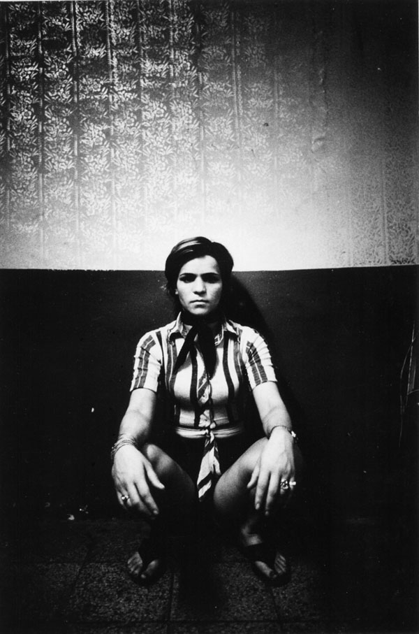
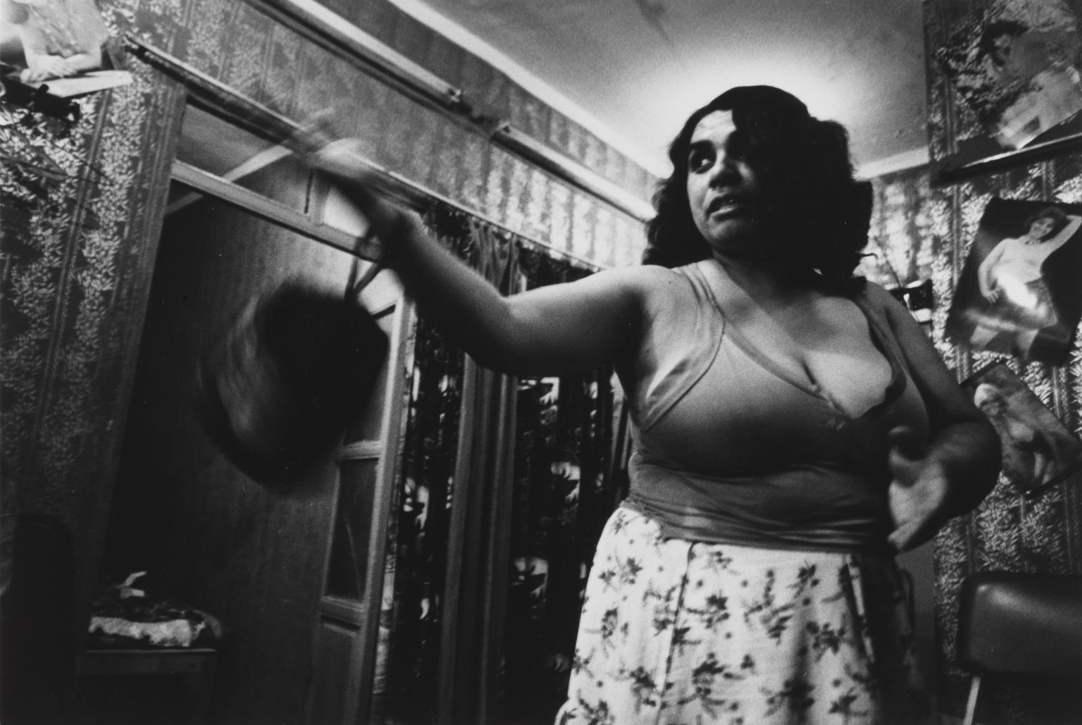
Untitled, Prostitute Series, 247 x 167 mm
Kaveh Golestan’s socially engaged photography exposes the plight of people living on the margins of society.
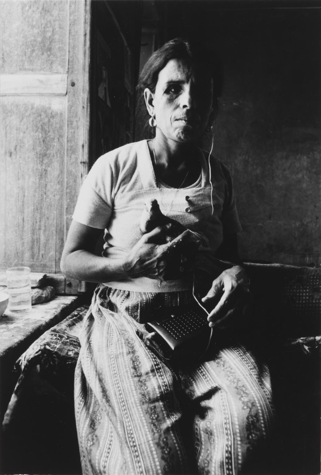
Untitled, Prostitute Series, 247 x 167 mm
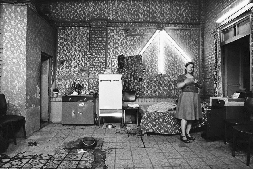
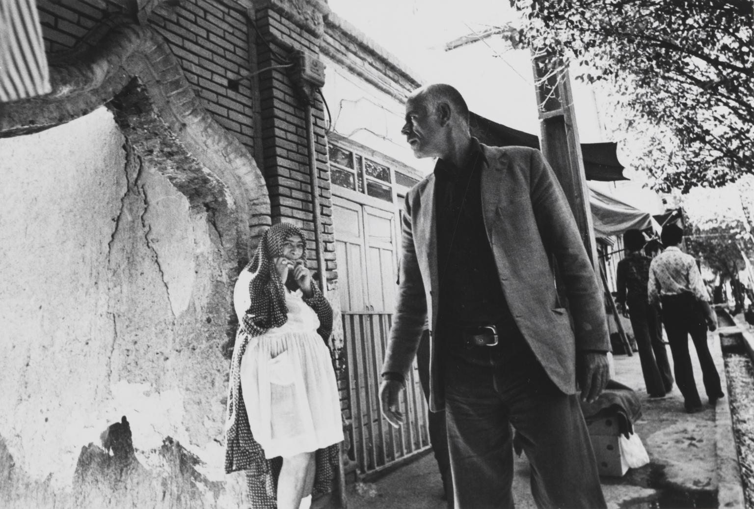
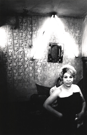
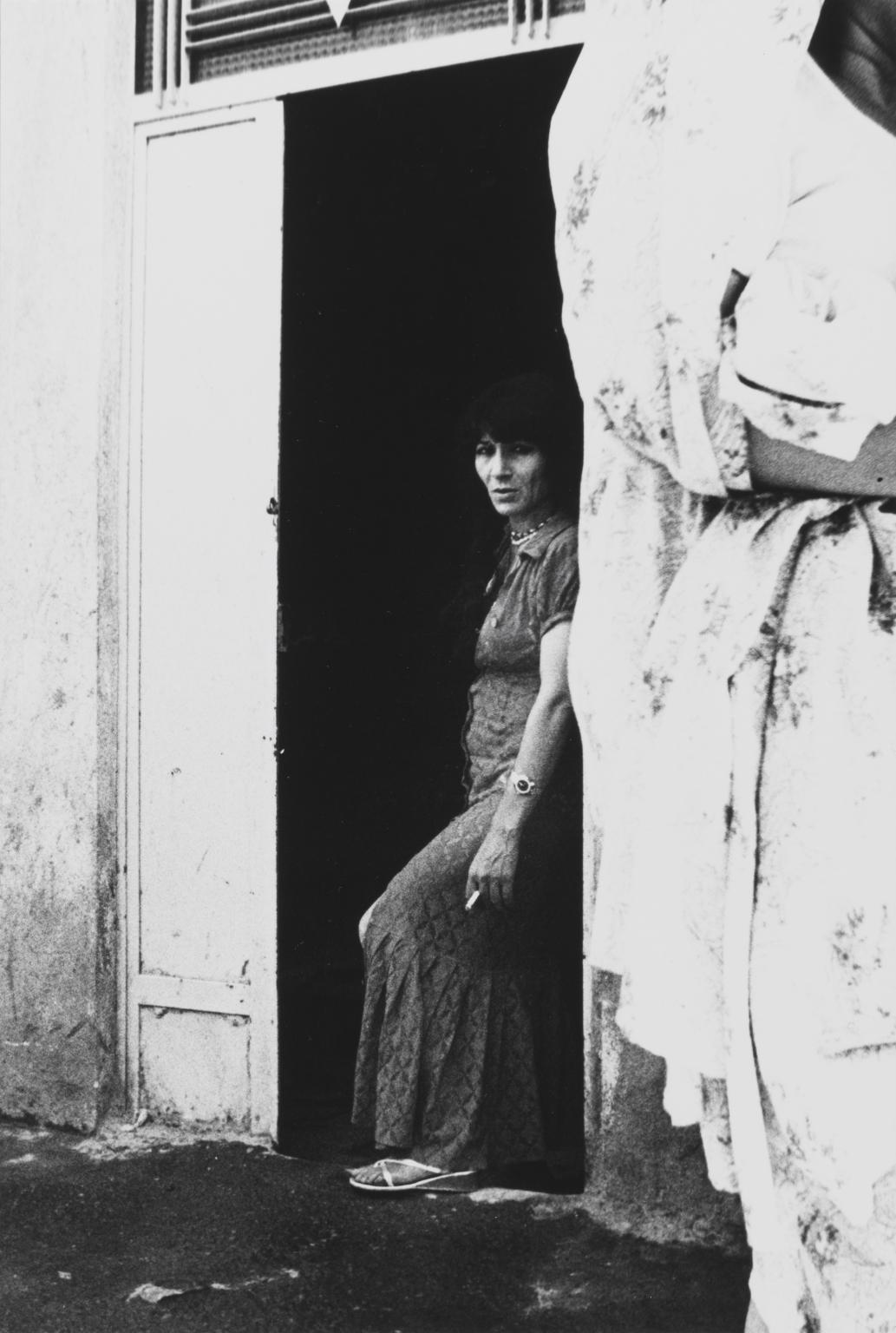
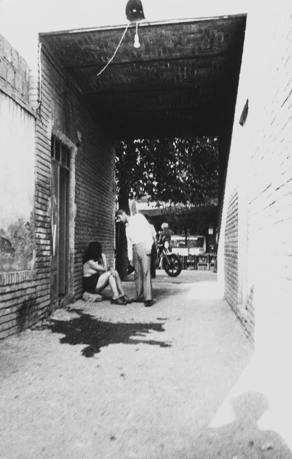
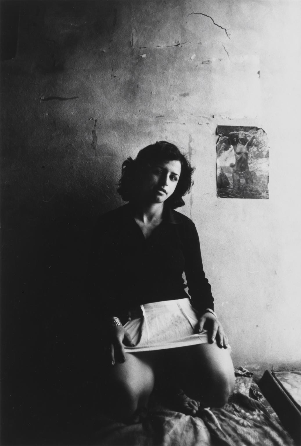
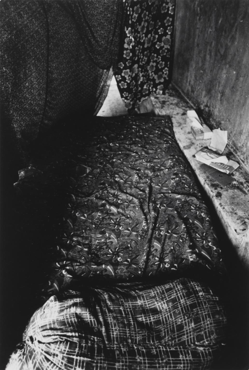
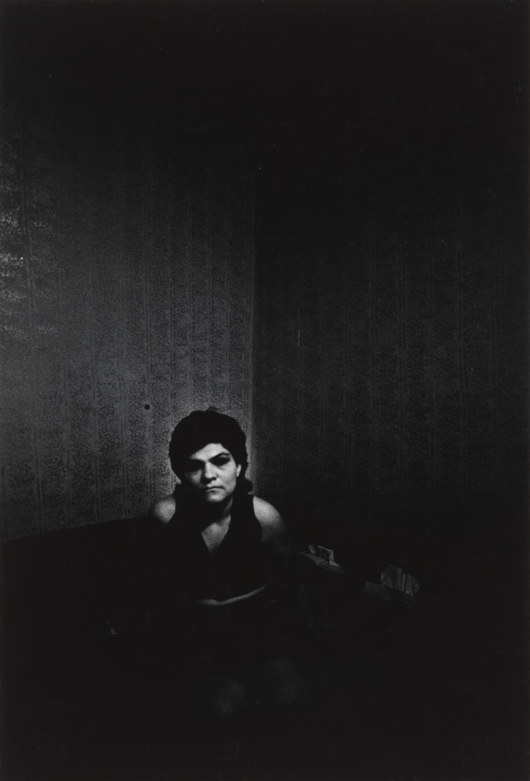
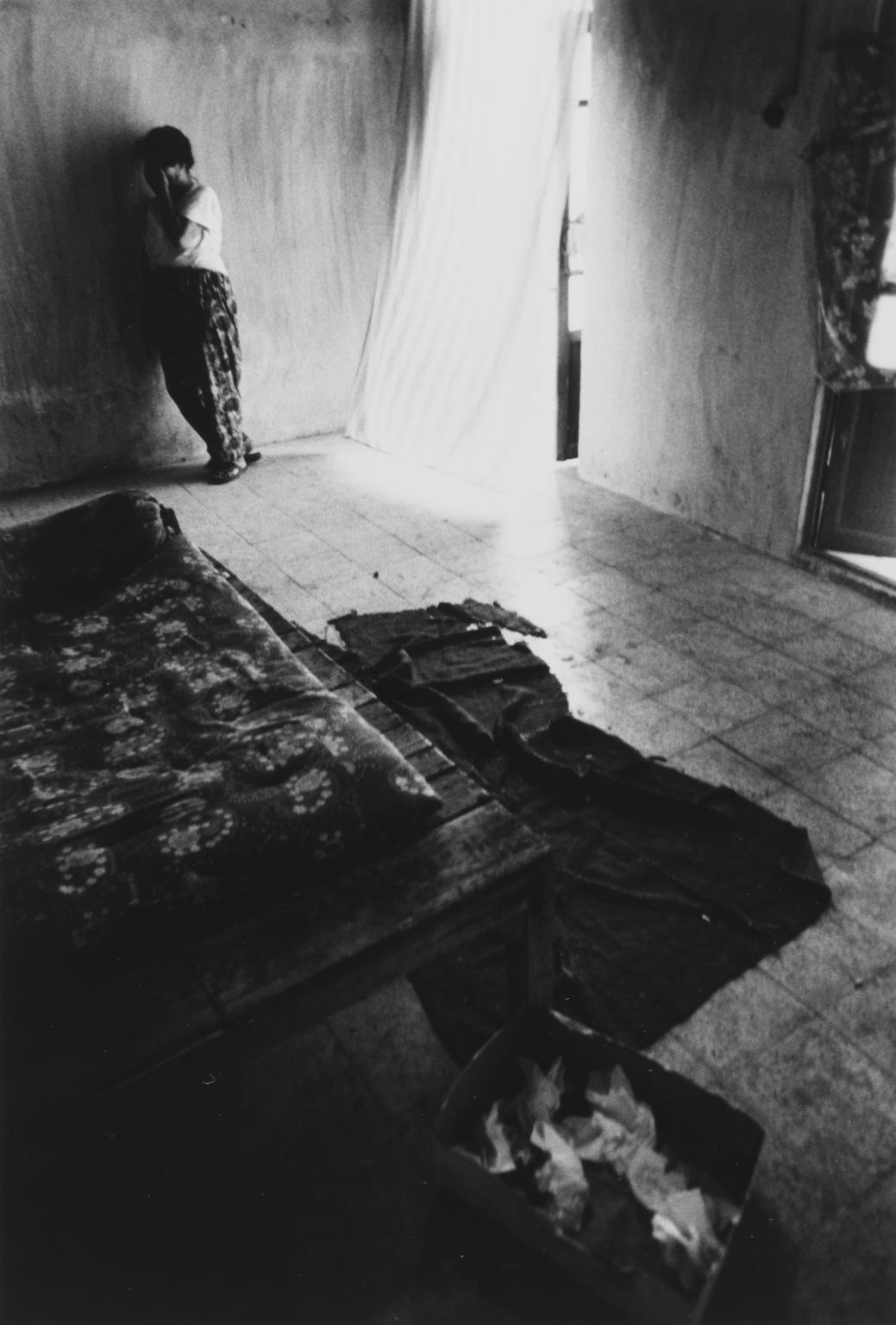
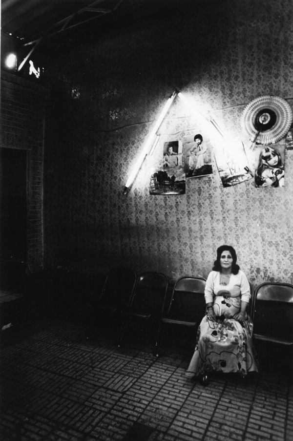
This series of portraits, taken between 1975 and 1977, documents sex workers from the former red light district, Shahr-e No, in Tehran, Iran. Following the 1953 Iranian coup a wall was erected around the area, creating an inner-city ghetto where approximately 1,500 women lived and worked. Here Golestan witnessed ‘the social, financial, hygienic, behavioural and psychological problems that exist in everyday society… magnified.’
Untitled, Prostitute Series, 167 x 247 mmUntitled, Prostitute Series, 248 x 167 mm
Golestan spent several years researching the area and gaining the trust of the residents, developing a connection with his subjects evidenced by the sensitivity of his portraits. Golestan believed in the power of art to challenge accepted narratives. By documenting harsh realities with brutal honesty he hoped to raise awareness of the issues facing society and encourage the public to take action.
Untitled, Prostitute Series, 248 x 167 mmUntitled, Prostitute Series, 167 x 248 mmUntitled, Prostitute Series, 248 x 167 mm
Golestan commented, ‘I want to show you images that will be like a slap in your face to shatter your security. You can look away, turn off, hide your identity … but you cannot stop the truth. No one can.’
Untitled, Prostitute Series, 245 x 157 mmUntitled, Prostitute Series, 247 x 167 mmUntitled, Prostitute Series, 167 x 247 mm
During the Iranian revolution of 1979 Shahr-e No was deliberately set alight. The authorities made no attempt to put out the fire and there are no records of how many women died.
Untitled, Prostitute Series, 248 x 167 mmUntitled, Prostitute Series, 248 x 167 mm
Under the newly formed Islamic Republic, the area was demolished in an act of ‘cultural cleansing’ and today bears no reference to its past. Golestan’s images are among the last known records of the women of Shahr-e No.
Untitled, Prostitute Series, 247 x 167 mmUntitled, Prostitute Series, 248 x 167 mm
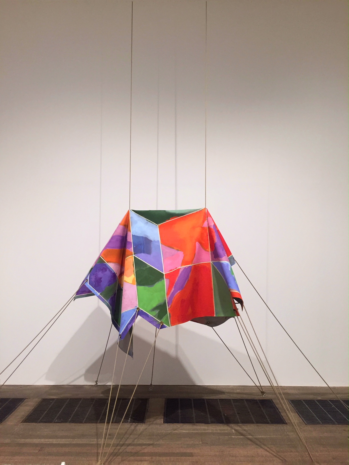
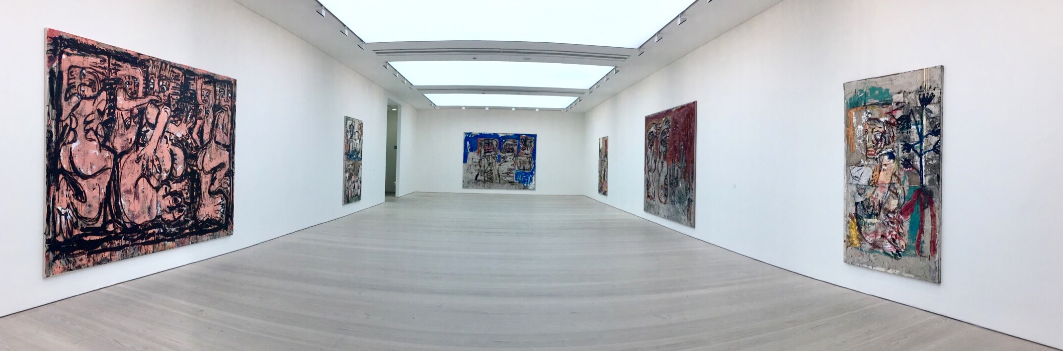
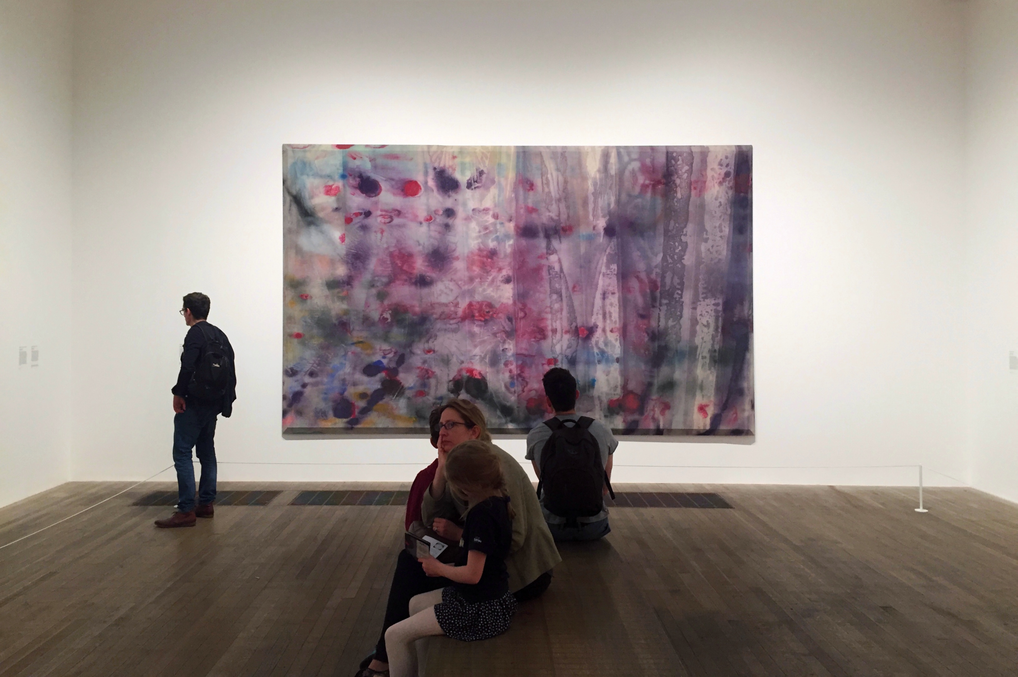
Iconoclasts explore the experimental and often transformational practices of thirteen groundbreaking artists, inviting us to engage anew with what modern day iconoclasm might be.
Thomas Mailaender
Daniel Crews-Chubb
By using a myriad of unusual image-making practices from branding imagery onto human skin to sculpting curving structures out of crow feathers – these artists are breaking the mould, ushering a new age of artistic defiance through their resistance to typical artistic processes and their personal interpretations of cultural mores.
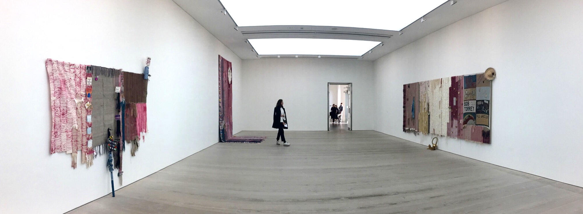
Josh Faught
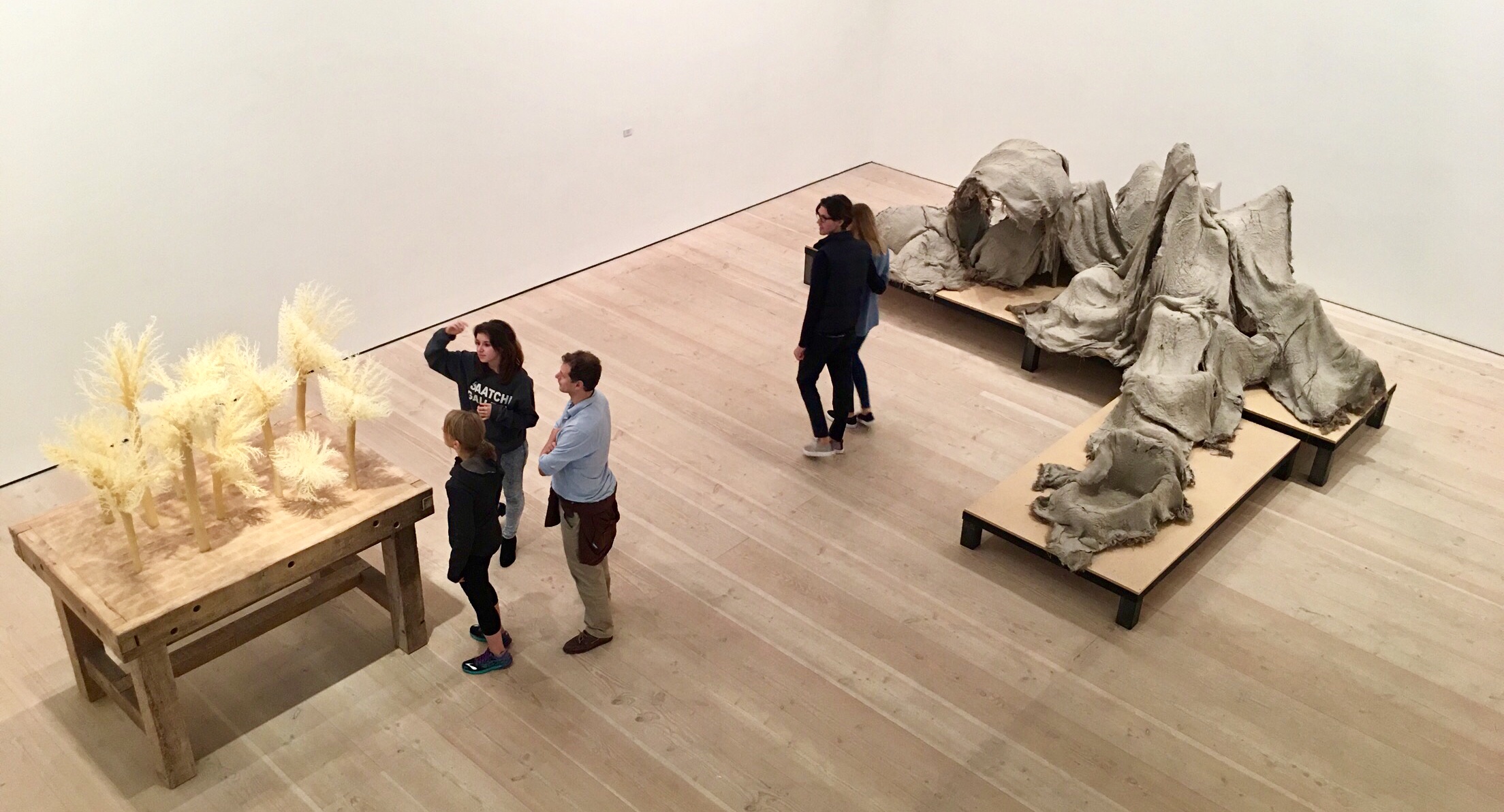
Alexi Williams Wynn – Douglas White
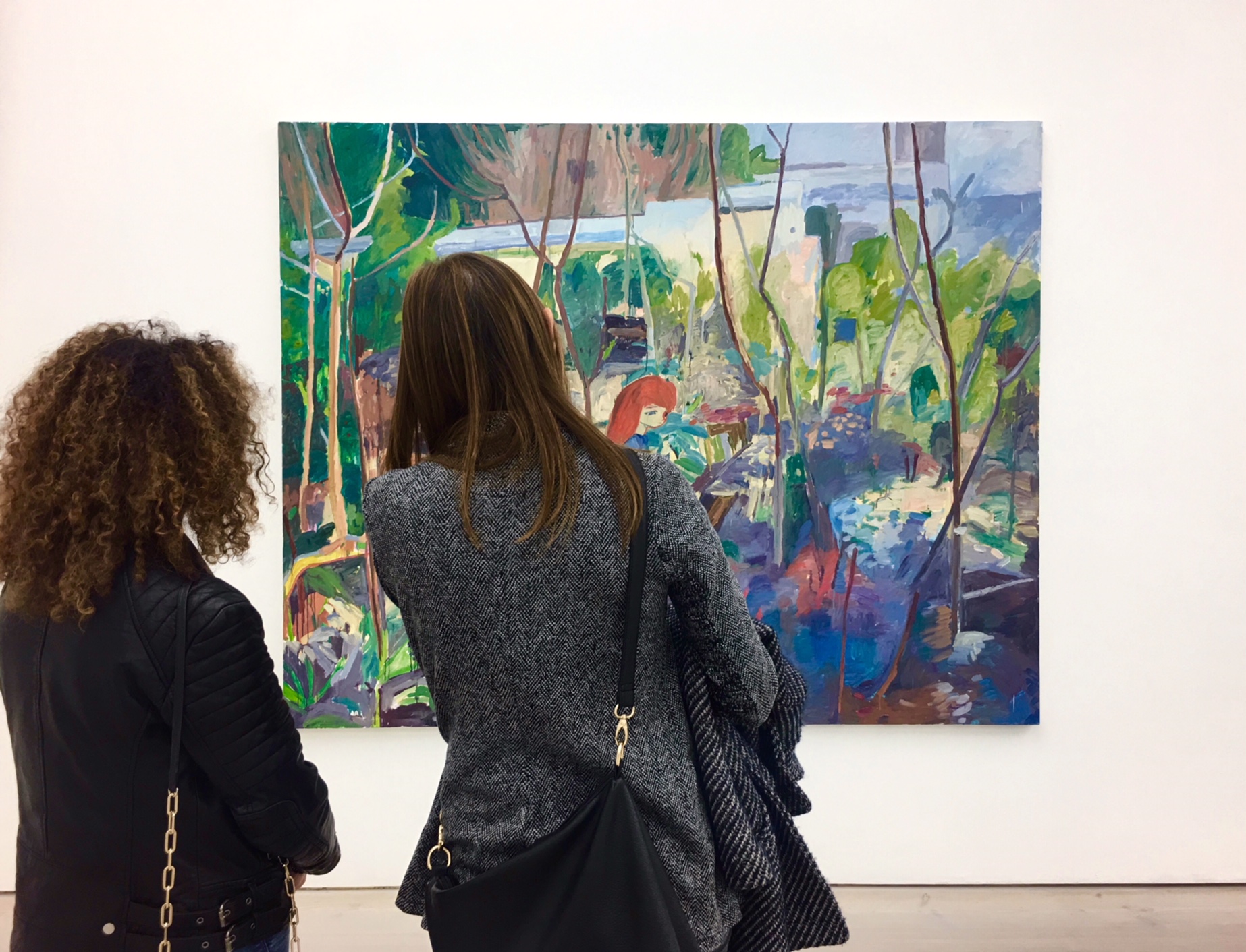
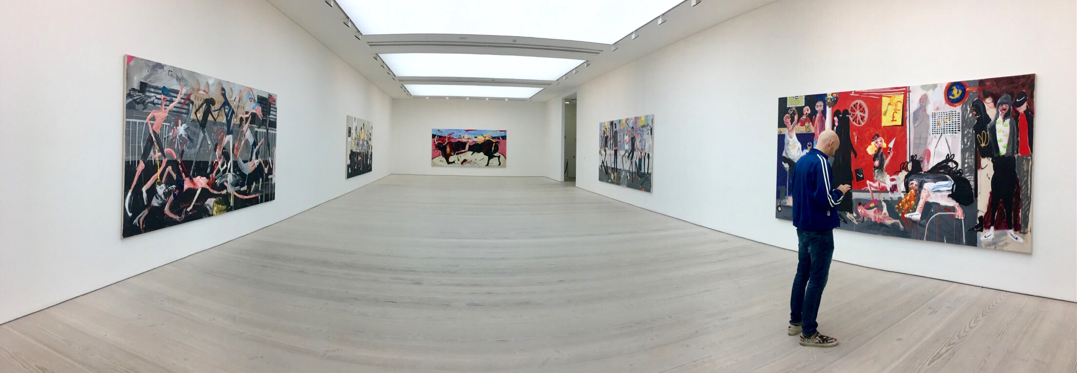
Dale Lewis
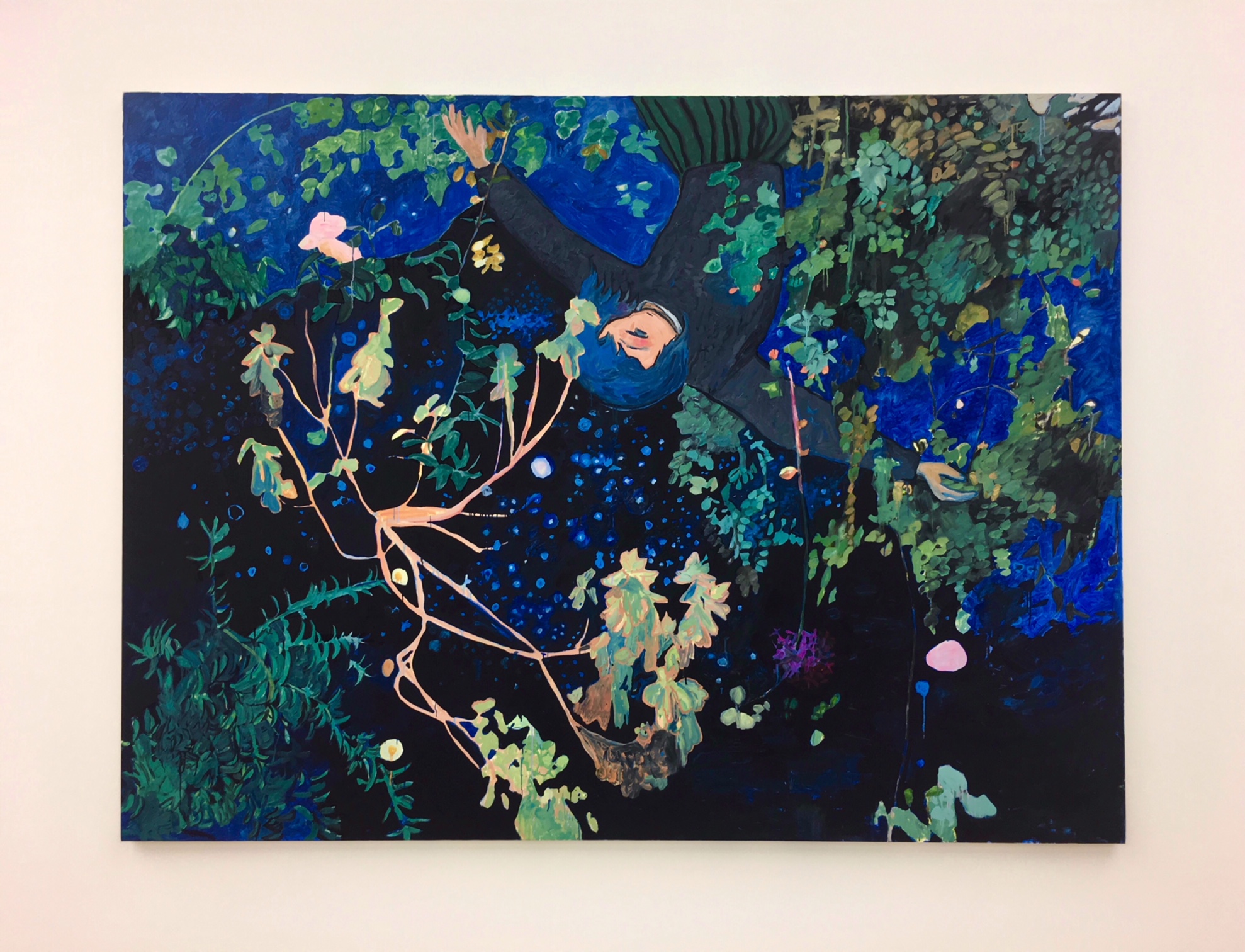
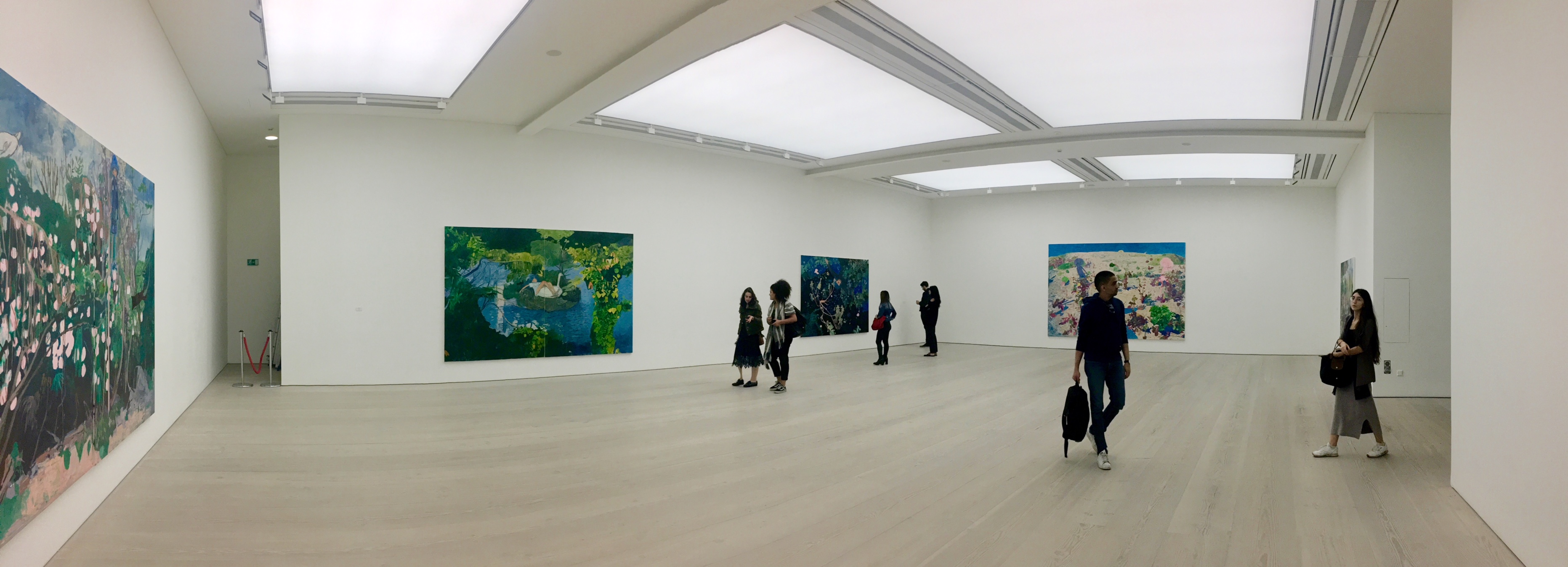
Makiko Kudo
Born in 1978, Aomori prefecture, Japan. Lives and works in Kanagawa prefecture, Japan.
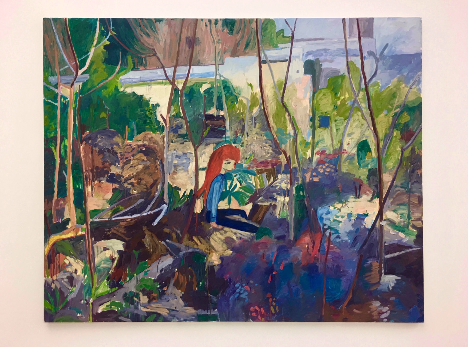
Makiko Kudo, Stage Curtain, Oil on canvas, 194.5 x 259.2 cm, 2011
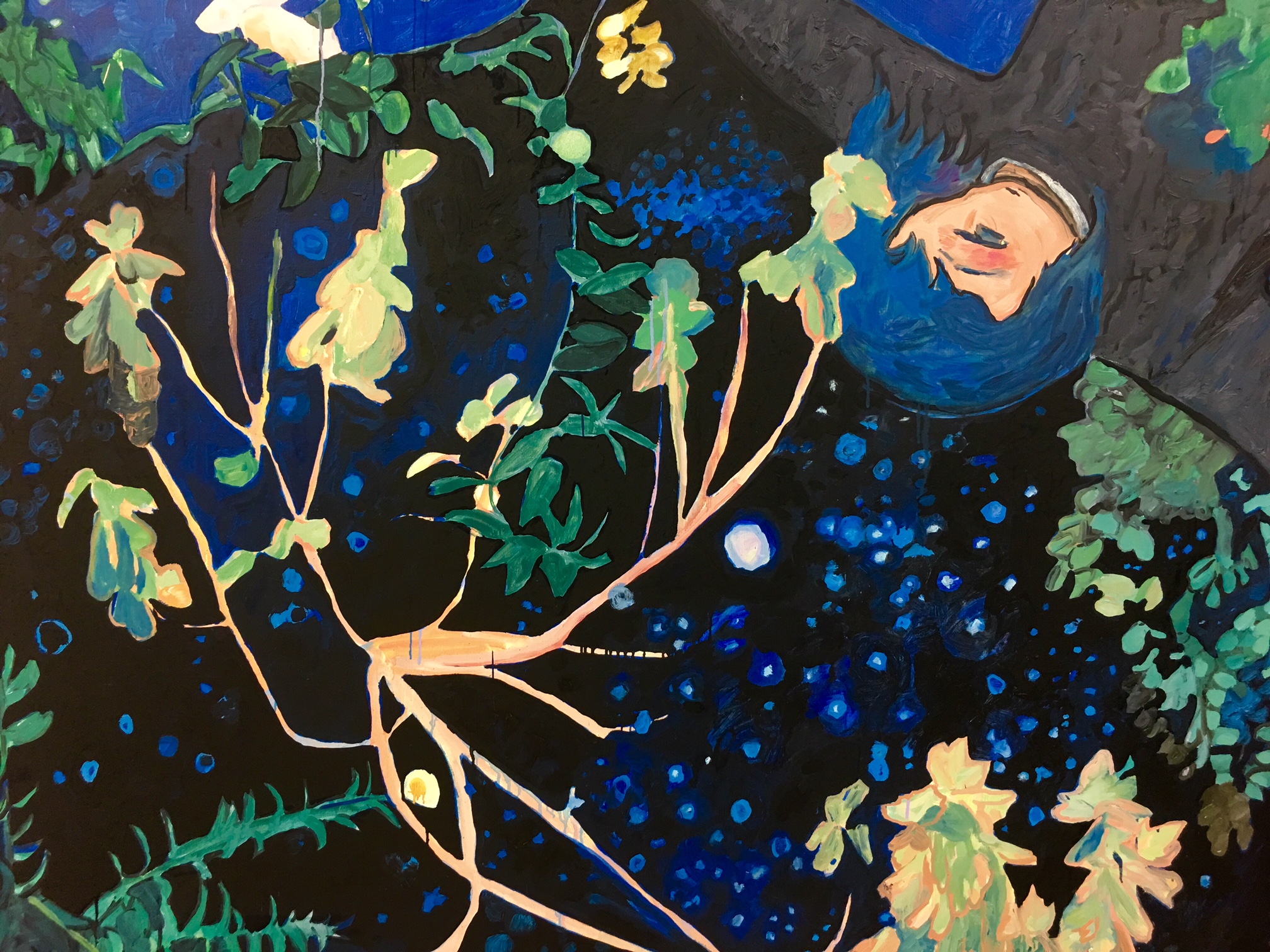
Makiko Kudo, Stage Curtain, Detail
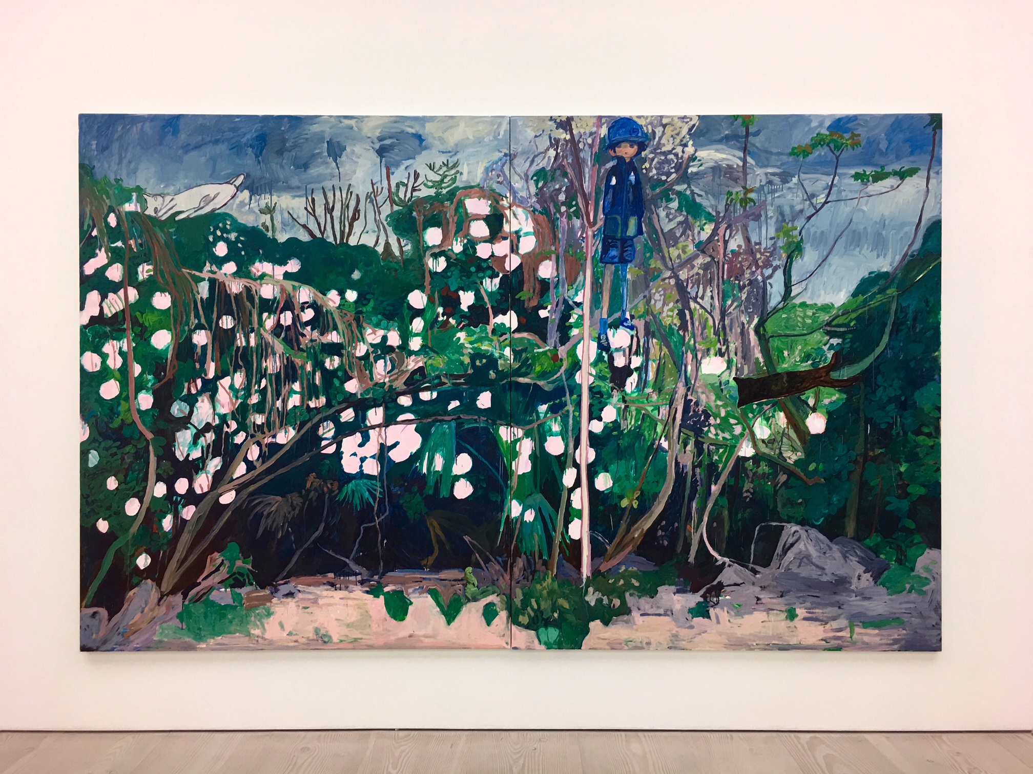
The realm of dreams and memory is one that Kudo’s figures inhabit. Rather than confronting or depicting the world as it is, Kudo rejects it by escaping from it – deriving the motifs from everyday life and her own imagination.
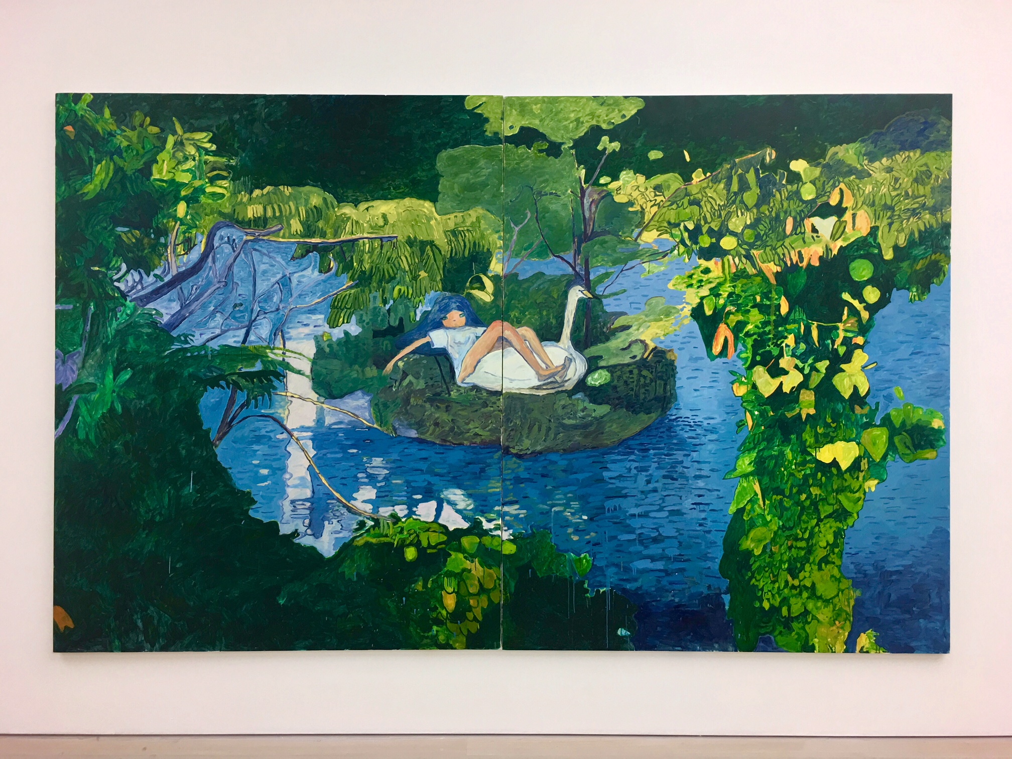
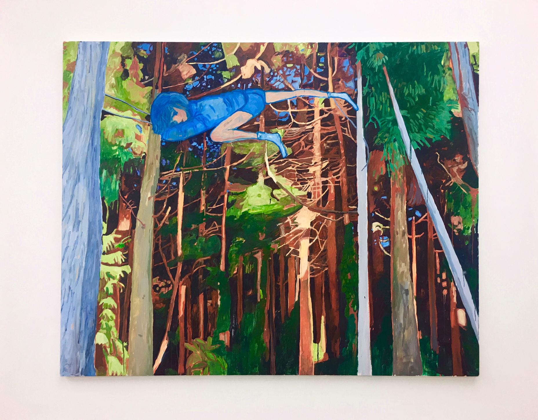
Makiko Kudo, Floating Island, Oil on canvas 227 x 364.6 cm, 2012
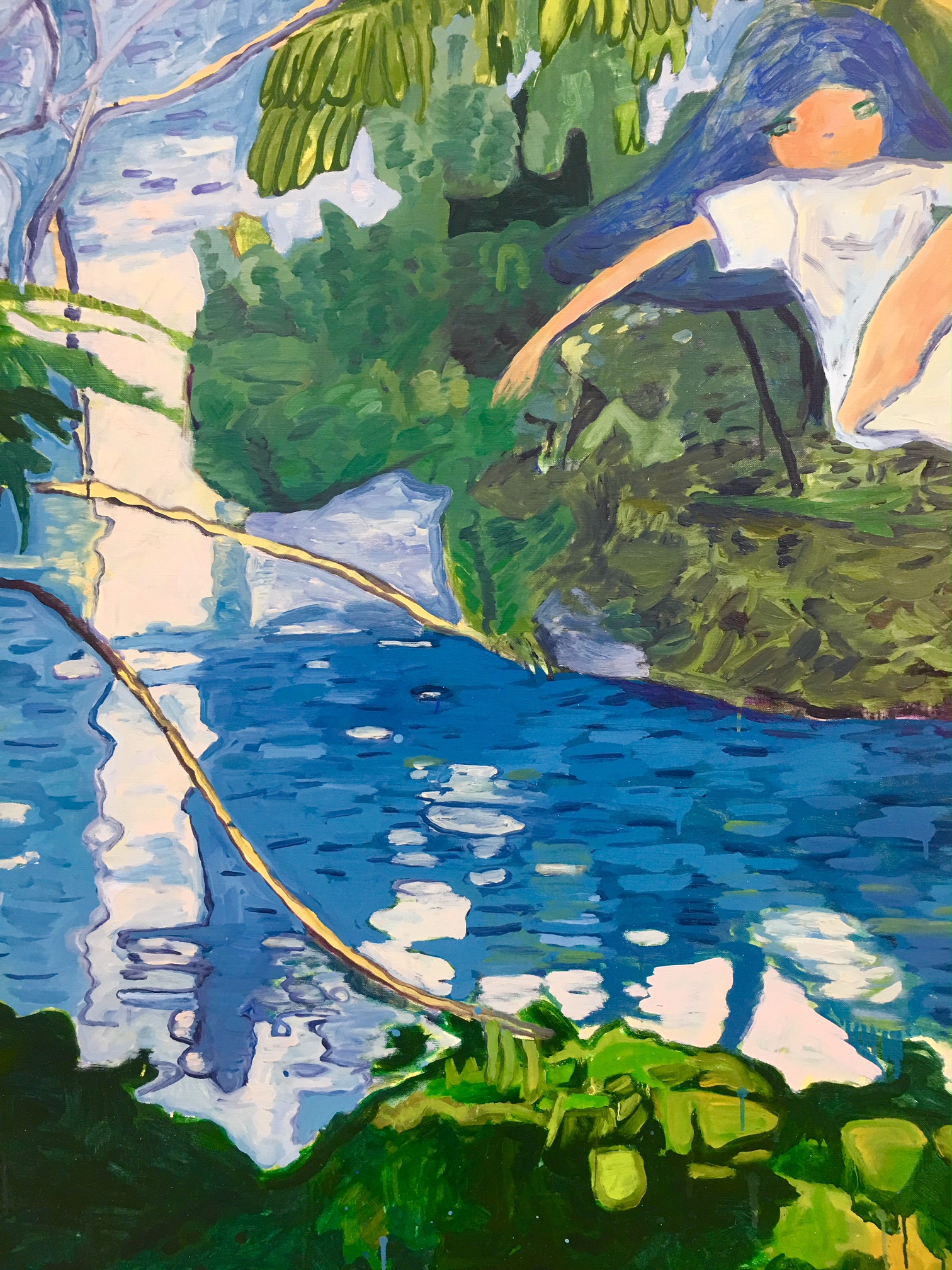
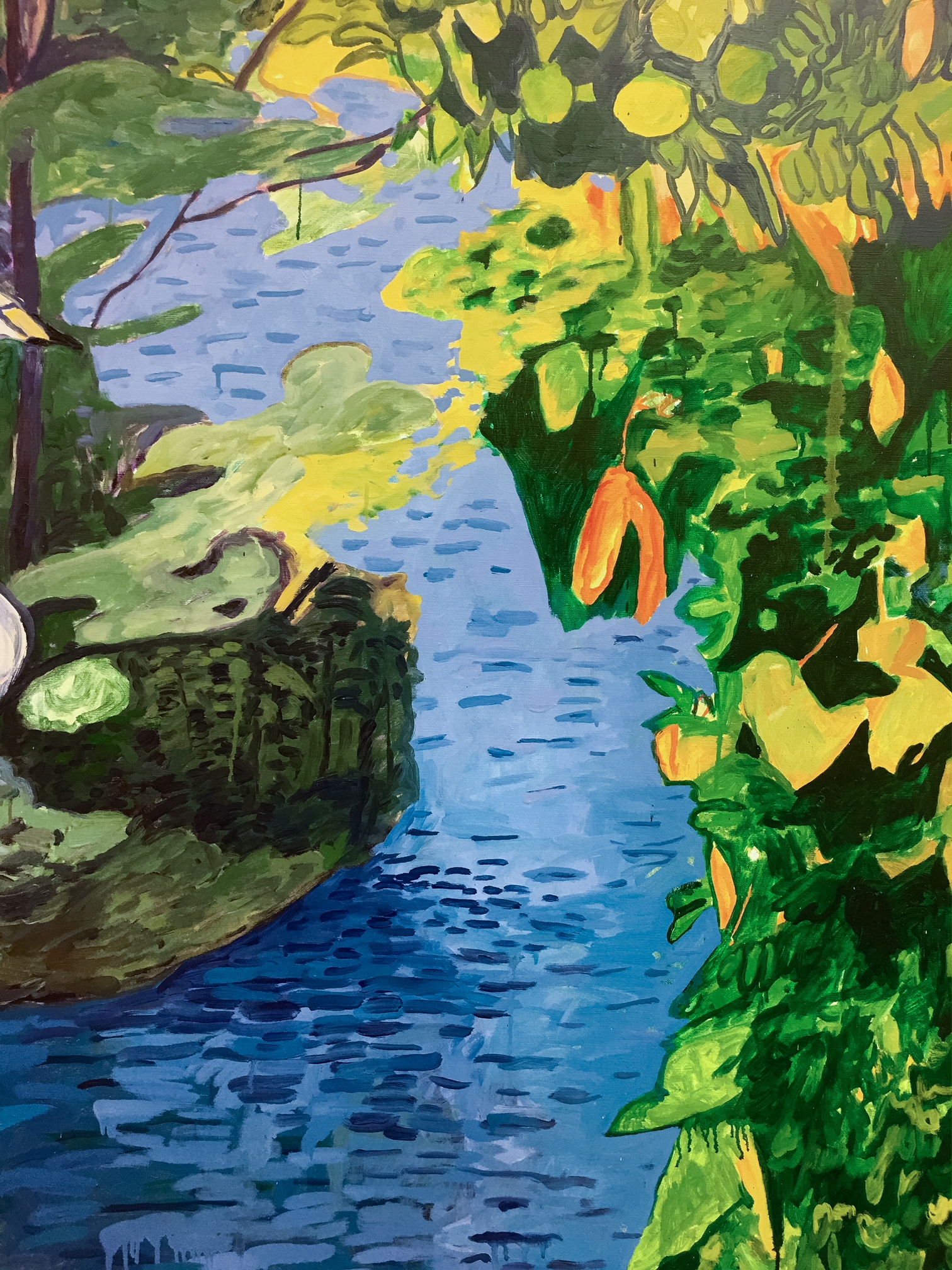
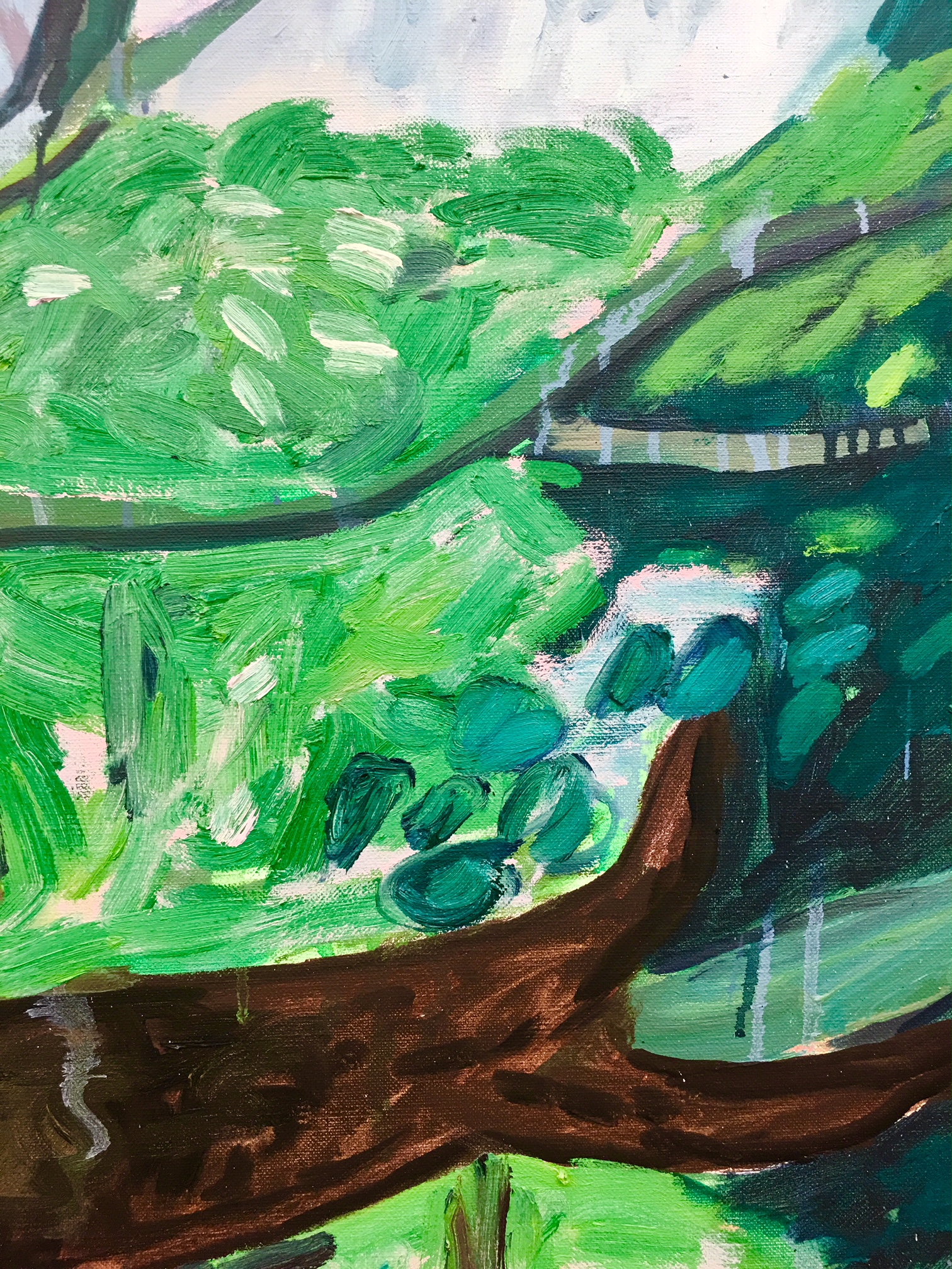
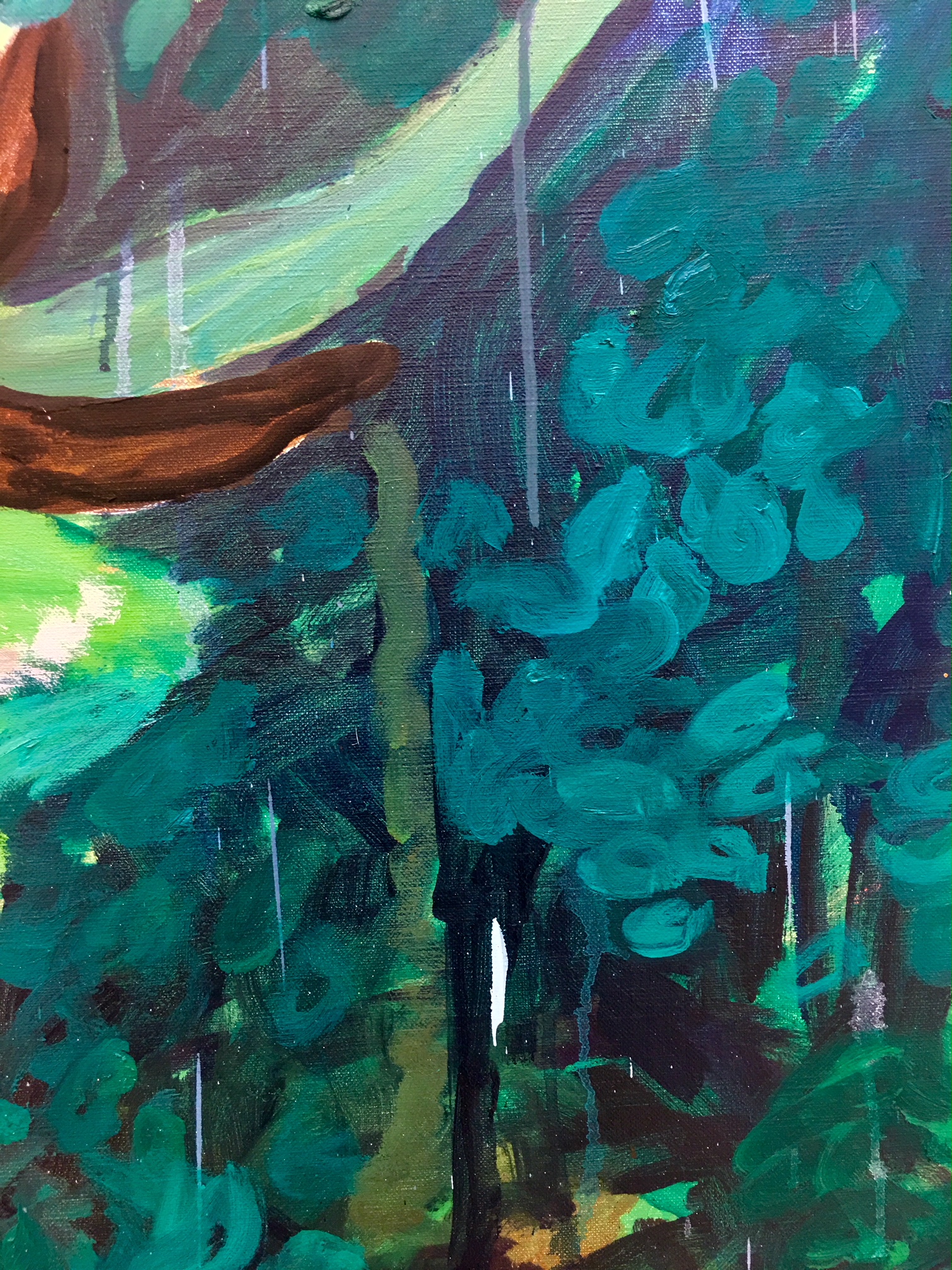
Makiko Kudo, Floating Island, Detail
Makiko Kudo, Floating Island, Detail
Makiko Kudo
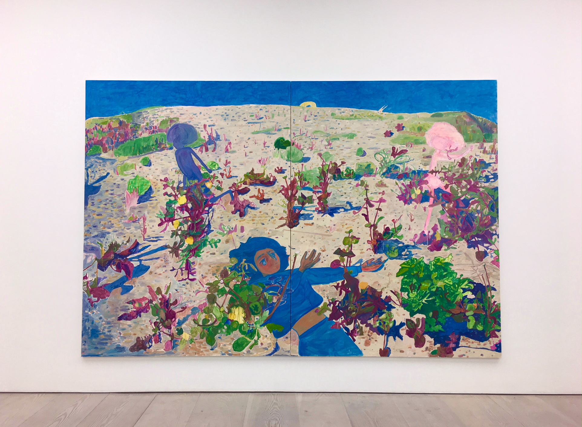
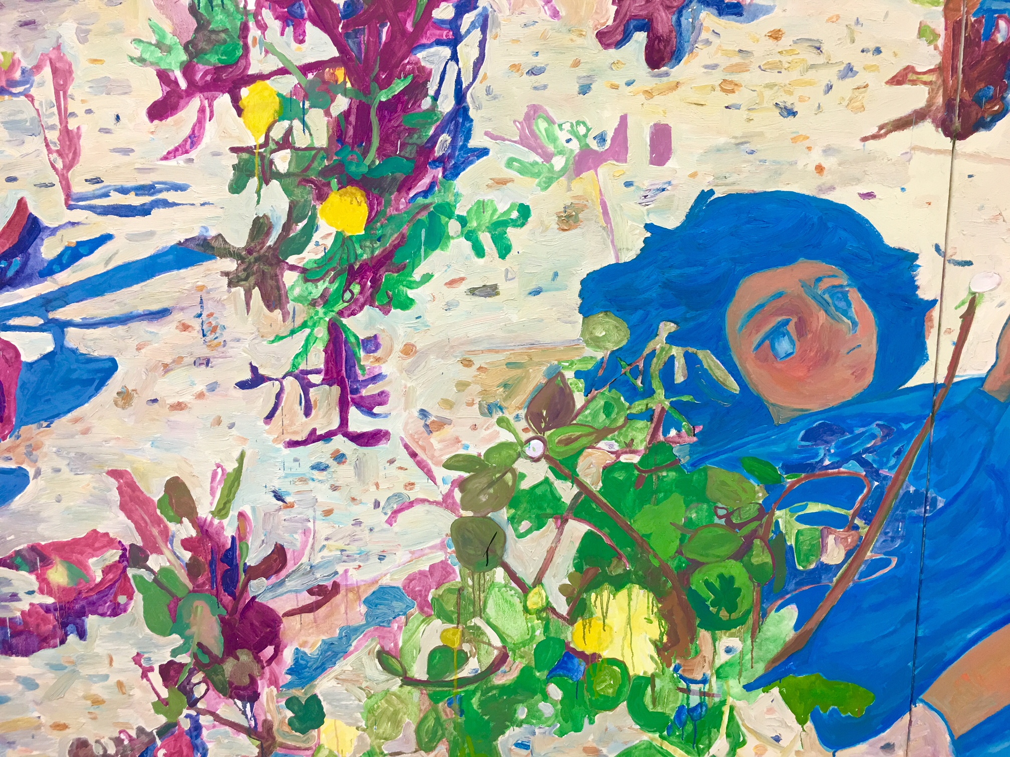
Makiko Kudo, Gray Town, Oil on canvas 227.5 x 365 cm, 2011
Makiko Kudo, Gray Town, Detail
Makiko Kudo, Gray Town, Detail
Makiko Kudo, Invisible, Oil on canvas 182.0 x 227.5 cm, 2011
Makiko Kudo, Burning Red, Oil on canvas 181.5 x 227 cm, 2012
“I feel like a kind of a ghost in a thin and flimsy world. Because I lack a sense of volume and reality. I sense reality more in my dreams. Constructing a painting in similar to dreaming. Shuffling different landscapes, creating stories and connecting them with emotion and imagination, like a collage or a jigsaw puzzle.”
Makiko Kudo, I See Season, Oil on canvas 259.5 x 389 cm, 2010
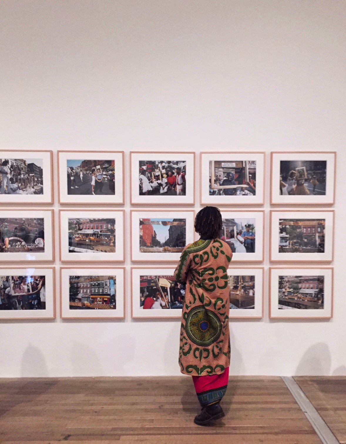
This exhibition celebrates the work of Black artists working in the united states in the two decades after 1963. During this turbulent time, these artists asked and answered many questions. How should an artist respond to political and cultural changes? Was there a ‘Black art’ or a ‘Black aesthetic’? Should an artist create legible images or make abstract work? Was there a choice to be made between addressing a specifically Black audience or a ‘universal’ one? The exhibition looks at responses to such questions.
In 1963, when the exhibition begins, the American Civil Rights Movement was at its height. At the March on Washington for Jobs and Freedom in Washington D.C., Dr Martin Luther King, Jr dreamed that his children would live in ‘a nation where they will not be judged by the colour of their skin but by the content of their character’.
King referred to himself proudly as ‘Negro’, but by this time, many who were on the March were beginning to call themselves Black. Taking issue with King’s non-violent position, especially after appalling racist violence later in 1963, many joined in calls for ‘Black Power’.
Others rejected in idea of an integrated America, and began to speak of a separate, autonomous Black Nation. Looking at newly independent African nations, and understanding an ancestral connection to the continent, the terms ‘Afro-American’ and ‘African American’ also began to take root. The artists in Soul of a Nation wereprofoundly aware of these political visions and different senses of self, and each took an aesthetic position in relation to them.
Reginald Gammon, Freedom Now, Acrylic paint on board, 1963
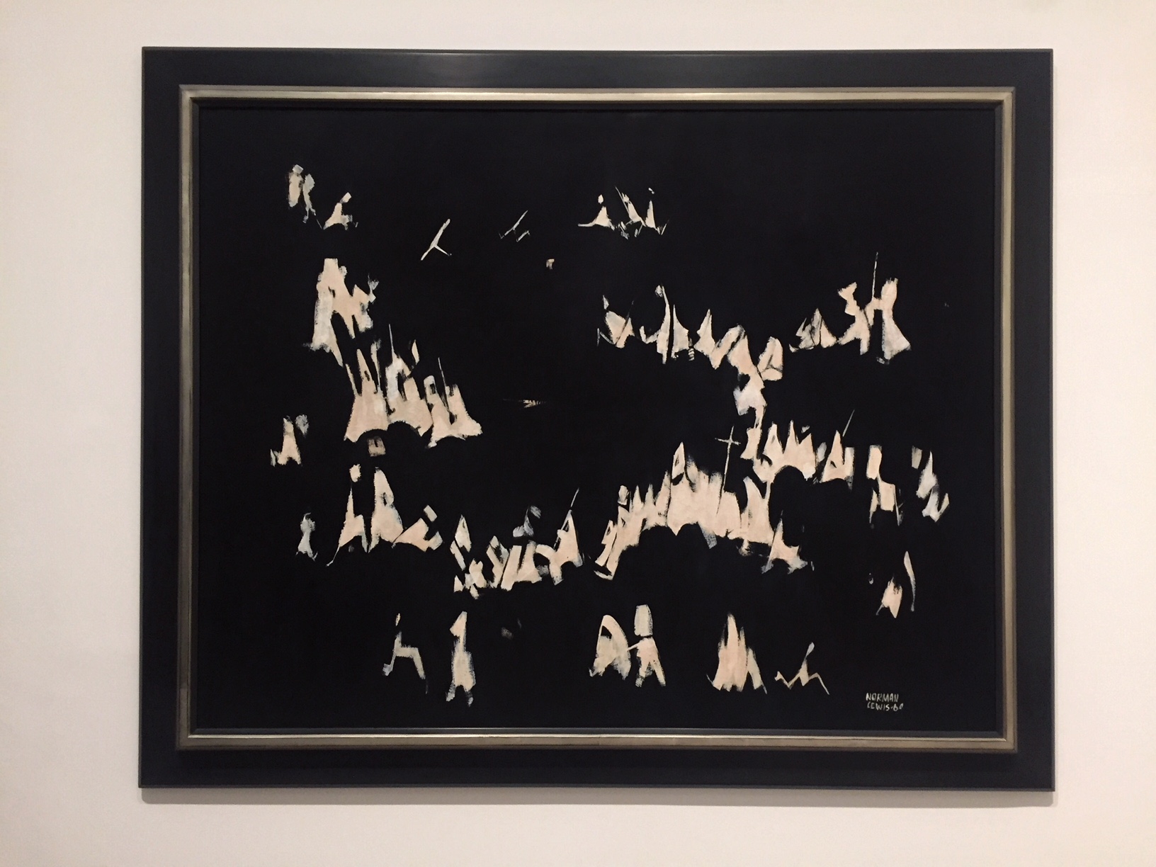
Norman Lewis
“America the Beautiful”
In a small series of works, he set aside his flair for colour to concentrate on black and white, in order to reflect on race relations in America. Here, lewis evokes a gathering of the Ku Klux Klan, while titling the work to suggest the difference between America’s vision of itself and its realities.
Norman Lewis, America the Beautiful, Oil paint on canvas, 1960
Romare Bearden The Dove Photostat on Fibreboard 1964
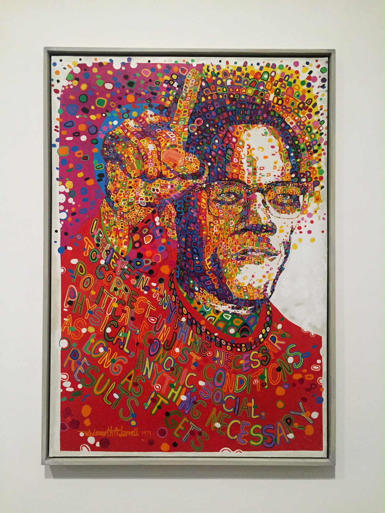
Wadsworth Jarrell
“Black Prince”
Black Prince is a portrait of Malcolm X, made for the second AfriCOBRA exhibition in 1971 held, like their first, at the Studio Museum in Harlem. It is based on a May 1963 photograph of Malcolm X in Harlem, speaking against segregation and ‘Uncle Tom Negro preachers’.
Wadsworth Jarrell Black Prince Acrylic paint on canvas
Wadsworth Jarrell Liberation soldiers Acrylic paint and foil canvas
Kay Brown
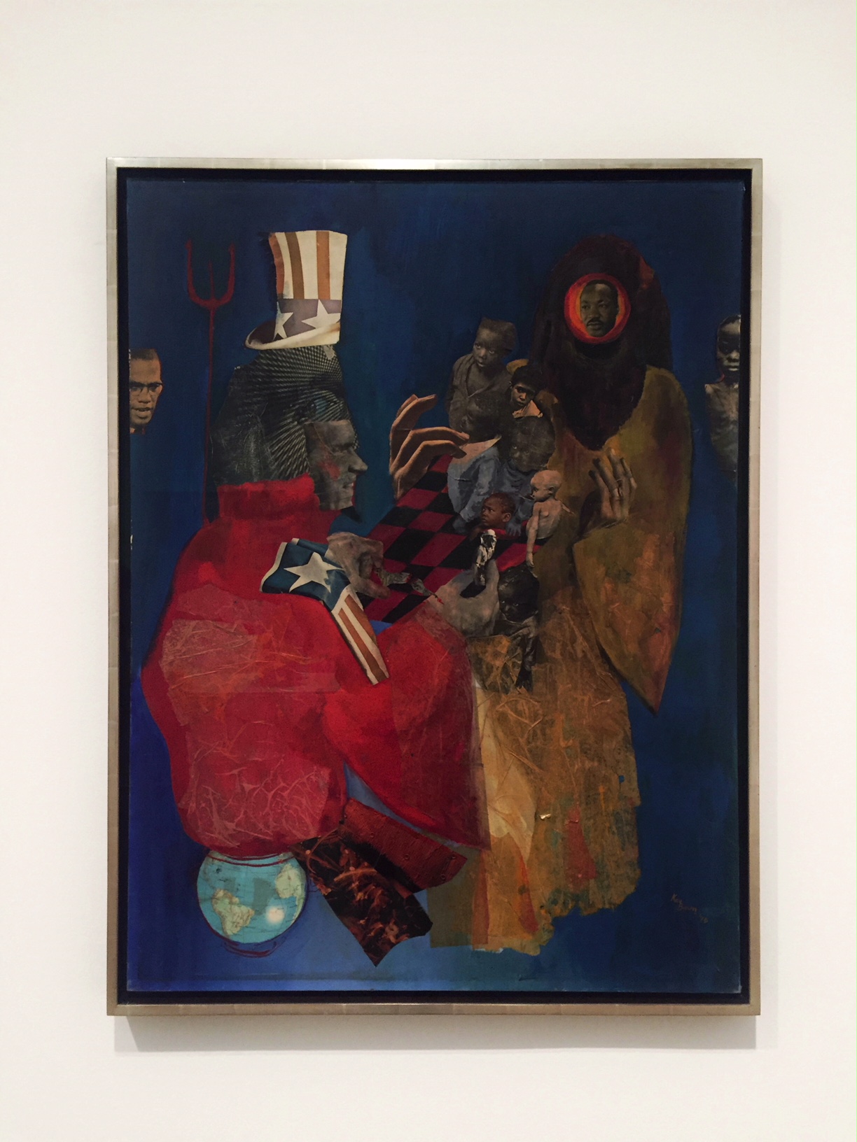
“The Divel and His Game”
Kay Brown was for a time the sole woman member of Weusi artist collective, named after the Swahili word for ‘blackness’, and would go on to be an influential member of Where We At! In The Devil and His Game, Brown comments on then-US president Richard Nixton’s foreign and domestic policies.
Kay Brown The Divel and His Game Paper and acrylic paint on canvas 1970
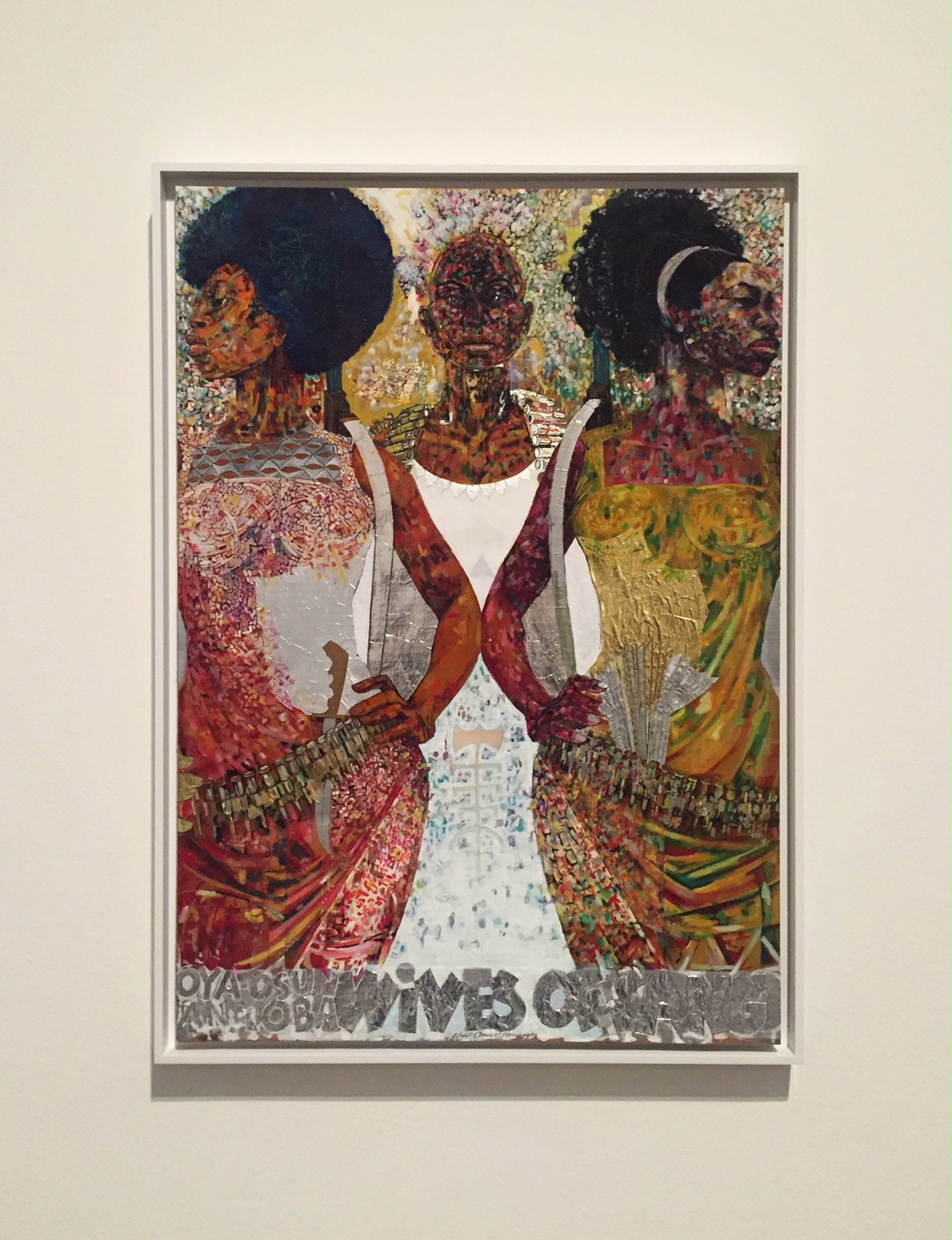
Jeff Donaldson, Wives of Sango, Acrylic paint, gold foil and silver foil on cardboard, 1979
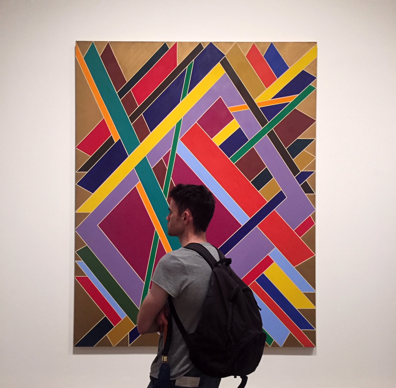
Ed Clark
“Yenom (#9)”
Ed Clark was a part of the second generation of abstract expressionist and in 1957 was the first American artist to experiment with irregularity shaped canvases.
Ed Clark, Yenom (#9), 1970
William T. Williams
“Trane”
This painting was named after John Coltrane and may conjure the cascades of sound in his performances.
William T. Williams, Trane Acrylic paint on canvas, 1969
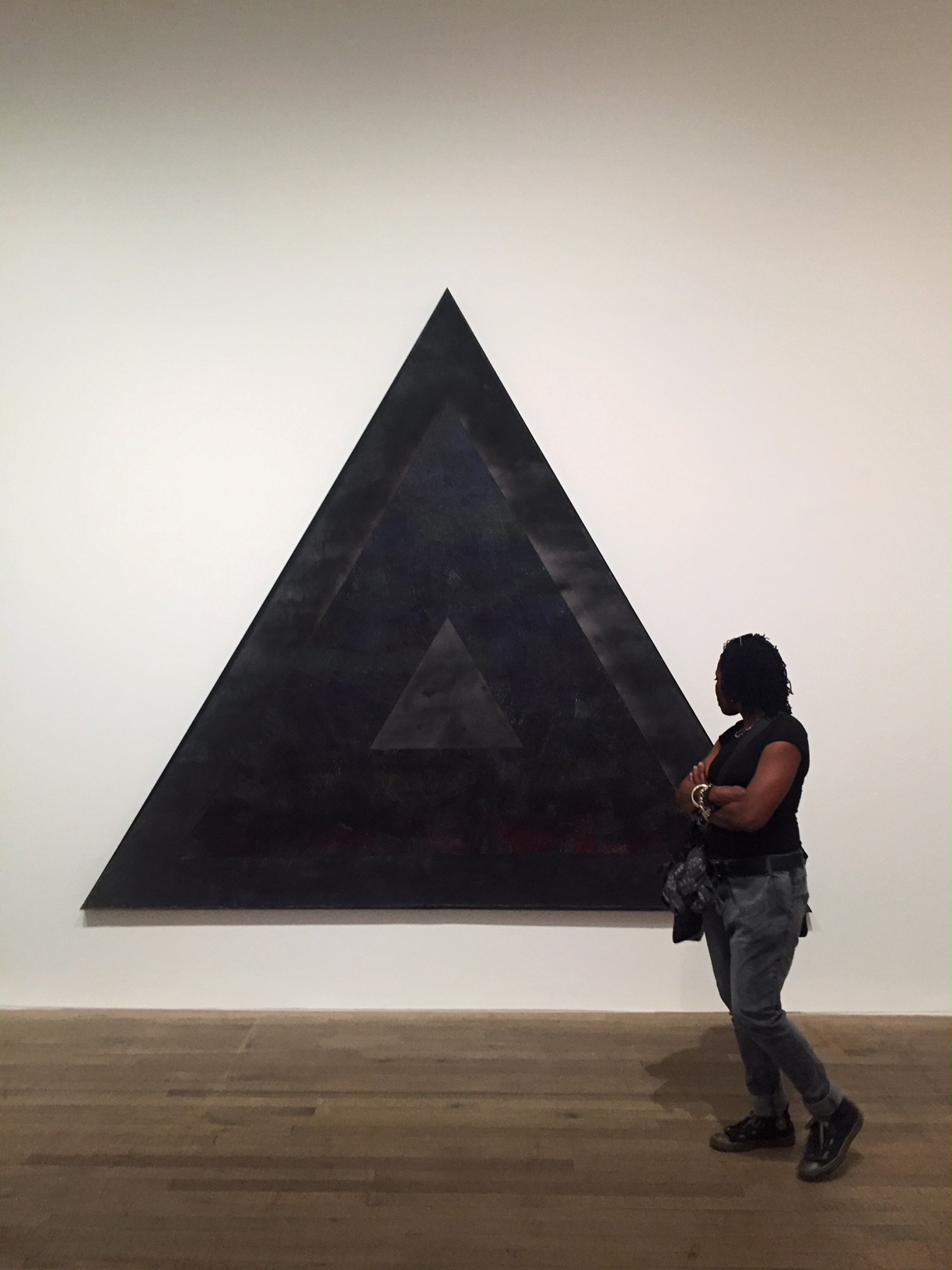
Jack Whitten
“Homage to Malcolm”
Most of his late 1960s works were colourful with expressive brushstrokes, however Homage to Malcolm is very clearly structured and is the artist’s only triangular painting.
Jack Whitten, Homage to Malcolm, Acrylic paint on canvas,1970
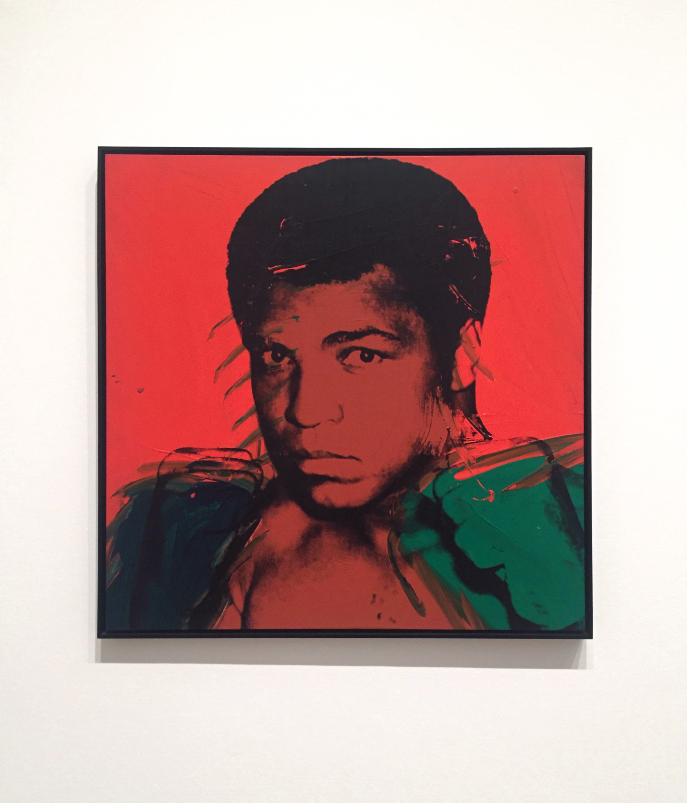
Andy Warhol
“Muhammad Ali”
The palette of red, black and green shares its colours with the pan-African flag where red represents the blood uniting the African diaspora, black as representative of its people, and green being the natural riches of the African continent.
Andy Warhol, Muhammad Ali, Acrylic paint and screenprint on canvas, 1978
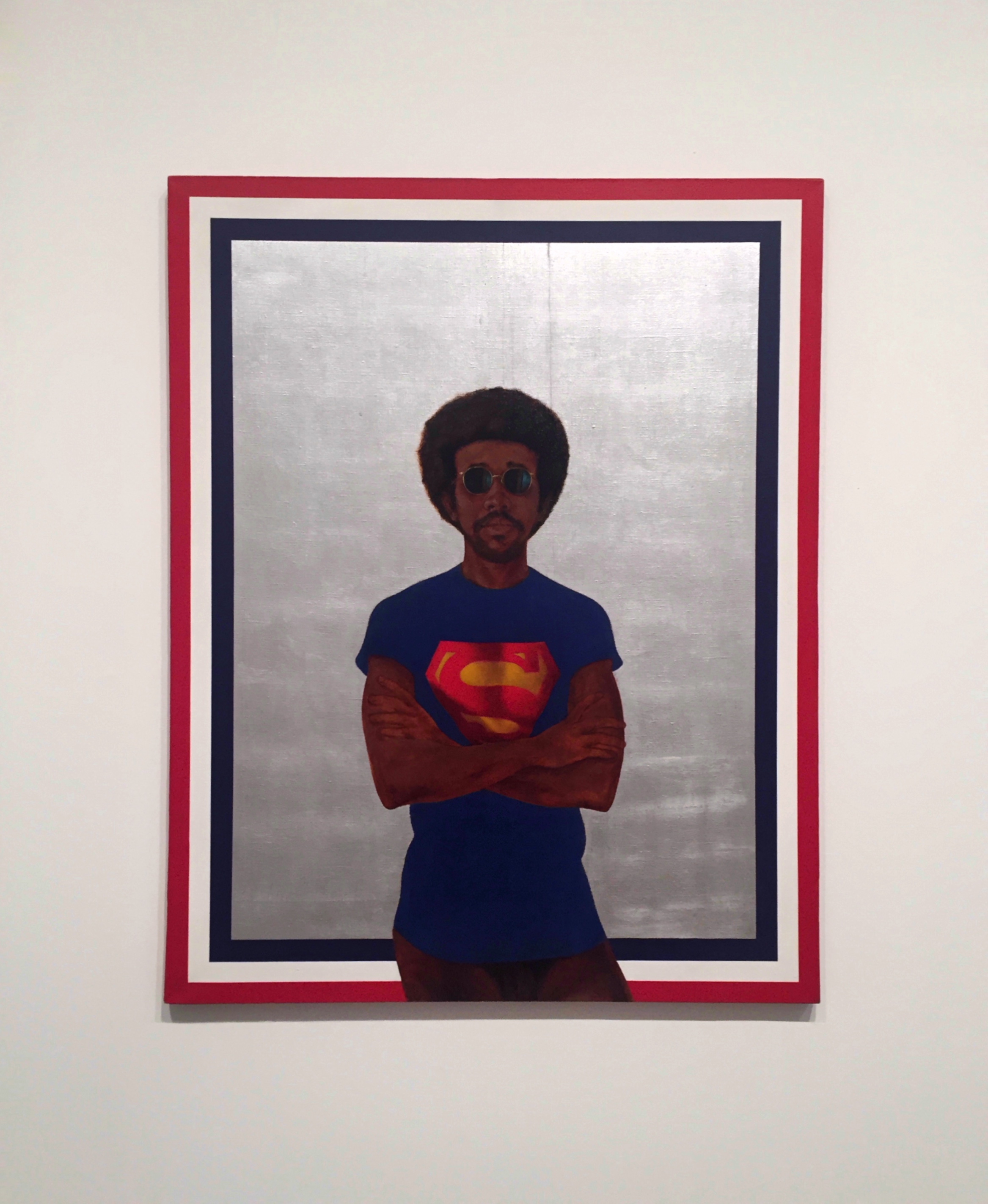
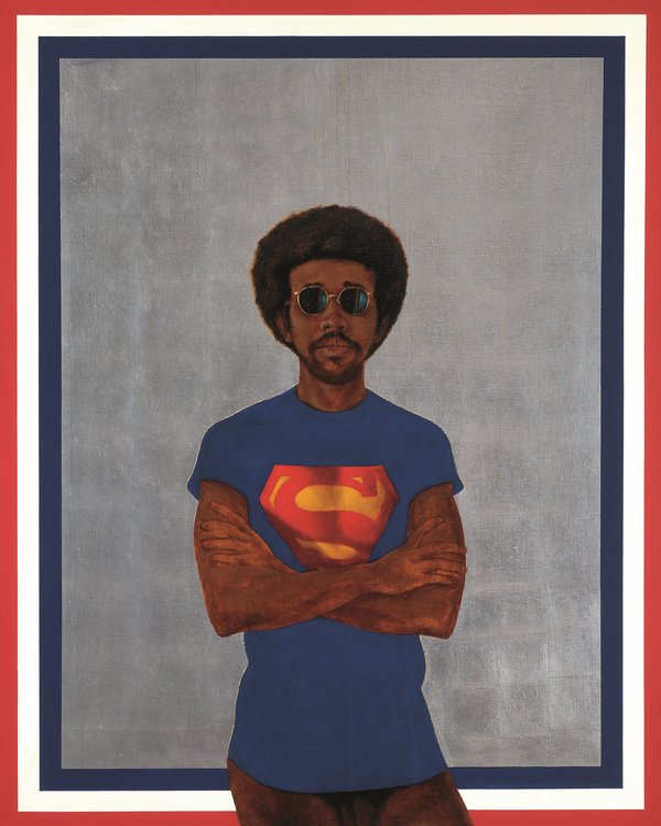
Barkley Hendricks
“Icon for My Man Superman (Superman Never Saved any Black People – Bobby Seale)”
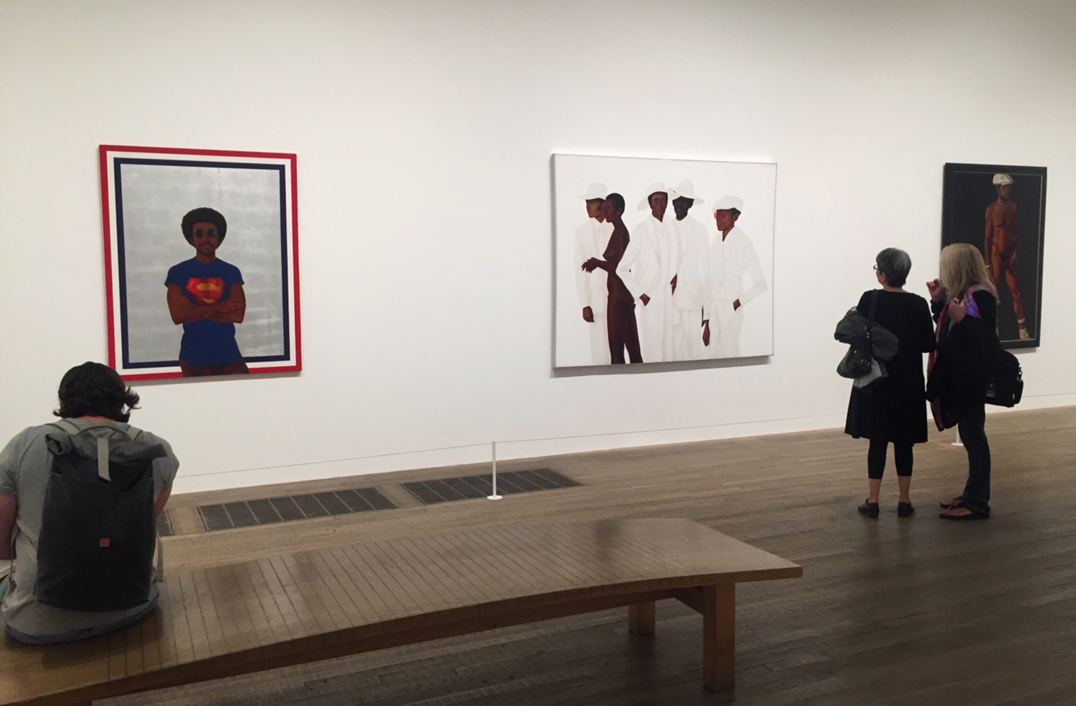
Icon for My Man Superman (Superman Never Saved any Black People – Bobby Seale) is a self-portrait, trimmed with a border evoking the American flag. Barkley Hendricks painted himself wearing a novelty T-shirt, provocatively nude from the waist down. The work’s subtitle invites a declarative statement of solidarity with the Black Panther co-founder Bobby Seale.
Barkley Hendricks, Icon for My Man Superman (Superman Never Saved any Black People – Bobby Seale), Oil paint, acrylic paint and aluminium leaf on canvas,1969
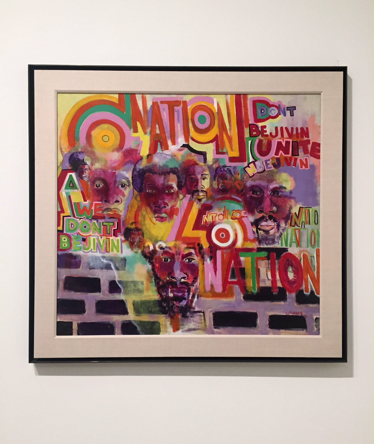
Gerald Williams
“Nation Time”
Gerald Williams was one of the five founding members of AfriCOBRA. For Williams, ‘Nation’ referred not to America but to a separate Black nation. Amiri Baraka used the word in the same way in his poem of the same year, ‘It’s Nation Time’, and Jeff Donaldson used the phrase too in the landmark AfriCOBRA text, ’10 in Search of a Nation’, also 1970: ‘It’s NATION TIME and we re now searching.
Gerald Williams, Nation Time, Acrylic paint on canvas, 1970
David Hammons
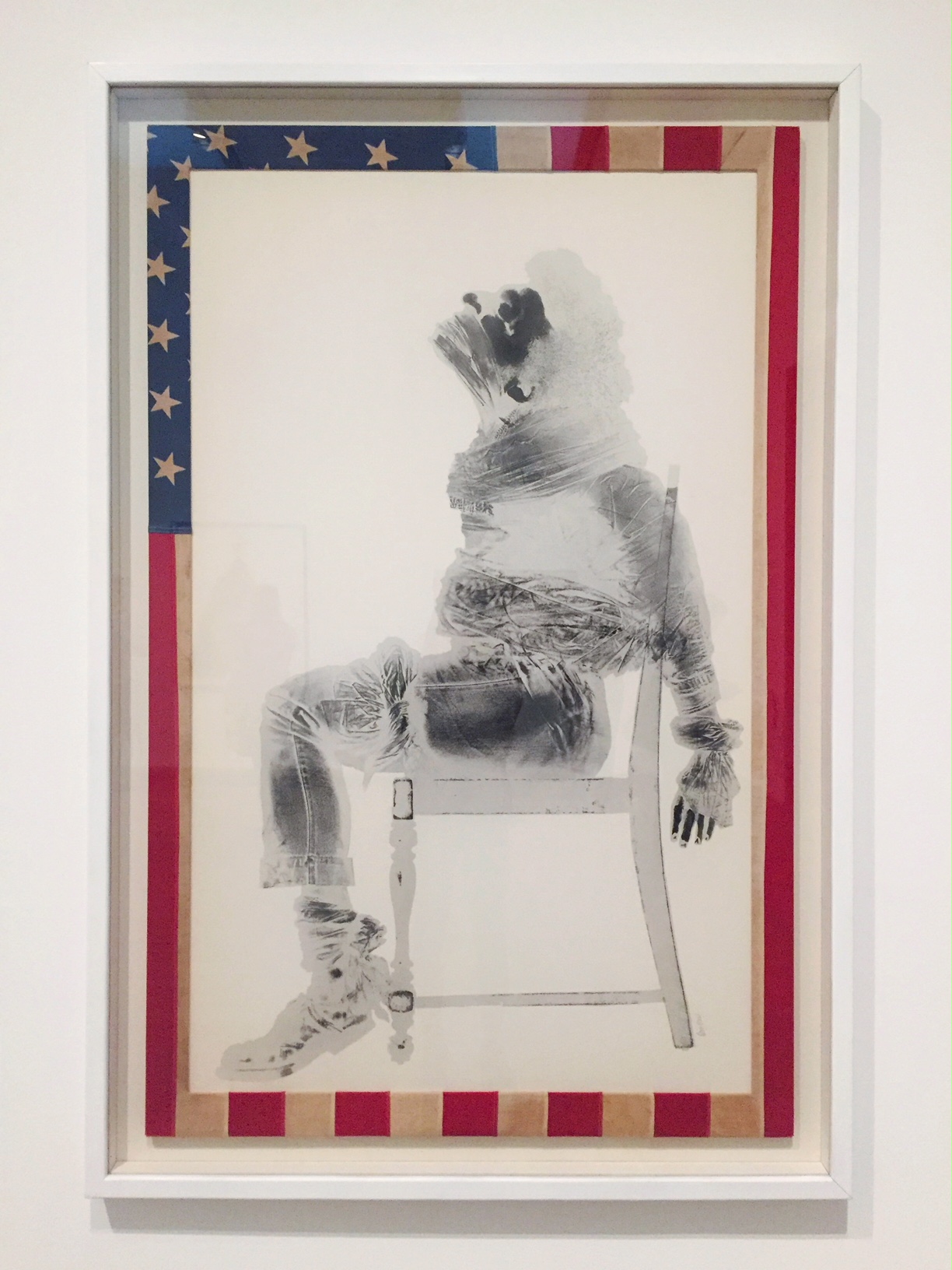
“Injustice Case”
Injustice Case refers to Black Panther Party co-founder Bobby Seale’s trial for conspiracy to incite violence, during which Seale was bound and gagged in the courtroom. Hammons cut an American flag to frame the image (itself a punishable offence), effectively making this shocking scene from the halls of justice an x-ray of America.
David Hammons, Injustice Case, Body print and screenprint on paper, frame wrapped with American Flag, 1970
Barkley Hendricks
“What’s Going on”
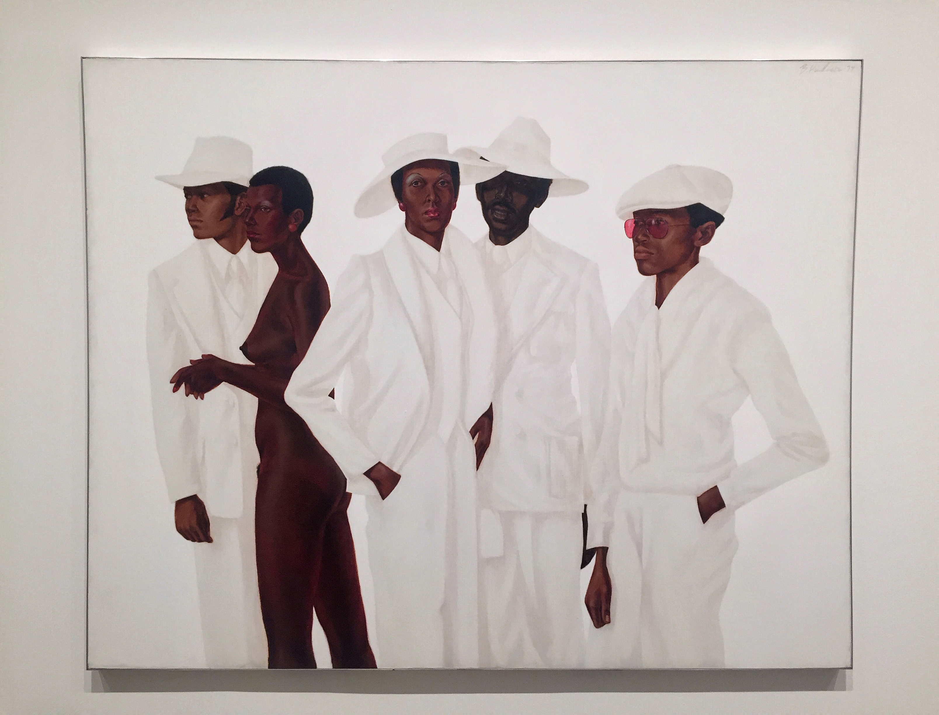
Five figures stand nearly life-size. Amalgamations of people real and imagined, the nude woman is modelled on Hendricks’s recurring model, dancer Adrienne Hawkins, and the youngest man in rose-tined glasses is based on the artist’s brother. Hendricks conveys a range of complexions by seamlessly transitioning between highly malleable, slow-drying oil paint and fast-dying acrylic to suggest different textures and surfaces.
Barkley Hendricks, What’s Going on Oil paint, acrylic paint and acrylic resin paint on canvas, 1974
Barkley Hendricks
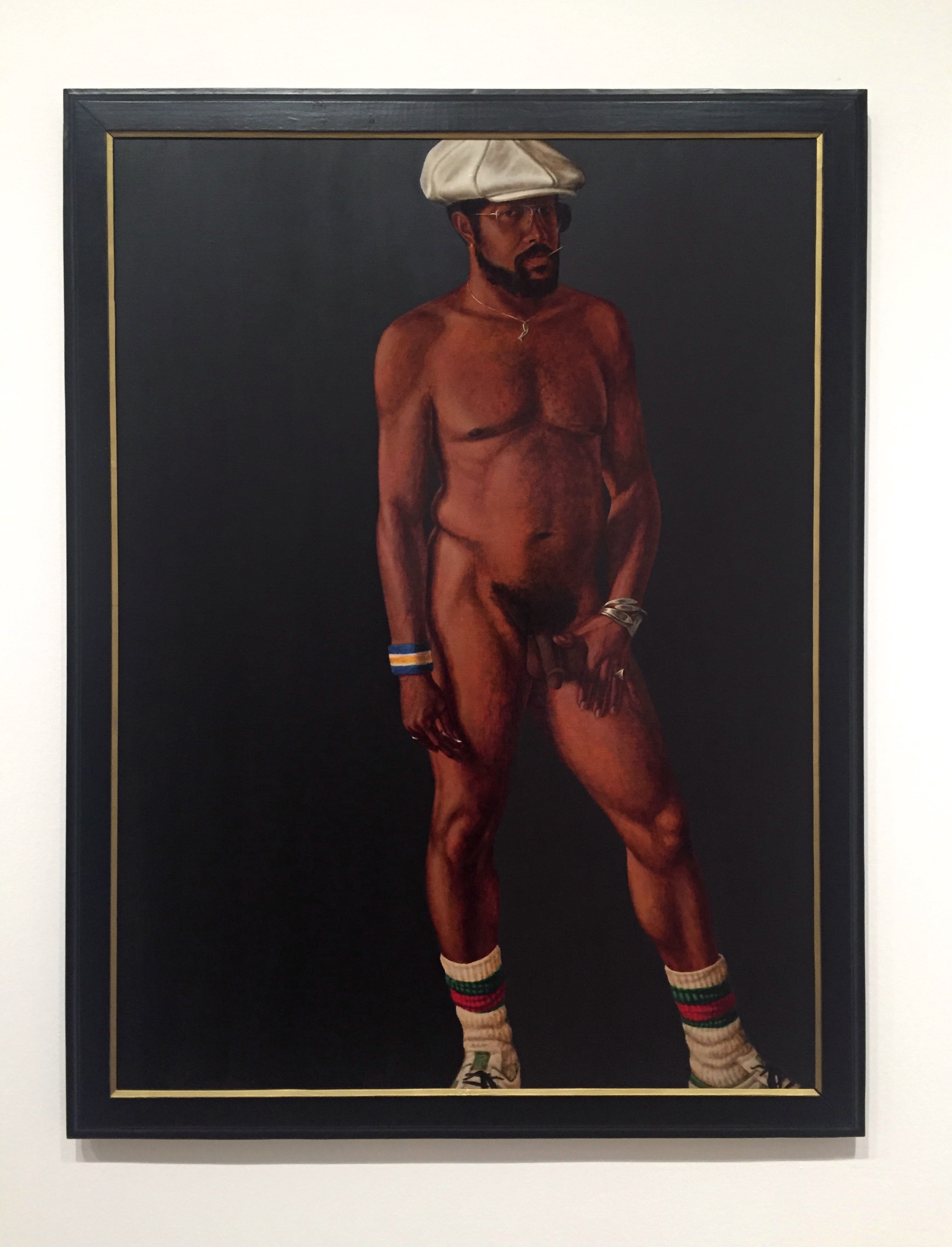
“Brilliantly Endowed (Self-Portrait)”
Brilliantly Endowed is a self-portrait that demonstrates swagger – defiance and cool detachment – as an everyday act of revolutionary aesthetics. Hendricks subtly targets New York Times critic Hilton Kramer, who had concluded a 1977 review by calling that artist ‘a brilliantly endowed painter who erred, perhaps, on the side of slickness’. The artist tackles head-on the double entendre and its potential stereotype connotation of Black male anatomy, while also putting on show his confidence as a painter, upending ‘slickness’ to embrace it as an attribute.
Barkley Hendricks, Brilliantly Endowed (Self-Portrait), Oil paint and acrylic paint on canvas, 1977
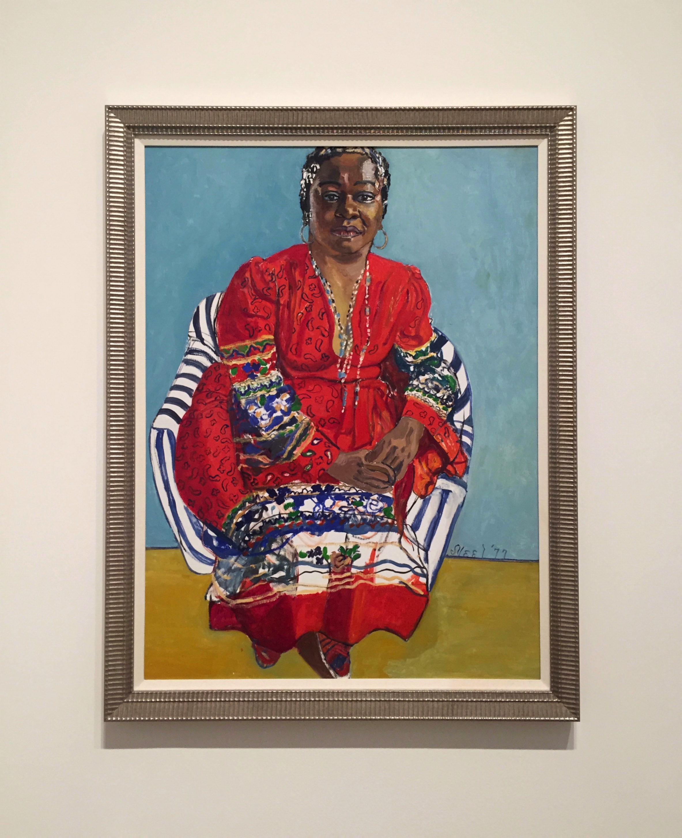
Alice Neel
“Faith Ringgold”
Alice Neel, a white artist, was an ardent supporter of the equal representation of Black people – both through her own selection of sitters, such as this portrait of artist Faith Ringgold, and in her social actions.
Alice Neel, Faith Ringgold, Oil paint on canvas, 1977
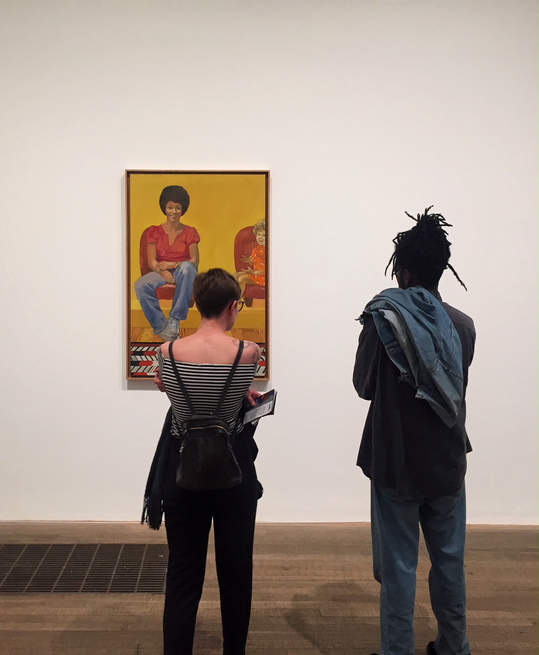
Emma Amos
“Eva the Babysitter”
Emma Amos was the sole woman artist in the Spiral group. The circumstances of socially-accepted domestic and child rearing responsibilities compounded the challenges women artists faced. This image honours a woman who helped enable Amos’s artistic practice. The radiant child-carer smiled while the artist’s toddler daughter is barely contained by the canvas.
Emma Amos, Eva the Babysitter, Oil pain on canvas, 1973
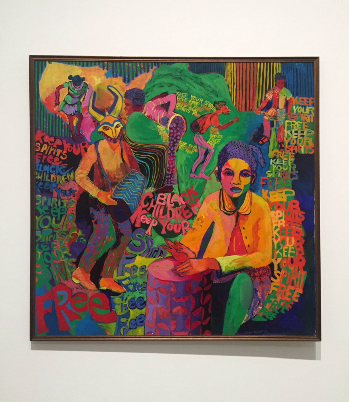
Carolyn Lawrence, Black Children Keep Your Spirits Free, Acrylic paint on canvas, 1972
virginia jaramillo, Untitled, Acrylic paint on canvas, 1971
Joe Overstreet
“We Came from There to get Here”
In he early 1960s, Joe Overstreet Was making image-based painting clearly expressing the political goals of Black Power; he was closely associated with the Black Arts Movement, and painted backdrops for the jazz musician Sun Ra. He later turned to making more abstract work, here painting a colourful grid and drawing the outlines of figures giving gestures of empowerment.
Joe Overstreet, We Came from There to get Here, Acrylic pain on canvas and rope, 1970
Frank Bowling
“Texas Louise”
Texas Louise was one of six Map Paintings Bowling included in his solo exhibition at the Whitney Museum of American Art in late 1971. He poured waves of acrylic over stencils of continents that were removed before more paint was applied, so ghostly outlines remain. Continents emerge from and disappear into colour; oceans and rivers are combined with pools and trails of liquid paint. While many Black Americans were pointing to Africa as a mother continent, Bowling’s maps do not privilege any particular place, and celebrate a more fluid and open idea of identity and belonging to the world.
Frank Bowling, Texas Louise, Acrylic paint on canvas, 1971
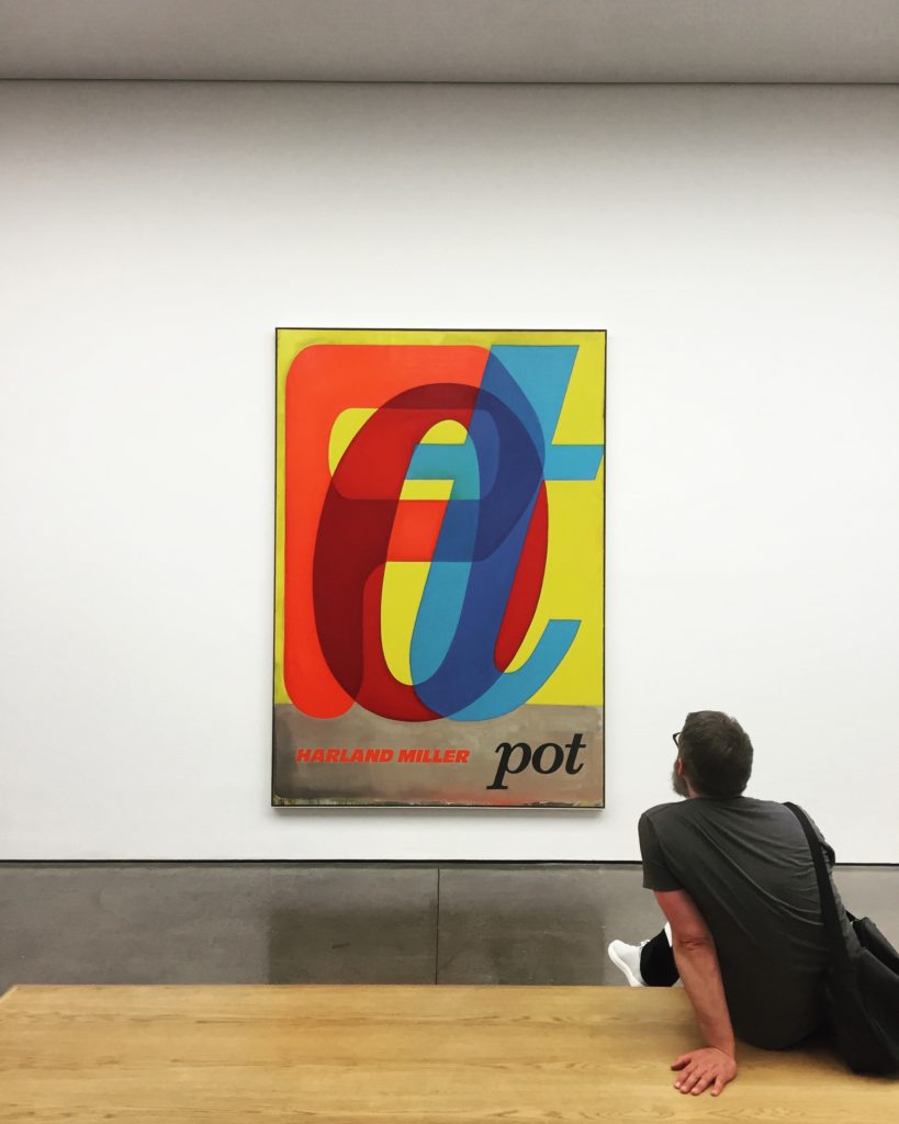
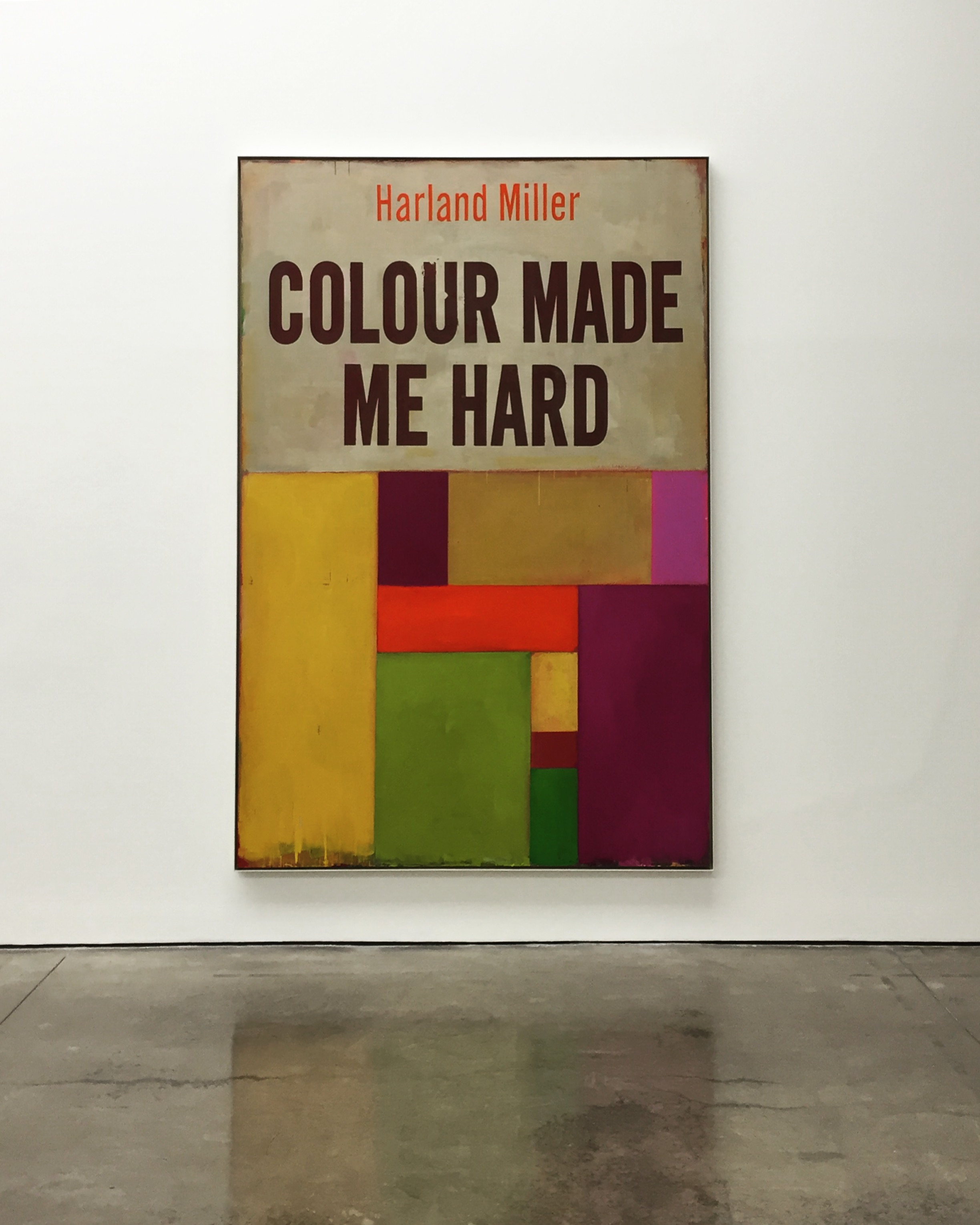
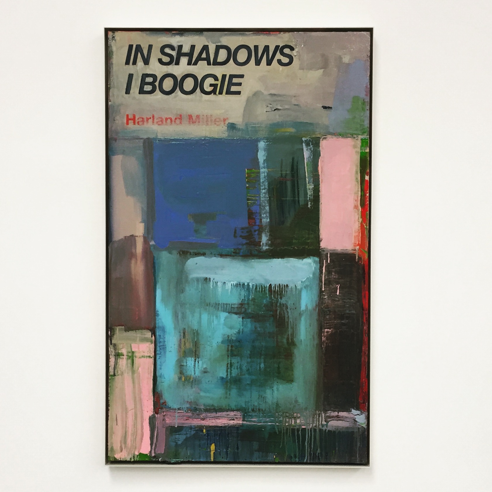
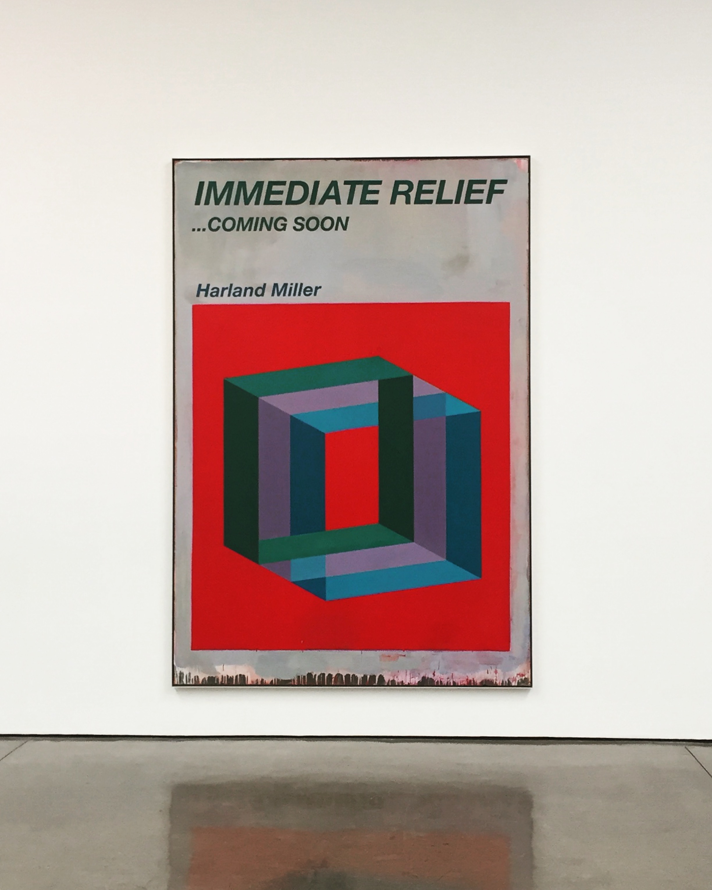
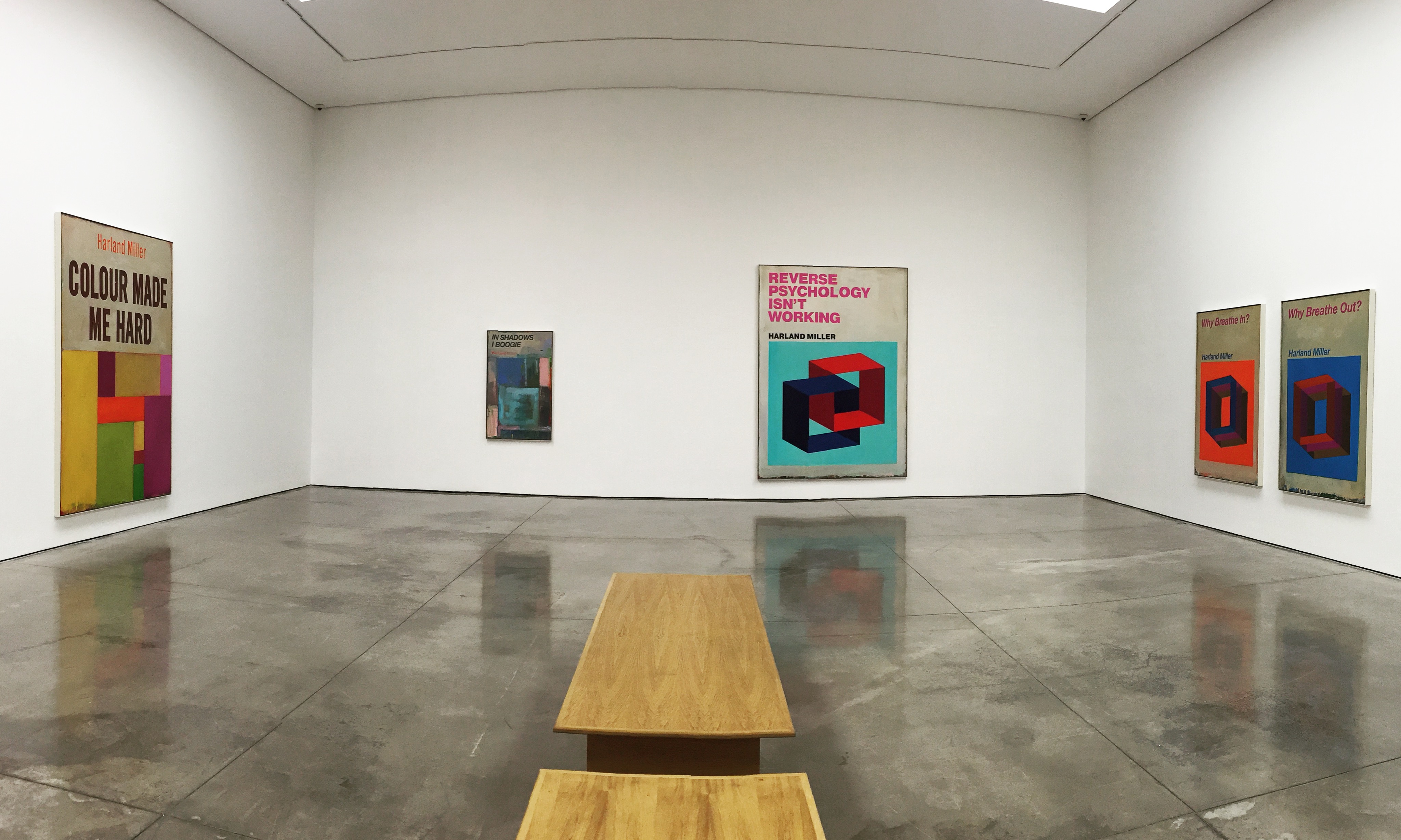
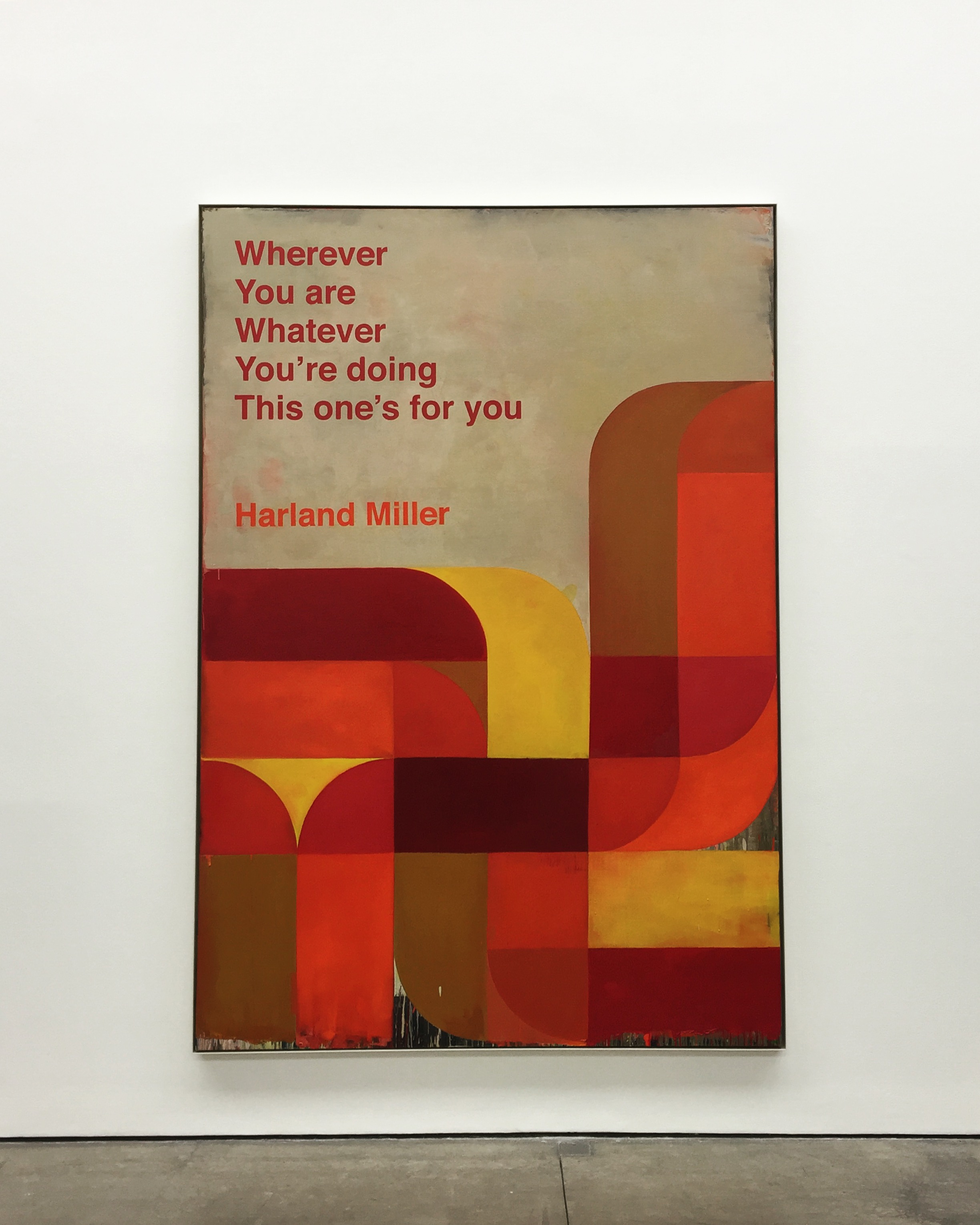
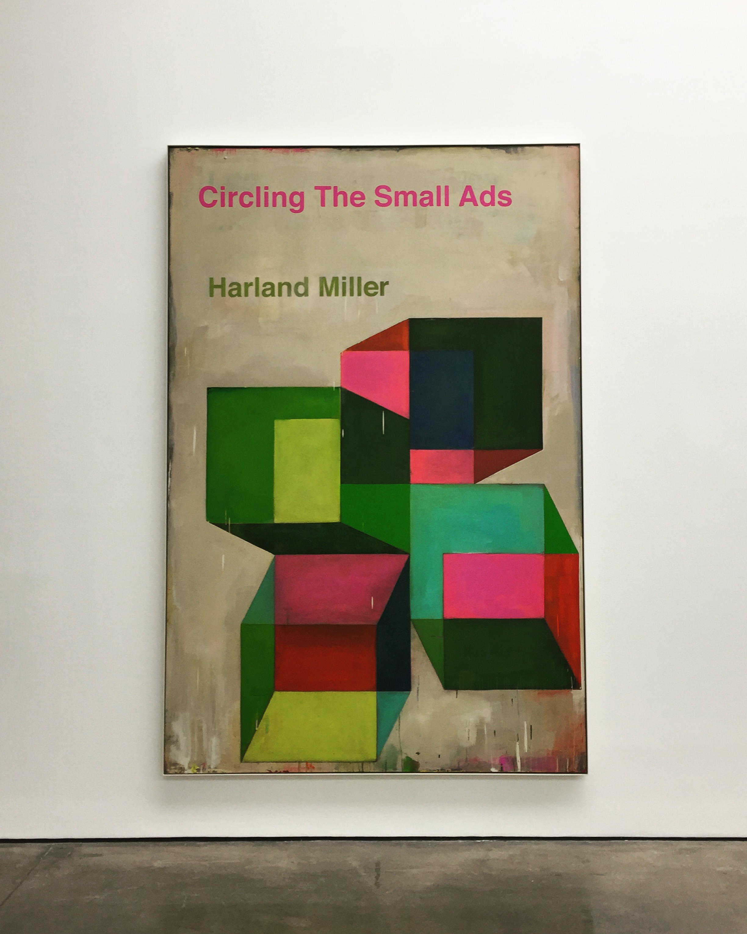
The first series of large-scale works draws on Miller’s extensive archive of psychology and social science books, which date from the 1960s and ’70s. Characterised by their bold and colourful abstract covers, these books embraced a positive attitude and the possibility of ‘fixing’ disorders through a process of self-help.
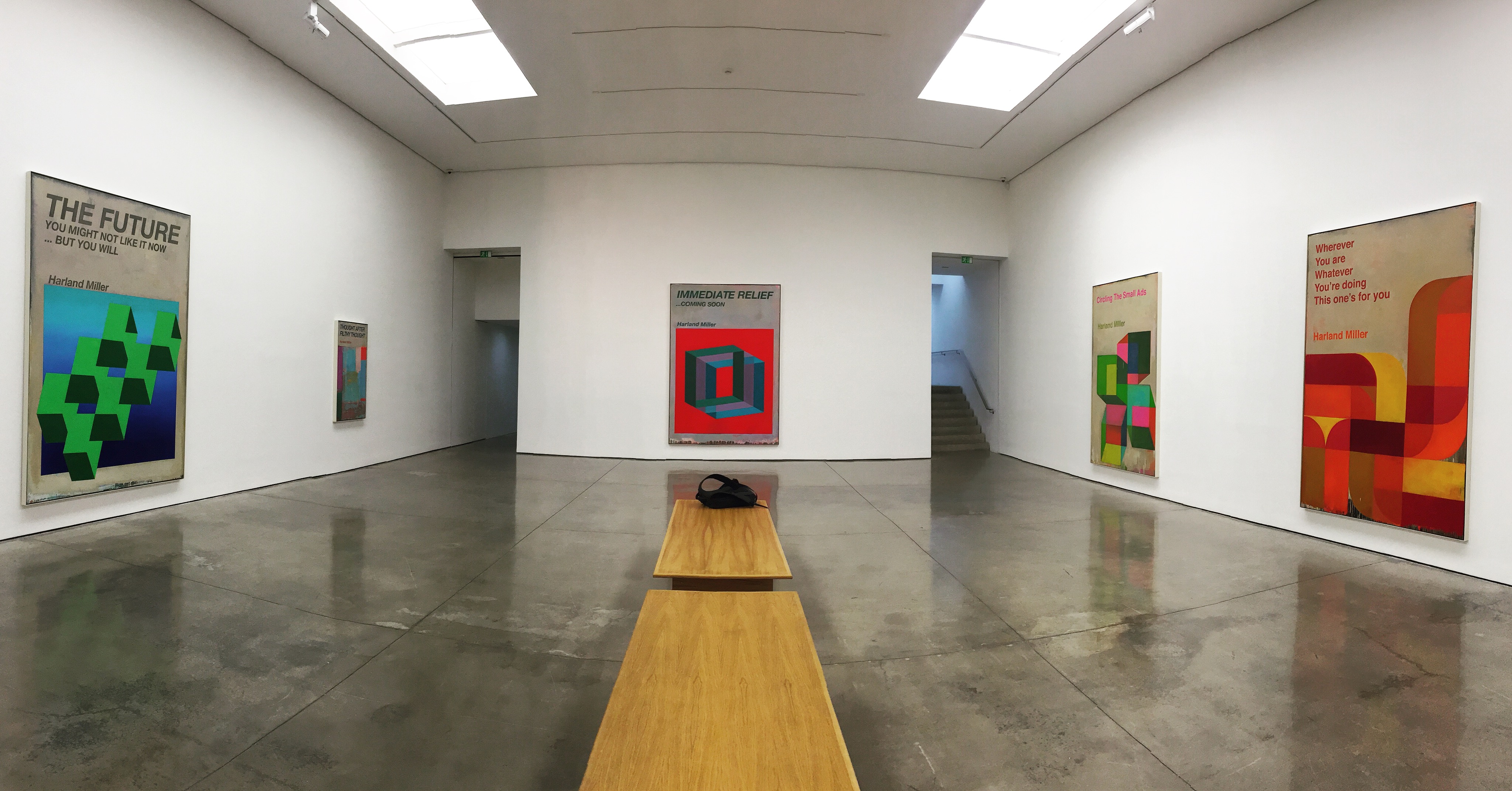
Pot, Oil on canvas, 105 x 72 x 2 in. 2017Colour Made Me Hard, Oil on canvas, 109 x 73 x 2 in. 2016In the Shadows I Boogie, Oil on canvas, 60 x 36 x 2 in. 2017
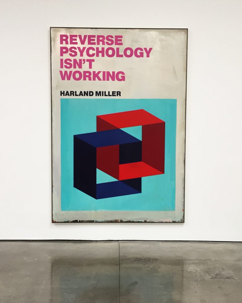
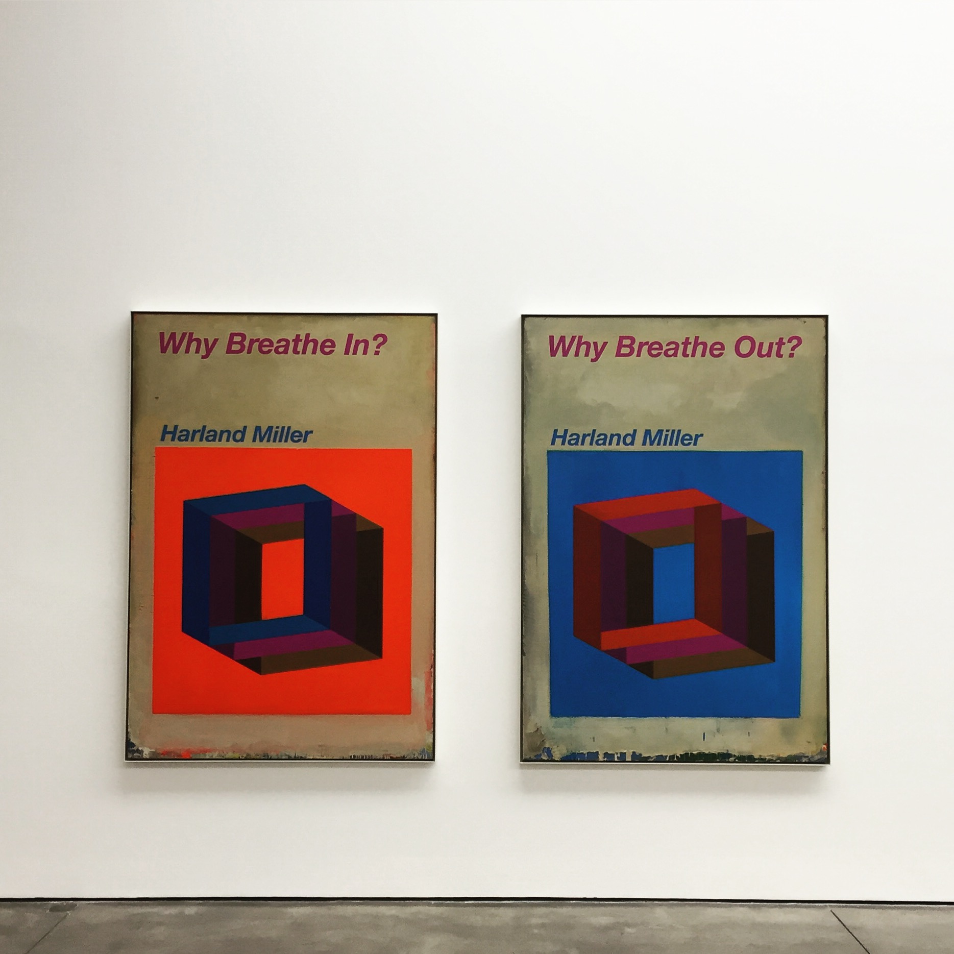
In Miller’s paintings, three-dimensional architectonic forms in bright, pop colours float against solid saturated backgrounds and are paired with fictional, sardonically humorous titles such as Reverse Psychology Isn’t Working (2017) and Immediate Relief … Coming Soon (2017). Occasionally, the same title appears on different compositions, highlighting how colour, forms and context can change both the rhythm and meaning of words.
Reverse Psychology Isn’t Working, Oil on canvas, 115 x 81 x 2 in. 2017Immediate Relief … Coming Soon, Oil on canvas, 118 x 81 x 2 in. 2017
Similar to the titles, Miller’s abstract imagery can also be read in different ways. Commenting on the work Armageddon – Is It To Much To Ask? (2017), for example, he says: ‘it’s an image that you see one way – then, when you relax, it flips and, no matter how hard you try, you can’t see it the original way. It’s symbolic of the way you read the title.’ These words reflect a departure for the artist, whose previous series of Penguin paperback paintings were re-appropriations of an existing object. Here, for the first time, Miller creates his own designs, focusing more closely on the impact of the image itself.
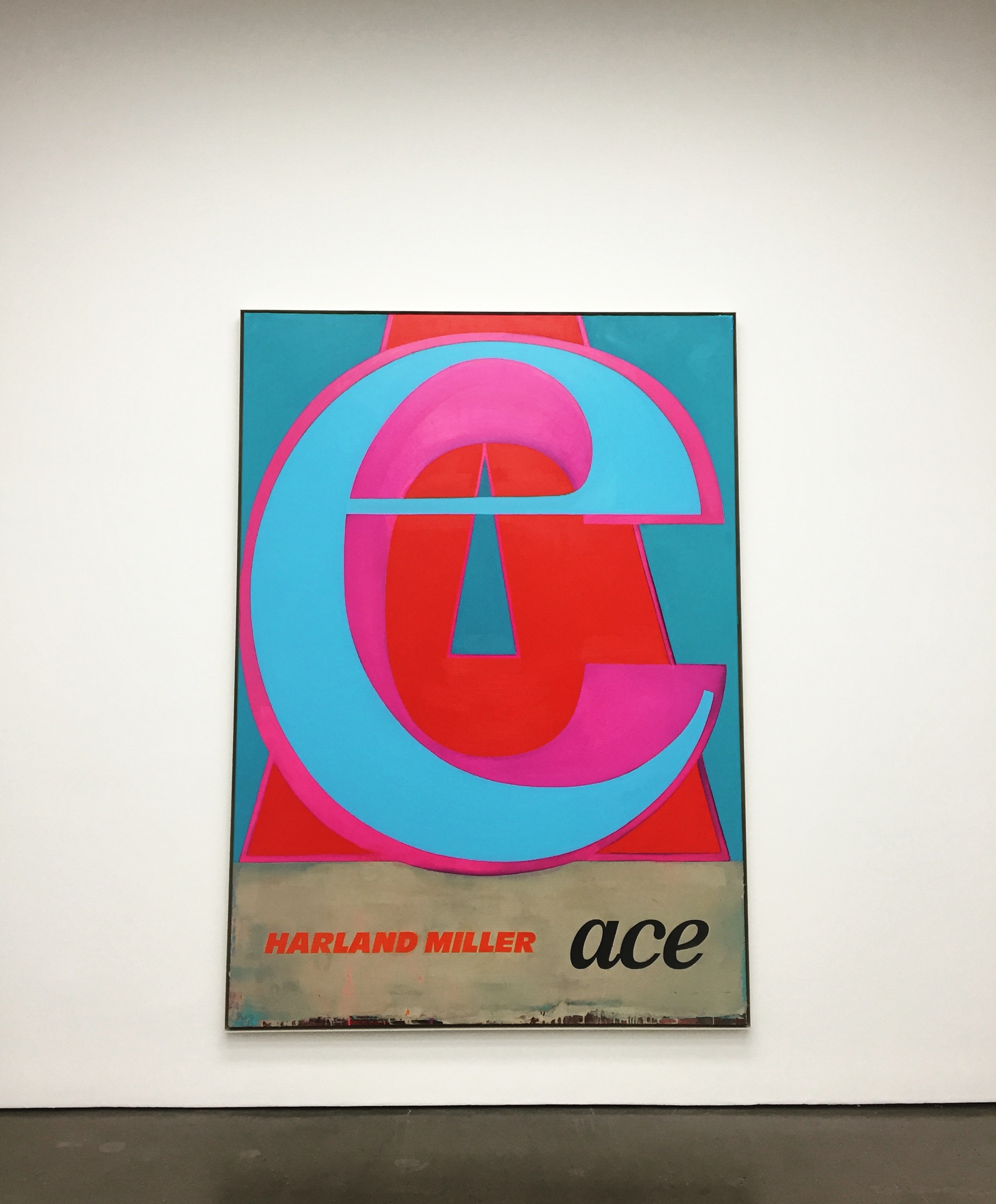
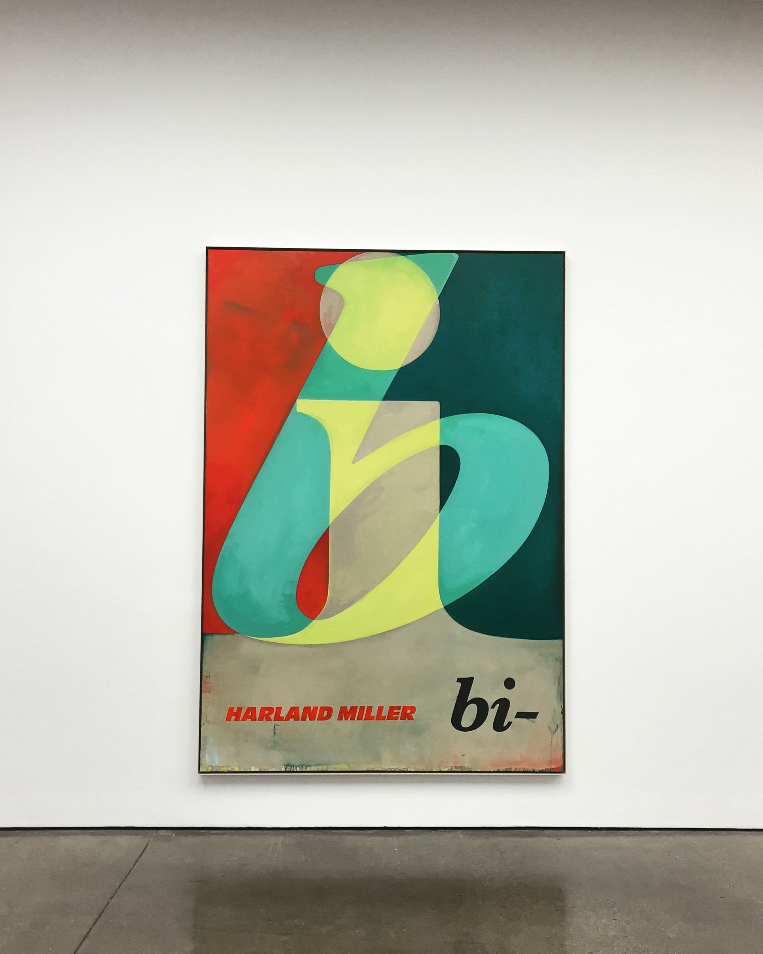
Why Breathe In, Why Breath Out, Oil on canvas, Two panels, each: 75 x 61 x 2 in. 2017Ace, Oil on canvas, 105 x 75 x 2 in. 2017Bi, Oil on canvas, 104 x 72 x 2 in. 2017
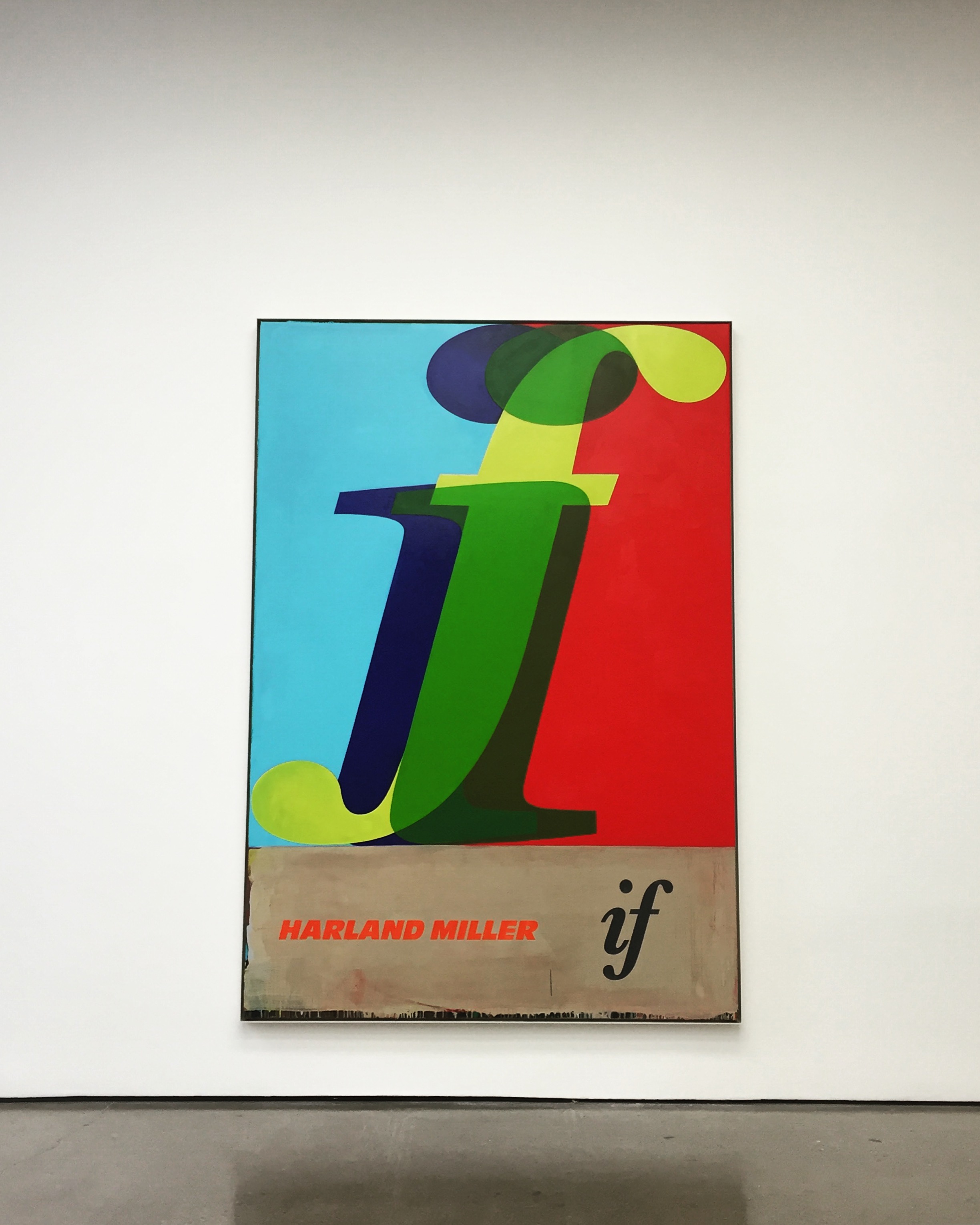
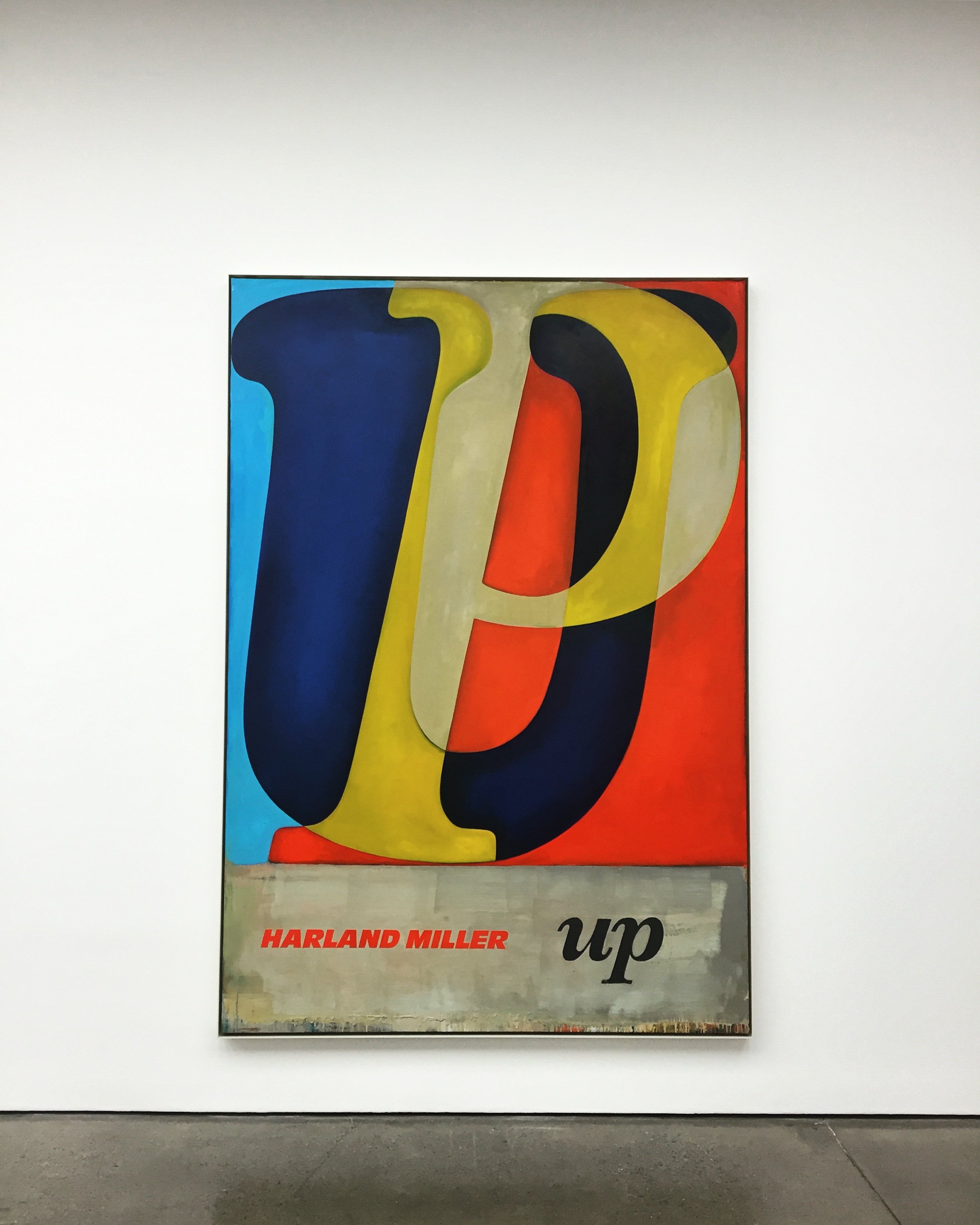
In another series of fictional book cover paintings, Miller depicts the outlines of letter in a range of typefaces and colours, intersected or layered over each other to create short, enigmatic words such as ‘Up’ or ‘If’.
Up, Oil on canvas, 104 x 73 x 2 in. 2017If, Oil on canvas, 104 x 72 x 2 in. 2017
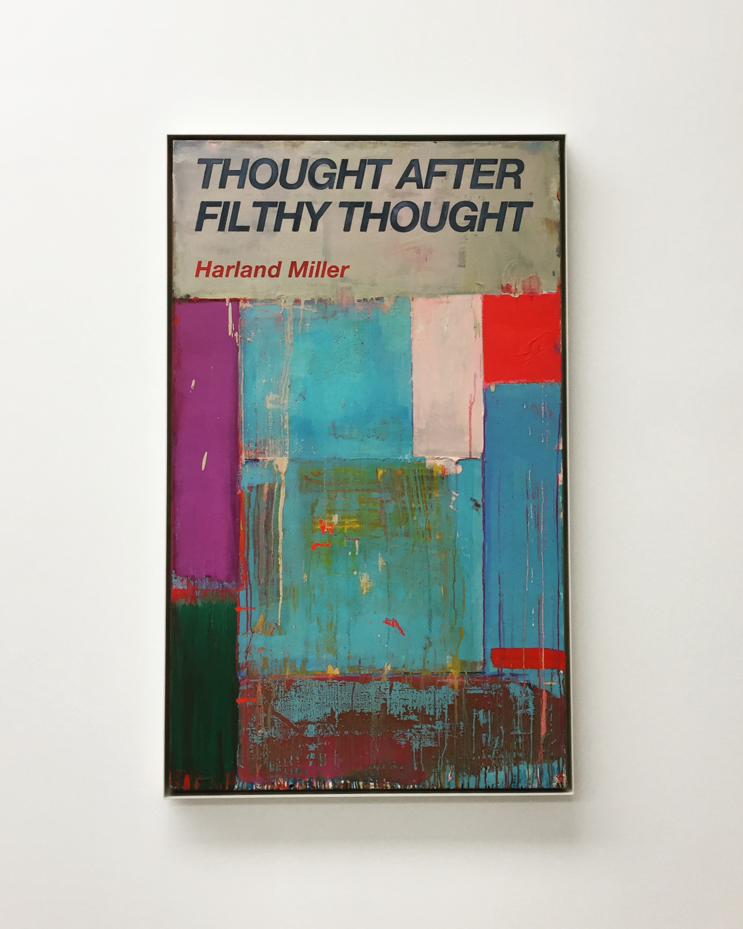
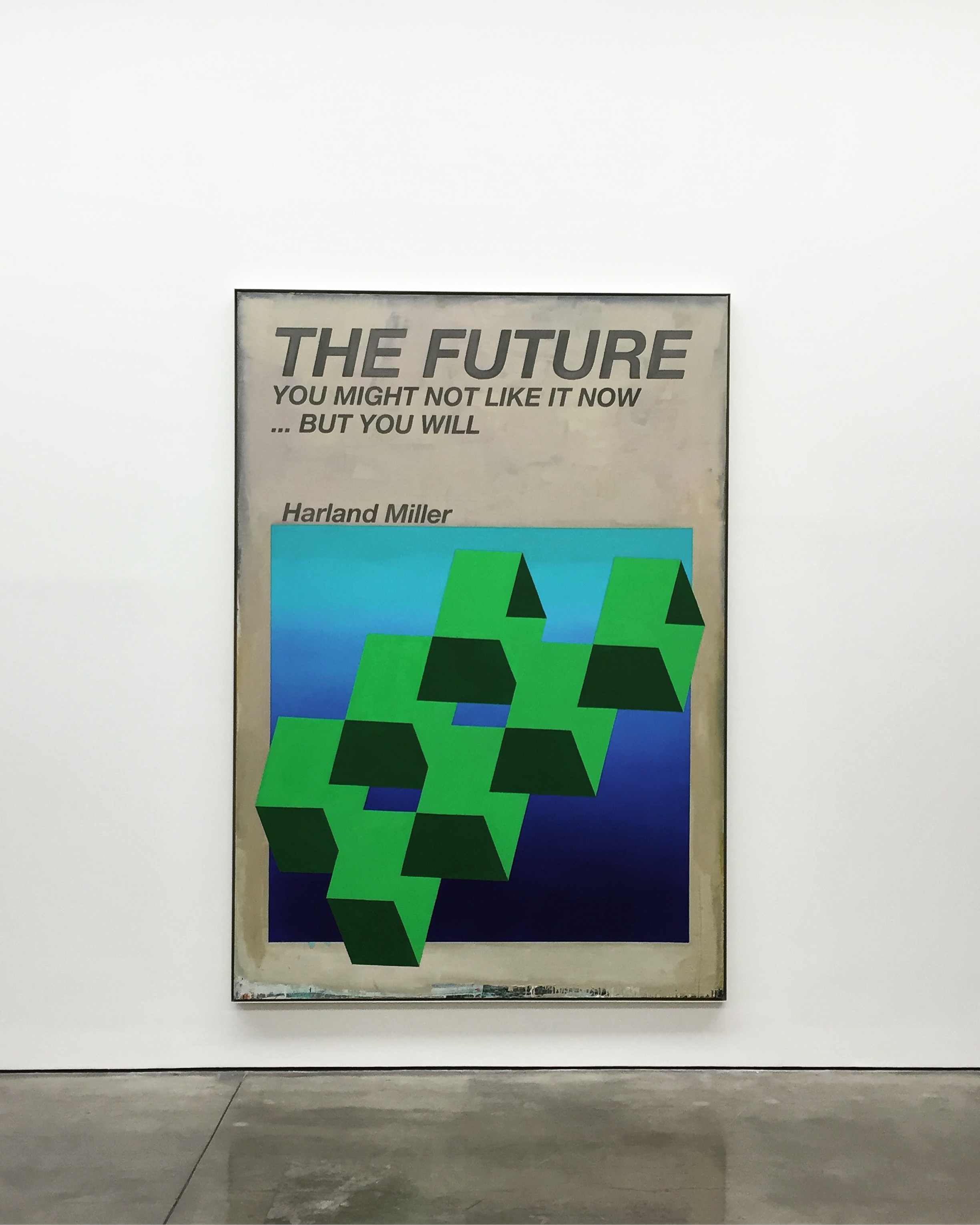
Through a process of isolation, overlaying and re-connecting, Miller creates a sense of depth in the image that deconstructs and abstracts the meaning of language itself. With their bold, saturated colours, these paintings reference American abstraction and, in particular, Robert Rauschenberg and Ed Ruscha’s use of vernacular signage and motifs. Miller has said about this series: ‘The idea is to make paintings that are just words, in contrast to the titles of previous works’.
Thought After Filthy Thought, Oil on canvas, 60 x 36 x 2 in. 2017The Future, You May Not Like it Now, But You Will, Oil on canvas, 115 x 80 x 2 in. 2017
In both series of paintings the artist continues to use his own name as author. While the presence of Miller’s name alludes to the actual authorship of both image and text, fact and fiction became blurred, allowing for the artist’s deadpan humour to provoke, question and draw attention to the context and content of each work.
Wherever You Are, Whatever You’re Doing, This One’s For You, Oil on canvas, 112 x 77 x 2 in. 2017Circling The Small Ads, Oil on canvas, 109 x 72 x 2 in. 2017


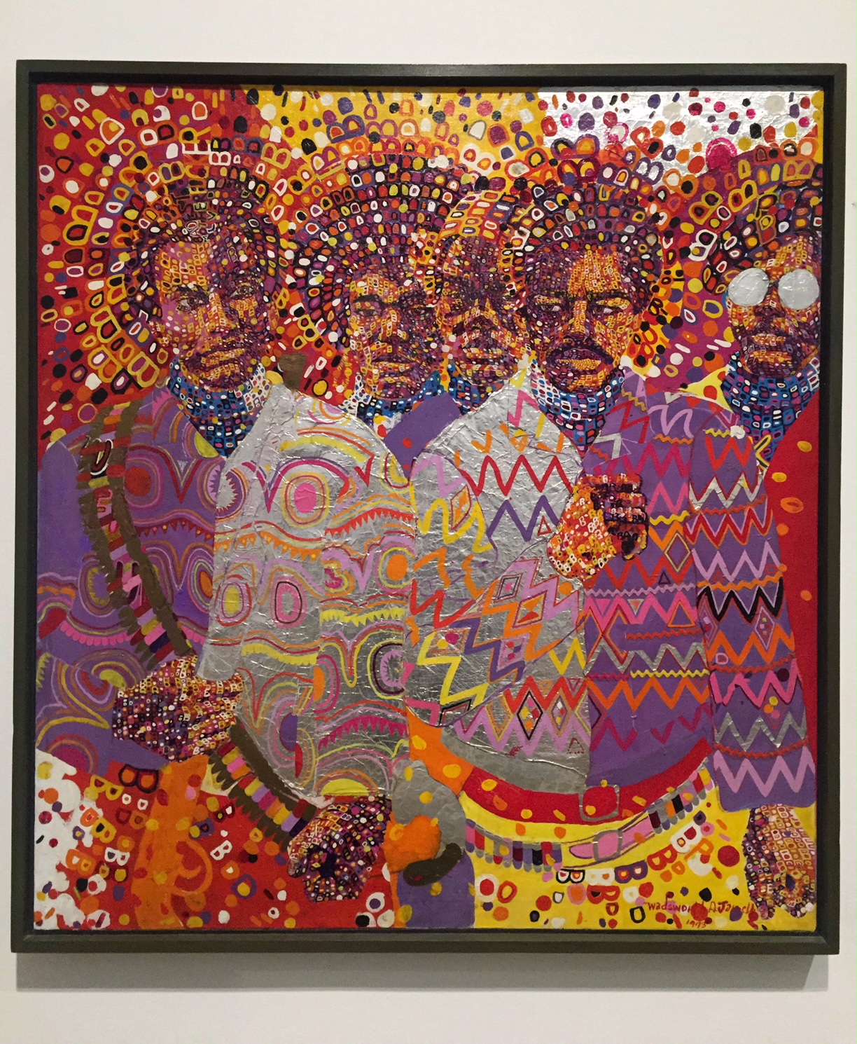 Wadsworth Jarrell Liberation soldiers Acrylic paint and foil canvas